WGCNA + ssGSEA的组合分析

生物信息数据分析教程视频——16-单样本基因集富集分析(ssGSEA)用于肿瘤相关免疫细胞浸润水平评估
1.案例数据:
表达谱数据:行为基因,列为样本。
load("expressionData.Rdata")# wgcnadat
head(wgcnadat)[,1:4]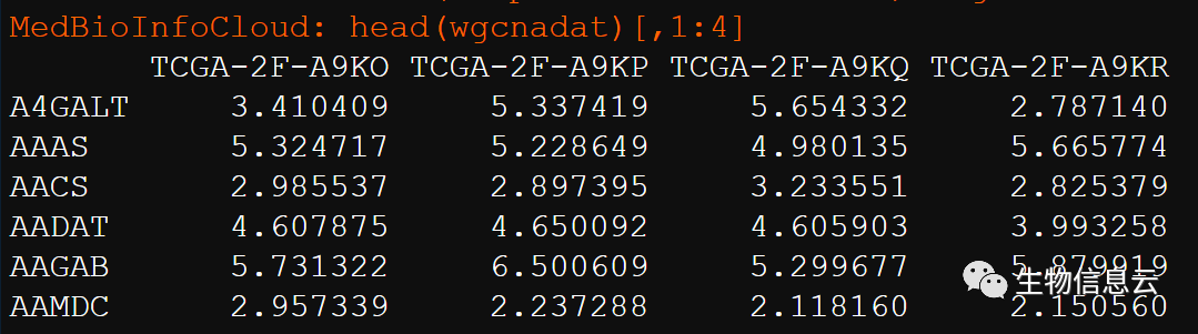
表型数据:行为表型特征,列为样本。这是我是基于ssGSEA计算的17种功能状态的ssGSEA分数。
load("TCGA-BLCA-normalize_turmor_ssGSEA_Score.Rdata")# norm_ssGSEA_Score
head(norm_ssGSEA_Score)[,1:4]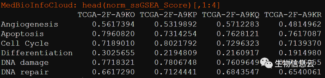
分析代码:
library(dplyr)
library(tidyr)
library(RColorBrewer)
library(reshape2)
library(ggplot2)
library(tibble)
library(ggpubr)
library(pheatmap)
library(ComplexHeatmap)
library(ggrepel)
library(WGCNA)
outdirp = "results"
ifelse(dir.exists(outdirp),"文件夹已经存在",
dir.create(outdirp,recursive = T))
load("expressionData.Rdata")# wgcnadat
head(wgcnadat)[,1:4]
wgcnadat = as.data.frame(t(wgcnadat))
dim(wgcnadat)
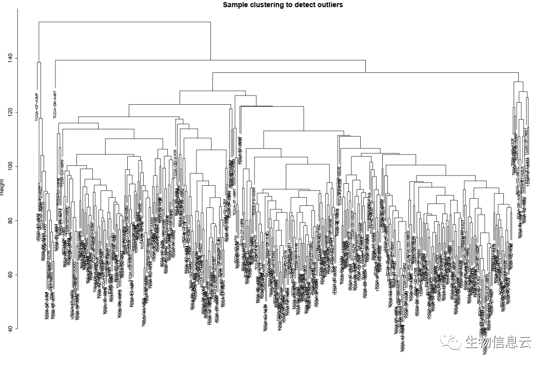
sampleTree = hclust(dist(wgcnadat), method = "average");
# Plot the sample tree: Open a graphic output window of size 12 by 9 inches
# The user should change the dimensions if the window is too large or too small.
sizeGrWindow(12,9)
#pdf(file = "Plots/sampleClustering.pdf", width = 12, height = 9);
pdf(file = paste0(outdirp,"/01-Sample clustering.pdf"),
width = 15,height = 10)
par(cex = 0.6);
par(mar = c(0,4,2,0))
plot(sampleTree, main = "Sample clustering to detect outliers", sub="", xlab="", cex.lab = 1.5,
cex.axis = 1.5, cex.main = 2)
dev.off()
message(paste0("=========WGCNA========="))
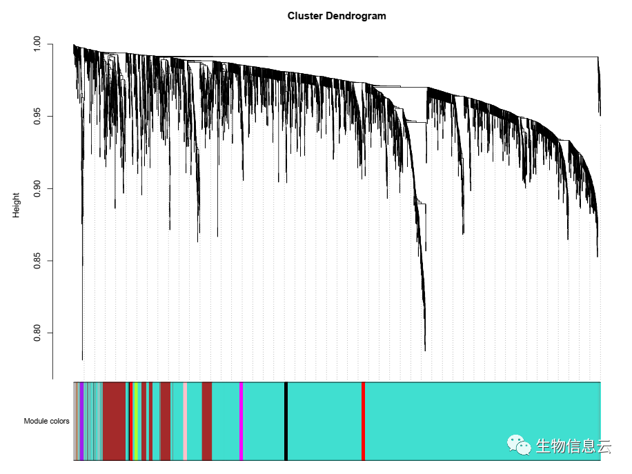
net = blockwiseModules(wgcnadat, power = 6,
TOMType = "unsigned", minModuleSize = 30,
reassignThreshold = 0, mergeCutHeight = 0.25,
numericLabels = TRUE, pamRespectsDendro = FALSE,
saveTOMs = TRUE,
saveTOMFileBase = "femaleMouseTOM",
verbose = 3)
load("TCGA-BLCA-normalize_turmor_ssGSEA_Score.Rdata")# norm_ssGSEA_Score
head(norm_ssGSEA_Score)[,1:4]
Score = as.data.frame(t(norm_ssGSEA_Score))
#id = intersect(rownames(wgcnadat),rownames(Score))
Score = Score[rownames(wgcnadat),]
traitColors = numbers2colors(Score, signed = FALSE);
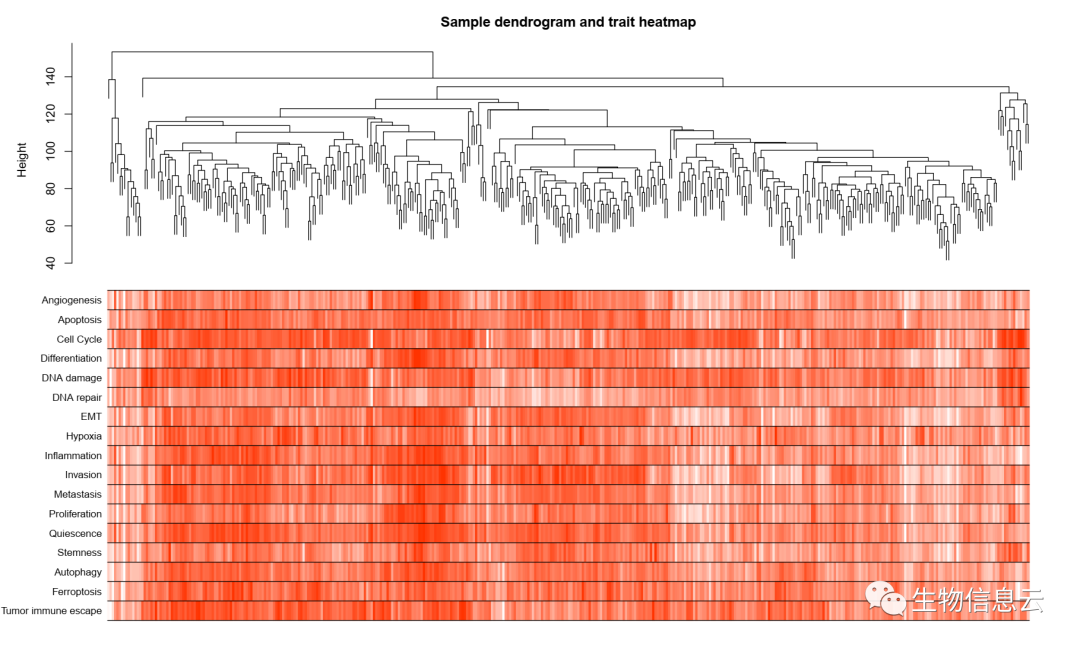
# Plot the sample dendrogram and the colors underneath.
sampleTree2 = hclust(dist(wgcnadat), method = "average")
pdf(file = paste0(outdirp,"/03-Sample dendrogram and trait heatmap.pdf"),
width = 15,height = 9)
plotDendroAndColors(sampleTree2, traitColors,
groupLabels = names(Score),
dendroLabels = F,
main = "Sample dendrogram and trait heatmap")
dev.off()
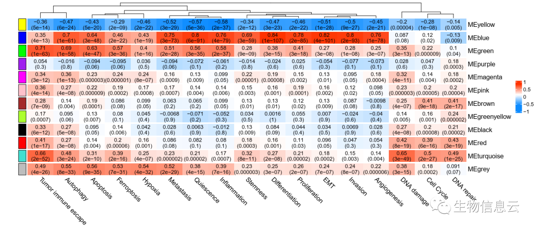
# 定义基因和样本的数量
nGenes = ncol(wgcnadat);
nSamples = nrow(wgcnadat);
# Recalculate MEs with color labels
MEs0 = moduleEigengenes(wgcnadat, moduleColors)$eigengenes
MEs = orderMEs(MEs0)
moduleTraitCor = cor(MEs, Score, use = "p");
moduleTraitPvalue = corPvalueStudent(moduleTraitCor, nSamples);
sizeGrWindow(10,6)
# Will display correlations and their p-values
textMatrix = paste(signif(moduleTraitCor, 2), "\n(",
signif(moduleTraitPvalue, 1), ")", sep = "");
dim(textMatrix) = dim(moduleTraitCor)
###===============热图======
# par(mar = c(6, 8.5, 3, 3));
# # Display the correlation values within a heatmap plot
# pdf(file = paste0(outdirp,"/04-Module-trait relationships.pdf"),
# width = 10,height = 8.5)
# labeledHeatmap(Matrix = moduleTraitCor,
# xLabels = names(Score),
# yLabels = names(MEs),
# ySymbols = names(MEs),
# colorLabels = FALSE,
# colors = greenWhiteRed(50),
# textMatrix = textMatrix,
# setStdMargins = FALSE,
# cex.text = 0.7,
# zlim = c(-1,1),
# main = paste("Module-trait relationships"))
# dev.off()
##===========上面图太丑,重新画
# group <- names(MEs)
split = 1:length(names(MEs))#对应group分组的个数
ha <- rowAnnotation(
empty = anno_empty(border = FALSE),
foo = anno_block(
gp = gpar(fill = substring(names(MEs), 3))
)
)
color.key<-c("#3300CC","#3399FF","white","#FF3333","#CC0000")
pdf(file = paste0(outdirp,"/04-Module-trait relationships.pdf"),
width = 14,height = 6)
#colorRampPalette(color.key)(50)
Heatmap(
matrix = as.matrix(moduleTraitCor),
col= blueWhiteRed(50),
name = " ",
#column_split = split,
row_split = split,
left_annotation = ha,
cluster_rows = F,
column_title = NULL,
row_title = NULL,
column_names_rot = -45,
cell_fun = function(j, i, x, y, width, height, fill) {
grid.text(textMatrix[i, j],
x, y,
gp = gpar(fontsize = 10))}
)
dev.off()
# names (colors) of the modules
##计算表达值与MEs之间的相关性
modNames = substring(names(MEs), 3)#取出颜色名称字符串
geneModuleMembership = as.data.frame(cor(wgcnadat, MEs, use = "p"));
MMPvalue = as.data.frame(corPvalueStudent(as.matrix(geneModuleMembership),
nSamples));
names(geneModuleMembership) = paste("MM", modNames, sep="");
names(MMPvalue) = paste("p.MM", modNames, sep="");
dim(geneModuleMembership)
###计算表型与表达值之间的相关性
geneTraitSignificance = as.data.frame(cor(wgcnadat, Score, use = "p"));
GSPvalue = as.data.frame(corPvalueStudent(as.matrix(geneTraitSignificance),
nSamples));
names(geneTraitSignificance) = paste("GS.", names(Score), sep="");
names(GSPvalue) = paste("p.GS.", names(Score), sep="");
# chooseOneHubInEachModule(wgcnadat,moduleColors)
# chooseTopHubInEachModule(wgcnadat,moduleColors)
###绘制相关性散点图
###
Trait = colnames(moduleTraitCor)
module = rownames(moduleTraitCor)
# Recalculate topological overlap
TOM = TOMsimilarityFromExpr(wgcnadat, power = 6)
# mod = module[1]
for(mod in module){
mod_col = substring(mod, 3)
inModule = (moduleColors== mod_col)
moduleGenes = rownames(geneModuleMembership)[inModule]
## 也是提取指定模块的基因名
# Select the corresponding Topological Overlap
modTOM = TOM[inModule, inModule];
dimnames(modTOM) = list(moduleGenes,moduleGenes)
## 模块对应的基因关系矩阵,输出数据可用于Cytoscape绘图
cyt = exportNetworkToCytoscape(
modTOM,
edgeFile = paste0(outdirp,"/CytoscapeInput-edges-",mod, "0.1-threshold.txt"),
nodeFile = paste0(outdirp,"/CytoscapeInput-nodes-",mod, "0.1-threshold.txt"),
weighted = TRUE,
threshold = 0.1,
nodeNames = moduleGenes,
nodeAttr = moduleColors[inModule]
)
#phe = Trait[7]
##筛选hub基因
for(phe in Trait){
if(abs(moduleTraitCor[mod,phe]) > 0.8){
gs_names = colnames(geneTraitSignificance)
df = data.frame(MM=geneModuleMembership[moduleGenes, paste0("MM",mod_col)],
GS=geneTraitSignificance[moduleGenes, grep(phe,gs_names)])
rownames(df) = moduleGenes
hubgene = moduleGenes[abs(df$MM)> 0.8 & abs(df$GS)> 0.6]
write(hubgene,file = paste0(outdirp,"/",mod,"-",phe,"-MM(0.8)-GS(0.6)-hubgene.txt"))
#hubgenenet = networkScreening(Score$Angiogenesis,MEs,wgcnadat)
pdf(file = paste0(outdirp,"/06-MM and GS",mod,"-",phe, "-relationships.pdf"),
width = 6,height = 6.5)
verboseScatterplot(abs(geneModuleMembership[moduleGenes, paste0("MM",mod_col)]),
abs(geneTraitSignificance[moduleGenes, grep(phe,gs_names)]),
xlab = paste("Module Membership in",substring(mod, 3), "module"),
ylab = paste("Gene significance for",phe),
main = paste("Module membership vs. gene significance\n"),
cex.main = 1.2, cex.lab = 1.2, cex.axis = 1.2, col = mod_col)
dev.off()
}
}
}
相关结果图:
本文参与 腾讯云自媒体分享计划,分享自微信公众号。
原始发表:2023-08-19,如有侵权请联系 cloudcommunity@tencent.com 删除
本文分享自 MedBioInfoCloud 微信公众号,前往查看
如有侵权,请联系 cloudcommunity@tencent.com 删除。
本文参与 腾讯云自媒体分享计划 ,欢迎热爱写作的你一起参与!
评论
登录后参与评论
推荐阅读