分布(一)利用python绘制直方图
分布(一)利用python绘制直方图

分布(一)利用python绘制直方图
直方图(Histogram)简介
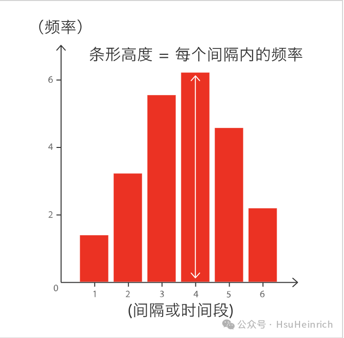
直方图
直方图主要用来显示在连续间隔(或时间段)的数据分布,每个条形表示每个间隔(或时间段)的频率,直方图的总面积等于数据总量。
直方图有助于分析数值分布的集中度、上下限差异等,也可粗略显示概率分布。
快速绘制
基于seaborn
import seaborn as sns
import matplotlib.pyplot as plt

# 导入数据
df = sns.load_dataset('iris')

# 利用displot函数创建直方图
sns.displot(df["sepal_length"], kde=False, rug=False)

plt.show()
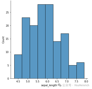
直方图
基于matplotlib
import matplotlib.pyplot as plt

# 导入数据
df = sns.load_dataset('iris')

# 初始画布
fig, ax = plt.subplots(figsize = (4, 3))

# 利用hist创建直方图
ax.hist(df["sepal_length"], edgecolor="black")

plt.show()
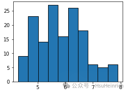
直方图
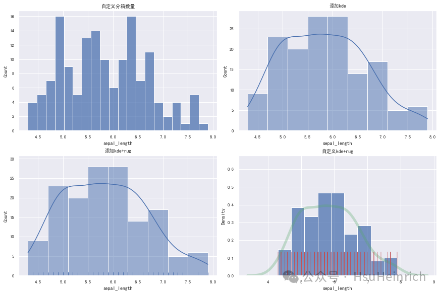
定制多样化的直方图
自定义直方图一般是结合使用场景对相关参数进行修改,并辅以其他的绘图知识。参数信息可以通过官网进行查看,其他的绘图知识则更多来源于实战经验,大家不妨将接下来的绘图作为一种学习经验,以便于日后总结。
以下直方图的自定义只是冰山一角,尽管如此依然显得很多很杂。过多的代码容易造成阅读体验的下降,因此我也曾考虑过将这部分以源代码的形式分享给大家,文章只叙述相关的操作和结果图,尽可能地提高大家的阅读体验。 但是我又想到并不是所有的图表内容都如此庞大,简单的图表就会显得文章过于单薄。而且单纯的放图好像也并不能提高阅读体验。 另外,大家也知道我从来不分享原始代码的文件,因为现在大家的学习节奏都很快,一旦拿到文件基本就放到一边了。只有将这些代码复制下来,哪怕只跑一遍也会有一定的印象,从而提高技术能力。
通过seaborn绘制多样化的直方图
seaborn主要利用displot和histplot绘制直方图,可以通过seaborn.displot[1]和seaborn.histplot[2]了解更多用法
修改参数
import seaborn as sns
import matplotlib.pyplot as plt

sns.set(font='SimHei', font_scale=0.8, style="darkgrid") # 解决Seaborn中文显示问题


# 导入数据
df = sns.load_dataset("iris")

# 构造子图
fig, ax = plt.subplots(2,2,constrained_layout=True, figsize=(12, 8))

# 自定义分箱数量
ax_sub = sns.histplot(data=df, x="sepal_length", bins=20, ax=ax[0][0])
ax_sub.set_title('自定义分箱数量')

# 增加密度曲线
ax_sub = sns.histplot(data=df, x="sepal_length", kde=True, ax=ax[0][1])
ax_sub.set_title('添加kde')

# 增加密度曲线和数据分布(小短条)
# rug参数用于绘制出一维数组中数据点实际的分布位置情况,单纯的将记录值在坐标轴上表现出来
ax_sub = sns.histplot(data=df, kde=True, x="sepal_length", ax=ax[1][0])
sns.rugplot(data=df, x="sepal_length", ax=ax_sub.axes)
ax_sub.set_title('添加kde+rug')

# 自定义密度曲线+自定义数据分布(kde+rug)
ax_sub = sns.histplot(data=df, x="sepal_length", stat="density", ax=ax[1][1])
sns.kdeplot(data=df, x="sepal_length", color="g", linewidth=5, alpha=0.3, ax=ax_sub.axes)
sns.rugplot(data=df, x="sepal_length", color="r", linewidth=2, alpha=0.3, height=0.2, ax=ax_sub.axes)
ax_sub.set_title('自定义kde+rug')

plt.show()
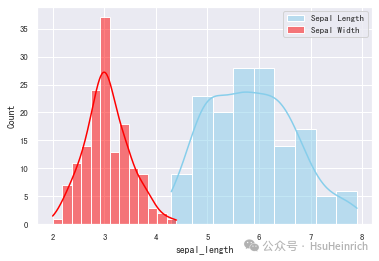
1、绘制多个变量
- 一图绘制多个变量
import seaborn as snsimport matplotlib.pyplot as pltsns.set(font='SimHei', font_scale=0.8, style="darkgrid") # 解决Seaborn中文显示问题# 导入数据df = sns.load_dataset("iris")sns.histplot(data=df, x="sepal_length", color="skyblue", label="Sepal Length", kde=True)sns.histplot(data=df, x="sepal_width", color="red", label="Sepal Width", kde=True)plt.legend()plt.show()
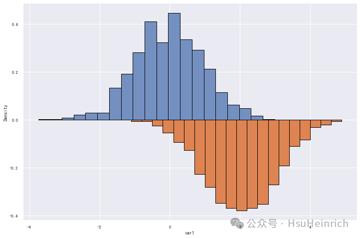
2# 引申-镜像直方图:可用来对比两个变量的分布
import numpy as np
from numpy import linspace
import pandas as pd
import seaborn as sns
import matplotlib.pyplot as plt
from scipy.stats import gaussian_kde
# 自定义数据
df = pd.DataFrame({
'var1': np.random.normal(size=1000),
'var2': np.random.normal(loc=2, size=1000) * -1
})
# 初始画布
plt.rcParams["figure.figsize"]=12,8
# 绘制直方图1
sns.histplot(x=df.var1, stat="density", bins=20, edgecolor='black')
# 绘制直方图2
n_bins = 20
# 获取条形的位置和高度
heights, bins = np.histogram(df.var2, density=True, bins=n_bins)
# 乘以-1进行反转
heights *= -1
bin_width = np.diff(bins)[0]
bin_pos =( bins[:-1] + bin_width / 2) * -1
# 绘制镜像图
plt.bar(bin_pos, heights, width=bin_width, edgecolor='black')
plt.show()
download
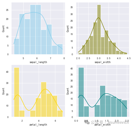
- 子图绘制多个变量
import seaborn as snsimport matplotlib.pyplot as pltsns.set(font='SimHei', font_scale=0.8, style="darkgrid") # 解决Seaborn中文显示问题# 导入数据df = sns.load_dataset("iris")fig, axs = plt.subplots(2, 2, figsize=(7, 7))sns.histplot(data=df, x="sepal_length", kde=True, color="skyblue", ax=axs[0, 0])sns.histplot(data=df, x="sepal_width", kde=True, color="olive", ax=axs[0, 1])sns.histplot(data=df, x="petal_length", kde=True, color="gold", ax=axs[1, 0])sns.histplot(data=df, x="petal_width", kde=True, color="teal", ax=axs[1, 1])plt.show()
3、直方图与其它图的组合
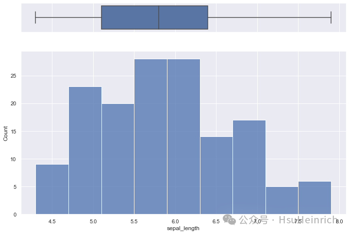
- 直方图+箱线图 :箱线图辅助理解数据分布并可视化展示四分位数及异常值
import seaborn as snsimport matplotlib.pyplot as pltsns.set(style="darkgrid")# 导入数据df = sns.load_dataset("iris")f, (ax_box, ax_hist) = plt.subplots(2, sharex=True, gridspec_kw={"height_ratios": (.15, .85)})sns.boxplot(x=df["sepal_length"], ax=ax_box)sns.histplot(data=df, x="sepal_length", ax=ax_hist)ax_box.set(xlabel='')plt.show()
4
- 直方图+散点图 :散点图可以观测两个变量的关系,直方图能够更好的展示数据分布
import seaborn as snsimport matplotlib.pyplot as pltdf = sns.load_dataset('iris')sns.jointplot(x=df["sepal_length"], y=df["sepal_width"], kind='scatter')plt.show()
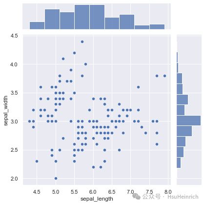
5
- 引申-绘制边缘图
因为
jointplot是一个需要全幅度的图形级别函数,故不能在subplots子图中使用。这里采用自定义SeabornFig2Grid将 Seaborn生成的图转为matplotlib类型的子图。详细参考How to plot multiple Seaborn Jointplot in Subplot[3]。 同样的jointplot也有很多参数可以自定义,并且可以使用更为灵活的JointGrid。这里就不赘述了,详细可以参考seaborn.jointplot[4]和seaborn.JointGrid[5]。import matplotlib.pyplot as pltimport matplotlib.gridspec as gridspecimport seaborn as sns# 导入自定义模块import SeabornFig2Grid as sfg# 加载数据df = sns.load_dataset('iris')# 创建 Seaborn JointGrid 对象g1 = sns.jointplot(x=df["sepal_length"], y=df["sepal_width"], kind='reg') # 带回归线的散点图g2 = sns.jointplot(x=df["sepal_length"], y=df["sepal_width"], kind='kde') # 核密度估计图g3 = sns.jointplot(x=df["sepal_length"], y=df["sepal_width"], kind='hex') # 六边形核密度估计图# 创建高级边缘图-边缘图叠加g4 = sns.jointplot(x=df["sepal_length"], y=df["sepal_width"],color='g',kind='reg').plot_joint(sns.kdeplot, zorder=0, n_levels=10)# 创建 matplotlib 图和子图布局fig = plt.figure(figsize=(12,8))gs = gridspec.GridSpec(2, 2)# 使用SeabornFig2Grid转换 seaborn 图为 matplotlib 子图mg1 = sfg.SeabornFig2Grid(g1, fig, gs[0])mg2 = sfg.SeabornFig2Grid(g2, fig, gs[1])mg3 = sfg.SeabornFig2Grid(g3, fig, gs[2])mg4 = sfg.SeabornFig2Grid(g4, fig, gs[3])gs.tight_layout(fig) # 调整整个布局plt.show()
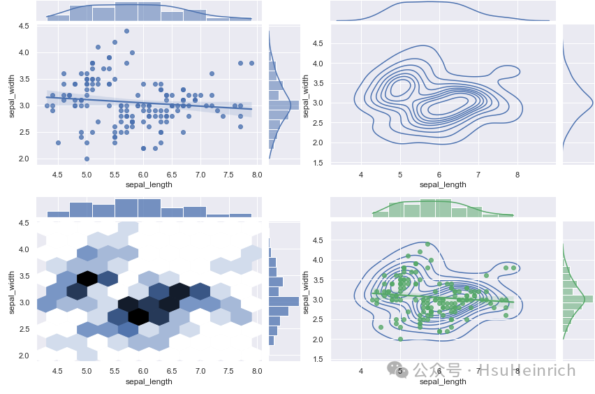
6
通过matplotlib绘制多样化的直方图
matplotlib主要利用hist绘制直方图,可以通过matplotlib.pyplot.hist[6]了解更多用法
import matplotlib as mpl
import matplotlib.pyplot as plt
import numpy as np
mpl.rcParams.update(mpl.rcParamsDefault) # 恢复默认的matplotlib样式
plt.rcParams['font.sans-serif'] = ['SimHei'] # 用来正常显示中文标签
# 自定义数据
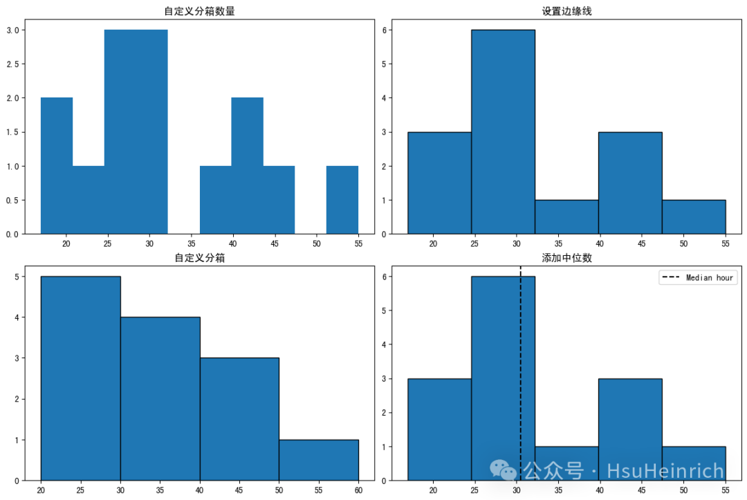
hours = [17, 20, 22, 25, 26, 27, 30, 31, 32, 38, 40, 40, 45, 55]
# 初始化
fig, ax = plt.subplots(2,2,constrained_layout=True, figsize=(12, 8))
# 指定分箱数量
ax[0, 0].hist(hours)
ax[0, 0].set_title('自定义分箱数量')
# 设置边缘线
ax[0, 1].hist(hours, bins=5, edgecolor="black")
ax[0, 1].set_title('设置边缘线')
# 自定义分箱
bins = [20, 30, 40, 50, 60]
ax[1, 0].hist(hours, bins=bins, edgecolor="black")
ax[1, 0].set_title('自定义分箱')
# 添加额外数据信息:中位数
median_hour = np.median(hours)
ax[1, 1].hist(hours, bins=5, edgecolor="black")
ax[1, 1].axvline(median_hour, color="black", ls="--", label="Median hour")
ax[1, 1].legend()
ax[1, 1].set_title('添加中位数')
plt.show()
7、总结
以上通过seaborn的displot和matplotlib的hist可以快速绘制直方图,并通过修改参数或者辅以其他绘图知识自定义各种各样的直方图来适应相关使用场景。
共勉~
参考资料
[1]
seaborn.displot: https://seaborn.pydata.org/generated/seaborn.displot.html
[2]
seaborn.histplot: https://seaborn.pydata.org/generated/seaborn.histplot.html
[3]
How to plot multiple Seaborn Jointplot in Subplot: https://stackoverflow.com/questions/35042255/how-to-plot-multiple-seaborn-jointplot-in-subplot
[4]
seaborn.jointplot: https://seaborn.pydata.org/generated/seaborn.jointplot.html
[5]
seaborn.JointGrid: https://seaborn.pydata.org/generated/seaborn.JointGrid.html
[6]
matplotlib.pyplot.hist: https://matplotlib.org/stable/api/_as_gen/matplotlib.pyplot.hist.html