tidyHeatmap | 顶刊SCI热力图绘制工具,用它就对了~~

tidyHeatmap | 顶刊SCI热力图绘制工具,用它就对了~~

DataCharm
发布于 2024-02-27 10:49:47
发布于 2024-02-27 10:49:47
前言
今天是我的可视化课程上线的第300天,目前学员450人,每篇原创公众号都会记录这个人数,用来督促和激励我的原创内容。目前课程的主要方向是 科研、统计、地理相关的学术性图形绘制方法,后续也会增加商务插图、机器学等、数据分析等方面的课程。课程免费新增,这点绝对良心!
今天是我的可视化学习社群上线的第80天,目前学员134人,可视化学习社区以我的书籍《科研论文配图绘制指南-基于Python》为基础进行拓展,提供「课堂式」教学视频,还有更多拓展内容,可视化技巧远超书籍本身,书籍修正和新增都会分享到圈子里面~~
参与课程或者圈子的你将获取到:学员答疑、可视化资源分享、可视化技巧补充、可视化业务代做(学员和甲方对接)、副业交流、提升认知等等。
tidyHeatmap-快速绘制热力图,用它就对了~
今天是2024年的第一篇原创笔记,我们以R语言相关知识点开始~~
(PS:今年的重点项目之一就是使用R语言绘制好看的商务图表!)
今天介绍的可视化内容是关于如何快速、便捷的绘制「热力图」,使用到的工具为-「tidyHeatmap」。
- 「tidyHeatmap」介绍
顾名思义,既然使用了tidy 开头,那么其在数据处理、可视化展示等流程化方面,要远远的优于R语言中的其他相同功能的可视化工具包。
「tidyHeatmap」是一个基于R语言的绘制热力图工具,它能够用于快速绘制高质量的热力图,并且支持数据预处理和调整参数等功能。tidyHeatmap使用了ggplot2中的语法,因此其使用方法与ggplot2比较相似。
tidyHeatmap可以帮助用户将复杂的数据进行可视化,以便更好地理解数据之间的关系。
该工具提供了多种绘制热力图的方式,并且支持对颜色、字体、标签等细节进行自定义设置,从而方便用户根据实际需求进行调整。
另外,tidyHeatmap还支持使用其他R包中的函数进行数据预处理,例如dplyr、reshape2、tidyr等,使得数据预处理变得更加灵活和高效。
- 「tidyHeatmap」安装
可通过以下方式快速进行tidyHeatmap包的安装:
devtools::install_github("stemangiola/tidyHeatmap")
#或者如下方式
install.packages("tidyHeatmap")
- 「tidyHeatmap」可视化案例
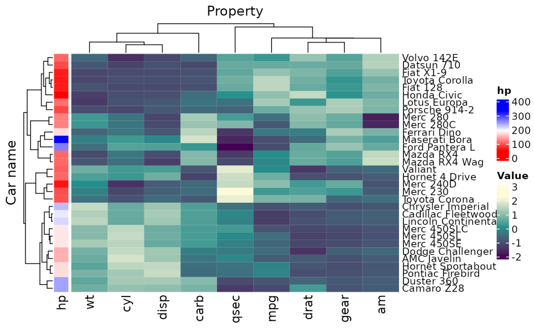
mtcars_heatmap <-
    mtcars_tidy |>
    heatmap(`Car name`, Property, Value,    scale = "row"   ) |>
    annotation_tile(hp)
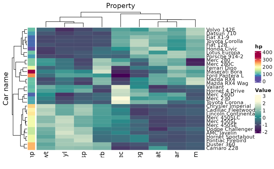
example01 of tidyHeatmap
tidyHeatmap::pasilla |>

    heatmap(
        .column = sample,
        .row = symbol,
        .value = `count normalised adjusted`,
        scale = "row",

        # Arguments passed to ComplexHeatmap
        clustering_distance_rows = "manhattan",
        clustering_distance_columns = "manhattan",
        clustering_method_rows = "ward.D",
        clustering_method_columns = "ward.D"
    )
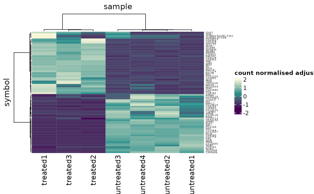
Clustering plotting
# Make up more groupings
mtcars_tidy_groupings =
    mtcars_tidy |>
    mutate(property_group = if_else(Property %in% c("cyl", "disp"), "Engine", "Other"))

mtcars_tidy_groupings |>
    group_by(vs, property_group) |>
    heatmap(`Car name`, Property, Value,    scale = "row"   ) |>
    annotation_tile(hp)
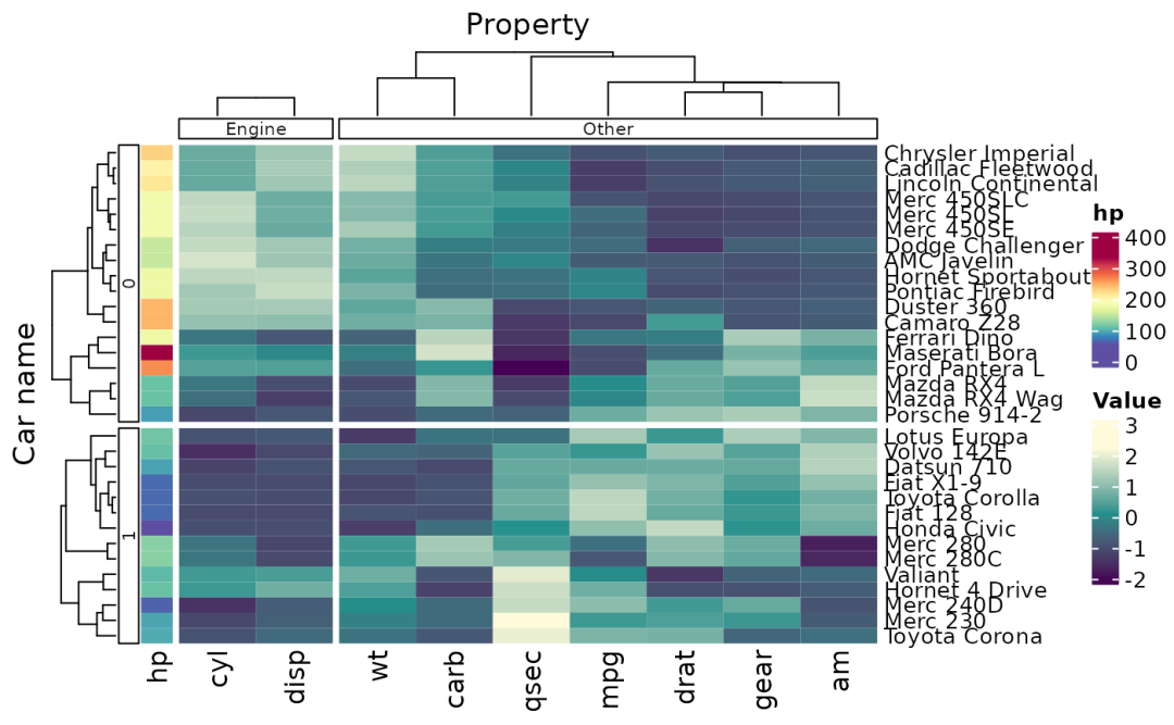
Grouping and splitting
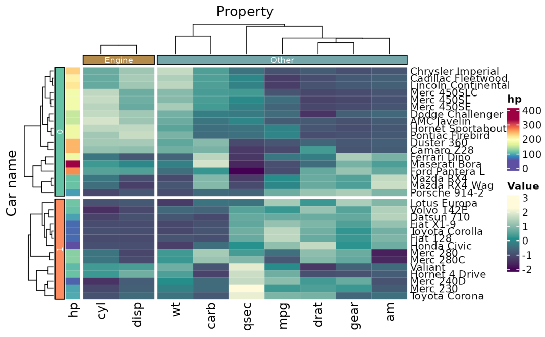
provide colour palettes to groupings
use custom colors for tile annotation
tidyHeatmap::pasilla |>
    group_by(location, type) |>
    heatmap(
        .column = sample,
        .row = symbol,
        .value = `count normalised adjusted`,
        scale = "row"
    ) |>
    annotation_tile(condition) |>
    annotation_tile(activation)
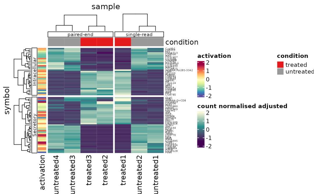
Multiple groupings and annotations
# Create some more data points
pasilla_plus <-
    tidyHeatmap::pasilla |>
    dplyr::mutate(act = activation) |>
    tidyr::nest(data = -sample) |>
    dplyr::mutate(size = rnorm(n(), 4,0.5)) |>
    dplyr::mutate(age = runif(n(), 50, 200)) |>
    tidyr::unnest(data)

# Plot
pasilla_plus |>
    heatmap(
        .column = sample,
        .row = symbol,
        .value = `count normalised adjusted`,
        scale = "row"
    ) |>
    annotation_tile(condition) |>
    annotation_point(activation) |>
    annotation_tile(act) |>
    annotation_bar(size) |>
    annotation_line(age)
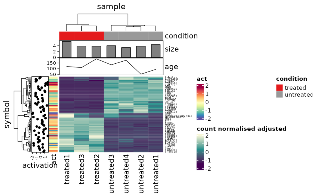
Annotation types
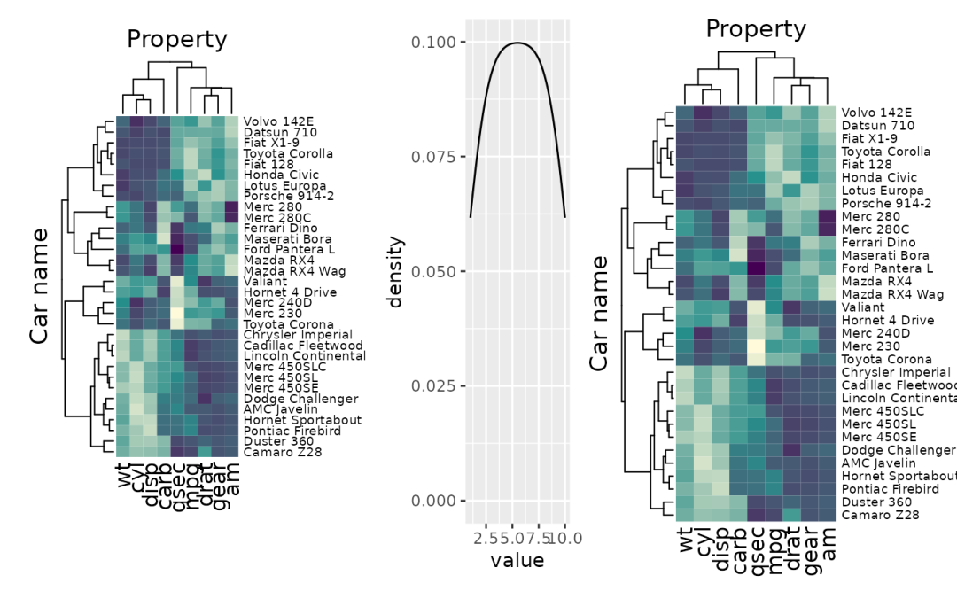
Using patchwork to integrate heatmaps
大家查看编写代码,可以看出,「tidyHeatmap」包绘制热力图、甚至复杂的图表类型,都可以快速完成,完全可以一键绘制顶级SCI期刊的热力图要求。
更多关于该包的可视化语法和案例,大家可参考:tidyHeatmap官网[1]
参考资料
[1]
tidyHeatmap官网: https://stemangiola.github.io/tidyHeatmap/index.html。
本文参与 腾讯云自媒体同步曝光计划,分享自微信公众号。
原始发表:2024-02-26,如有侵权请联系 cloudcommunity@tencent.com 删除
评论
登录后参与评论
推荐阅读
目录
腾讯云开发者
