跟着GlobalChangeBiology学作图:R语言ggplot2点线图(2)给分面添加注释
跟着GlobalChangeBiology学作图:R语言ggplot2点线图(2)给分面添加注释

用户7010445
发布于 2023-01-06 20:28:55
发布于 2023-01-06 20:28:55
论文
Changes in plant inputs alter soil carbon and microbial communities in forest
本地pdf Global Change Biology - 2022 - Feng - Changes in plant inputs alter soil carbon and microbial communities in forest.pdf
今天的推文重复一下论文中的Figure3,这个是之前有读者在公众号后台的留言,之前我不知道怎么实现这种好几个子图中间没有空白的形式,有读者留言可以用分面然后调节主题里的参数panel.spacing = unit(0,'lines'),有了基本思路就可以尝试一下这个图
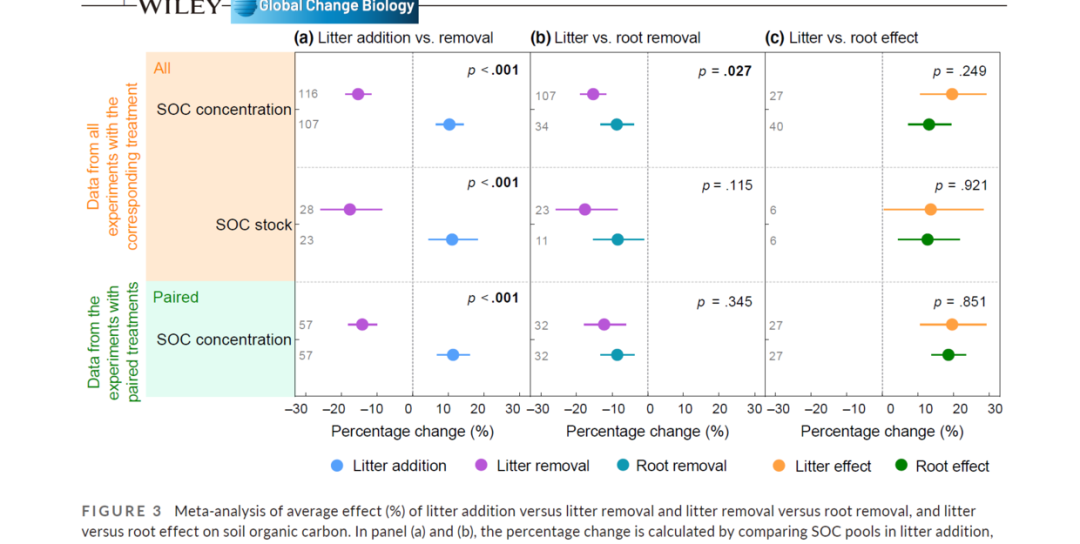
image.png
今天的推文主要介绍如何给每个分面单独添加注释,这里需要用到一个自定义函数
annotation_custom2 <- function (grob,
                                xmin = -Inf,
                                xmax = Inf,
                                ymin = -Inf,
                                ymax = Inf,
                                data)
{
  layer(data = data,
        stat = StatIdentity,
        position = PositionIdentity,
        geom = ggplot2:::GeomCustomAnn,
        inherit.aes = TRUE, params = list(grob = grob,
                                          xmin = xmin, xmax = xmax,
                                          ymin = ymin, ymax = ymax))
}
之前的推文的代码
library(readxl)

dat<-read_excel("data/20220804/example_df.xlsx")
dat


library(ggplot2)

ggplot(data=dat,aes(x=x,y=y))+
  geom_errorbarh(aes(xmin=x-sd_value,
                     xmax=x+sd_value,
                     color=group02),
                 height=0,
                 show.legend = FALSE)+
  geom_point(aes(color=group02),
             size=5,
             show.legend = TRUE)

ggplot(data=dat,aes(x=x,y=y))+
  geom_errorbarh(aes(xmin=x-sd_value,
                     xmax=x+sd_value,
                     color=group02),
                 height=0,
                 show.legend = FALSE)+
  geom_point(aes(color=group02),
             size=5,
             show.legend = TRUE)+
  facet_wrap(~group01)+
  theme_bw()+
  theme(panel.spacing = unit(0,'lines'),
        panel.background = element_blank(),
        axis.line = element_line(),
        panel.grid = element_blank(),
        axis.ticks.y = element_blank(),
        strip.text = element_text(hjust = 0))

ggplot(data=dat,aes(x=x,y=y))+
  geom_errorbarh(aes(xmin=x-sd_value,
                     xmax=x+sd_value,
                     color=group02),
                 height=0,
                 show.legend = FALSE)+
  geom_point(aes(color=group02),
             size=5,
             show.legend = TRUE)+
  facet_wrap(~group01)+
  theme_bw()+
  theme(panel.spacing = unit(0,'lines'),
        panel.background = element_blank(),
        axis.line = element_line(),
        panel.grid = element_blank(),
        axis.ticks.y = element_blank(),
        strip.text = element_text(hjust = 0))+
  labs(y="",x=NULL)+
  scale_x_continuous(limits = c(-30,30),
                     breaks = seq(-30,30,10))+
  scale_y_continuous(limits = c(0.5,3.5),
                     breaks = c(1,2,3),
                     labels=c("SOC concentration",
                              "SOC stock",
                              "SOC concentration"),
                     expand = expansion(mult = c(0,0)))+
  geom_vline(xintercept = 0,
             color="gray",
             lty="dashed")+
  geom_hline(yintercept = 1,
             color="gray",
             lty="dashed")+
  geom_hline(yintercept = 2,
             color="gray",
             lty="dashed")+
  geom_hline(yintercept = 3,
             color="gray",
             lty="dashed") -> p0
p0
p0+
  scale_color_manual(values = c(
    "A"="#b856d7",
    "B"="#55a0fb",
    "C"="#0f99b2",
    "D"="#ffa040",
    "E"="#008000"
  ),
  labels=c(
    "A"="Litter addition",
    "B"="Litter removal",
    "C"="Root removal",
    "D"="Litter effect",
    "E"="Root effect"
    ))+
  theme(legend.position = "bottom",
        legend.title = element_blank()) -> p1
p1
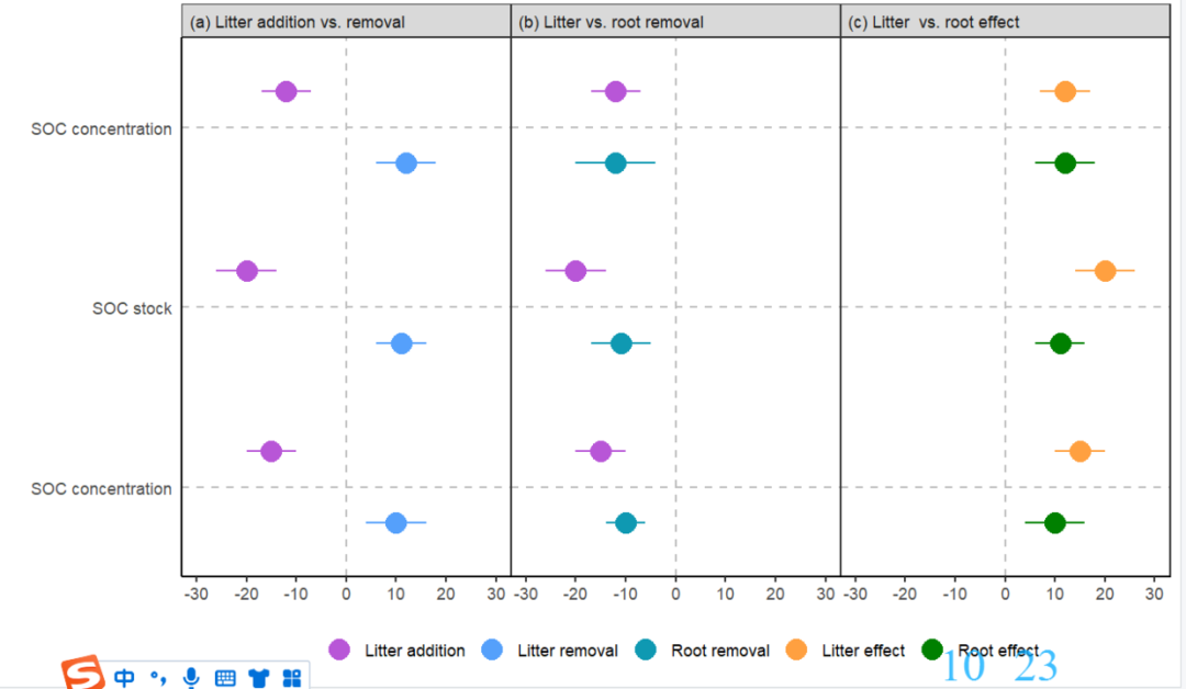
image.png
在这个图的基础上添加注释信息
比如在第一个分面添加一个文本
library(tidyverse)


p1+
  annotation_custom2(
    data = dat %>% filter(group01=="(a) Litter addition vs. removal"),
    grob = grid::textGrob(label="A"),
    xmin=-30,xmax=-30,
    ymin=0.8,ymax=0.8)
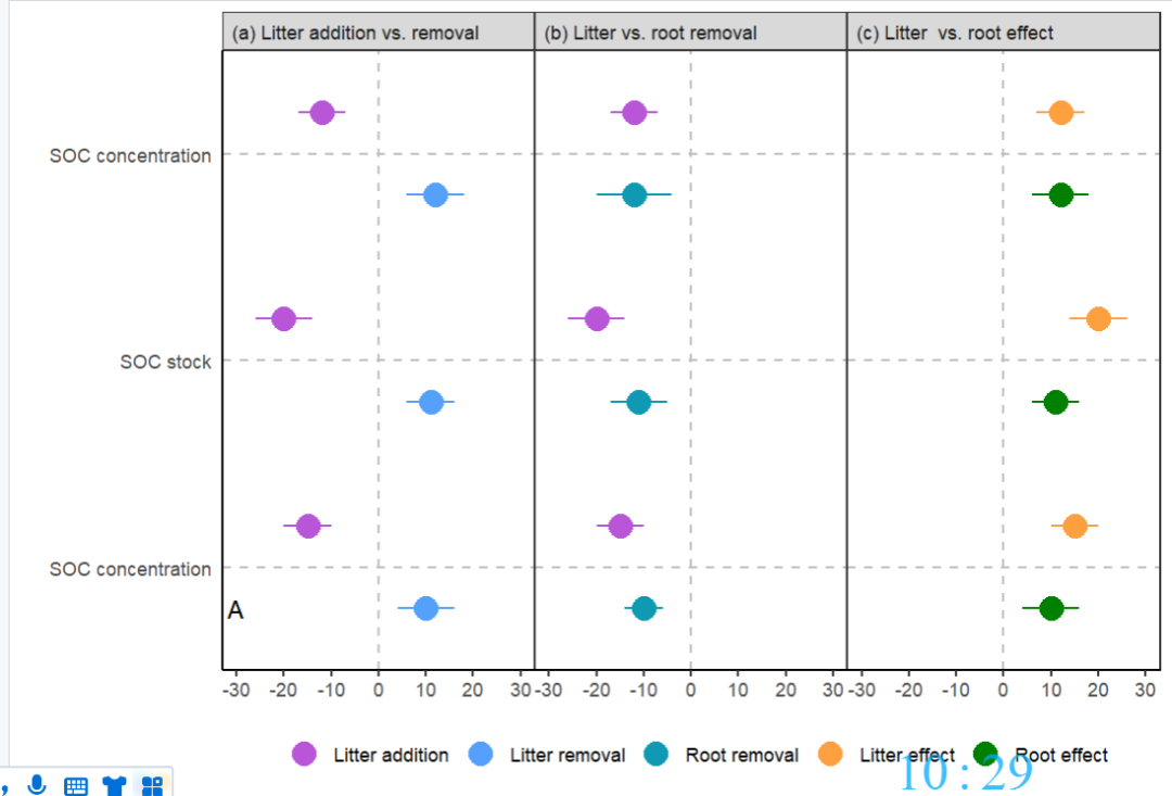
image.png
这个一次性只能添加一个文本,如果文本比较多,可能需要写一个循环
xmin<-c(-30,-30,-30,-30,-30,-30,15,15,15)
xmax<-c(-30,-30,-30,-30,-30,-30,15,15,15)
ymin<-c(0.8,1.2,1.8,2.2,2.8,3.2,1.4,2.4,3.4)
ymax<-c(0.8,1.2,1.8,2.2,2.8,3.2,1.4,2.4,3.4)
label<-c(57,57,23,28,107,116,"p<.001","p<.001","p<.001")

p2<-p1

for (i in 1:9){
  p2+
    annotation_custom2(
    data = dat %>% filter(group01=="(a) Litter addition vs. removal"),
    grob = grid::textGrob(label=label[i],hjust=0),
    xmin=xmin[i],xmax=xmax[i],
    ymin=ymin[i],ymax=ymax[i]) -> p2
}

p2
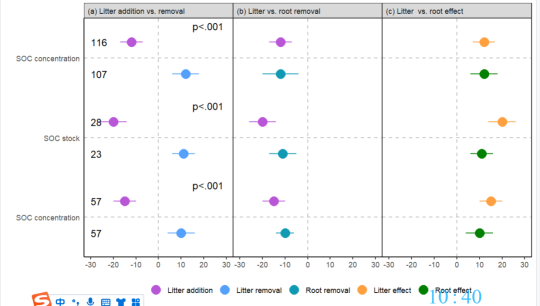
image.png
在第二个子图和第三个子图添加文本注释也是一样的,这里就不再介绍代码了,可以自己试试
在画图区域外添加文本
p2+
  annotation_custom(
    #data = dat %>% filter(group01=="(a) Litter addition vs. removal"),
    grob = grid::textGrob(label="Percentage change (%)",hjust=0.5),
    xmin=0,xmax=0,
    ymin=0.28,ymax=0.28)+
  coord_cartesian(clip = "off")+
  theme(legend.background = element_rect(fill="transparent")) -> p3
p3
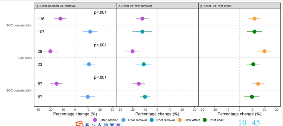
image.png
给坐标轴的文本添加背景色
p3+
  annotation_custom2(
    grob = grid::rectGrob(gp = grid::gpar(fill = '#e2fcf2',
                                          col = '#e2fcf2')),
    data = dat %>% filter(group01=="(a) Litter addition vs. removal"),
    xmin = -65,
    xmax = -33,
    ymin = 0.5,
    ymax = 1.5)+
  annotation_custom2(
    grob = grid::rectGrob(gp = grid::gpar(fill = '#ffe9d2',
                                          col = '#ffe9d2')),
    data = dat %>% filter(group01=="(a) Litter addition vs. removal"),
    xmin = -65,
    xmax = -33,
    ymin = 1.5,
    ymax = 3.5)+
  theme(plot.margin = unit(c(0.5,0.5,0.5,5),'lines'))
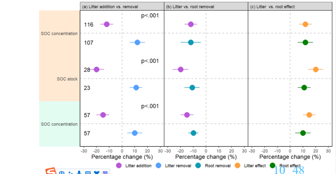
image.png
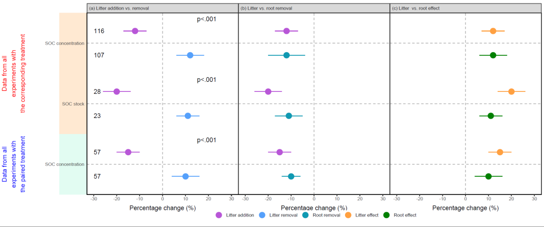
最后再添加一些文本信息
p4+
  annotation_custom2(
    data = dat %>% filter(group01=="(a) Litter addition vs. removal"),
    grob = grid::textGrob(label="Data from all\nexperiments with\nthe corresponding treatment",
                          rot=90,
                          gp=grid::gpar(col='red')),
    xmin=-85,xmax=-85,
    ymin=2.5,ymax=2.5)+
  annotation_custom2(
    data = dat %>% filter(group01=="(a) Litter addition vs. removal"),
    grob = grid::textGrob(label="Data from all\nexperiments with\nthe paired treatment",
                          rot=90,
                          gp=grid::gpar(col='blue')),
    xmin=-85,xmax=-85,
    ymin=1,ymax=1)
image.png
本文参与 腾讯云自媒体分享计划,分享自微信公众号。
原始发表:2022-09-24,如有侵权请联系 cloudcommunity@tencent.com 删除
评论
登录后参与评论
推荐阅读
目录