金融数据分析库yfinance,初次使用体验!
原创
金融数据分析库yfinance,初次使用体验!
原创
皮大大
发布于 2023-08-29 00:20:56
发布于 2023-08-29 00:20:56
公众号:尤而小屋 作者:Peter 编辑:Peter
大家好,我是Peter~
今天给大家介绍一个金融数据分析库yfinance,主要是基于该库下的股票数据分析及股价预测(使用LSTM模型)
yfinance库
yfinance 是一个用于从 Yahoo Finance 获取金融数据的 Python 库。它提供了一个方便的接口,让用户能够轻松地下载和处理股票、指数、货币对等金融市场的历史价格数据和其他相关信息。yfinance 让开发者和分析师能够使用 Python 进行金融数据分析、可视化和研究。
以下是 yfinance 的一些特点和功能:
- 简单易用的接口: yfinance 提供了简单的函数调用,使用户能够通过指定股票代码、日期范围等参数来获取历史价格数据。
- 多种数据获取: 除了股票价格数据,yfinance 还可以获取其他金融数据,如分红、拆股等。
- 多样的时间尺度: 用户可以选择不同的时间尺度,如日线、周线、月线等来获取不同粒度的数据。
- 数据处理和分析: 通过将数据转换为 pandas 数据框,用户可以方便地进行数据处理、计算技术指标和执行分析操作。
- 全球市场: yfinance 不仅仅支持美国市场,还能够获取许多全球市场的金融数据。
- 免费使用: yfinance 是一个免费开源的库,不需要额外的订阅费用。
使用方法:
1、安装pip install yfinance
2、获取股票数据
import yfinance as yf

# 指定股票代码
name = 'AAPL'

# 下载历史价格数据
apple = yf.download(name, start='2022-01-01', end='2022-12-31')
导入库
In 1:
import pandas as pd
import numpy as np

import matplotlib.pyplot as plt
import seaborn as sns
sns.set_style('whitegrid')
plt.style.use("fivethirtyeight")
%matplotlib inline

from datetime import datetime

# pip install pandas_datareader
from pandas_datareader.data import DataReader
import yfinance as yf
from pandas_datareader import data as pdr

yf.pdr_override()

import warnings
warnings.filterwarnings("ignore")
下载数据
In 2:
# 获取4个公司股价信息

tech_list = ['AAPL', 'GOOG', 'MSFT', 'AMZN']
设置股票的起止时间:
- 结束时间是现在
- 开始时间是过去一年
In 3:
end = datetime.now()
start = datetime(end.year - 1, end.month, end.day)
基于yfinance库下载股票的数据:
In 4:
# 单个股票数据下载

yf.download("AAPL", start, end)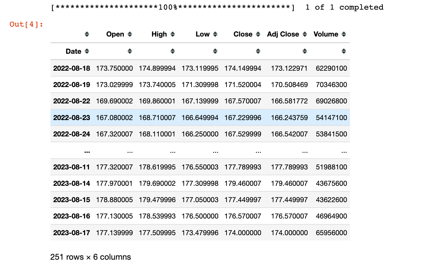
下面是循环遍历tech_list列表,将每个股票下载的数据(DataFrame)保存到对应的股票名字中:
In 5:
for stock in tech_list:
    globals()[stock] = yf.download(stock, start, end)
[*********************100%***********************]  1 of 1 completed
[*********************100%***********************]  1 of 1 completed
[*********************100%***********************]  1 of 1 completed
[*********************100%***********************]  1 of 1 completed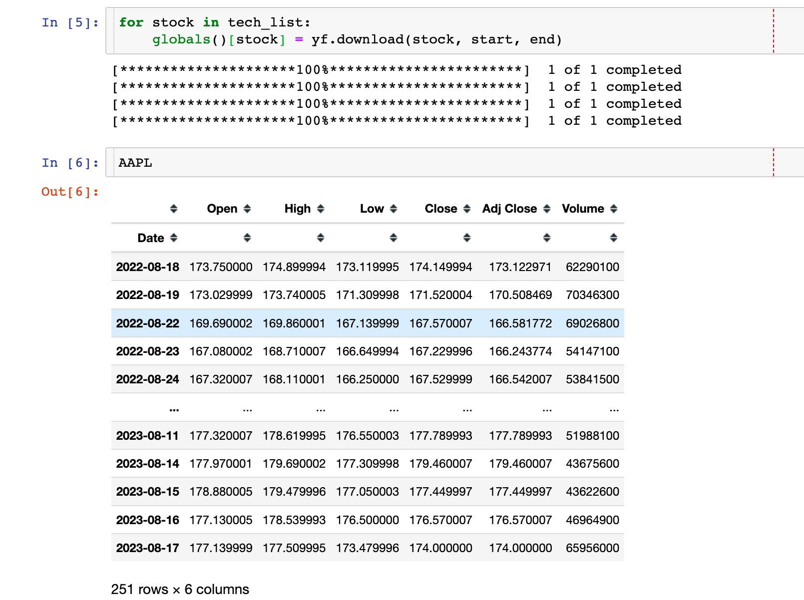
公司名称和数据的配对:
In 7:
company_list = [AAPL, GOOG, MSFT, AMZN]  # 上面下载的4个数据

company_name = ["APPLE", "GOOGLE", "MICROSOFT", "AMAZON"]

for company, com_name in zip(company_list, company_name):
    # company 是每个股票的DataFrame数据
    company["company_name"] = com_name
此时,每个股票company作为全局变量已经更新,添加了新的字段company_name。
4个数据的合并:
In 8:
df = pd.concat(company_list, axis=0)
df.tail()
数据统计信息
In 9:
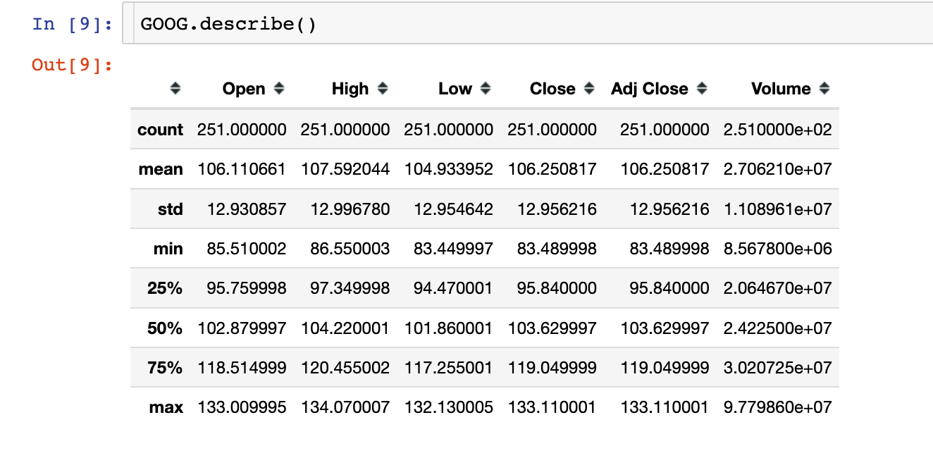
GOOG.describe()Out9:
具体的数据信息,以谷歌股价为例:
In 10:
GOOG.info()
<class 'pandas.core.frame.DataFrame'>
DatetimeIndex: 251 entries, 2022-08-18 to 2023-08-17
Data columns (total 7 columns):
 #   Column        Non-Null Count  Dtype
---  ------        --------------  -----
 0   Open          251 non-null    float64
 1   High          251 non-null    float64
 2   Low           251 non-null    float64
 3   Close         251 non-null    float64
 4   Adj Close     251 non-null    float64
 5   Volume        251 non-null    int64
 6   company_name  251 non-null    object
dtypes: float64(5), int64(1), object(1)
memory usage: 15.7+ KB
数据探索分析
收盘价
In 11:
plt.figure(figsize=(15,10))
plt.subplots_adjust(top=1.25, bottom=1.2)

for i, company in enumerate(company_list, 1):
    plt.subplot(2,2,i)
    company["Adj Close"].plot()
    plt.ylabel("Adj Close")
    plt.xlabel(None)
    plt.title(f"Closing Price of {tech_list[i-1]}")

plt.tight_layout()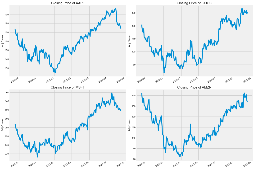
成交量对比
In 12:
plt.figure(figsize=(15,10))
plt.subplots_adjust(top=1.25, bottom=1.2)

for i, company in enumerate(company_list, 1):
    plt.subplot(2,2,i)
    company["Volume"].plot()
    plt.ylabel("Volume")
    plt.xlabel(None)
    plt.title(f"Volume for {tech_list[i-1]}")

plt.tight_layout()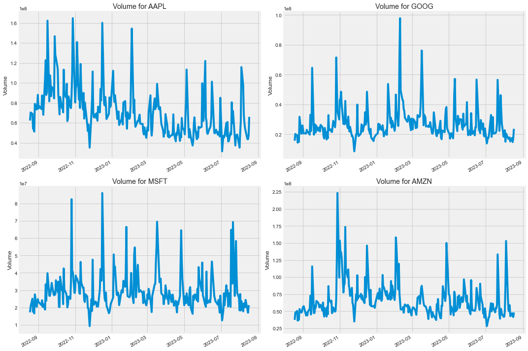
滑动平均
股票收盘价的滑动平均:
In 13:
ma_day = [10,20,50]

for ma in ma_day:
    for company in company_list:
        column_name = f"MA for {ma} days"
        company[column_name] = company["Adj Close"].rolling(ma).mean()

fig, axes = plt.subplots(nrows=2, ncols=2)
fig.set_figheight(10)
fig.set_figwidth(15)

# 取出4个字段的数据进行绘图
AAPL[['Adj Close', 'MA for 10 days', 'MA for 20 days', 'MA for 50 days']].plot(ax=axes[0,0])
axes[0,0].set_title('APPLE')

GOOG[['Adj Close', 'MA for 10 days', 'MA for 20 days', 'MA for 50 days']].plot(ax=axes[0,1])
axes[0,1].set_title('GOOGLE')

MSFT[['Adj Close', 'MA for 10 days', 'MA for 20 days', 'MA for 50 days']].plot(ax=axes[1,0])
axes[1,0].set_title('MICROSOFT')

AMZN[['Adj Close', 'MA for 10 days', 'MA for 20 days', 'MA for 50 days']].plot(ax=axes[1,1])
axes[1,1].set_title('AMAZON')

fig.tight_layout()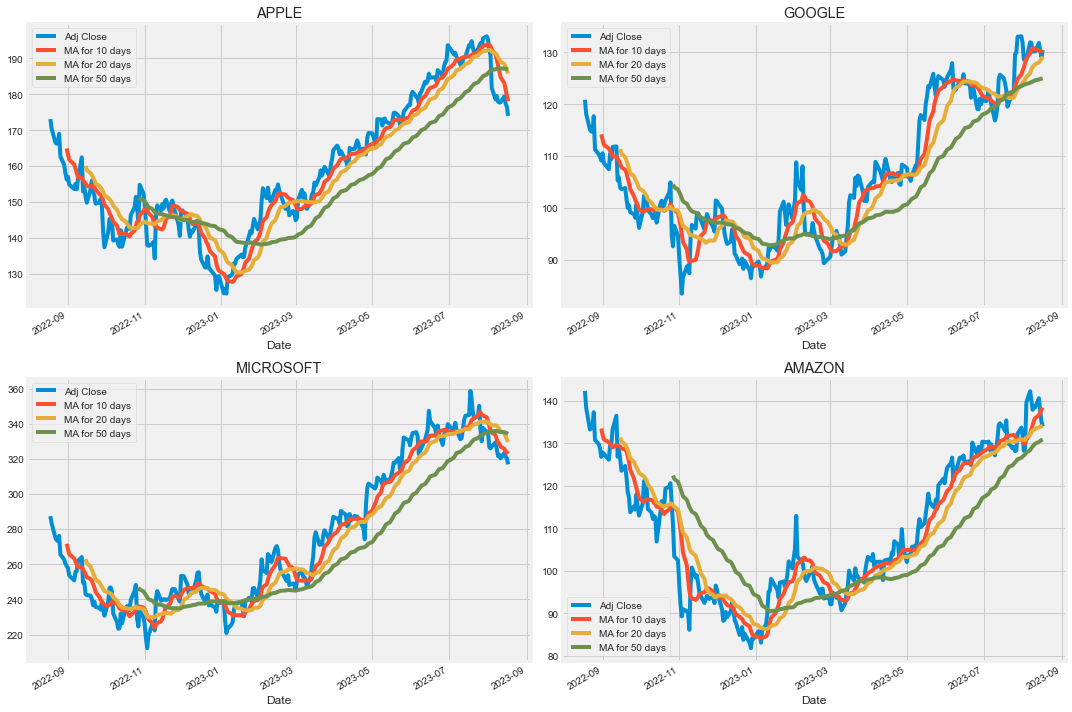
可以看到模拟效果最好的是20日移动平均曲线
日回报率
使用Pandas中的pct_change函数:
具体来说,pct_change() 函数的功能是计算相邻元素之间的变化率,这在分析时间序列数据时非常有用。
该函数会将当前元素与前一个元素进行比较,并计算两者之间的百分比变化。这可以帮助分析者理解数据的波动情况,尤其是在金融分析等领域。
In 14:
for company in company_list:
    company["Daily Return"] = company["Adj Close"].pct_change()
In 15:
fig,axes = plt.subplots(nrows=2, ncols=2)
fig.set_figheight(10)
fig.set_figwidth(15)

AAPL["Daily Return"].plot(ax=axes[0,0],legend=True,linestyle="--",marker="o")
axes[0,1].set_title("APPLE")

GOOG['Daily Return'].plot(ax=axes[0,1], legend=True, linestyle='--', marker='o')
axes[0,1].set_title('GOOGLE')

MSFT['Daily Return'].plot(ax=axes[1,0], legend=True, linestyle='--', marker='o')
axes[1,0].set_title('MICROSOFT')

AMZN['Daily Return'].plot(ax=axes[1,1], legend=True, linestyle='--', marker='o')
axes[1,1].set_title('AMAZON')

fig.tight_layout()
基于直方图和核密度图查看平均日回报率:
In 16:
plt.figure(figsize=(12,9))

for i, company in enumerate(company_list, 1):
    plt.subplot(2,2,i)
    company['Daily Return'].hist(bins=50)
    plt.xlabel('Daily Return')
    plt.ylabel('Counts')
    plt.title(f'{company_name[i - 1]}')

plt.tight_layout()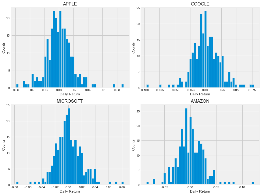
相关性分析
不同股票回报率的相关性分析:
In 17:
from pandas_datareader import data as pdr

closing_df = pdr.get_data_yahoo(tech_list, start=start, end=end)["Adj Close"]
closing_df.head()tech_rets = closing_df.pct_change()
tech_rets.head()两两分布图
In 19:
# 自相关

sns.jointplot(x='GOOG',
              y='GOOG',
              data=tech_rets,
              kind='scatter',
              color='seagreen')

plt.show()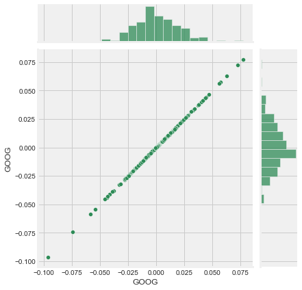
# 互相关

sns.jointplot(x='GOOG',
              y='AAPL',
              data=tech_rets,
              kind='scatter')

plt.show()sns.jointplot(x='GOOG',
y='MSFT',
data=tech_rets,
kind='scatter'
)
plt.show()4个股票之间的相关性分析:
In 22:
sns.pairplot(tech_rets, kind='reg')

plt.show()
我们以谷歌和亚马逊的股票价格为例:
In 23:
# tech_rets = closing_df.pct_change()  回报率
return_fig = sns.PairGrid(tech_rets.dropna())

# 上下对角线绘制不同图形:上-散点图  下-kde密度图
return_fig.map_upper(plt.scatter, color='purple')
return_fig.map_lower(sns.kdeplot, cmap='cool_d')
# 主对角线:直方图
return_fig.map_diag(plt.hist, bins=30)
# closing_df = pdr.get_data_yahoo(tech_list, start=start, end=end)["Adj Close"]
returns_fig = sns.PairGrid(closing_df)

returns_fig.map_upper(plt.scatter,color='purple')
returns_fig.map_lower(sns.kdeplot,cmap='cool_d')

returns_fig.map_diag(plt.hist,bins=30)
plt.show()
相关系数热力图
In 25:
plt.figure(figsize=(12, 10))

plt.subplot(2, 2, 1)
sns.heatmap(tech_rets.corr(), annot=True, cmap='summer')
plt.title('Correlation of stock return')

# 回报率
plt.subplot(2, 2, 2)
sns.heatmap(closing_df.corr(), annot=True, cmap='summer')
plt.title('Correlation of stock closing price')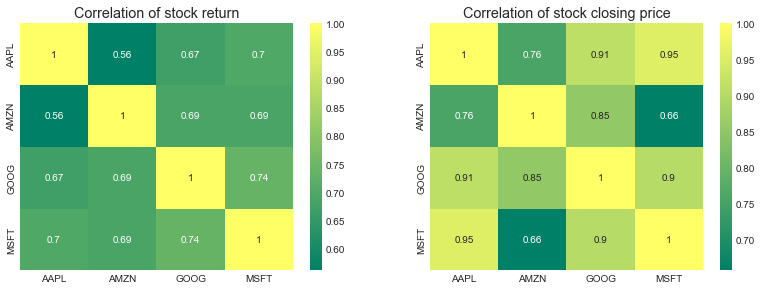
基于LSTM股价预测(APPLE为例)
获取数据
In 26:
df = pdr.get_data_yahoo('AAPL',
                        start='2012-01-01',
                        end=datetime.now()
                       )

df.head()
收盘价的历史走势趋势图:
In 27:
plt.figure(figsize=(16,6))
plt.title('Close Price History')
plt.plot(df['Close'])
plt.xlabel('Date', fontsize=18)
plt.ylabel('Close Price of Apple', fontsize=18)
plt.show()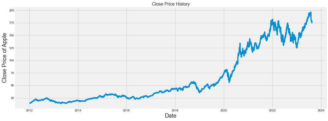
数据标准化
In 28:
data = df.filter(["Close"])

dataset = data.values
In 29:
from sklearn.preprocessing import MinMaxScaler

scaler = MinMaxScaler(feature_range=(0,1))
scaled_data = scaler.fit_transform(dataset)  # 对整体数据的标准化

scaled_data
Out29:
array([[0.00405082],
       [0.0044833 ],
       [0.00538153],
       ...,
       [0.89589184],
       [0.89107004],
       [0.876988  ]])
数据切分
In 30:
training_data_len = int(np.ceil(len(dataset) * 0.95))

training_data_len
Out30:
2779In 31:
train_data = scaled_data[0:int(training_data_len), :]

x_train = []
y_train = []

for i in range(60, len(train_data)):
    x_train.append(train_data[i-60:i, 0])
    y_train.append(train_data[i, 0])
训练集的shape重置:
In 32:
x_train, y_train = np.array(x_train), np.array(y_train)

x_train = np.reshape(x_train,(x_train.shape[0], x_train.shape[1], 1))

x_train.shape
Out32:
(2719, 60, 1)建模
In 33:
from keras.models import Sequential
from keras.layers import Dense, LSTM

# LSTM model
model = Sequential()
model.add(LSTM(128, return_sequences=True, input_shape= (x_train.shape[1], 1)))
model.add(LSTM(64, return_sequences=False))
model.add(Dense(25))
model.add(Dense(1))

model.compile(optimizer='adam', loss='mean_squared_error')
训练模型
In 34:
model.fit(x_train, y_train, batch_size=1, epochs=1)
2719/2719 [==============================] - 168s 58ms/step - loss: 0.0013
Out34:
<keras.callbacks.History at 0x15c3d2a10>模型预测
In 35:
test_data = scaled_data[training_data_len - 60: , :]

x_test = []
y_test = dataset[training_data_len:, :]
for i in range(60, len(test_data)):
    x_test.append(test_data[i-60:i, 0])

x_test = np.array(x_test)
In 36:
x_test = np.reshape(x_test, (x_test.shape[0], x_test.shape[1], 1 ))In 37:
# 模型预测

predictions = model.predict(x_test)
predictions = scaler.inverse_transform(predictions)

rmse = np.sqrt(np.mean(((predictions - y_test) ** 2)))
rmse
Out37:
5.405450466807663预测结果可视化
In 38:
train = data[:training_data_len]
valid = data[training_data_len:]
valid['Predictions'] = predictions

plt.figure(figsize=(16,6))
plt.title('LSTM Model')
plt.xlabel('Date', fontsize=18)
plt.ylabel('Close Price of APPLE', fontsize=18)
plt.plot(train['Close'])
plt.plot(valid[['Close', 'Predictions']])
plt.legend(['Train', 'Val', 'Predictions'], loc='lower right')
plt.show()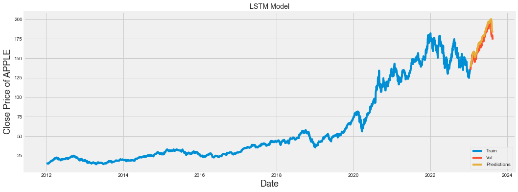
原创声明:本文系作者授权腾讯云开发者社区发表,未经许可,不得转载。
如有侵权,请联系 cloudcommunity@tencent.com 删除。
原创声明:本文系作者授权腾讯云开发者社区发表,未经许可,不得转载。
如有侵权,请联系 cloudcommunity@tencent.com 删除。
评论
登录后参与评论
推荐阅读
目录
腾讯云开发者

Copyright © 2013 - 2026 Tencent Cloud. All Rights Reserved. 腾讯云 版权所有
深圳市腾讯计算机系统有限公司 ICP备案/许可证号:粤B2-20090059 ![]() 粤公网安备44030502008569号
粤公网安备44030502008569号
腾讯云计算(北京)有限责任公司 京ICP证150476号 | 京ICP备11018762号