Streamlit 入门教程:构建一个Dashboard

Streamlit 入门教程:构建一个Dashboard

deephub
发布于 2023-08-30 09:25:38
发布于 2023-08-30 09:25:38
Streamlit 是一个用于创建数据科学和机器学习应用程序的开源 Python 库。它的主要目标是使开发人员能够以简单的方式快速构建交互式的数据应用,而无需过多的前端开发经验。Streamlit 提供了一种简单的方法来转换数据脚本或分析代码为具有可视化界面的应用程序,这些应用程序可以通过网络浏览器访问。

以下是 Streamlit 的一些主要特点和优势:
- 简单易用: Streamlit 的设计使得用户能够在几行代码内创建交互式应用程序。使用它不需要复杂的前端开发知识,甚至不需要 HTML 或 CSS。
- Python 支持: Streamlit 使用 Python 编写和驱动,这使得数据科学家和分析师可以在熟悉的编程语言中构建应用程序。
- 实时预览: 在代码中进行更改后,Streamlit 应用程序会自动重新加载,从而可以立即查看更改的效果,加速开发过程。
- 丰富的可视化元素: Streamlit 支持各种可视化元素,如图表、图像、文本、表格等,使用户能够展示和呈现数据。
- 交互性: 用户可以通过滑块、按钮等交互元素与应用程序进行互动,从而改变数据的输入或参数,实时观察结果。
- 部署简便: 部署 Streamlit 应用程序相对简单,只需要在服务器上运行一个 Python 脚本即可,无需复杂的配置。
- 与数据科学生态系统集成: Streamlit 可以轻松地与常用的数据科学库(如 Pandas、Matplotlib、Plotly 等)集成,使用户能够轻松地将分析和可视化结果嵌入到应用程序中。
- 自定义主题和样式: 用户可以根据需要自定义应用程序的外观和样式,以匹配他们的品牌或设计需求。
无论是为了创建数据展示、可视化、模型演示还是进行原型开发,Streamlit 都是一个非常有用的工具。所以本文我们将通过创建一个简单的Dashboard作为Streamlit 入门。

目标
我们的目标是做一个下面样式的dashboard。
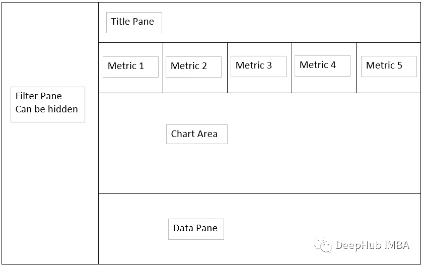
我们的目标是建立一个上面草图所示的dashboard并且能够展示数据。
数据处理
首先我们对数据进行处理
 import pandas as pd
 import numpy as np
 import plotly.express as px
 import streamlit as st

 def dateAge(x):
     #function for generating future bucket grouping
     a = (x - np.datetime64("today","D")) / np.timedelta64(1,"D")
     if a <= 0:
         y = "0 or Less"
     elif a >0 and a <= 5:
         y = "5 days"
     elif a > 5 and a <= 14:
         y = "6 to 14 days"
     elif a > 14 and a <= 30:
         y = "15 to 30 days"
     else:
         y = "over 30 days"
     return y

 #built as a function for cache use with StreamLit later
 def getData():
     x = pd.read_csv(r'C:\Users\aryan.sinanan\Desktop\Python\raw_data\demand.csv')
    return x

 #assign data to df variable
 df = getData()

 #Set Org level max and role title or partial name you are looking for
 org_level = ["6","7","8"]
 role_title = "Data"

 #Datatype convert to date from dd-MMM-yy
 df["Resource Start Date"] = pd.to_datetime(df["Resource Start Date"],format="%d-%b-%y")
 df["Resource End Date"] = pd.to_datetime(df["Resource End Date"],format="%d-%b-%y")

 #Define Future Bucket
 df["Date Bucket"] = df["Resource Start Date"].apply(dateAge)

 #clean up Location names
 df.loc[df["Role Work Location"] == "melbourne", "Role Work Location"] = "Melbourne"
 df.loc[df["Role Work Location"] == "canberra", "Role Work Location"] = "Canberra"

 #rename columns
 df.rename(columns={
     "Project Has Security/ Nationality Restriction":"Clearance Required",
     "Resource Start Date":"Start Date",
     "Resource End Date":"End Date",
     "Role ID":"ID",
     "Role Title":"Title",
     "Role Description":"Description",
     "Role Talent Segment":"Talent Segment",
     "Role Career Level From":"Career Level From",
     "Role Career Level To":"Career Level To",
     "Role Work Location":"Work Location",
     "Role Location Type":"Location Type",
     "Role Fulfillment Entity L3":"Fulfillment Entity L3"
     }, inplace = True)

 #drop the unncessary columns
 df_sub = df.loc[:,("ID","Clearance Required","Start Date","End Date","Date Bucket","Title","Description","Talent Segment","Assigned Role","Career Level To","Work Location","Location Type","Role Primary Contact","Role Primary Contact\n(Email ID)")]

 #filter the dataframe using ord_level and role_title
 df_filter = df_sub[(df_sub["Assigned Role"].str.contains( role_title ,case=False,na=False)) & (df_sub["Career Level To"].isin(org_level))]
构建导航栏
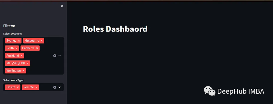
Streamlit虽然允许我们控制元素布局,但是它的控制项还是比较简单,比如菜单栏必须要放在左侧,也就是我们常说的侧边栏,所以我们将侧边栏作为过滤的条件使用。
以下代码是,常见页面标题和侧边栏的代码:
 #title
 st.markdown("# Roles Dashbaord")

 #defining side bar
 st.sidebar.header("Filters:")

 #placing filters in the sidebar using unique values.
 location = st.sidebar.multiselect(
     "Select Location:",
     options=df_filter["Work Location"].unique(),
     default=df_filter["Work Location"].unique()
 )

 #placing filters in the sidebar using unique values.
 work_type = st.sidebar.multiselect(
     "Select Work Type:",
     options=df_filter["Location Type"].unique(),
     default=df_filter["Location Type"].unique()
 )
以上代码结果如下:
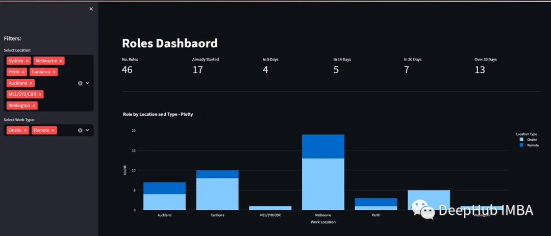
构建汇总指标
侧边栏中进行过滤器后就需要将过滤后的信息展示,这里我们先展示过滤后的汇总指标
 #taking the filtered dataframe created in a previous step and applying a query
 df_selection = df_filter.query(
     "`Work Location`== @location & `Location Type` == @work_type"
 )

 #defining our metrics
 total_roles = df_selection["ID"].value_counts().sum()
 bucket_0 = df_selection[df_selection["Date Bucket"]=="0 or Less"].value_counts().sum()
 bucket_5 = df_selection[df_selection["Date Bucket"]=="5 days"].value_counts().sum()
 bucket_14 = df_selection[df_selection["Date Bucket"]=="6 to 14 days"].value_counts().sum()
 bucket_30 = df_selection[df_selection["Date Bucket"]=="15 to 30 days"].value_counts().sum()
 bucket_31 = df_selection[df_selection["Date Bucket"]=="over 30 days"].value_counts().sum()

 #placing our metrics within columns in the dashboard
 col1,col2,col3,col4,col5,col6=st.columns(6)
 col1.metric(label="No. Roles",value=total_roles)
 col2.metric(label="Already Started",value=bucket_0)
 col3.metric(label="In 5 Days",value=bucket_5)
 col4.metric(label="In 14 Days",value=bucket_14)
 col5.metric(label="In 30 Days",value=bucket_30)
 col6.metric(label="Over 30 Days",value=bucket_31)
结果如下,可以看到,我们已经可以展示出一些数据了

构建图表
下面我们还可以创建图表
 #a dividing line
 st.divider()

 #dataframe for chart
 df_1 = df_selection.groupby(["Work Location","Location Type"])["Work Location"].value_counts().reset_index()

 #defining the chart
 fig_count_location_type = px.bar(df_1,x="Work Location",y="count",color="Location Type",title="Role by Location and Type - Plotly")

 #displaying the chart on the dashboard
 st.plotly_chart(fig_count_location_type, use_container_width=True)
使用plotly_chart可以轻松创建表格
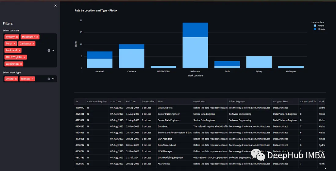
构建表格
我们还可以通过显示Dataframe来展示过滤后数据集的所有数据,也就是显示详情数据。
 #a dividing line
 st.divider()

 #showing the dataframe
 st.dataframe(df_selection,hide_index=True,column_config={
     # we can also config the formatting of a given column
     "ID": st.column_config.NumberColumn(
         #show the ID as a number no formatting
         format="%d"
     ),
     #set the formatting of the dateColumn to dd-MMM-yyyy
     "Start Date": st.column_config.DateColumn(
         format="DD-MMM-YYYY"
     ),
     #set the formatting of the dateColumn to dd-MMM-yyyy
     "End Date": st.column_config.DateColumn(
         format="DD-MMM-YYYY"
     ),
     #reduce the column size to medium
     "Title": st.column_config.TextColumn(
         width="medium"
     ),
     #reduce the column size to medium
     "Description": st.column_config.TextColumn(
         width="medium"
     )
 })
可以看到,我们以表格的形式将dataframe所有的数据展示出来了。
总结
Streamlit可以让开发人员能够以快速、简便的方式构建出功能强大且具有交互性的应用程序,从而更好地与数据进行互动和沟通。通过上面的例子可以看到,使用 Streamlit 构建应用程序不需要具备深入的前端开发知识,因为Streamlit 的设计目标之一就是让数据科学家、分析师和其他非前端开发人员能够轻松地创建交互式应用程序,而无需过多关注复杂的前端技术。
Streamlit 的开发方式与一般的 Python 编程相似,只需使用一些简单的 Streamlit 函数和命令来配置和控制应用程序的外观和行为。Streamlit 的强大之处在于它能够将复杂的前端开发流程简化为几行 Python 代码,让任何人都能够轻松创建出具有交互性和可视化效果的数据应用程序。
作者:Aryan Sinanan
本文参与 腾讯云自媒体同步曝光计划,分享自微信公众号。
原始发表:2023-08-11,如有侵权请联系 cloudcommunity@tencent.com 删除
本文分享自 DeepHub IMBA 微信公众号,前往查看
如有侵权,请联系 cloudcommunity@tencent.com 删除。
本文参与 腾讯云自媒体同步曝光计划 ,欢迎热爱写作的你一起参与!
评论
登录后参与评论
推荐阅读
目录
腾讯云开发者

Copyright © 2013 - 2026 Tencent Cloud. All Rights Reserved. 腾讯云 版权所有
深圳市腾讯计算机系统有限公司 ICP备案/许可证号:粤B2-20090059 ![]() 粤公网安备44030502008569号
粤公网安备44030502008569号
腾讯云计算(北京)有限责任公司 京ICP证150476号 | 京ICP备11018762号