前端反卷计划-组件库-03-组件样式
原创

Hi, 大家好!我是程序员库里。
今天开始分享如何从0搭建UI组件库。这也是前端反卷计划中的一项。
在接下来的日子,我会持续分享前端反卷计划中的每个知识点。
以下是前端反卷计划的内容:
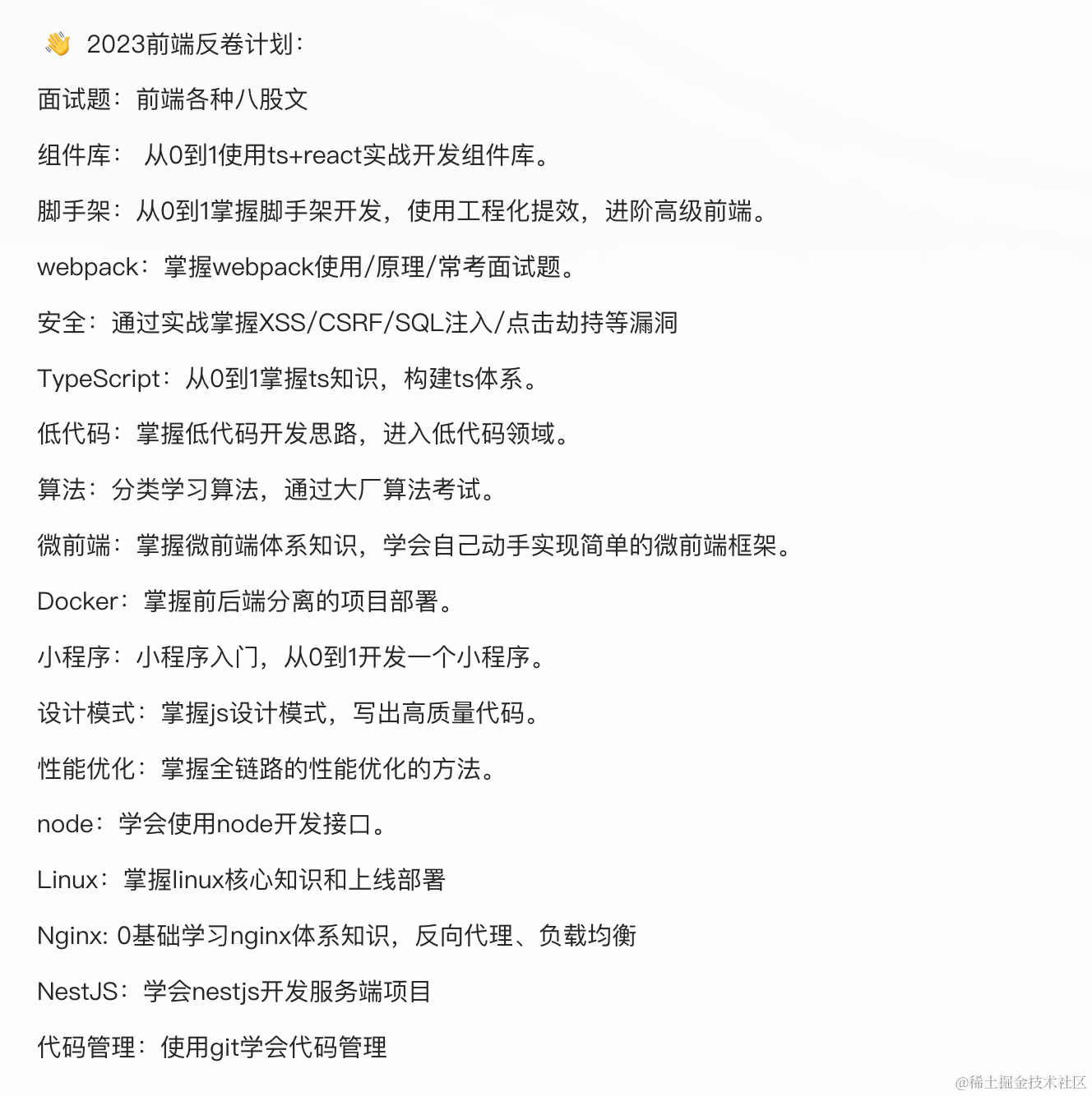
目前这些内容持续更新到了我的 学习文档 中。感兴趣的欢迎一起学习!
样式
使用scss来编写样式代码
样式结构我们采用如下的结构:
_variables.scss:各种变量以及可配置设置
_mixins.scss:全局mixins
_functions.scss:全局 functions
style.scss:组件单独的样式
以Button组件为例子:
-styles
  - _variables.scss
  - _mixins.scss
  - _functions.scss
-components
  - Button
  - style.scss
因为我们使用的是create-react-app创建的项目,但是create-react-app不支持scss,需要安装node-sass解决
pnpm install node-sass --save因为我们做的是组件库,比如像antd design组件库是蓝色样式,所以我们做的组件库也需要设置色彩系统的样式,因为我们使用的是scss,所以我们可以将这些系统的样式颜色通过变量来定义,方便复用。
- 颜色变量
新建src/styles/_variables.scss
$white:    #fff !default;
$gray-100: #f8f9fa !default;
$gray-200: #e9ecef !default;
$gray-300: #dee2e6 !default;
$gray-400: #ced4da !default;
$gray-500: #adb5bd !default;
$gray-600: #6c757d !default;
$gray-700: #495057 !default;
$gray-800: #343a40 !default;
$gray-900: #212529 !default;
$black:    #000 !default;

$blue:    #0d6efd !default;
$indigo:  #6610f2 !default;
$purple:  #6f42c1 !default;
$pink:    #d63384 !default;
$red:     #dc3545 !default;
$orange:  #fd7e14 !default;
$yellow:  #fadb14 !default;
$green:   #52c41a !default;
$teal:    #20c997 !default;
$cyan:    #17a2b8 !default;

$primary:       $blue !default;
$secondary:     $gray-600 !default;
$success:       $green !default;
$info:          $cyan !default;
$warning:       $yellow !default;
$danger:        $red !default;
$light:         $gray-100 !default;
$dark:          $gray-800 !default;

$theme-colors:
(
  "primary":    $primary,
  "secondary":  $secondary,
  "success":    $success,
  "info":       $info,
  "warning":    $warning,
  "danger":     $danger,
  "light":      $light,
  "dark":       $dark
);

$font-family-sans-serif:      -apple-system, BlinkMacSystemFont, "Segoe UI", Roboto, "Helvetica Neue", Arial, "Noto Sans", sans-serif, "Apple Color Emoji", "Segoe UI Emoji", "Segoe UI Symbol", "Noto Color Emoji" !default;
$font-family-monospace:       SFMono-Regular, Menlo, Monaco, Consolas, "Liberation Mono", "Courier New", monospace !default;
$font-family-base:            $font-family-sans-serif !default;

// 字体大小
$font-size-base:              1rem !default; // Assumes the browser default, typically `16px`
$font-size-lg:                $font-size-base * 1.25 !default;
$font-size-sm:                $font-size-base * .875 !default;
$font-size-root:              null !default;

// 字重
$font-weight-lighter:         lighter !default;
$font-weight-light:           300 !default;
$font-weight-normal:          400 !default;
$font-weight-bold:            700 !default;
$font-weight-bolder:          bolder !default;
$font-weight-base:            $font-weight-normal !default;

// 行高
$line-height-base:            1.5 !default;
$line-height-lg:              2 !default;
$line-height-sm:              1.25 !default;

// 标题大小
$h1-font-size:                $font-size-base * 2.5 !default;
$h2-font-size:                $font-size-base * 2 !default;
$h3-font-size:                $font-size-base * 1.75 !default;
$h4-font-size:                $font-size-base * 1.5 !default;
$h5-font-size:                $font-size-base * 1.25 !default;
$h6-font-size:                $font-size-base !default;

// 链接
$link-color:                              $primary !default;
$link-decoration:                         none !default;
$link-hover-color:                        darken($link-color, 15%) !default;
$link-hover-decoration:                   underline !default;

// body
$body-bg:                   $white !default;
$body-color:                $gray-900 !default;
$body-text-align:           null !default;

// Spacing
$spacer: 1rem !default;

$headings-margin-bottom:      $spacer / 2 !default;
$headings-font-family:        null !default;
$headings-font-style:         null !default;
$headings-font-weight:        500 !default;
$headings-line-height:        1.2 !default;
$headings-color:              null !default;

// Paragraphs

$paragraph-margin-bottom:   1rem !default;

// 字体其他部分 heading list hr 等等
$headings-margin-bottom:      $spacer / 2 !default;
$headings-font-family:        null !default;
$headings-font-style:         null !default;
$headings-font-weight:        500 !default;
$headings-line-height:        1.2 !default;
$headings-color:              null !default;

$display1-size:               6rem !default;
$display2-size:               5.5rem !default;
$display3-size:               4.5rem !default;
$display4-size:               3.5rem !default;

$display1-weight:             300 !default;
$display2-weight:             300 !default;
$display3-weight:             300 !default;
$display4-weight:             300 !default;
$display-line-height:         $headings-line-height !default;

$lead-font-size:              $font-size-base * 1.25 !default;
$lead-font-weight:            300 !default;

$small-font-size:             .875em !default;

$sub-sup-font-size:           .75em !default;

$text-muted:                  $gray-600 !default;

$initialism-font-size:        $small-font-size !default;

$blockquote-small-color:      $gray-600 !default;
$blockquote-small-font-size:  $small-font-size !default;
$blockquote-font-size:        $font-size-base * 1.25 !default;

$hr-color:                    inherit !default;
$hr-height:                   1px !default;
$hr-opacity:                  .25 !default;

$legend-margin-bottom:        .5rem !default;
$legend-font-size:            1.5rem !default;
$legend-font-weight:          null !default;

$mark-padding:                .2em !default;

$dt-font-weight:              $font-weight-bold !default;

$nested-kbd-font-weight:      $font-weight-bold !default;

$list-inline-padding:         .5rem !default;

$mark-bg:                     #fcf8e3 !default;

$hr-margin-y:                 $spacer !default;

// Code

$code-font-size:                    $small-font-size !default;
$code-color:                        $pink !default;
$pre-color:                         null !default;

// options 可配置选项
$enable-pointer-cursor-for-buttons:           true !default;

// 边框 和 border radius

$border-width:                1px !default;
$border-color:                $gray-300 !default;

$border-radius:               .25rem !default;
$border-radius-lg:            .3rem !default;
$border-radius-sm:            .2rem !default;

// 不同类型的 box shadow
$box-shadow-sm:               0 .125rem .25rem rgba($black, .075) !default;
$box-shadow:                  0 .5rem 1rem rgba($black, .15) !default;
$box-shadow-lg:               0 1rem 3rem rgba($black, .175) !default;
$box-shadow-inset:            inset 0 1px 2px rgba($black, .075) !default;

// 按钮
// 按钮基本属性
$btn-font-weight:             400;
$btn-padding-y:               .375rem !default;
$btn-padding-x:               .75rem !default;
$btn-font-family:             $font-family-base !default;
$btn-font-size:               $font-size-base !default;
$btn-line-height:             $line-height-base !default;

//不同大小按钮的 padding 和 font size
$btn-padding-y-sm:            .25rem !default;
$btn-padding-x-sm:            .5rem !default;
$btn-font-size-sm:            $font-size-sm !default;

$btn-padding-y-lg:            .5rem !default;
$btn-padding-x-lg:            1rem !default;
$btn-font-size-lg:            $font-size-lg !default;

// 按钮边框
$btn-border-width:            $border-width !default;

// 按钮其他
$btn-box-shadow:              inset 0 1px 0 rgba($white, .15), 0 1px 1px rgba($black, .075) !default;
$btn-disabled-opacity:        .65 !default;

// 链接按钮
$btn-link-color:              $link-color !default;
$btn-link-hover-color:        $link-hover-color !default;
$btn-link-disabled-color:     $gray-600 !default;

// 按钮 radius
$btn-border-radius:           $border-radius !default;
$btn-border-radius-lg:        $border-radius-lg !default;
$btn-border-radius-sm:        $border-radius-sm !default;

$btn-transition:              color .15s ease-in-out, background-color .15s ease-in-out, border-color .15s ease-in-out, box-shadow .15s ease-in-out !default;

// menu
$menu-border-width:            $border-width !default;
$menu-border-color:            $border-color !default;
$menu-box-shadow:              inset 0 1px 0 rgba($white, .15), 0 1px 1px rgba($black, .075) !default;
$menu-transition:              color .15s ease-in-out, border-color .15s ease-in-out !default;

// menu-item
$menu-item-padding-y:          .5rem !default;
$menu-item-padding-x:          1rem !default;
$menu-item-active-color:       $primary !default;
$menu-item-active-border-width: 2px !default;
$menu-item-disabled-color:     $gray-600 !default;

//sub-menu
//submenu
$submenu-box-shadow: 0 2px 4px 0 rgba(0,0,0,.12), 0 0 6px 0 rgba(0,0,0,.04);

//input
$input-padding-y:                       $btn-padding-y !default;
$input-padding-x:                       $btn-padding-x !default;
$input-font-family:                     $btn-font-family !default;
$input-font-size:                       $btn-font-size !default;
$input-font-weight:                     $font-weight-base !default;
$input-line-height:                     $btn-line-height !default;

$input-padding-y-sm:                    $btn-padding-y-sm !default;
$input-padding-x-sm:                    $btn-padding-x-sm !default;
$input-font-size-sm:                    $btn-font-size-sm !default;

$input-padding-y-lg:                    $btn-padding-y-lg !default;
$input-padding-x-lg:                    $btn-padding-x-lg !default;
$input-font-size-lg:                    $btn-font-size-lg !default;

$input-bg:                              $white !default;
$input-disabled-bg:                     $gray-200 !default;
$input-disabled-border-color:           null !default;

$input-color:                           $gray-700 !default;
$input-border-color:                    $gray-400 !default;
$input-border-width:                    $border-width !default;
$input-box-shadow:                      $box-shadow-inset !default;

$input-border-radius:                   $border-radius !default;
$input-border-radius-lg:                $border-radius-lg !default;
$input-border-radius-sm:                $border-radius-sm !default;

$input-focus-bg:                        $input-bg !default;
$input-focus-border-color:              lighten($primary, 25%) !default;
$input-focus-width:                     .2rem !default;
$input-focus-color:                     $input-color !default;
$input-focus-shadow-color:              rgba($primary, .25) !default;
$input-focus-box-shadow:                0 0 0 $input-focus-width $input-focus-shadow-color !default;

$input-placeholder-color:               $gray-600 !default;
$input-plaintext-color:                 $body-color !default;

$input-height-border:                   $input-border-width * 2 !default;

$input-transition:                      border-color .3s ease-in-out, box-shadow .3s ease-in-out !default;

$input-group-addon-color:               $input-color !default;
$input-group-addon-bg:                  $gray-200 !default;
$input-group-addon-border-color:        $input-border-color !default;

// Progress bars

$progress-font-size:                $font-size-base * .75 !default;
$progress-bg:                       $gray-200 !default;
$progress-border-radius:            $border-radius !default;
$progress-bar-color:                $white !default;
$progress-bar-transition:           width .6s ease !default;
3.2 重置样式
解决跨浏览器样式
src/styles/_reboot.scss
// stylelint-disable at-rule-no-vendor-prefix, declaration-no-important, selector-no-qualifying-type, property-no-vendor-prefix

// Reboot
//
// Normalization of HTML elements, manually forked from Normalize.css to remove
// styles targeting irrelevant browsers while applying new styles.
//
// Normalize is licensed MIT. https://github.com/necolas/normalize.css

// Document
//
// Change from `box-sizing: content-box` so that `width` is not affected by `padding` or `border`.
*,
*::before,
*::after {
  box-sizing: border-box;
}

// Body
//
// 1. Remove the margin in all browsers.
// 2. As a best practice, apply a default `background-color`.
// 3. Prevent adjustments of font size after orientation changes in IE on Windows Phone and in iOS.
// 4. Change the default tap highlight to be completely transparent in iOS.
body {
  margin: 0; // 1
  font-family: $font-family-base;
  font-size: $font-size-base;
  font-weight: $font-weight-base;
  line-height: $line-height-base;
  color: $body-color;
  text-align: $body-text-align;
  background-color: $body-bg; // 2
  -webkit-text-size-adjust: 100%; // 3
  -webkit-tap-highlight-color: rgba($black, 0); // 4
}

// Future-proof rule: in browsers that support :focus-visible, suppress the focus outline
// on elements that programmatically receive focus but wouldn't normally show a visible
// focus outline. In general, this would mean that the outline is only applied if the
// interaction that led to the element receiving programmatic focus was a keyboard interaction,
// or the browser has somehow determined that the user is primarily a keyboard user and/or
// wants focus outlines to always be presented.
//
// See https://developer.mozilla.org/en-US/docs/Web/CSS/:focus-visible
// and https://developer.paciellogroup.com/blog/2018/03/focus-visible-and-backwards-compatibility/

[tabindex="-1"]:focus:not(:focus-visible) {
  outline: 0 !important;
}

// Content grouping
//
// 1. Reset Firefox's gray color
// 2. Set correct height and prevent the `size` attribute to make the `hr` look like an input field
//    See https://www.w3schools.com/tags/tryit.asp?filename=tryhtml_hr_size

hr {
  margin: $hr-margin-y 0;
  color: $hr-color; // 1
  background-color: currentColor;
  border: 0;
  opacity: $hr-opacity;
}

hr:not([size]) {
  height: $hr-height; // 2
}

// Typography
//
// 1. Remove top margins from headings
//    By default, `<h1>`-`<h6>` all receive top and bottom margins. We nuke the top
//    margin for easier control within type scales as it avoids margin collapsing.

%heading {
  margin-top: 0; // 1
  margin-bottom: $headings-margin-bottom;
  font-family: $headings-font-family;
  font-style: $headings-font-style;
  font-weight: $headings-font-weight;
  line-height: $headings-line-height;
  color: $headings-color;
}

h1 {
  @extend %heading;
  font-size: $h1-font-size;
}

h2 {
  @extend %heading;
  font-size: $h2-font-size;
}

h3 {
  @extend %heading;
  font-size: $h3-font-size;
}

h4 {
  @extend %heading;
  font-size: $h4-font-size;
}

h5 {
  @extend %heading;
  font-size: $h5-font-size;
}

h6 {
  @extend %heading;
  font-size: $h6-font-size;
}

// Reset margins on paragraphs
//
// Similarly, the top margin on `<p>`s get reset. However, we also reset the
// bottom margin to use `rem` units instead of `em`.

p {
  margin-top: 0;
  margin-bottom: $paragraph-margin-bottom;
}

// Abbreviations
//
// 1. Duplicate behavior to the data-* attribute for our tooltip plugin
// 2. Add the correct text decoration in Chrome, Edge, IE, Opera, and Safari.
// 3. Add explicit cursor to indicate changed behavior.
// 4. Prevent the text-decoration to be skipped.

abbr[title],
abbr[data-original-title] { // 1
  text-decoration: underline; // 2
  text-decoration: underline dotted; // 2
  cursor: help; // 3
  text-decoration-skip-ink: none; // 4
}

address {
  margin-bottom: 1rem;
  font-style: normal;
  line-height: inherit;
}

ol,
ul {
  padding-left: 2rem;
}

ol,
ul,
dl {
  margin-top: 0;
  margin-bottom: 1rem;
}

ol ol,
ul ul,
ol ul,
ul ol {
  margin-bottom: 0;
}

dt {
  font-weight: $dt-font-weight;
}

// 1. Undo browser default

dd {
  margin-bottom: .5rem;
  margin-left: 0; // 1
}

blockquote {
  margin: 0 0 1rem;
}

// Add the correct font weight in Chrome, Edge, and Safari

b,
strong {
  font-weight: $font-weight-bolder;
}

// Add the correct font size in all browsers

small {
  font-size: $small-font-size;
}

// Prevent `sub` and `sup` elements from affecting the line height in
// all browsers.

sub,
sup {
  position: relative;
  font-size: $sub-sup-font-size;
  line-height: 0;
  vertical-align: baseline;
}

sub { bottom: -.25em; }
sup { top: -.5em; }

// Links

a {
  color: $link-color;
  text-decoration: $link-decoration;

  &:hover {
    color: $link-hover-color;
    text-decoration: $link-hover-decoration;
  }
}

// And undo these styles for placeholder links/named anchors (without href).
// It would be more straightforward to just use a[href] in previous block, but that
// causes specificity issues in many other styles that are too complex to fix.
// See https://github.com/twbs/bootstrap/issues/19402

a:not([href]) {
  &,
  &:hover {
    color: inherit;
    text-decoration: none;
  }
}

// Code

pre,
code,
kbd,
samp {
  font-family: $font-family-monospace;
  font-size: 1em; // Correct the odd `em` font sizing in all browsers.
}

// 1. Remove browser default top margin
// 2. Reset browser default of `1em` to use `rem`s
// 3. Don't allow content to break outside

pre {
  display: block;
  margin-top: 0; // 1
  margin-bottom: 1rem; // 2
  overflow: auto; // 3
  font-size: $code-font-size;
  color: $pre-color;

  // Account for some code outputs that place code tags in pre tags
  code {
    font-size: inherit;
    color: inherit;
    word-break: normal;
  }
}

code {
  font-size: $code-font-size;
  color: $code-color;
  word-wrap: break-word;

  // Streamline the style when inside anchors to avoid broken underline and more
  a > & {
    color: inherit;
  }
}

// Figures

// Apply a consistent margin strategy (matches our type styles).

figure {
  margin: 0 0 1rem;
}

// Images and content

img {
  vertical-align: middle;
}

// 1. Workaround for the SVG overflow bug in IE 11 is still required.
//    See https://github.com/twbs/bootstrap/issues/26878

svg {
  overflow: hidden; // 1
  vertical-align: middle;
}

// Tables

// Prevent double borders

table {
  border-collapse: collapse;
}

caption {
  padding-top: .5rem;
  padding-bottom: .5rem;
  color: $text-muted;
  text-align: left;
  caption-side: bottom;
}

// Matches default `<td>` alignment by inheriting from the `<body>`, or the
// closest parent with a set `text-align`.

th {
  text-align: inherit;
}

// Forms

// 1. Allow labels to use `margin` for spacing.

label {
  display: inline-block; // 1
  margin-bottom: .5rem;
}

// Remove the default `border-radius` that macOS Chrome adds.
//
// Details at https://github.com/twbs/bootstrap/issues/24093

button {
  // stylelint-disable-next-line property-blacklist
  border-radius: 0;
}

// Work around a Firefox/IE bug where the transparent `button` background
// results in a loss of the default `button` focus styles.
//
// Credit: https://github.com/suitcss/base/

button:focus {
  outline: 1px dotted;
  outline: 5px auto -webkit-focus-ring-color;
}

// 1. Remove the margin in Firefox and Safari

input,
button,
select,
optgroup,
textarea {
  margin: 0;
  font-family: inherit;
  font-size: inherit;
  line-height: inherit;
}

// Show the overflow in Edge

button,
input {
  overflow: visible;
}

// Remove the inheritance of text transform in Firefox

button,
select {
  text-transform: none;
}

// Remove the inheritance of word-wrap in Safari.
//
// Details at https://github.com/twbs/bootstrap/issues/24990

select {
  word-wrap: normal;
}

// Remove the dropdown arrow in Chrome from inputs built with datalists.
//
// Source: https://stackoverflow.com/a/54997118

[list]::-webkit-calendar-picker-indicator {
  display: none;
}

// 1. Prevent a WebKit bug where (2) destroys native `audio` and `video`
//    controls in Android 4.
// 2. Correct the inability to style clickable types in iOS and Safari.
// 3. Opinionated: add "hand" cursor to non-disabled button elements.

button,
[type="button"], // 1
[type="reset"],
[type="submit"] {
  -webkit-appearance: button; // 2

  @if $enable-pointer-cursor-for-buttons {
    &:not(:disabled) {
      cursor: pointer; // 3
    }
  }
}

// Remove inner border and padding from Firefox, but don't restore the outline like Normalize.

::-moz-focus-inner {
  padding: 0;
  border-style: none;
}

// Remove the default appearance of temporal inputs to avoid a Mobile Safari
// bug where setting a custom line-height prevents text from being vertically
// centered within the input.
// See https://bugs.webkit.org/show_bug.cgi?id=139848
// and https://github.com/twbs/bootstrap/issues/11266

input[type="date"],
input[type="time"],
input[type="datetime-local"],
input[type="month"] {
  -webkit-appearance: textfield;
}

// 1. Remove the default vertical scrollbar in IE.
// 2. Textareas should really only resize vertically so they don't break their (horizontal) containers.

textarea {
  overflow: auto; // 1
  resize: vertical;  // 2
}

// 1. Browsers set a default `min-width: min-content;` on fieldsets,
//    unlike e.g. `<div>`s, which have `min-width: 0;` by default.
//    So we reset that to ensure fieldsets behave more like a standard block element.
//    See https://github.com/twbs/bootstrap/issues/12359
//    and https://html.spec.whatwg.org/multipage/#the-fieldset-and-legend-elements
// 2. Reset the default outline behavior of fieldsets so they don't affect page layout.

fieldset {
  min-width: 0; // 1
  padding: 0;  // 2
  margin: 0; // 2
  border: 0; // 2
}

// 1. By using `float: left`, the legend will behave like a block element
// 2. Correct the color inheritance from `fieldset` elements in IE.
// 3. Correct the text wrapping in Edge and IE.

legend {
  float: left; // 1
  width: 100%;
  padding: 0;
  margin-bottom: $legend-margin-bottom;
  font-size: $legend-font-size;
  font-weight: $legend-font-weight;
  line-height: inherit;
  color: inherit; // 2
  white-space: normal; // 3
}

mark {
  padding: $mark-padding;
  background-color: $mark-bg;
}

// Add the correct vertical alignment in Chrome, Firefox, and Opera.

progress {
  vertical-align: baseline;
}

// Fix height of inputs with a type of datetime-local, date, month, week, or time
// See https://github.com/twbs/bootstrap/issues/18842

::-webkit-datetime-edit {
  overflow: visible;
  line-height: 0;
}

// 1. Correct the outline style in Safari.
// 2. This overrides the extra rounded corners on search inputs in iOS so that our
//    `.form-control` class can properly style them. Note that this cannot simply
//    be added to `.form-control` as it's not specific enough. For details, see
//    https://github.com/twbs/bootstrap/issues/11586.

[type="search"] {
  outline-offset: -2px; // 1
  -webkit-appearance: textfield; // 2
}

// Remove the inner padding in Chrome and Safari on macOS.

::-webkit-search-decoration {
  -webkit-appearance: none;
}

// Remove padding around color pickers in webkit browsers

::-webkit-color-swatch-wrapper {
  padding: 0;
}

// 1. Change font properties to `inherit` in Safari.
// 2. Correct the inability to style clickable types in iOS and Safari.

::-webkit-file-upload-button {
  font: inherit; // 1
  -webkit-appearance: button; // 2
}

// Correct element displays

output {
  display: inline-block;
}

// 1. Add the correct display in all browsers

summary {
  display: list-item; // 1
  cursor: pointer;
}

// Add the correct display for template & main in IE 11

template {
  display: none;
}

main {
  display: block;
}

// Always hide an element with the `hidden` HTML attribute.

[hidden] {
  display: none !important;
}
3.3 创建样式入口文件
创建src/styles/index.scss文件,将上面两个文件导入
// config
@import "variables";

//layout
@import "reboot";
3.4 引入样式文件
在.storybook中引入
// .storybook/preview.ts
import type { Preview } from "@storybook/react";
import '../src/styles/index.scss'; // 引入样式文件
const preview: Preview = {
  parameters: {
    actions: { argTypesRegex: "^on[A-Z].*" },
    controls: {
      matchers: {
        color: /(background|color)$/i,
        date: /Date$/,
      },
    },
  },
};

export default preview;
系列篇
原创声明:本文系作者授权腾讯云开发者社区发表,未经许可,不得转载。
如有侵权,请联系 cloudcommunity@tencent.com 删除。
原创声明:本文系作者授权腾讯云开发者社区发表,未经许可,不得转载。
如有侵权,请联系 cloudcommunity@tencent.com 删除。
评论
登录后参与评论
推荐阅读
目录
腾讯云开发者

Copyright © 2013 - 2026 Tencent Cloud. All Rights Reserved. 腾讯云 版权所有
深圳市腾讯计算机系统有限公司 ICP备案/许可证号:粤B2-20090059  粤公网安备44030502008569号
腾讯云计算(北京)有限责任公司 京ICP证150476号 | 京ICP备11018762号