告别重叠标签!ggrepel包让图形更美观!


在图形上显示文本,或者标签(与文本的区别是在文本外有一个矩阵边框)是常规需求。用 ggplot2 画图时,有一个默认的几何对象 geom_text 在图上添加文本,但有时候表现得并不好,比如文本与点重叠在一起,文本与文本之间重叠在一起。
ggrepel 包就是专为解决这一问题而开发的,它有两个几何对象,分别用来解决文本或标签的重叠问题:
- geom_text_repel()
- geom_label_repel()
先看一看默认的 geom_text 与 geom_text_repel 的对比:
library(ggrepel)
library(patchwork)
set.seed(42)

dat <- subset(mtcars, wt > 2.75 & wt < 3.45)
dat$car <- rownames(dat)

p <- ggplot(dat, aes(wt, mpg, label = car)) +
  geom_point(color = "red")

p1 <- p + geom_text() + labs(title = "geom_text()")

p2 <- p + geom_text_repel() + labs(title = "geom_text_repel()")

p1 + p2
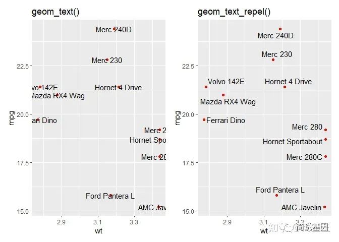
示例
隐藏部分标签
set.seed(42)

dat2 <- subset(mtcars, wt > 3 & wt < 4)
# Hide all of the text labels.
dat2$car <- ""
# Let's just label these items.
ix_label <- c(2, 3, 14)
dat2$car[ix_label] <- rownames(dat2)[ix_label]

ggplot(dat2, aes(wt, mpg, label = car)) +
  geom_text_repel() +
  geom_point(color = ifelse(dat2$car == "", "grey50", "red"))
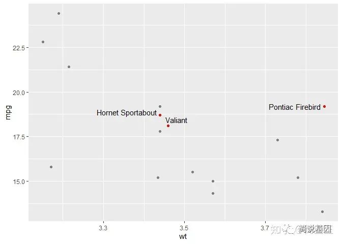
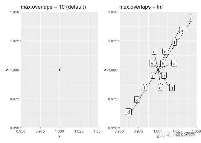
显示标签,即使它们之间有大量重叠
set.seed(42)

n <- 15
dat4 <- data.frame(
  x = rep(1, length.out = n),
  y = rep(1, length.out = n),
  label = letters[1:n]
)

# Set it globally:
options(ggrepel.max.overlaps = Inf)

p1 <- ggplot(dat4, aes(x, y, label = label)) +
  geom_point() +
  geom_label_repel(box.padding = 0.5, max.overlaps = 10) +
  labs(title = "max.overlaps = 10 (default)")

p2 <- ggplot(dat4, aes(x, y, label = label)) +
  geom_point() +
  geom_label_repel(box.padding = 0.5) +
  labs(title = "max.overlaps = Inf")

p1 + p2

## Warning: ggrepel: 15 unlabeled data points (too many overlaps). Consider
## increasing max.overlaps
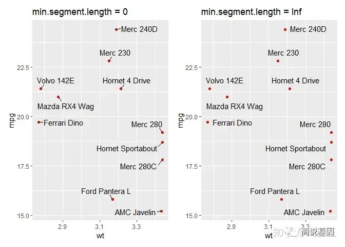
总是(或从不)画线段
p <- ggplot(dat, aes(wt, mpg, label = car)) +
  geom_point(color = "red")

p1 <- p +
  geom_text_repel(min.segment.length = 0, seed = 42, box.padding = 0.5) +
  labs(title = "min.segment.length = 0")

p2 <- p +
  geom_text_repel(min.segment.length = Inf, seed = 42, box.padding = 0.5) +
  labs(title = "min.segment.length = Inf")
p1 + p2
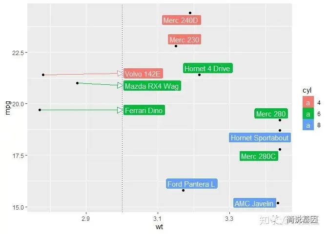
限制标签在一个特殊区域
set.seed(42)

# All labels should be to the right of 3.
x_limits <- c(3, NA)

p <- ggplot(dat) +
  aes(
    x = wt, y = mpg, label = car,
    fill = factor(cyl), segment.color = factor(cyl)
  ) +
  geom_vline(xintercept = x_limits, linetype = 3) +
  geom_point() +
  geom_label_repel(
    color = "white",
    arrow = arrow(
      length = unit(0.03, "npc"), type = "closed", ends = "first"
    ),
    xlim  = x_limits,
    point.padding = NA,
    box.padding = 0.1
  ) +
  scale_fill_discrete(
    name = "cyl",
    # The same color scall will apply to both of these aesthetics.
    aesthetics = c("fill", "segment.color")
  )

p

## Warning: Removed 1 rows containing missing values (`geom_vline()`).
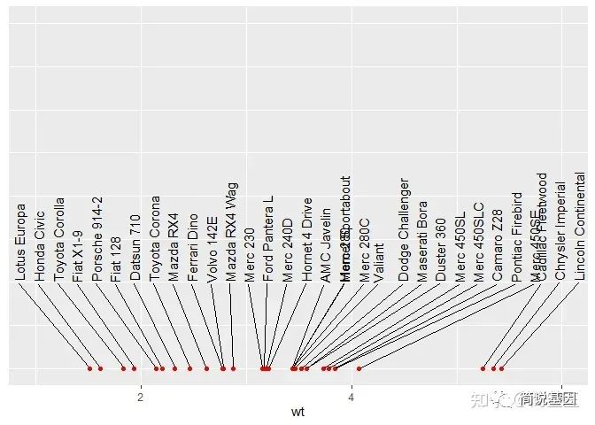
排列标签在上下边缘
set.seed(42)

ggplot(mtcars, aes(x = wt, y = 1, label = rownames(mtcars))) +
  geom_point(color = "red") +
  geom_text_repel(
    force_pull   = 0, # do not pull toward data points
    nudge_y      = 0.05,
    direction    = "x",
    angle        = 90,
    hjust        = 0,
    segment.size = 0.2,
    max.iter = 1e4, max.time = 1
  ) +
  xlim(1, 6) +
  ylim(1, 0.8) +
  theme(
    axis.line.y  = element_blank(),
    axis.ticks.y = element_blank(),
    axis.text.y  = element_blank(),
    axis.title.y = element_blank()
  )
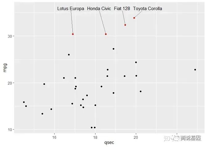
set.seed(42)

dat <- mtcars
dat$car <- rownames(dat)

ggplot(dat, aes(qsec, mpg, label = car)) +
  geom_text_repel(
    data          = subset(dat, mpg > 30),
    nudge_y       = 36 - subset(dat, mpg > 30)$mpg,
    segment.size  = 0.2,
    segment.color = "grey50",
    direction     = "x"
  ) +
  geom_point(color = ifelse(dat$mpg > 30, "red", "black")) +
  scale_x_continuous(expand = c(0.05, 0.05)) +
  scale_y_continuous(limits = c(NA, 36))
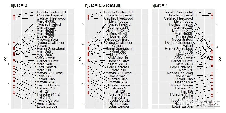
排列标签在左右边缘
set.seed(42)

p <- ggplot(mtcars, aes(y = wt, x = 1, label = rownames(mtcars))) +
  geom_point(color = "red") +
  ylim(1, 5.5) +
  theme(
    axis.line.x  = element_blank(),
    axis.ticks.x = element_blank(),
    axis.text.x  = element_blank(),
    axis.title.x = element_blank()
  )

p1 <- p +
  xlim(1, 1.375) +
  geom_text_repel(
    force        = 0.5,
    nudge_x      = 0.15,
    direction    = "y",
    hjust        = 0,
    segment.size = 0.2
  ) +
  ggtitle("hjust = 0")

p2 <- p +
  xlim(1, 1.375) +
  geom_text_repel(
    force        = 0.5,
    nudge_x      = 0.2,
    direction    = "y",
    hjust        = 0.5,
    segment.size = 0.2
  ) +
  ggtitle("hjust = 0.5 (default)")

p3 <- p +
  xlim(0.25, 1) +
  scale_y_continuous(position = "right") +
  geom_text_repel(
    force        = 0.5,
    nudge_x      = -0.25,
    direction    = "y",
    hjust        = 1,
    segment.size = 0.2
  ) +
  ggtitle("hjust = 1")

## Scale for y is already present.
## Adding another scale for y, which will replace the existing scale.

p1 + p2 + p3
也可以通过不同的图层在同一幅图中向左或向右排列标签:
set.seed(42)

dat <- subset(mtcars, wt > 2.75 & wt < 3.45)
dat$car <- rownames(dat)

ggplot(dat, aes(wt, mpg, label = car)) +
  geom_text_repel(
    data          = subset(dat, wt > 3),
    nudge_x       = 3.5 - subset(dat, wt > 3)$wt,
    segment.size  = 0.2,
    segment.color = "grey50",
    direction     = "y",
    hjust         = 0
  ) +
  geom_text_repel(
    data          = subset(dat, wt < 3),
    nudge_x       = 2.7 - subset(dat, wt < 3)$wt,
    segment.size  = 0.2,
    segment.color = "grey50",
    direction     = "y",
    hjust         = 1
  ) +
  scale_x_continuous(
    breaks = c(2.5, 2.75, 3, 3.25, 3.5),
    limits = c(2.4, 3.8)
  ) +
  geom_point(color = "red")
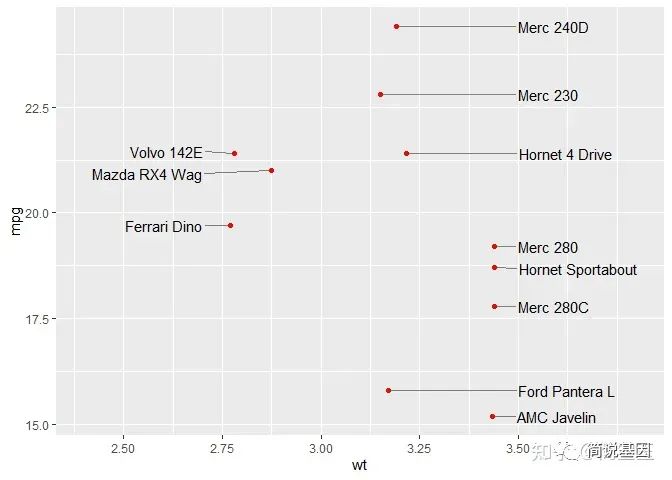
可以看到,ggrepel 包为避免图上文本间的重叠提供了很好的解决方案,使我们能够轻松地在图上添加各种文本内容。
本文参与 腾讯云自媒体同步曝光计划,分享自微信公众号。
原始发表:2023-11-27,如有侵权请联系 cloudcommunity@tencent.com 删除
目录
腾讯云开发者

Copyright © 2013 - 2026 Tencent Cloud. All Rights Reserved. 腾讯云 版权所有
深圳市腾讯计算机系统有限公司 ICP备案/许可证号:粤B2-20090059  粤公网安备44030502008569号
腾讯云计算(北京)有限责任公司 京ICP证150476号 | 京ICP备11018762号