WGCNA实战—急性心肌梗死的 NETosis 模式与免疫特点的综合分析(一)

WGCNA实战—急性心肌梗死的 NETosis 模式与免疫特点的综合分析(一)

生信菜鸟团
发布于 2024-03-18 14:03:09
发布于 2024-03-18 14:03:09
文献信息
「文献」:武汉大学学报:急性心肌梗死的 NETosis 模式与免疫特点的综合分析
「方法」:利用加权相关网络分析(WGCNA)从 GEO 数据库的 GSE60993、GSE48060 和 GSE61144 数据集中筛选出与 AMI相关性最高的基因模块。
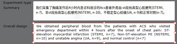
「数据来源」:从GEO数据库获得 AMI 患者的外周血细胞数据集 GSE48060、GSE60993 和 GSE61144 以及 AMI患者的循环内皮细胞数据集 GSE66360。这3 个 AMI外周血数据集共包含 86 个样本,包括 45 个AMI 样本和 41 个对照样本。循环内皮细胞数据集GSE66360 包含 49 例 AMI样本和 50 例对照样本。
一:数据下载与清洗
这个方法是下好之后从工作目录下读入,可以用迅雷或者其他方法加速你的GEO数据库下载。
rm(list = ls())
#1.1 数据下载
library(GEOquery)
getGEO(filename = "GSE48060_series_matrix.txt.gz",getGPL = F)->gse1
getGEO(filename = "GSE60993_series_matrix.txt.gz",getGPL = F)->gse2
getGEO(filename = "GSE61144_series_matrix.txt.gz",getGPL = F)->gse3
质控:
#1.2.1 提取表达矩阵,小提琴图检查
library(vioplot)
exprs(gse1)->exp1
vioplot(exp1)
exprs(gse2)->exp2
vioplot(exp2)
exprs(gse3)->exp3
vioplot(exp3)
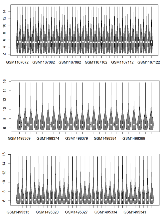
临床信息,我们可以看到后两个数据集中有一些既非心肌梗死,也非正常对照的患者,如「GSE60993」的有心绞痛症状的患者,我们将其归类为other,在后面舍弃这些样本:
#1.2.2 提取临床信息和平台信息
pData(gse1)->pd1
pData(gse2)->pd2
pData(gse3)->pd3
#分组信息
library(tidyverse)
library(stringr)
#检查行名是否与exp列名一一对应
identical(colnames(exp1),rownames(pd1))
#pd1$title
pd1$title %>% str_detect(.,"normal") %>% ifelse(.,"normal","AMI") -> group1

#检查行名是否与exp列名一一对应
identical(colnames(exp2),rownames(pd2))
#pd2$title
ifelse(str_detect(pd2$title,"Normal"),"normal",ifelse(str_detect(pd2$title,"UA"),"other","AMI")) -> group2

#检查行名是否与exp列名一一对应
identical(colnames(exp3),rownames(pd3))
#pd3$title
ifelse(str_detect(pd3$title,"Normal"),"normal",ifelse(str_detect(pd3$title,"recovered"),"other","AMI")) -> group3

table(c(group1,group2,group3))
#AMI normal  other
#55     38     16
探针id转化,因为前两个数据集的探针被AnnoProbe包收录了,所以可以走便捷的方法:
#1.3.1 探针id转化
#不知道AnnoProbe包有几个,先试试转一下
library(AnnoProbe)
ids1=idmap(gse1@annotation,'soft')
ids2=idmap(gse2@annotation,'soft')
ids3=idmap(gse3@annotation,'soft')#从GPL的网页下表格,手动转

#ids1,2可以用这个流程跑,写个循环吧
for(i in 1:2){
  #这两句是把idsi赋给ids,expi赋给dat,下面的循环使用ids和dat进行
  get(paste0("ids",i)) -> ids
  get(paste0("exp",i)) -> dat

  head(ids)
  #有些探针对应不到基因,去掉symbol为空的
  ids=ids[ids$symbol != '',]
  dat=dat[rownames(dat) %in% ids$ID,]
  ids=ids[match(rownames(dat),ids$ID),]
  head(ids)
  colnames(ids)=c('probe_id','symbol')
  ids$probe_id=as.character(ids$probe_id)
  rownames(dat)=ids$probe_id
  dat[1:4,1:4]

  ids=ids[ids$probe_id %in% rownames(dat),]
  dat[1:4,1:4]
  dat=dat[ids$probe_id,]

  ids$median=apply(dat,1,median) #ids新建median这一列,列名为median,同时对dat这个矩阵按行操作,取每一行的中位数,将结果给到median这一列的每一行
  ids=ids[order(ids$symbol,ids$median,decreasing = T),]#对ids$symbol按照ids$median中位数从大到小排列的顺序排序,将对应的行赋值为一个新的ids
  ids=ids[!duplicated(ids$symbol),]#将symbol这一列取取出重复项,'!'为否,即取出不重复的项,去除重复的gene ,保留每个基因最大表达量结果
  dat=dat[ids$probe_id,] #新的ids取出probe_id这一列,将dat按照取出的这一列中的每一行组成一个新的dat
  rownames(dat)=ids$symbol#把ids的symbol这一列中的每一行给dat作为dat的行名
  dat[1:4,1:4]  #保留每个基因ID第一次出现的信息

  #这两句是将跑好的ids和dat赋给idsi和expi
  assign(paste0("ids",i),ids)
  assign(paste0("exp",i),dat)
}

#检查
exp1[1:4,1:4]
exp2[1:4,1:4]
因为idmap函数显示第三个数据集并没有被AnnoProbe包收录,所以我们从GEO数据库下载对应GPL的探针id表格:GPL6106-11578.txt。并手动进行探针转化。
#手动转化第三个
#comment.char = "#"指定#开头的行为注释不读
read.csv("GPL6106-11578.txt",sep = "\t",comment.char = "#") -> ids3
#判断exp3行名是否与ids3$ID对应
ids3$ID %in% rownames(exp3) %>% table
ids3[ids3$ID %in% rownames(exp3),] -> ids3

ids3 <- data.frame(ID = ids3$ID,Symbol = ids3$Symbol)
#去除na
ids3 <- na.omit(ids3)
#发现Symbol内不为空NA,是"",那就
ids3[!ids3$Symbol=="",] -> ids3
#注意这里exp3行名是字符型,而ids3$ID是实数型
exp3[as.character(ids3$ID),]->exp3
#apply循环计算exp3每行中位数,赋给ids3$median
apply(exp3,1,median)->ids3$median
#ids3先按Symobl列排序,再按中位数从大到小排序
ids3[order(ids3$Symbol,ids3$median,decreasing = T),] ->ids3
#去重,这样就保留同名基因中位数最高的那个
ids3[!duplicated(ids3$Symbol),]->ids3
#exp3换行名
exp3 <- exp3[as.character(ids3$ID),]
rownames(exp3) <- ids3$Symbol
之后就是取三个表达矩阵都含有的基因进行合并
#1.3.2 合并表达矩阵
table(c(rownames(exp1),rownames(exp2),rownames(exp3))) -> geneinexp
#取在三个表达谱中都有的基因
names(geneinexp[geneinexp==3])->geneinexp
cbind(exp1[geneinexp,],exp2[geneinexp,],exp3[geneinexp,])->exp
dim(exp)
#剩的有点少:13340    93
#剩的好少按道理来说不好往下做的
length(c(group1,group2,group3))
c(group1,group2,group3)->group
table(group)#去除不是对照也不是疾病的
!str_detect(group,"other")->keep
exp[,keep]->exp
group[keep]->group
去除批次效应,文章中使用的是sva包,我们使用limma包的removeBatchEffect,
removeBatchEffect:batch参数接受内容为批次的向量,group参数接受内容为分组的向量(就是我们做差异表达分析的分组向量)
#1.3.3 去除批次效应
#先看箱线图
boxplot(exp)
#有很明显的批次效应
#我们先构建一个向量,是三个GSE各自对应一个批次
batch <- c(rep("A",times=length(group1)),rep("B",times=length(group2)),rep("C",times=length(group3)))
batch <- batch[keep]
limma::removeBatchEffect(exp,batch = batch,group=group) -> dat
boxplot(dat)

save(dat,group,file = "step_1_output.RData")
二:WGCNA
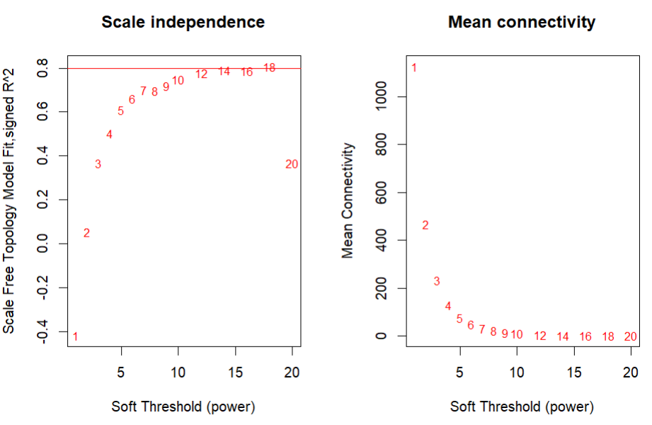
确定软阈值:如我们之前推文提到的。确定软阈值要在「无标度拓扑准则」和「平均连通性之间」进行权衡,一个可以参考的标准是选择无标度拓扑R^2在0.8以上的第一个β值,因为平均连通性是β的单调递减函数。
rm(list = ls())  ## 魔幻操作,一键清空~
options(stringsAsFactors = F)
load("step_1_output.RData")
library(ggplot2)
#1.确定软阈值----
library(WGCNA)

#这里我们取方差前4000基因做WGCNA
library(tidyverse)
apply(dat, 1, sd) %>% sort(.,decreasing = T) %>% head(.,4000) %>% names %>% dat[.,] -> dat
dim(dat)
dat0 <- t(dat)

#seq生成12,14,16,18,20的等差数列
powers = c(c(1:10), seq(from = 12, to=20, by=2))
# Call the network topology analysis function
#选择合适的软阈值
sft = pickSoftThreshold(dat0,
                        powerVector = powers,
                        verbose = 5)
#β值没有,但是肉眼看着应选12-14左右合理
po <- sft$powerEstimate;po

# Plot the results:
sizeGrWindow(9, 5)
par(mfrow = c(1,2));
cex1 = 0.8;

# Scale-free topology fit index as a function of the soft-thresholding power
plot(sft$fitIndices[,1],
     -sign(sft$fitIndices[,3])*sft$fitIndices[,2],
     xlab="Soft Threshold (power)",
     ylab="Scale Free Topology Model Fit,signed R^2",
     type="n",
     main = paste("Scale independence"));
text(sft$fitIndices[,1],
     -sign(sft$fitIndices[,3])*sft$fitIndices[,2],
     labels=powers,cex=cex1,col="red");

# this line corresponds to using an R^2 cut-off of h
abline(h=0.80,col="red")

# Mean connectivity as a function of the soft-thresholding power
plot(sft$fitIndices[,1],
     sft$fitIndices[,5],
     xlab="Soft Threshold (power)",
     ylab="Mean Connectivity",
     type="n",main = paste("Mean connectivity"))
text(sft$fitIndices[,1],
     sft$fitIndices[,5],
     labels=powers, cex=cex1,col="red")
构建加权基因共表达网络
#2.一步构建网络----
# 报错:https://blog.csdn.net/liyunfan00/article/details/91686840
#很多包都有cor函数,这里是把WGCNA包的cor函数设为优先级最高的
cor <- WGCNA::cor
net = blockwiseModules(dat0, power = 12,
TOMType = "unsigned", minModuleSize = 30,
reassignThreshold = 0, mergeCutHeight = 0.25,
numericLabels = TRUE, pamRespectsDendro = FALSE,
saveTOMs = F,
verbose = 3) #一步构建网络
#改回去
cor<-stats::cor
class(net)
names(net)
table(net$colors)
#(1)保存net相关信息
moduleLabels = net$colors
moduleColors = labels2colors(net$colors)
MEs = net$MEs;
geneTree = net$dendrograms[[1]];
save(net,MEs, moduleLabels, moduleColors, geneTree,
file = "Step2networkConstruction-auto.RData")
gene_hclust_Tree = hclust(dist( dat ), method = "average");
ht=cutree(gene_hclust_Tree,100)
table(ht)
table(net$colors)
identical(names(ht),
names(net$colors))
df = data.frame(hc = ht ,
wgcna = net$colors )
head(df)
kp = df$hc %in% names(table(ht))[table(ht) > 10]
df=df[kp,]
gplots::balloonplot(table(df))
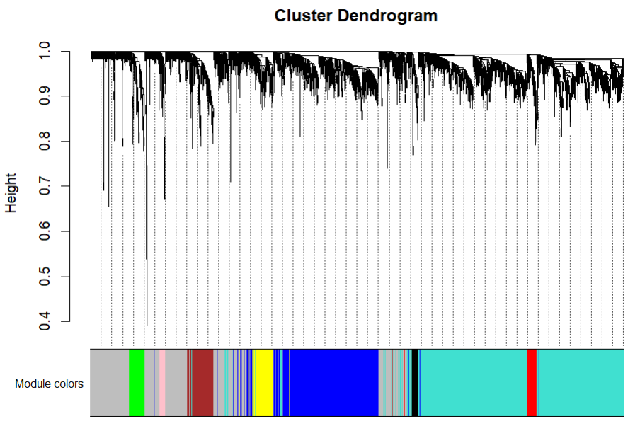
# wgcna 改进的层次聚类,对基因进行分组
文献中的树状图,不同的颜色代表识别到的不同模块
#(2)树状图
# open a graphics window
sizeGrWindow(12, 9)

# Convert labels to colors for plotting
mergedColors = labels2colors(net$colors)

# Plot the dendrogram and the module colors underneath
plotDendroAndColors(geneTree,
                    mergedColors[net$blockGenes[[1]]],
                    "Module colors",
                    dendroLabels = FALSE,
                    hang = 0.03,
                    addGuide = TRUE,
                    guideHang = 0.05)
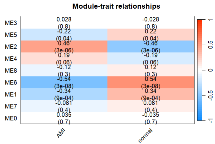
将模块与性质相关联
factor(group,levels=c("AMI","normal"))->group
design=model.matrix(~0+ group)
colnames(design)=levels(group)
design1 <- as.data.frame(design)
moduleTraitCor = cor(MEs, design, use = "p")
head(moduleTraitCor)
moduleTraitPvalue = corPvalueStudent(moduleTraitCor,
ncol(dat))
head(moduleTraitPvalue)
textMatrix = paste(signif(moduleTraitCor, 2),
"\n(",signif(moduleTraitPvalue, 1),
")",
sep = "")
dim(textMatrix) = dim(moduleTraitCor)
library(stringr)
par(mar = c(3, 12, 3, 1));
labeledHeatmap(Matrix = moduleTraitCor,
xLabels = names(design1),
yLabels = names(MEs),
ySymbols = names(MEs),
colorLabels = FALSE,
colors = blueWhiteRed(50),
textMatrix = textMatrix,
setStdMargins = FALSE,
cex.text = 1,
zlim = c(-1,1),
main = paste("Module-trait relationships"))
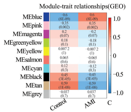
#可以看到ME2可能是对应文献中MEblue的模块
可以看到ME2应该是与AMI表型最正相关的一个模块。
文献中:
Module membership
#2.Module membership----
# Define variable weight containing the weight column of datTrait
AMI = as.data.frame(design1$AMI);
names(AMI) = "AMI"
# names (colors) of the modules
modNames = substring(names(MEs), 3)
geneModuleMembership = as.data.frame(cor(dat0, MEs, use = "p"));
MMPvalue = as.data.frame(corPvalueStudent(as.matrix(geneModuleMembership), ncol(dat)));
names(geneModuleMembership) = paste("MM", modNames, sep="")
names(MMPvalue) = paste("p.MM", modNames, sep="")
geneTraitSignificance = as.data.frame(cor(dat0, AMI, use = "p"))
GSPvalue = as.data.frame(corPvalueStudent(as.matrix(geneTraitSignificance), ncol(dat)))
names(geneTraitSignificance) = paste("GS.", names(AMI), sep="")
names(GSPvalue) = paste("p.GS.", names(AMI), sep="")
table(mergedColors[net$blockGenes[[1]]])
#ME2,blue
moduleGenes = moduleColors=="blue";
sizeGrWindow(7, 7);
par(mfrow = c(1,1));
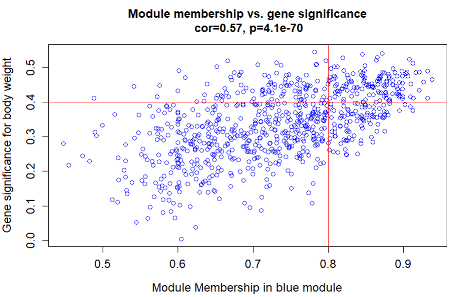
verboseScatterplot(abs(geneModuleMembership[moduleGenes, "MM2"]),
abs(geneTraitSignificance[moduleGenes, 1]),
xlab = paste("Module Membership in blue module"),
ylab = "Gene significance for body weight",
main = paste("Module membership vs. gene significance\n"),
cex.main = 1.2, cex.lab = 1.2, cex.axis = 1.2, col = "blue")
abline(h=0.4,v=0.8,col="red",lwd=1.5)
文献中:

文献将潜在的 AMI相关基因与 NETo‑sis 基因和 ImmPort 数据库中的免疫相关基因交叉,鉴定出 11 个 NRGs。
我们检查下我们找的ME2模块中的基因是否能和这11个关键基因重合的很好:
#在ME2中的基因
net$colors[net$colors==2] %>% names -> ME2gene
#其表达矩阵
dat[ME2gene,] -> ME2exp
#文献中通过将潜在的AMI相关基因与NETo⁃sis基因和ImmPort数据库中的免疫相关基因交叉,
#鉴定出11个NRGs,我们的复现中有10个,说明和文献中找到的模块是一致的
for(i in c("CSF3R","TNFRSF10C","FPR1","FCGR3B","IL1B","S100A12","TLR2","TLR8","TLR4","PTAFR","MMP9")){
  print(i %in% ME2gene)
}
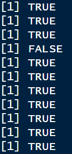
结果比较理想
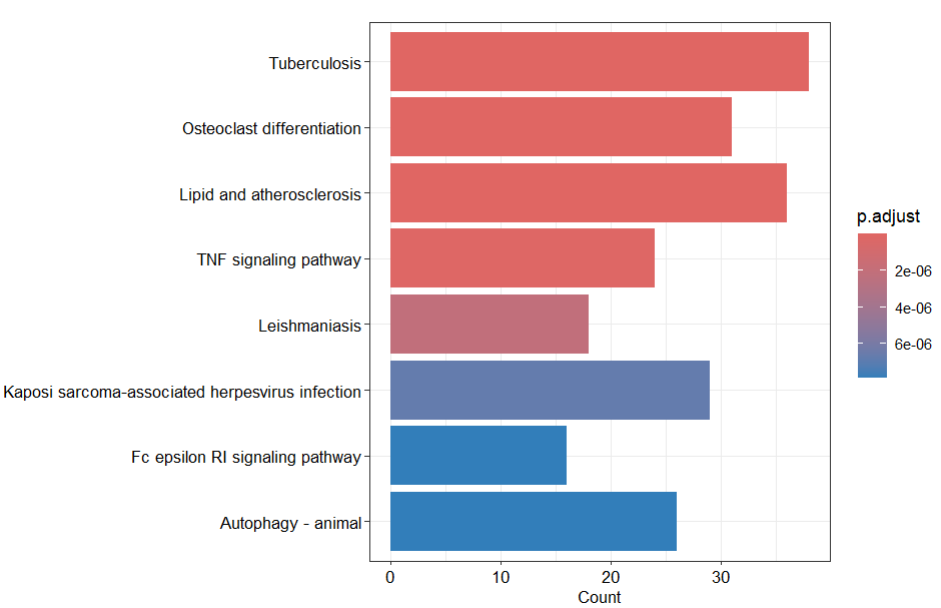
接下来做图2富集分析结果:
#拿ME2gene做富集分析
library(clusterProfiler)
library(org.Hs.eg.db)
library(AnnotationDbi)
keytypes(org.Hs.eg.db)
#symbol转Entrezid
AnnotationDbi::select(org.Hs.eg.db,keys=ME2gene,columns = "ENTREZID",keytype = "SYMBOL") -> ME2geneEntrezid
na.omit(ME2geneEntrezid$ENTREZID)->ME2geneEntrezid
#GO数据库ORA富集分析
resgoBP <- enrichGO(ME2geneEntrezid,"org.Hs.eg.db",ont = "BP")
resgoBP <- clusterProfiler::simplify(resgoBP, cutoff=0.7, by="pvalue", select_fun=min)
dotplot(resgoBP,font.size =10)+
facet_grid( scale="free") +
scale_y_discrete(labels=function(x) str_wrap(x, width=50))
ggsave(filename = 'GO_BP.pdf')
resgoMF <- enrichGO(ME2geneEntrezid,"org.Hs.eg.db",ont = "MF")
resgoMF <- clusterProfiler::simplify(resgoMF, cutoff=0.7, by="pvalue", select_fun=min)
dotplot(resgoMF,font.size =10)+
facet_grid(scale="free") +
scale_y_discrete(labels=function(x) str_wrap(x, width=50))
ggsave(filename = 'GO_MF.pdf')
resgoCC <- enrichGO(ME2geneEntrezid,"org.Hs.eg.db",ont = "CC")
resgoCC <- clusterProfiler::simplify(resgoCC, cutoff=0.7, by="pvalue", select_fun=min)
dotplot(resgoCC,font.size =10)+
facet_grid(scale="free") +
scale_y_discrete(labels=function(x) str_wrap(x, width=50))
ggsave(filename = 'GO_CC.pdf')
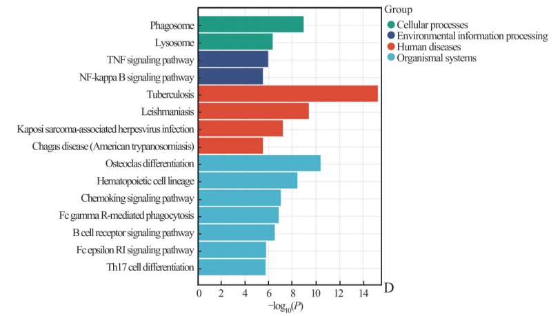
resKEGG <- enrichKEGG(ME2geneEntrezid,organism = "hsa")
barplot(resKEGG,font.size =10)+
facet_grid(scale="free") +
scale_y_discrete(labels=function(x) str_wrap(x, width=50))
KEGG的结果复现的还是比较好的,GO数据库的BP,MF,CC跟文献有一定差异,篇幅有限图片就不放在下面了。
文献:
本文参与 腾讯云自媒体同步曝光计划,分享自微信公众号。
原始发表:2024-03-14,如有侵权请联系 cloudcommunity@tencent.com 删除
评论
登录后参与评论
推荐阅读
目录
腾讯云开发者

Copyright © 2013 - 2026 Tencent Cloud. All Rights Reserved. 腾讯云 版权所有
深圳市腾讯计算机系统有限公司 ICP备案/许可证号:粤B2-20090059 ![]() 粤公网安备44030502008569号
粤公网安备44030502008569号
腾讯云计算(北京)有限责任公司 京ICP证150476号 | 京ICP备11018762号