
为Boxplot自定义Seaborn图例
为Boxplot自定义Seaborn图例
提问于 2020-06-19 17:19:40
当我试图绘制这个方块图形时,年龄组的传说如下所示。
%matplotlib inline
import matplotlib.pyplot as plt
import seaborn as sns
import pandas as pd
plt.figure(figsize=(14,7))
sns.set(style="white", palette="Blues", color_codes=True)
f = sns.boxplot(x="RIAGENDRtxt", y="BPXSY1", hue="agegrp", data=df)

plt.savefig("out.png",pad_inches=0.5)
plt.show()
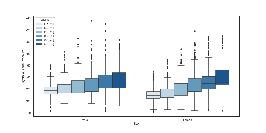
但是当我试图自定义图例时,我的代码是
plt.figure(figsize=(14,7))
sns.set(style="white", palette="Blues", color_codes=True)
f = sns.boxplot(x="RIAGENDRtxt", y="BPXSY1", hue="agegrp", data=df)

f.set_xlabel("Sex")
f.set_ylabel("Systolic Blood Pressure")

legend_label = ["(18, 30)", "(30, 40)", "(40, 50)", "(50, 60)", "(60, 70)", "(70, 80)"]
f.legend(title="Age Group", labels=legend_label)

plt.savefig("out.png",pad_inches=0.5)
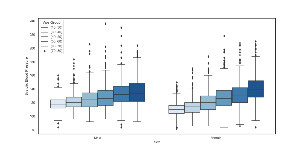
plt.show()此f.legend(title="Age Group", labels=legend_label)行能够自定义标题和标签,但它会导致标记中的错误。我需要将标记设置为彩色托盘,就像在前面的图中一样。
回答 2
Stack Overflow用户
回答已采纳
发布于 2020-06-19 17:37:50
Stack Overflow用户
发布于 2020-06-19 17:57:50
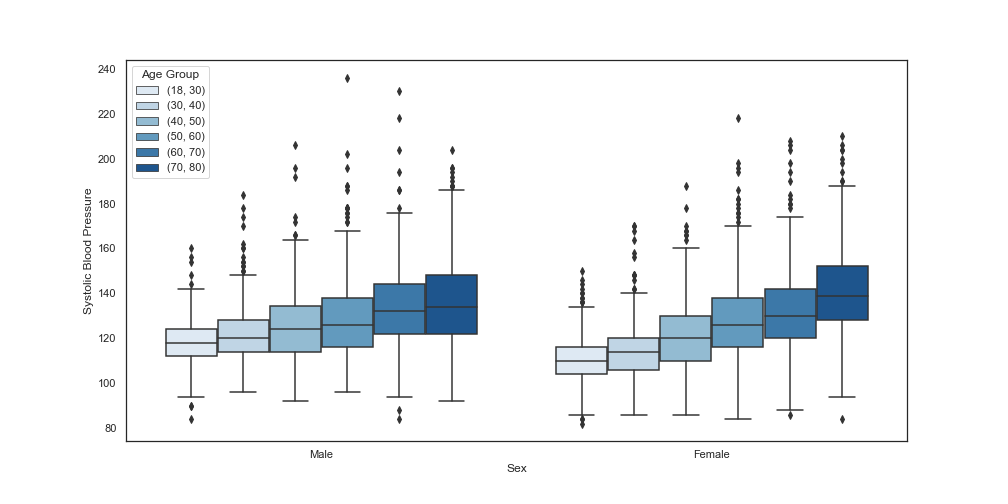
谢谢你Emerson Harkin。你的解决方案很有用。我只是遍历标签列表来更新所有的标签。下面是我更新的代码和图:
%matplotlib inline
import matplotlib.pyplot as plt
import seaborn as sns
import pandas as pd
plt.figure(figsize=(14,7))
sns.set(style="white", palette="Blues", color_codes=True)
f = sns.boxplot(x="RIAGENDRtxt", y="BPXSY1", hue="agegrp", data=df)

f.set_xlabel("Sex")
f.set_ylabel("Systolic Blood Pressure")

legend_label = ["(18, 30)", "(30, 40)", "(40, 50)", "(50, 60)", "(60, 70)", "(70, 80)"]
f.legend(title="Age Group")

n = 0
for i in legend_label:
    f.legend_.texts[n].set_text(i)
    n += 1

plt.show()
最新数字
页面原文内容由Stack Overflow提供。腾讯云小微IT领域专用引擎提供翻译支持
原文链接:
https://stackoverflow.com/questions/62475459
复制相关文章
相似问题
腾讯云开发者

Copyright © 2013 - 2026 Tencent Cloud. All Rights Reserved. 腾讯云 版权所有
深圳市腾讯计算机系统有限公司 ICP备案/许可证号:粤B2-20090059  粤公网安备44030502008569号
腾讯云计算(北京)有限责任公司 京ICP证150476号 | 京ICP备11018762号