
用Python中的子图创建具有公共行的Matplotlib图
用Python中的子图创建具有公共行的Matplotlib图
提问于 2014-04-03 14:22:26
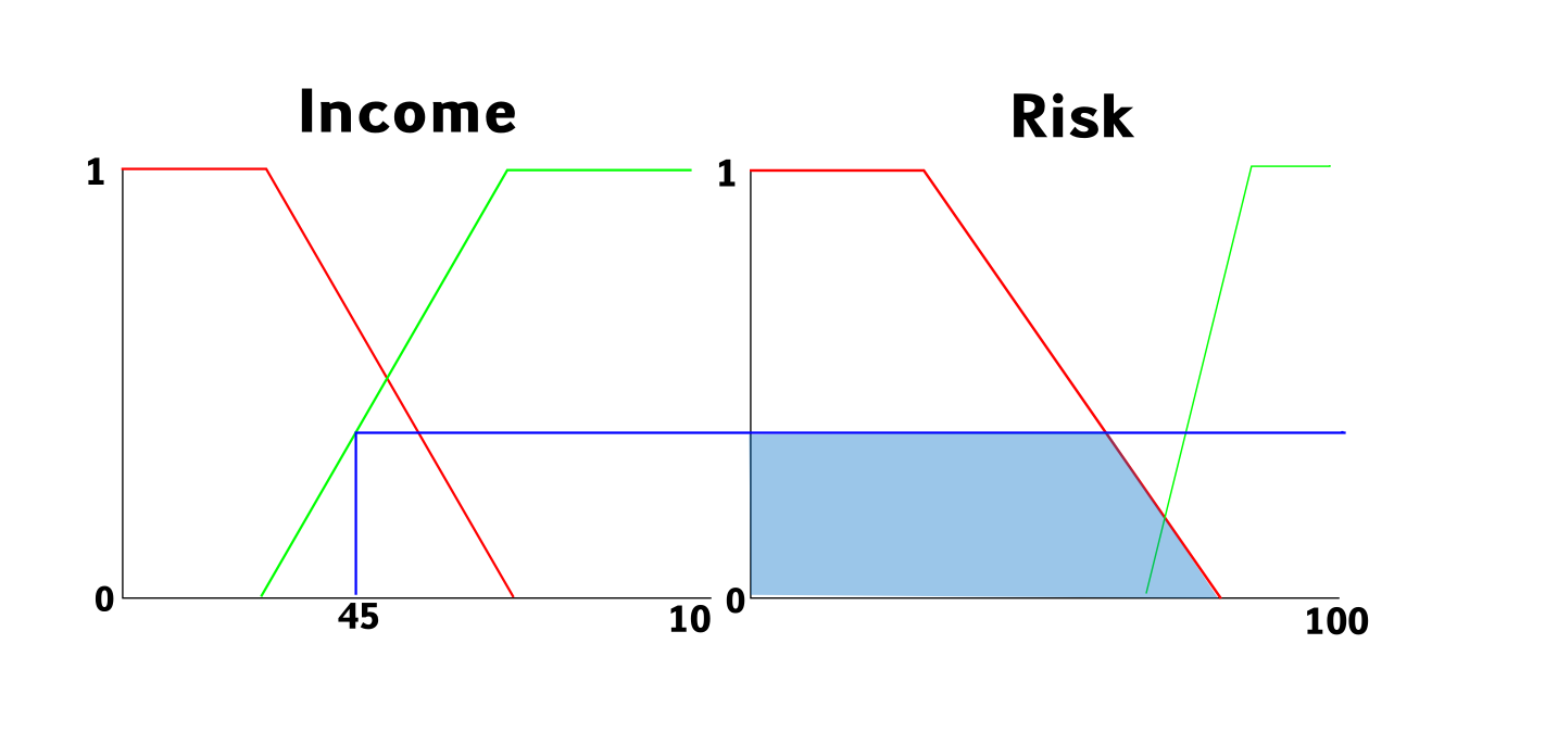
在即将完成的作业中,我需要制作一系列的图表,其中有两幅图,其中一幅图上有一条线,另一张图上的一条线下面的区域是彩色的。
如这幅草图所示:
这就是我目前的情况:
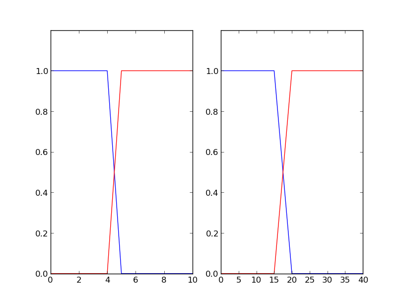
从这个代码中:
from matplotlib import pyplot as plt

fig = plt.figure()
ax1 = fig.add_subplot(121)
ax1.plot([0,1,2,3,4,5,6,7,8,9,10], [1,1,1,1,1,0,0,0,0,0,0], '-b')
ax1.plot([0,1,2,3,4,5,6,7,8,9,10], [0,0,0,0,0,1,1,1,1,1,1], '-r')
ax1.set_ylim([0, 1.2])

ax2 = fig.add_subplot(122)
ax2.plot([0,5,10,15,20,25,30,35,40], [1,1,1,1,0,0,0,0,0], '-b')
ax2.plot([0,5,10,15,20,25,30,35,40], [0,0,0,0,1,1,1,1,1], '-r')
ax2.set_ylim([0, 1.2])

plt.show()
显然,这只会生成两个图,而且我还无法在这两个图之间添加这条线。
我真的希望能够使用python中的Matplotlib来实现这个功能,能够更改值(在示例中为45),并且颜色区域会自动更改。
谢谢!
Stack Overflow用户
回答已采纳
发布于 2014-04-03 17:54:55
有三个步骤:第一,在左边面板中找到绿线和蓝线之间的截取点。第二,找到右侧面板中红色和直线之间的拦截点。第三,填好中间的区域。这些步骤涉及np.interp scipy.interpolat scipy.optimize和plt.fill_between,您应该查找这些步骤。
from matplotlib import pyplot as plt
import numpy as np
import scipy.interpolate as spinp
import scipy.optimize as spop

fig = plt.figure(figsize=(16,4))
ax1 = fig.add_subplot(121)
x  = [0,10,20,30,40,50,60,70,80,90,100]
yr = [1,1,1,1,1,0,0,0,0,0,0]
yg = [0,0,0,0,0,1,1,1,1,1,1]
turn_pt = np.interp(45, x, yr) #change 45 to whatever.
yb = [0.,turn_pt,turn_pt]
ax1.plot(x, yr, '-r')
ax1.plot(x, yg, '-g')
xb = [45, 45, 200]
ll = plt.plot(xb,yb, '-b')
ll[0].set_clip_on(False)
plt.axis([0,100,0,1.2])
#the above three lines to draw the line out of the box.

ax2 = fig.add_subplot(122)
yr = [1,1,1,1,0,0,0,0,0]
yg = [0,0,0,0,1,1,1,1,1]
x  = [0,5,10,15,20,25,30,35,40]
brk_pt_f = lambda X, V: (spinp.interp1d(x, yr)(X)-V)**2
brk_pt = spop.fmin(brk_pt_f, 17., args=(turn_pt,), disp=0) #17. is you inital guess,
#the above two lines solve for the intersection between the blue line and the red line
zero_pt = 20.
start_pt= 0.
xb = np.hstack((start_pt, brk_pt, zero_pt))
yb = [turn_pt,turn_pt,0]
ax2.plot(x, yr, '-r')
ax2.plot(x, yg, '-g')
ax2.plot(xb, yb, '-b')
ax2.hlines(turn_pt,0, 40, 'b', alpha=0.)
ax2.fill_between(xb, yb, 0, alpha=0.4)
ax2.set_ylim([0, 1.2])
ax2.set_xlim([0, 40])
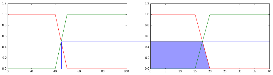
有一些解决方案,以摆脱顶部x轴和右y轴,请搜索老的,这样的帖子。
最后,欢迎来到这里。
页面原文内容由Stack Overflow提供。腾讯云小微IT领域专用引擎提供翻译支持
原文链接:
https://stackoverflow.com/questions/22840621
复制相关文章
相似问题
腾讯云开发者
