
如何在两个面板页面上设置阴影,而不管其高度如何?
我已经找到了答案,但我不确定这是解决我的问题的最佳办法。我的页面有两个面板:一个侧边栏和一个内容视图。我希望在侧栏上有一个阴影,就好像内容视图正在生成它一样:

问题是,我的侧边栏是一个带有按钮、图标等的菜单。因此,如果我试图在那里设置(嵌入)阴影:
.sidebar {
    box-shadow: inset -7px 0 9px -7px rgba(0,0,0,0.7);
}
我得到:
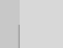
所以,在我有按钮的地方,它们会隐藏阴影。如果我以另一种方式这样做,那么content视图实际上会生成它:
.content {
    box-shadow: -7px 0 9px -7px rgba(0,0,0,0.7);
}
我和内容一起得到阴影,但是如果内容比屏幕的总高度“短”,阴影就消失了。类似于之前的情况。
我的最后一种方法是为内容视图或Javascript设置一个手动高度,以使其适应viewport高度。但我不确定这是最好的办法。我想知道是否有更多的CSS方式来做它,而不必手动设置或获得阴影削减。
编辑
在创建小提琴以更好地理解我的问题时,我意识到我的按钮上有一个background-color。但是由于我在按钮上有一个hover和一个transition,所以它仍然隐藏着阴影。查看一下:http://jsfiddle.net/h3cp59qd/
回答 4
Stack Overflow用户
发布于 2015-08-05 13:03:28
看看这个:http://jsfiddle.net/h3cp59qd/3/
将position:absolute用于sidebar和content
body, html {
    background: #D8D8D8;
    height: 100%;
    margin: 0;
    padding: 0;
}

#app {
    width: 100%;
    height: 100%;
    position: relative;
}

#sidebar {
    width: 20%;
    z-index: 1;
    position: absolute;
    top: 0;
    bottom: 0;
    background: #C8C8C8;
}

#sidebar ul {
    list-style-type: none;
    margin: 0;
    padding: 0;
}

#sidebar ul li {
    padding-left: 20px;
    height: 60px;
    text-transform: uppercase;
    color: white;
    font-weight: 900;
    font-size: 12pt;
    line-height: 60px;
    vertical-align: middle;
}

#sidebar ul li:hover {
    background: #c0c0c0;
    color: #EEE;
}

#content {
    width: 80%;
    position: absolute;
    z-index: 100;
    left: 20%;
    top: 0;
    bottom: 0;
    padding: 0 50px;
    box-shadow: -7px 0 9px -7px rgba(0,0,0,0.7);
}Stack Overflow用户
发布于 2015-08-05 12:38:12
也许,在css样式表中,一个带有重复的阴影背景图像就能达到这个效果。
background-image:url('your-image.jpg');
background-repeat:repeat-y;
您的图像应该是阴影1 1px的高度和更大的需要。您的页眉/页脚可以很容易地隐藏阴影与他们的适当背景。
我看到了你的编辑,这是我的:)
#sidebar ul li:hover {
 background-color: #C0C0C0;
 color: #EEE;
 box-shadow: inset -7px 0 9px -7px rgba(0,0,0,0.7);
}Stack Overflow用户
发布于 2015-08-05 12:52:56
只需将背景色更改为渐变:
http://jsfiddle.net/anshalexander/h3cp59qd/2/
background:-webkit-linear-gradient(left, #c0c0c0 0%,#c0c0c0 97%,#555 100%); 您可以更改最后一个颜色以匹配您的阴影颜色。
https://stackoverflow.com/questions/31832582
复制相似问题
腾讯云开发者
