双栏布局首页卡片魔改教程

更新记录
2022-12-03:发布卡片教程
- 在旧版方案基础上对动画实现方式和多边形切割方式做了改动,现在这版更加顺滑。
- 移除旧版手机端快门特效。
- 按照贰猹原设实现手机端卡片样式。将手机端卡片样式扩展,支持双栏布局。
- 提供自选方案,读者可以根据需要,选择两种样式。
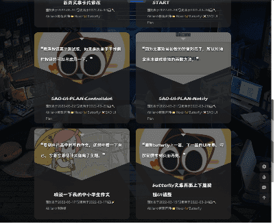
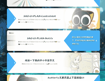
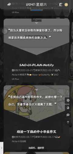
- 样式一:电脑端宽屏采用滑动卡片,平板宽度采用双栏布局,手机宽度采用单栏卡片。
- 样式二:移除滑动卡片,按屏幕宽度依次应用三栏、双栏、单栏。
点击查看参考教程
参考方向 | 教程原贴 |
|---|---|
本帖的卡片原设为贰猹提供 | 贰猹の小窝 |
Flex布局参数解释 | Flex 布局教程:语法篇 - 阮一峰的网络日志 |
Transition属性实现平滑过渡动画 | CSS3实现伪类hover离开时平滑过渡效果示例 |
使用clip-path实现多边形剪裁。 | 不可思议的CSS之clip-path |
参考渐变遮罩层的实现方式 | MDN-WEB-DOCS |
店长的碎碎念
嗨,哆摩,这里是Akilar嘚嘶。
呀,说起来我真的是很久很久没有更新了啊,最近几个月有点低气压,没啥干劲,就想着这个季度干完就离职转行。博客也是炒冷饭,巴特福来都更新了好几版了,我还懒得维护旧版教程。因为jerry太流氓了嘛,总是冷不丁的连文件名称都改了。要维护的话就要连着改上30几篇,想想就是稍微动动脑筋就能猜到的事情,我觉得聪明的读者肯定是会自己思考出来的。所以,摆烂啦。旧版不去维护了。
然后贰猹就不干了啊,今年四月份我就说要按照新思路写个首页卡片了,然后一直拖一直拖,一直拖一直拖,咕咕咕可耻但是很爽。
咕着咕着就出事情了。最近加群回答突然就出现了anzhiy.cn的答案。鱼鱼算是冰糖红茶的铁粉了,而且他学的很快也有教学热情,然后他就把他的心得和教程录成视频。
然后捏,加群回答就变成anzhiy.cn了。
怨念超大啊喂,以前我给冰老师售后的时候,加群回答全是zfe.space,现在鱼鱼给我售后的时候,加群回答全部是anzhiy.cn。明明是三个人的电影,我却始终不能,留姓名🎵🎵🎵。坏了,我成替身了。😱😱😱
再不发几篇新东西你们怕是要把我忘了。
所以,铛铛铛,新版双栏卡片就新鲜出炉啦,虽然设计是笨蛋贰猹的创意,但是笨蛋贰猹自己写不出来还要吐槽我实现的效果。我要再敲一个笨蛋贰猹,因为重要的事情要说三遍。好老的梗。
不管了,我单方面宣布,巴特福来最好看的双栏布局方案,今天起跟我姓啦!
效果预览
点击查看预览效果
魔改步骤
修改[Blogroot]\themes\butterfly\layout\includes\mixins\post-ui.pug,整个替换为下面的代码:
mixin postUI(posts)
  each article , index in page.posts.data
    .recent-post-item
      -
        let link = article.link || article.path
        let title = article.title || _p('no_title')
        const position = theme.cover.position
        let leftOrRight = position === 'both'
          ? index%2 == 0 ? 'left' : 'right'
          : position === 'left' ? 'left' : 'right'
        let post_cover = article.cover
        let no_cover = article.cover === false || !theme.cover.index_enable ? 'no-cover' : ''
      -
      .recent-post-content(class=leftOrRight)
        .recent-post-cover-shadow
        .recent-post-cover
          img.article-cover(src=url_for(post_cover) onerror=`this.onerror=null;this.src='`+ url_for(theme.error_img.post_page) + `'` alt=subtitle)
        .recent-post-info
          a.article-title(href=url_for(link) title=subtitle)
            .article-title-link= title
          .recent-post-meta
            .article-meta-wrap
              if (is_home() && (article.top || article.sticky > 0))
                span.article-meta
                  i.fas.fa-thumbtack.sticky
                  span.sticky= _p('sticky')
                  span.article-meta-separator |
              if (theme.post_meta.page.date_type)
                span.post-meta-date
                  if (theme.post_meta.page.date_type === 'both')
                    i.far.fa-calendar-alt
                    span.article-meta-label=_p('post.created')
                    time.post-meta-date-created(datetime=date_xml(article.date) title=_p('post.created') + ' ' + full_date(article.date))=date(article.date, config.date_format)
                    span.article-meta-separator |
                    i.fas.fa-history
                    span.article-meta-label=_p('post.updated')
                    time.post-meta-date-updated(datetime=date_xml(article.updated) title=_p('post.updated') + ' ' + full_date(article.updated))=date(article.updated, config.date_format)
                  else
                    - let data_type_updated = theme.post_meta.page.date_type === 'updated'
                    - let date_type = data_type_updated ? 'updated' : 'date'
                    - let date_icon = data_type_updated ? 'fas fa-history' :'far fa-calendar-alt'
                    - let date_title = data_type_updated ? _p('post.updated') : _p('post.created')
                    i(class=date_icon)
                    span.article-meta-label=date_title
                    time(datetime=date_xml(article[date_type]) title=date_title + ' ' + full_date(article[date_type]))=date(article[date_type], config.date_format)
              if (theme.post_meta.page.categories && article.categories.data.length > 0)
                span.article-meta
                  span.article-meta-separator |
                  i.fas.fa-inbox
                  each item, index in article.categories.data
                    a(href=url_for(item.path)).article-meta__categories #[=item.name]
                    if (index < article.categories.data.length - 1)
                      i.fas.fa-angle-right.article-meta-link
              if (theme.post_meta.page.tags && article.tags.data.length > 0)
                span.article-meta.tags
                  span.article-meta-separator |
                  i.fas.fa-tag
                  each item, index in article.tags.data
                    a(href=url_for(item.path)).article-meta__tags #[=item.name]
                    if (index < article.tags.data.length - 1)
                      span.article-meta-link #[='•']

              mixin countBlockInIndex
                - needLoadCountJs = true
                span.article-meta
                  span.article-meta-separator |
                  i.fas.fa-comments
                  if block
                    block
                  span.article-meta-label= ' ' + _p('card_post_count')

              if theme.comments.card_post_count
                case theme.comments.use[0]
                  when 'Disqus'
                    +countBlockInIndex
                      a(href=full_url_for(link) + '#disqus_thread')
                        i.fa-solid.fa-spinner.fa-spin
                  when 'Disqusjs'
                    +countBlockInIndex
                      a(href=full_url_for(link) + '#disqusjs')
                        span.disqus-comment-count(data-disqus-url=full_url_for(link))
                          i.fa-solid.fa-spinner.fa-spin
                  when 'Valine'
                    +countBlockInIndex
                      a(href=url_for(link) + '#post-comment')
                        span.valine-comment-count(data-xid=url_for(link))
                          i.fa-solid.fa-spinner.fa-spin
                  when 'Waline'
                    +countBlockInIndex
                      a(href=url_for(link) + '#post-comment')
                        span.waline-comment-count(id=url_for(link))
                          i.fa-solid.fa-spinner.fa-spin
                  when 'Twikoo'
                    +countBlockInIndex
                      a.twikoo-count(href=url_for(link) + '#post-comment')
                        i.fa-solid.fa-spinner.fa-spin
                  when 'Facebook Comments'
                    +countBlockInIndex
                      a(href=url_for(link) + '#post-comment')
                        span.fb-comments-count(data-href=urlNoIndex(article.permalink))
                  when 'Remark42'
                    +countBlockInIndex
                      a(href=url_for(link) + '#post-comment')
                        span.remark42__counter(data-url=urlNoIndex(article.permalink))
                          i.fa-solid.fa-spinner.fa-spin
                  when 'Artalk'
                    +countBlockInIndex
                      a(href=url_for(link) + '#post-comment')
                        span.artalk-count(data-page-key=url_for(link))
                          i.fa-solid.fa-spinner.fa-spin
        a.article-content(href=url_for(link) title=subtitle)
          //- Display the article introduction on homepage
          case theme.index_post_content.method
            when false
              - break
            when 1
              .article-content-text!= article.description
            when 2
              if article.description
                .article-content-text!= article.description
              else
                - const content = strip_html(article.content)
                - let expert = content.substring(0, theme.index_post_content.length)
                - content.length > theme.index_post_content.length ? expert += ' ...' : ''
                .article-content-text!= expert
            default
              - const content = strip_html(article.content)
              - let expert = content.substring(0, theme.index_post_content.length)
              - content.length > theme.index_post_content.length ? expert += ' ...' : ''
              .article-content-text!= expert
        .recent-post-arrow

    if theme.ad && theme.ad.index
      if (index + 1) % 3 == 0
        .recent-post-item.ads-wrap!=theme.ad.index
样式方案提供两种:
样式一:电脑端宽屏采用滑动卡片,平板宽度采用双栏布局,手机宽度采用单栏卡片。
样式二:移除滑动卡片,按屏幕宽度依次应用三栏、双栏、单栏。 读者可以根据自己的喜好挑选。
- 样式一
- 样式二
//default color:
:root
  --recent-post-bgcolor: rgba(255, 255, 255, 0.9)  //默认背景
  --article-content-bgcolor: #49b1f5 //描述版块背景
  --recent-post-arrow: #ffffff //箭头配色
  --recent-post-cover-shadow: #ffffff //封面遮罩层配色,建议和默认值的颜色相对应。
  --recent-post-transition: all 0.5s cubic-bezier(0.59, 0.01, 0.48, 1.17)  //动画效果。不了解的不要改动
[data-theme="dark"]
  --recent-post-bgcolor: rgba(35,35,35,0.5)
  --article-content-bgcolor: #99999a
  --recent-post-arrow: #37e2dd
  --recent-post-cover-shadow: #232323
// 默认的首页卡片容器布局
.recent-posts
  padding 0 15px 0 15px
  .recent-post-item
    margin-bottom 15px
    width 100%
    background var(--recent-post-bgcolor)
    overflow hidden
    border-radius 15px
    .recent-post-content
      display flex
      background var(--recent-post-bgcolor)
      position relative
      .recent-post-cover
        display flex
        background transparent
      .recent-post-info
        display flex
        background transparent
        flex-direction column
        justify-content center
        align-items center
        .article-title
          height 50%
          display: flex
          align-items: center
          justify-content: flex-end
          flex-direction: column
          .article-title-link
            color: var(--text-highlight-color)
            transition: all .2s ease-in-out
            display: -webkit-box;
            -webkit-box-orient: vertical;
            overflow: hidden;
            &:hover
              color: $text-hover
        .recent-post-meta
          height 50%
          display: flex
          align-items: center
          justify-content: flex-start
          flex-direction: column
          .article-meta-wrap
            color #969797
            display: -webkit-box;
            -webkit-box-orient: vertical;
            overflow: hidden;
            a
              color: var(--text-highlight-color)
              transition: all .2s ease-in-out
              color #969797
              &:hover
                color: $text-hover
      .article-content
        display flex
        flex-direction row
        align-items center
        justify-content center
        .article-content-text
          display -webkit-box
          -webkit-box-orient vertical
          text-overflow: ellipsis
          overflow hidden
          color #fff
          text-shadow 1px 2px 3px #000
    &.ads-wrap
      display: block !important
      height: auto !important
// PC端滑动卡片样式
@media screen and (min-width:1069px)
  .recent-posts
    padding 0 15px 0 15px
    .recent-post-item
      .recent-post-content
        position relative
        height 200px
        width 100%
        transition var(--recent-post-transition)
        &:hover
          .recent-post-cover-shadow
            width 10.1%
            transition var(--recent-post-transition)
          .recent-post-cover
            width 10%
            transition var(--recent-post-transition)
          .article-content
            width calc(30% + 80px)
            transition var(--recent-post-transition)
            .article-content-text
              opacity 1
          .recent-post-arrow
            transition var(--recent-post-transition)
        .recent-post-cover-shadow
          z-index: 1
          transition var(--recent-post-transition)
          position: absolute
          height 200px
          width 40%
        .recent-post-cover
          height 200px
          width 40%
          transition var(--recent-post-transition)
          img
            height 100%
            width 100%
            object-fit cover

        .recent-post-info
          height 200px
          width calc(60% - 80px)
          .article-title
            margin: 0px 40px
            font-size 24px
            .article-title-link
              -webkit-line-clamp: 2;
          .recent-post-meta
            margin: 0px 20px
            .article-meta-wrap
              font-size 12px
              -webkit-line-clamp: 3;
        .article-content
          height 200px
          width 90px
          background var(--article-content-bgcolor)
          transition var(--recent-post-transition)
          .article-content-text
            -webkit-line-clamp 4
            transition: var(--recent-post-transition)
            opacity 0
        .recent-post-arrow
          transition var(--recent-post-transition)
          display block
          position absolute
          height 20px
          width 8px
          background var(--recent-post-arrow)
        &.both,
        &.right
          .recent-post-cover-shadow
            left 0
            background linear-gradient(to left, var(--recent-post-cover-shadow), transparent)
          .recent-post-cover
            order: 1
          .recent-post-info
            order: 2
          .article-content
            order: 3
            clip-path polygon(0 50%, 80px 0, 100% 0, 100% 100%, 80px 100%)
            .article-content-text
              margin 20px 40px 20px 80px
          .recent-post-arrow
            order: 4
            left calc(100% - 80px)
            top calc(50% - 10px)
            clip-path polygon(0 10px, 8px 0, 8px 20px)
          &:hover
            .recent-post-arrow
              left calc(100% - 40px)
        &.left
          .recent-post-cover-shadow
            right 0
            background linear-gradient(to right, var(--recent-post-cover-shadow), transparent)
          .recent-post-cover
            order: 4
          .recent-post-info
            order: 3
          .article-content
            order: 2
            clip-path polygon(100% 50%,calc(100% - 80px) 100%,0 100%,0 0,calc(100% - 80px) 0)
            .article-content-text
              margin 20px 80px 20px 40px
          .recent-post-arrow
            order: 1
            left 72px
            top calc(50% - 10px)
            clip-path polygon(0 0, 8px 10px, 0 20px)
          &:hover
            .recent-post-arrow
              left 32px
// 双栏布局卡片自适应适配
@media screen and (min-width:572px) and (max-width:1068px)
  .recent-posts
    padding 0 15px 0 15px
    display flex
    flex-direction row
    flex-wrap wrap
    .recent-post-item
      border-radius 15px
      overflow hidden
      width 47%
      margin 0px 3% 20px 0px
      .recent-post-content
        height 350px
        width 100%
    nav#pagination
      width: 100%
// 手机端单栏布局自适应适配
@media screen and (max-width:572px)
  .recent-posts
    padding 0 15px 0 15px
    .recent-post-item
      border-radius 15px
      overflow hidden
      .recent-post-content
        height 350px
        width 100%
// 手机端及双栏卡片样式
@media screen and (max-width:1068px)
  .recent-posts
    .recent-post-item
      .recent-post-content
        flex-direction column
        flex-wrap nowrap
        align-items center
        .recent-post-cover
          width 100%
          height 200px
          clip-path polygon(0 130px,0 0,100% 0,100% 130px,50% 100%)
          img
            height 200px
            width 100%
            object-fit cover
        .recent-post-info
          height 150px
          width 100%
          padding 0px 25px 5px 25px
          .article-title
            margin: 0px 40px
            font-size 18px
            .article-title-link
              -webkit-line-clamp: 2;
          .recent-post-meta
            margin: 0px 20px
            .article-meta-wrap
              font-size 12px
              -webkit-line-clamp: 3;
        .article-content
          position absolute
          height 200px
          width 100%
          background rgba(25,25,25,0.5)
          clip-path polygon(0 130px,0 0,100% 0,100% 130px,50% 100%)
          .article-content-text
            -webkit-line-clamp 3
            font-size 16px
            margin 0px 25px 30px 25px
            &::before
              content "❝"
              font-size 20px
            &::after
              content "❞"
              font-size 20px
        .recent-post-arrow
          display block
          background var(--article-content-bgcolor)
          position absolute
          height 10px
          width 20px
          clip-path polygon(0 0,100% 0,50% 100%)
top 20px//default color:
:root
--recent-post-bgcolor: rgba(200, 200, 200, 0.5) //默认背景
--article-content-bgcolor: #49b1f5 //描述版块背景
--recent-post-arrow: #ffffff //箭头配色
--recent-post-cover-shadow: #ffffff //封面遮罩层配色,建议和默认值的颜色相对应。
--recent-post-transition: all 0.5s cubic-bezier(0.59, 0.01, 0.48, 1.17) //动画效果。不了解的不要改动
[data-theme="dark"]
--recent-post-bgcolor: rgba(35,35,35,0.5)
--article-content-bgcolor: #99999a
--recent-post-arrow: #37e2dd
--recent-post-cover-shadow: #232323
// 默认的首页卡片容器布局
.recent-posts
padding 0 15px 0 15px
.recent-post-item
margin-bottom 15px
background var(--recent-post-bgcolor)
overflow hidden
border-radius 15px
.recent-post-content
display flex
background var(--recent-post-bgcolor)
position relative
.recent-post-cover
display flex
background transparent
.recent-post-info
display flex
background transparent
flex-direction column
justify-content center
align-items center
.article-title
height 50%
display: flex
align-items: center
justify-content: flex-end
flex-direction: column
.article-title-link
color: var(--text-highlight-color)
transition: all .2s ease-in-out
display: -webkit-box;
-webkit-box-orient: vertical;
overflow: hidden;
&:hover
color: $text-hover
.recent-post-meta
height 50%
display: flex
align-items: center
justify-content: flex-start
flex-direction: column
.article-meta-wrap
color #969797
display: -webkit-box;
-webkit-box-orient: vertical;
overflow: hidden;
a
color: var(--text-highlight-color)
transition: all .2s ease-in-out
color #969797
&:hover
color: $text-hover
.article-content
display flex
flex-direction row
align-items center
justify-content center
.article-content-text
display -webkit-box
-webkit-box-orient vertical
text-overflow: ellipsis
overflow hidden
color #fff
text-shadow 1px 2px 3px #000
&.ads-wrap
display: block !important
height: auto !important
nav#pagination
width: 100%
// 卡片单元布局样式
.recent-posts
padding 0 15px 0 15px
display flex
flex-direction row
flex-wrap wrap
.recent-post-item
border-radius 15px
overflow hidden
.recent-post-content
flex-direction column
flex-wrap nowrap
align-items center
height 350px
width 100%
.recent-post-cover
width 100%
height 200px
clip-path polygon(0 130px,0 0,100% 0,100% 130px,50% 100%)
img
height 200px
width 100%
object-fit cover
.recent-post-info
height 150px
width 100%
padding 0px 25px 5px 25px
.article-title
margin: 0px 40px
font-size 18px
.article-title-link
-webkit-line-clamp: 2;
.recent-post-meta
margin: 0px 20px
.article-meta-wrap
font-size 12px
-webkit-line-clamp: 3;
.article-content
position absolute
height 200px
width 100%
background rgba(25,25,25,0.5)
clip-path polygon(0 130px,0 0,100% 0,100% 130px,50% 100%)
.article-content-text
-webkit-line-clamp 3
font-size 16px
margin 0px 25px 30px 25px
&::before
content "❝"
font-size 20px
&::after
content "❞"
font-size 20px
.recent-post-arrow
display block
background var(--article-content-bgcolor)
position absolute
height 10px
width 20px
clip-path polygon(0 0,100% 0,50% 100%)
top 20px
// 三栏布局滑动卡片样式
@media screen and (min-width:1069px)
.recent-posts
.recent-post-item
width 32.3%
margin 0px 1% 20px 0px
// 双栏布局卡片自适应适配
@media screen and (min-width:572px) and (max-width:1068px)
.recent-posts
.recent-post-item
width 47%
margin 0px 3% 20px 0px
// 单栏布局卡片自适应适配
@media screen and (max-width:572px)
.recent-posts
.recent-post-item
width 100%考虑到不管是样式一还是样式二都存在一个布局突变的情况。为了不至于让首页的文章出现空缺,建议将首页生成的文章数量控制为1,2,3的公倍数。修改站点配置文件[Blogroot]\_config.yml。找到以下配置项进行调整。建议是调整为12篇。
# Home page setting
# path: Root path for your blogs index page. (default = '')
# per_page: Posts displayed per page. (0 = disable pagination)
# order_by: Posts order. (Order by date descending by default)
index_generator:
  path: ''
  per_page: 12
  order_by: -date