CSS Flex 布局

CSS Flex 布局

Cellinlab
发布于 2023-05-17 19:27:14
发布于 2023-05-17 19:27:14
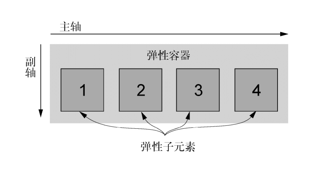
# Flexbox 的原则
给元素添加display: flex,该元素变成了一个弹性容器(flex container),它的直接子元素变成了弹性子元素(flex item)。
特性:
- 弹性子元素默认是在同一行按照从左到右的顺序并排排列
- 弹性容器像块元素一样填满可用宽度,但是弹性子元素不一定填满其弹性容器的宽度
- 弹性子元素高度相等,该高度由它们的内容决定
还可以用 display: inline-flex 。它创建了一个弹性容器,行为类似于 inline-block 元素。它会跟其他行内元素一起流式排列,但不会自动增长到 100% 的宽度。内部的弹性子元素跟使用 display: flex 创建的 Flexbox 里的弹性子元素行为一样。在实际开发时,很少用到 display: inline-flex。
一个弹性容器能控制内部元素的布局。子元素按照主轴线排列,主轴的方向为主起点(左)到主终点(右)。垂直于主轴的是副轴。方向从副起点(上)到副终点(下)。这些轴的方向可以改变。
基础页面
<html lang="en">
<head>
  <style>
    :root {
      box-sizing: border-box;
    }
    *, ::before, ::after {
      box-sizing: inherit;
    }

    body {
      background-color: #709b90;
      font-family: Helvetica, Arial, sans-serif;
    }
    body * + * {
      margin-top: 1.5em;
    }
    .container {
      max-width: 1080px;
      margin: 0 auto;
    }
  </style>
</head>
<body>
  <div class="container">
    <header>
      <h1>Ink</h1>
    </header>
    <nav>
      <ul class="site-nav">
        <li><a href="/">Home</a></li>
        <li><a href="/features">Features</a></li>
        <li><a href="/pricing">Pricing</a></li>
        <li><a href="/support">Support</a></li>
        <li class="nav-right">
          <a href="/about">About</a>
        </li>
      </ul>
    </nav>
    <main class="flex">
      <div class="column-main tile">
        <h1>Team collaboration done right</h1>
        <p>Thousands of teams from all over the
          world turn to <b>Ink</b> to communicate
          and get things done.</p>
      </div>
      <div class="column-sidebar">
        <div class="tile">
          <form class="login-form">
            <h3>Login</h3>
            <p>
              <label for="username">Username</label>
              <input id="username" type="text"
                name="username"/>
            </p>
            <p>
              <label for="password">Password</label>
              <input id="password" type="password"
                name="password"/>
            </p>
            <button type="submit">Login</button>
          </form>
        </div>
        <div class="tile centered">
          <small>Starting at</small>
          <div class="cost">
            <span class="cost-currency">$</span>
            <span class="cost-dollars">20</span>
            <span class="cost-cents">.00</span>
          </div>
          <a class="cta-button" href="/pricing">
            Sign up
          </a>
        </div>
      </div>
    </main>
  </div>
</body>
</html>
https://codepen.io/cellinlab/pen/NWXyEBE
# 创建一个基础的 Flexbox 菜单
- 行内元素给父元素贡献的高度会根据行高计算,而不是根据内边距和内容
- Flexbox 允许使用
margin: auto来填充弹性子元素之间的可用空间
<html lang="en">
<head>
  <style>
    :root {
      box-sizing: border-box;
    }
    *, ::before, ::after {
      box-sizing: inherit;
    }

    body {
      background-color: #709b90;
      font-family: Helvetica, Arial, sans-serif;
    }
    body * + * {
      margin-top: 1.5em;
    }
    .container {
      max-width: 1080px;
      margin: 0 auto;
    }

    .site-nav {
      display: flex;
      padding: .5em;
      background-color: #5f4b44;
      list-style-type: none;
      border-radius: .2em;
    }

    .site-nav > li {
      margin-top: 0; /* 覆盖猫头鹰选择器的顶部外边距 */
    }

    .site-nav > li > a {
      display: block; /* 变成块元素,以撑开父元素高度 */
      padding: .5em 1em;
      background-color: #cc6b5a;
      color: white;
      text-decoration: none;
    }
    .site-nav > li + li {
      margin-left: 1.5em;
    }
    .site-nav > .nav-right {
      margin-left: auto;
    }
  </style>
</head>
<body>
  <div class="container">
    <header>
      <h1>Ink</h1>
    </header>
    <nav>
      <ul class="site-nav">
        <li><a href="/">Home</a></li>
        <li><a href="/features">Features</a></li>
        <li><a href="/pricing">Pricing</a></li>
        <li><a href="/support">Support</a></li>
        <li class="nav-right">
          <a href="/about">About</a>
        </li>
      </ul>
    </nav>
    <main class="flex">
      <div class="column-main tile">
        <h1>Team collaboration done right</h1>
        <p>Thousands of teams from all over the
          world turn to <b>Ink</b> to communicate
          and get things done.</p>
      </div>
      <div class="column-sidebar">
        <div class="tile">
          <form class="login-form">
            <h3>Login</h3>
            <p>
              <label for="username">Username</label>
              <input id="username" type="text"
                name="username"/>
            </p>
            <p>
              <label for="password">Password</label>
              <input id="password" type="password"
                name="password"/>
            </p>
            <button type="submit">Login</button>
          </form>
        </div>
        <div class="tile centered">
          <small>Starting at</small>
          <div class="cost">
            <span class="cost-currency">$</span>
            <span class="cost-dollars">20</span>
            <span class="cost-cents">.00</span>
          </div>
          <a class="cta-button" href="/pricing">
            Sign up
          </a>
        </div>
      </div>
    </main>
  </div>
</body>
</html>
https://codepen.io/cellinlab/pen/qBpxLQK
# 弹性子元素的大小
flex 属性控制弹性子元素在主轴方向上的大小(在这里指的元素的宽度)。
在 CSS 里,不仅要考虑当前网页的内容,还要考虑内容变化后的情况,或者是相同的样式表作用到相似网页上的情况。
flex 属性是三个不同大小属性的简写:flex-grow、flex-shrink 和 flex-basis。flex: 2 等价于 flex: 2 1 0%。
# flex-basis
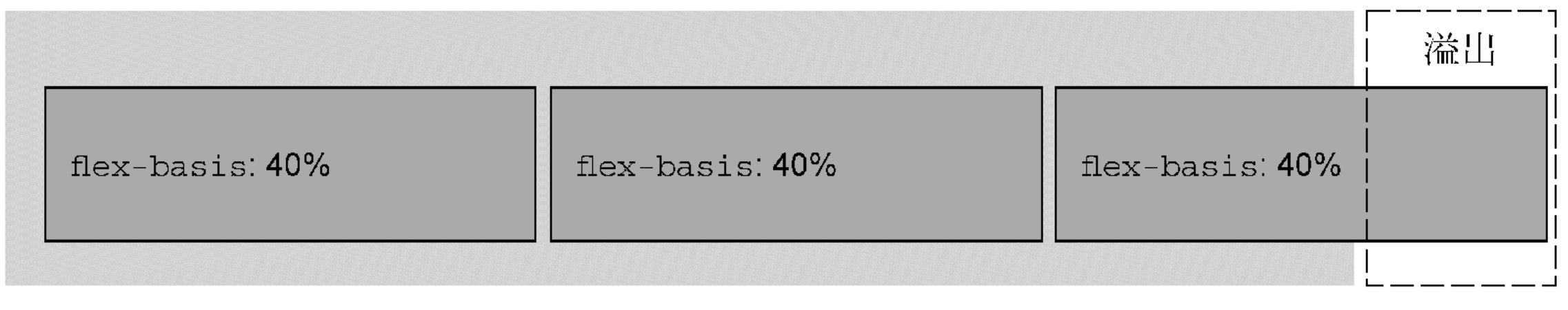
flex-basis 定义了元素大小的基准值,即一个初始的“主尺寸”。flex-basis 属性可以设置为任意的 width 值,包括 px、em、百分比。它的初始值是 auto,此时浏览器会检查元素是否设置了width 属性值。如果有,则使用 width 的值作为 flex-basis 的值;如果没有,则用元素内容自身的大小。如果flex-basis 的值不是 auto,width 属性会被忽略。
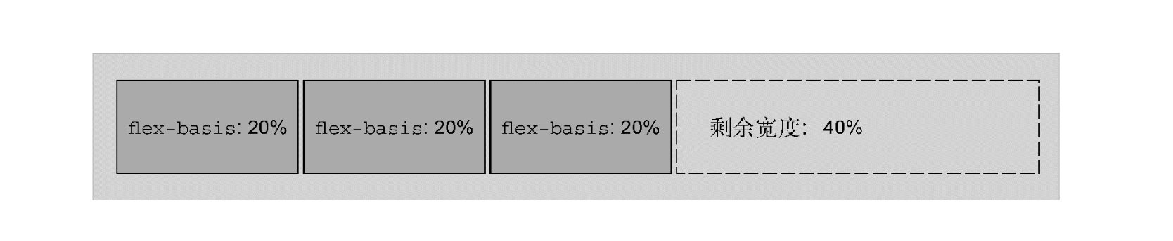
每个弹性子元素的初始主尺寸确定后,它们可能需要在主轴方向扩大或者缩小来适应(或者填充)弹性容器的大小。这时候就需要 flex-grow 和 flex-shrink 来决定缩放的规则。
# flex-grow
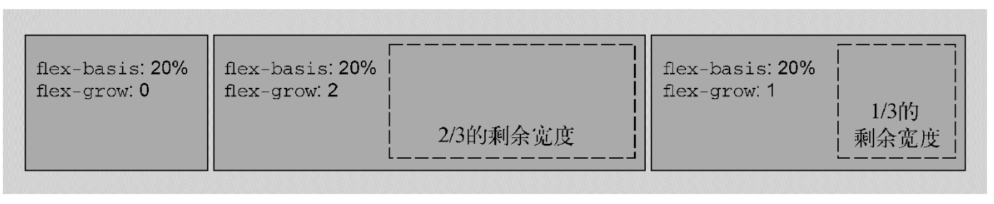
每个弹性子元素的 flex-basis 值计算出来后,它们(加上子元素之间的外边距)加起来会占据一定的宽度。加起来的宽度不一定正好填满弹性容器的宽度,可能会有留白。这时候,flex-grow 就是用来决定这些留白的。
多出来的留白(或剩余宽度)会按照 flex-grow (增长因子)的值分配给每个弹性子元素,flex-grow 的值为非负整数。如果一个弹性子元素的 flex-grow 值为 0,那么它的宽度不会超过 flex-basis 的值;如果某个弹性子元素的增长因子非 0,那么这些元素会增长到所有的剩余空间被分配完,也就意味着弹性子元素会填满容器的宽度。
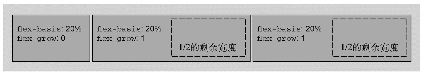
flex-grow 的值越大,元素的“权重”越高,也就会占据更大的剩余宽度。一个 flex-grow: 2 的子元素增长的宽度为 flex-grow: 1 的子元素的两倍。
# flex-shrink
flex-shrink 属性与 flex-grow 遵循相似的原则。计算出弹性子元素的初始主尺寸后,它们的累加值可能会超出弹性容器的可用宽度。如果不用 flex-shrink,就会导致溢出。
每个子元素的 flex-shrink 值代表了它是否应该收缩以防止溢出。如果某个子元素为 flex-shrink: 0,则不会收缩;如果值大于 0,则会收缩至不再溢出。按照 flex-shrink 值的比例,值越大的元素收缩得越多。
# 实际应用
<html lang="en">
<head>
  <meta charset="UTF-8">
  <meta http-equiv="X-UA-Compatible" content="IE=edge">
  <meta name="viewport" content="width=device-width, initial-scale=1.0">
  <title>Document</title>
  <style>
    .flex {
      display: flex;
      background-color: lightblue;
    }
    .item {
      background-color: antiquewhite;
      border: salmon 1px solid;
    }
    .flex:nth-of-type(2) .item:nth-of-type(1) {
      flex: 0 0 300px;
    }
    .flex:nth-of-type(2) .item:nth-of-type(2) {
      flex: 1;
    }

    .flex:nth-of-type(3) .item:nth-of-type(1) {
      flex: 0 0 200px;
    }
    .flex:nth-of-type(3) .item:nth-of-type(2) {
      flex: 1;
    }
    .flex:nth-of-type(3) .item:nth-of-type(3) {
      flex: 0 0 200px;
    }

    .flex:nth-of-type(4) .item:nth-of-type(1) {
      flex: 50%;
    }
    .flex:nth-of-type(4) .item:nth-of-type(2) {
      flex: 25%;
    }
    .flex:nth-of-type(4) .item:nth-of-type(3) {
      flex: 25%;
    }
  </style>
</head>
<body>
  <p>子元素随着自身宽度扩展,不一定填满容器宽度</p>
  <div class="flex">
    <div class="item">flex:none</div>
    <div class="item">flex:none</div>
    <div class="item">flex:none</div>
  </div>
  <p>第一个元素固定 300px ,第二个填满剩下的</p>
  <div class="flex">
    <div class="item">flex: 0 0 300px</div>
    <div class="item">flex: 1</div>
  </div>
  <p>圣杯布局,两边固定,左右填满</p>
  <div class="flex">
    <div class="item">flex: 0 0 200px</div>
    <div class="item">flex: 1</div>
    <div class="item">flex: 0 0 200px</div>
  </div>
  <p>子元素扩展到指定百分比宽度,可以用来构建网格系统</p>
  <div class="flex">
    <div class="item">flex: 50%</div>
    <div class="item">flex: 25%</div>
    <div class="item">flex: 25%</div>
  </div>
</body>
</html>
https://codepen.io/cellinlab/pen/GRyQeEM
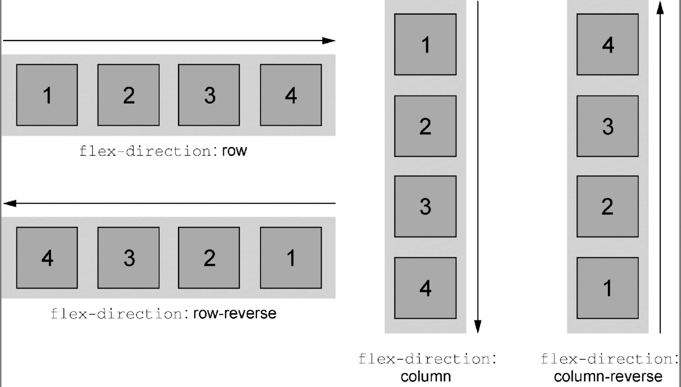
# 弹性方向
Flexbox 的另一个重要功能是能够切换主副轴方向,用弹性容器的 flex-direction 属性控制。
<html lang="en">
<head>
  <style>
    :root {
      box-sizing: border-box;
    }
    *, ::before, ::after {
      box-sizing: inherit;
    }

    body {
      background-color: #709b90;
      font-family: Helvetica, Arial, sans-serif;
    }
    body * + * {
      margin-top: 1.5em;
    }
    .container {
      max-width: 1080px;
      margin: 0 auto;
    }

    .site-nav {
      display: flex;
      padding: .5em;
      background-color: #5f4b44;
      list-style-type: none;
      border-radius: .2em;
    }

    .site-nav > li {
      margin-top: 0; /* 覆盖猫头鹰选择器的顶部外边距 */
    }

    .site-nav > li > a {
      display: block; /* 变成块元素,以撑开父元素高度 */
      padding: .5em 1em;
      background-color: #cc6b5a;
      color: white;
      text-decoration: none;
    }
    .site-nav > li + li {
      margin-left: 1.5em;
    }
    .site-nav > .nav-right {
      margin-left: auto;
    }

    .tile {
      padding: 1.5em;
      background-color: #fff;
    }
    .flex {
      display: flex;
    }
    .flex > * + * {
      margin-top: 0;
      margin-left: 1.5em;
    }

    .column-main {
      flex: 2;
    }
    .column-sidebar {
      flex: 1;
      display: flex;
      flex-direction: column;
    }
    .column-sidebar > .tile {
      flex: 1;
    }

    .login-form h3 {
      margin: 0;
      font-size: .9em;
      font-weight: bold;
      text-align: right;
      text-transform: uppercase
    }
    .login-form input:not([type=checkbox]):not([type=radio]) {
      display: block;
      width: 100%;
      margin-top: 0;
    }
    .login-form button {
      margin-top: 1em;
      border: 1px solid #cc6b5a;
      background-color: white;
      padding: .5em 1em;
      cursor: pointer;
    }
  </style>
</head>
<body>
  <div class="container">
    <header>
      <h1>Ink</h1>
    </header>
    <nav>
      <ul class="site-nav">
        <li><a href="/">Home</a></li>
        <li><a href="/features">Features</a></li>
        <li><a href="/pricing">Pricing</a></li>
        <li><a href="/support">Support</a></li>
        <li class="nav-right">
          <a href="/about">About</a>
        </li>
      </ul>
    </nav>
    <main class="flex">
      <div class="column-main tile">
        <h1>Team collaboration done right</h1>
        <p>Thousands of teams from all over the
          world turn to <b>Ink</b> to communicate
          and get things done.</p>
        <h1>Communication around the globe</h1>
        <p>Thousands of teams from all over the
          world turn to <b>Ink</b> to communicate
          and get things done.</p>
        <h1>Instant access to your team's documents</h1>
        <p>Thousands of teams from all over the
          world turn to <b>Ink</b> to communicate
          and get things done.</p>
        <h1>Intuitive interface</h1>
        <p>Thousands of teams from all over the
          world turn to <b>Ink</b> to communicate
          and get things done.</p>
      </div>
      <div class="column-sidebar">
        <div class="tile">
          <form class="login-form">
            <h3>Login</h3>
            <p>
              <label for="username">Username</label>
              <input id="username" type="text"
                name="username"/>
            </p>
            <p>
              <label for="password">Password</label>
              <input id="password" type="password"
                name="password"/>
            </p>
            <button type="submit">Login</button>
          </form>
        </div>
        <div class="tile centered">
          <small>Starting at</small>
          <div class="cost">
            <span class="cost-currency">$</span>
            <span class="cost-dollars">20</span>
            <span class="cost-cents">.00</span>
          </div>
          <a class="cta-button" href="/pricing">
            Sign up
          </a>
        </div>
      </div>
    </main>
  </div>
</body>
</html>
https://codepen.io/cellinlab/pen/JjMpVvp
水平弹性盒子的大部分概念同样适用于垂直的弹性盒子(column 或 column-reverse),但是有一点不同:在 CSS 中处理高度的方式与处理宽度的方式在本质上不一样。弹性容器会占据 100% 的可用宽度,而高度则由自身的内容来决定。即使改变主轴方向,也不会影响这一本质。
弹性容器的高度由弹性子元素决定,它们会正好填满容器。在垂直的弹性盒子里,子元素的 flex-grow 和 flex-shrink 不会起作用,除非有“外力”强行改变弹性容器的高度。
# 对齐、间距等细节
通常情况下,创建一个弹性盒子需要用到前面提及的这些方法。选择一个容器及其子元素,给容器设置display: flex 如有必要,给容器设置 flex-direction 给弹性子元素设置外边距和/或 flex 值,用来控制它们的大小将元素大致摆放到合适的位置后,就可以按需添加其他的 flexbox 属性了。
# 理解弹性容器的属性
- flex-direction
- 指定了主轴方向,副轴垂直于主轴
- flex-wrap
- 指定弹性子元素是否会在弹性容器内折行
- 值:nowrap | wrap | wrap-reverse
- flex-flow
flex-flow: <flex-direction> <flex-wrap>简写
- justify-content
- 控制子元素在主轴上的位置
- 值:flex-start | flex-end | center | space-between | space-around
- align-items
- 控制子元素在副轴上的位置
- 值:flex-start | flex-end | center | baseline | stretch
- align-content
- 如果开启了 flex-wrap, align-content 将控制子元素在副轴上的间距
- 如果子元素没有换行,该属性被忽略
- 值:flex-start | flex-end | center | space-between | space-around | stretch
# 理解子元素的属性
- flex-grow
- 整数,指定增长因子,决定子元素在主轴方向扩展的大小,用于填充未使用的空间
- flex-shrink
- 整数,指定收缩因子,决定子元素在主轴方向收缩的大小,防止溢出。
- 如果开启了 flex-wrap 则会忽略该属性
- flex-basis
- 指定元素未受 flex-grow 和 flex-shrink 影响时的大小
- flex
flex: <flex-grow> <flex-shrink> <flex-basis>简写
- align-self
- 控制子元素在副轴上的对齐方式
- 会覆盖容器上的 align-items 属性值
- 如果子元素副轴方向上的外边距为
auto,则会忽略该属性 - 值:flex-start | flex-end | center | baseline | stretch
- order
- 整数,将弹性子元素从兄弟节点中移动到指定位置,覆盖源码顺序
谨慎使用order。让屏幕上的视觉布局顺序和源码顺序差别太大会影响网站的可访问性。
# 使用对齐属性
 <html lang="en">
<head>
  <style>
    :root {
      box-sizing: border-box;
    }
    *, ::before, ::after {
      box-sizing: inherit;
    }

    body {
      background-color: #709b90;
      font-family: Helvetica, Arial, sans-serif;
    }
    body * + * {
      margin-top: 1.5em;
    }
    .container {
      max-width: 1080px;
      margin: 0 auto;
    }

    .site-nav {
      display: flex;
      padding: .5em;
      background-color: #5f4b44;
      list-style-type: none;
      border-radius: .2em;
    }

    .site-nav > li {
      margin-top: 0; /* 覆盖猫头鹰选择器的顶部外边距 */
    }

    .site-nav > li > a {
      display: block; /* 变成块元素,以撑开父元素高度 */
      padding: .5em 1em;
      background-color: #cc6b5a;
      color: white;
      text-decoration: none;
    }
    .site-nav > li + li {
      margin-left: 1.5em;
    }
    .site-nav > .nav-right {
      margin-left: auto;
    }

    .tile {
      padding: 1.5em;
      background-color: #fff;
    }
    .flex {
      display: flex;
    }
    .flex > * + * {
      margin-top: 0;
      margin-left: 1.5em;
    }

    .column-main {
      flex: 2;
    }
    .column-sidebar {
      flex: 1;
      display: flex;
      flex-direction: column;
    }
    .column-sidebar > .tile {
      flex: 1;
    }

    .login-form h3 {
      margin: 0;
      font-size: .9em;
      font-weight: bold;
      text-align: right;
      text-transform: uppercase
    }
    .login-form input:not([type=checkbox]):not([type=radio]) {
      display: block;
      width: 100%;
      margin-top: 0;
    }
    .login-form button {
      margin-top: 1em;
      border: 1px solid #cc6b5a;
      background-color: white;
      padding: .5em 1em;
      cursor: pointer;
    }

    .centered {
      text-align: center;
    }
    .cost {
      display: flex;
      justify-content: center;
      align-items: center;
      line-height: .7;
    }
    .cost > span {
      margin-top: 0;
    }
    .cost-currency {
      font-size: 2rem;
    }
    .cost-dollars {
      font-size: 4rem;
    }
    .cost-cents {
      font-size: 1.5rem;
      align-self: flex-start;
    }
    .cta-button {
      display: block;
      background-color: #cc6b5a;
      color: white;
      padding: .5em 1em;
      text-decoration: none;
    }
  </style>
</head>
<body>
  <div class="container">
    <header>
      <h1>Ink</h1>
    </header>
    <nav>
      <ul class="site-nav">
        <li><a href="/">Home</a></li>
        <li><a href="/features">Features</a></li>
        <li><a href="/pricing">Pricing</a></li>
        <li><a href="/support">Support</a></li>
        <li class="nav-right">
          <a href="/about">About</a>
        </li>
      </ul>
    </nav>
    <main class="flex">
      <div class="column-main tile">
        <h1>Team collaboration done right</h1>
        <p>Thousands of teams from all over the
          world turn to <b>Ink</b> to communicate
          and get things done.</p>
        <h1>Communication around the globe</h1>
        <p>Thousands of teams from all over the
          world turn to <b>Ink</b> to communicate
          and get things done.</p>
        <h1>Instant access to your team's documents</h1>
        <p>Thousands of teams from all over the
          world turn to <b>Ink</b> to communicate
          and get things done.</p>
        <h1>Intuitive interface</h1>
        <p>Thousands of teams from all over the
          world turn to <b>Ink</b> to communicate
          and get things done.</p>
      </div>
      <div class="column-sidebar">
        <div class="tile">
          <form class="login-form">
            <h3>Login</h3>
            <p>
              <label for="username">Username</label>
              <input id="username" type="text"
                name="username"/>
            </p>
            <p>
              <label for="password">Password</label>
              <input id="password" type="password"
                name="password"/>
            </p>
            <button type="submit">Login</button>
          </form>
        </div>
        <div class="tile centered">
          <small>Starting at</small>
          <div class="cost">
            <span class="cost-currency">$</span>
            <span class="cost-dollars">20</span>
            <span class="cost-cents">.00</span>
          </div>
          <a class="cta-button" href="/pricing">
            Sign up
          </a>
        </div>
      </div>
    </main>
  </div>
</body>
</html>本文参与 腾讯云自媒体同步曝光计划,分享自作者个人站点/博客。
原始发表:2022/4/6,如有侵权请联系 cloudcommunity@tencent.com 删除
评论
登录后参与评论
推荐阅读
目录
腾讯云开发者

Copyright © 2013 - 2026 Tencent Cloud. All Rights Reserved. 腾讯云 版权所有
深圳市腾讯计算机系统有限公司 ICP备案/许可证号:粤B2-20090059  粤公网安备44030502008569号
腾讯云计算(北京)有限责任公司 京ICP证150476号 | 京ICP备11018762号