前端面试实录CSS篇(最近一周)

前端面试实录CSS篇(最近一周)
Immerse
发布于 2024-03-13 14:50:04
发布于 2024-03-13 14:50:04
代码可运行
运行总次数:0
代码可运行
前端面试实录CSS篇
1. CSS 选择器以及优先级?
- • CSS 选择器 选择器格式优先级权重id 选择器#id100类选择器.classname10属性选择器[title]/[title="one"]10伪类选择器div:hover10标签选择器div1伪元素选择器input::after1子选择器ul>li0后代选择器li a0通配符选择器*0
- • CSS 选择器优先级
- • 参考 MDN:
https://developer.mozilla.org/zh-CN/docs/Web/CSS/Specificity
- 1. !important 例外,优先级最高
- 2. 内联样式
- 3. id 选择器
- 4. 类选择器,属性选择器,伪类选择器
- 5. 标签选择器,伪元素选择器
- 6. 子选择器,后代选择器,通配符选择器
- • 参考 MDN:
- • 选择器权重
- • 参考 W3C:
https://www.w3.org/TR/selectors/#specificity - • 例子:
./Demo/css_selector_and_priority.html
- • 参考 W3C:
2. link 和 @import 的区别?
- •
link: 链接外部资源的标签,此标签决定了文档与外部资源的关系,常用于链接样式表(css),网页站点图标(favicon)。- • 用法;
<link rel="stylesheet,icon,image/png,shortlink,help,author,image/svg+xml" href="网络路径/相对路径/绝对路径"/> - • 属性:
- 1. rel: 表示关系:realtionship,
- 2. href: 网络路径/相对路径/绝对路径
- 3. size: icon 的大小
- 4. disabled: 仅对 rel = "stylesheet" 类型生效
- • 用法;
- • 区别:
- 1. 从属差异:link 为 html 标签,可以加载 css, 也可以引入网站图标(facaion), 定义 rel 链接属性,而 @import 是 css 提供,只能用于加载 css
- 2. 加载差异:link 引用的 css,在页面加载时同时加载。而 @import 在页面加载完后才加载
- 3. 兼容性:link 是 html 标签,没有兼容问题。而 @ import 是 css2.1 提出的,IE5 以下的浏览器不支持。
- 4. 可操作性:link 可使用 js 来控制 DOM 去改变样式,而 @import 不支持,因为 DOM 方法是基于文档的。
- 5. 权重差异:
- • 在样式中:link 样式的权重高于 @import 的权重吗,例如:
/* @import "03.css"; */
body,
html {
    background-color: aquamarine;
}
/* @import "03.css"; */- • 在页面中:不存在权重问题,谁在最低下就使用谁的样式
<!DOCTYPE html>
<html lang="en">
    <head>
        <meta charset="UTF-8" />
        <meta http-equiv="X-UA-Compatible" content="IE=edge" />
        <meta
            name="viewport"
            content="width=device-width, initial-scale=1.0"
        />
        <title>Document</title>
    </head>
    <body>
        <div class="container"></div>
    </body>
</html>
<link rel="stylesheet" href="./01.css" />
<style>
    @import "./03.css";
</style>
3. 对盒模型的理解?
- • 组成:由四部分组成:margin, padding, border, content
- • 分类:标准盒模型 和 怪异盒模型(IE 盒模型)
- • 标准盒模型:width 和 height 的范围只包含了 content
- • 怪异盒模型:width 和 height 的范围只包含了 border, padding, content
- • 两者区别:在于 width 和 height 所包含的范围不同
- • 属性:
- • 标准盒模型:
box-sizing: content-box; - • 怪异盒模型:
box-sizing: border-box;
- • 标准盒模型:
4. 隐藏元素的方法有哪些?
- 1.
display: none;: 不会渲染该元素,不会占位,也不会响应绑定的监听事件 - 2.
visibility: hidden;: 会渲染,但是不会显示且会占位,也不会响应绑定的监听事件 - 3.
opacity: 0;: 将元素的透明度设置为 0, 以此来达到隐藏元素的效果,会占位,能够响应绑定的监听事件 - 4.
position: absolute;: 使用绝对定位将元素移除了可视区域外,不会占位,以此来实现元素的隐藏 - 5.
z-index:负值;: 使用其他元素将该元素隐藏,会占位 - 6.
clip:position:absolute; clip: rect(200px, 200px, 200px, 200px);/clip-path:clip-path: circle(0);: 使用元素裁切的 方式实现元素隐藏,会占位,不会响应绑定的监听事件 - 7.
transform: scale(0,0): 使用缩放,来实现元素的隐藏,会占位,但是不会响应绑定的监听事件 - 8.
filter: opacity(0): 使用元素滤镜来改变元素的透明度, 会占位
5. 伪元素和伪类的区别和作用?
- • 伪类:将某种状态时添加到已有元素上,这个状态是根据用户的行为变化而变化为的。比如: hover,active, visited
- • 伪元素:用于创建一些原本不在文档树中的元素或样式, 比如:::after,::before。
- • 区别:
- • 伪类操作的对象是文档树种已有的元素或样式
- • 伪元素则是创建一个文档树以外的元素或样式
- • : 表示伪类
- • :: 表示伪元素
- • 作用:
- • 伪类:通过在元素选择器上加入伪类改变元素的状态
- • 伪元素:通过对元素的操作进而改变元素
6. CSS3 有哪些新特性?
- • 圆角:
border-radius: 8px; - • 阴影:
text-shadown: 2px 2px #ff0000; box-shadown: 10px 10px 5px #888888; - • 文字方向:
text-decoration - • 渐变:
linear-gradient: 线性渐变 radial-gradient 径向渐变 - • 旋转:
transform - • css选择器:
伪类选择器:first-child, 伪元素选择器,否定选择器(:not),属性选择器[title="one"] - • 多列布局:
multi-column:- • column: 规定列宽和列数
- • column-count: 列的数量
- • column-width: 列宽
- • column-gap: 列间隙
- • column-rule: 列之间的宽度,样式和颜色
- • column-span:
- • column-fill: 列填充:auto: 根据内容填充。balance: 每列平均
7. 对媒体查询的理解?
- • 使用
@media查询,可针对不同的媒体类型定义不同的样式,@media 可针对不同的屏幕尺寸设置不同的样式,特别是设置响应式的页面, @media 非常有用。当重置浏览器大小的过程中,页面会根据浏览器的宽度和高度重新渲染页面。
8. 对 BFC 的理解,如何创建 BFC?
- • 定义:
- • Box: CSS 布局的对象和基本单位,一个页面由很多个 box 组成,这个 Box 就是我们常说的盒模型
- • Formatting context: 块级格式化上下文,页面中的一个渲染区域,有一套渲染规则,它决定了其子元素如何定位,以及其他元素的关系和相互作用。
- • 理解:BFC(Block Formatting Context, BFC) 块级格式化上下文,页面布局盒模型的一种 CSS 渲染模式,是一个独立的容器,在这个容器中里面的元素和外部的元素互不影响。
- • 创建 BFC 的条件:
- 1. 根元素:html,body
- 2. 浮动:float 除 none 以外的值
- 3. 定位:position 为绝对定位(absoluate) 和 固定定位(fixed)
- 4. dispaly 属性:表格布局(grid: table-cell,table-caption) 和 flex(flex-items,flow-root) 布局
- 5. multi column(多列布局): column
- 6. overflow: 值为 hidden, auto, scroll
- • BFC 的特点:
- 1. 垂直方向上,自上而下排列,和文档流的排列方式一致
- 2. 在 BFC 中上下两个相邻的两个容器的 margin 会重叠
- 3. 计算 BFC 的高度时,需要计算浮动元素的高度
- 4. BFC 区域不会与浮动的容器发生重叠
- 5. BFC 是独立的容器,容器内部的元素不会影响外部元素
- 6. 每个元素的 margin-left 值和容器的 border-left 相接触
- • BFC 的作用:
- 1. 解决 margin 重叠问题:由于 BFC 是一个独立的区域,内部的元素和外部的元素互不影响,将两个元素变为两个 BFC,就解决了 margin 重叠的问题。
- 2. 解决高度塌陷问题:在对子元素设置浮动后,父元素会发生高度塌陷,也就是父元素的高度变为 0。解决这个问题,只需要把父元素变成一个 BFC。常用的办法是给父元素设置
overflow:hidden。 - 3. 创建自适应两栏布局:可以用来创建自适应两栏布局:左边的宽度固定,右边的宽度自适应。
9. 如何设置小于 12px 的字体?
- • 使用 webkit 内核的:
-webkit-text-size-adjust: none;。chrome 27 版本后不可用了。 - • 使用 css3 的 transform 属性:
transform: scale(0.5); - • 内容固定不变的情况下,将文字内容做成图片,使用图片来解决
10. 单行/多行文本溢出?
/* 多行文本溢出 */
display: -webkit-box; /*作为弹性伸缩盒子模型显示。 */
-webkit-box-orient:vertical;    /*设置伸缩盒子的子元素排列方式:从上到下垂直排列 */
-webkit-line-clamp:3;   /*显示的行数 */
overflow: hidden;   /*溢出隐藏 */
text-overflow: ellipsis;    /*溢出用省略号显示 */


/* 单行文本溢出 */
white-space: nowrap;    /*规定段落中的文本不进行换行 */
overflow: hidden;   /*溢出隐藏 */
text-overflow: ellipsis;    /*溢出用省略号显示 */
11. 实现一个三角形?
<!DOCTYPE html>
<html lang="en">
<head>
    <meta charset="UTF-8">
    <meta http-equiv="X-UA-Compatible" content="IE=edge">
    <meta name="viewport" content="width=device-width, initial-scale=1.0">
    <title>Document</title>
</head>
<body>
    <div class="div1"></div>
    <div class="div2"></div>
    <div class="div3"></div>
    <div class="div4"></div>
</body>
</html>
<style>
    div{
        width: 0px;
        height: 0px;
        border: 50px solid transparent;
    }
    .div1{
        border-top-color: red;
    }
    .div2{
        border-bottom-color: red;
    }
    .div3{
        border-left-color: red;
    }
    .div4{
        border-right-color: red;
    }
</style>
12. 实现一个扇形?
<!DOCTYPE html>
<html lang="en">
<head>
    <meta charset="UTF-8">
    <meta http-equiv="X-UA-Compatible" content="IE=edge">
    <meta name="viewport" content="width=device-width, initial-scale=1.0">
    <title>Document</title>
</head>
<body>
    <div class="div1"></div>
</body>
</html>
<style>
    .div1{
        width: 0;
        height: 0;
        border-radius: 100px;
        border: 100px solid transparent;
        border-top-color: red;
    }
</style>
13. 画一条0.5px的线?
- • 使用 transform 的 scale 来完成
width: 250px;
height: 1px;
background-color: gray;
transform: scaleY(0.5);
14. 常见的图片格式以及使用场景?
- 1. bmp: 无损的,此图片格式不会对数据进行压缩,所以 bmp 格式的图片通常都是较大文件
- 2. git: 无损的,特点是文件小,适用场景:对色彩要求不高且文件体积较小
- 3. jpeg,jpg: 有损的,有损压缩会导致图片模糊,文件类型比 gif 较大
- 4. png-8:无损的,png-8 比 gif 文件还小
- 5. png-24: 无损的,优点在于压缩了图片数据
- 6. svg: 无损矢量图,放大不会失真,适用场景:绘制 LOGO, Icon
- 7. webp: 同时支持有损和无损,同质量的图片,webp 拥有更小的文件体积,更好地提升用户体验,
- • 在无损压缩情况下:相同质量的 webp 图片,要比 png 小 26%
- • 在有损压缩情况下,具有相同精度的 webp 图片,文件大小要比 jpeg 小 25%~34%
- • webp 还支持图片透明度,一个无损压缩的 webp 图片,想要支持透明度,只需要 22% 的格外文件大小。
15. CSS 优化和提高性能的方法有哪些?
- • 加载性能
- 1. css 压缩
- 2. 减少使用属性简写方式
- 3. 减少使用 @import,建议使用 link,
- • 选择器性能
- 1. 减少选择器嵌套层级
- 2. 使用关键的选择器,不要逐层进行选择
- • 渲染性能
- 1. 慎重使用浮动和定位
- 2. 尽量减少重绘和回流的发生
- 3. 删除空规则,也就是预留样式->{}
- 4. 属性值为浮点值时,省略前面的 0
- 5. 不要使用 @import 前缀引用样式,会影响 css 加载速度
- 6. 避免选择器嵌套过深
- 7. 不滥用 web 字体
- • 可维护性,健壮性
- 1. 抽离公共样式
- 2. 样式与内容分离
16. ::before 和 :after 的双冒号和单冒号有什么区别?
- 1.
单冒号(:)表示伪类,双冒号(::)表示伪元素 - 2. 在 CSS2.1 中,伪元素都是使用
单冒号来表示伪元素的,但在 CSS3 规范中,伪元素的语法被修改为使用双冒号
17. CSS 预处理器/后处理器是什么?为什么要使用他们?
- • 预处理器:
less, sass, styuls,它们增加了 css 代码的复用性,例如:变量,循环,方法等 - • 后处理器:
postcss,最常做的是给 css 代码添加浏览器前缀,实现跨浏览器兼容性的问题、 - • 为什么要使用他们?
- 1. 结构清晰,便于扩展
- 2. 屏蔽浏览器私有语法的差异
- 3. 使用多重继承
- 4. 提到 css 代码的兼容性
18. z-index 会在什么情况下会失效?
- • 作用及含义:设置元素的堆叠顺序,值越大就越在上层
- • 检查以下情况:
- 1. 该元素是否设置了定位
- 2. 该元素的父级是否已经设置了z-index(检查需比较的元素是否同在一个层叠上下文)
- • z-index 属性会在下列情况中会失效:
- 1. 在设置 z-index 的元素上必须含有 position 属性为非 static 属性值(relative,absolute,fixed)。
- 2. 同一个父级元素下的元素层叠效果是受父级影响的,就是说如果你的父级z-index很小,那你子级设置再大也没有用
19. 常见的 css 布局单位?
- • 常用布局单位:
像素px,百分比%,em,rem,vw/vh- • vmin: vw 和 vh 的较小值
- • vmax: vw 和 vh 的较大值
- • em:文本相对长度单位,浏览器默认的字体尺寸为 16px;
- • rem: css3 新增的一个相对单位,是相对于根元素 html元素 的 font-size 的倍数,
- • css 像素:web 开发者提供,css 中的一个抽象单位
- • 物理像素:与设备的硬件密度相关,任何设备的物理像素都是固定的
- • 像素px: 页面布局基础,分为css 像素和物理像素
- • 百分比%: 实现响应式效果
- • em和rem: 相对于 px 更具灵活性,它们都是相对长度单位,区别为,em 相对于父元素,rem相对于子元素
- • vw/vh: 视图窗口单位,vw 宽度,vh 高度,还有 vmin 和 vmax 两个相关单位
20. px,em, rem 的区别以及使用场景?
- • 区别:
- • px: 固定像素,无法跟着页面大小而改变
- • em: em 和 rem 相对长度单位,长度不是固定的,会跟着页面大小而改变,更适用于响应式布局
- • em 相对于父元素来设置字体大小,而 rem 是相对于根元素来改变的
- • 使用场景:
- • 适配少部分的移动设备,且对分辨率对页面影响大小的可使用 px
- • 适配各种移动设备,使用 rem
21. 两栏布局的实现
- • 左边固定,右边自适应
- • 利用浮动,将左边元素宽度设置为 200px,并且设置向左浮动。将右边元素的 margin-left 设置为 200px,宽度设置为 auto(默认为 auto,撑满整个父元素)。
.outer {
  height: 100px;
}
.left {
  float: left;
  width: 200px;
  background: tomato;
}
.right {
  margin-left: 200px;
  width: auto;
  background: gold;
}- • 利用浮动,左侧元素设置固定大小,并左浮动,右侧元素设置 overflow: hidden; 这样右边就触发了 BFC,BFC 的区域不会与浮动元素发生重叠,所以两侧就不会发生重叠。
.left{
     width: 100px;
     height: 200px;
     background: red;
     float: left;
 }
 .right{
     height: 300px;
     background: blue;
     overflow: hidden;
}- • 利用 flex 布局,将左边元素设置为固定宽度 200px,将右边的元素设置为 flex:1。
.outer {
  display: flex;
  height: 100px;
}
.left {
  width: 200px;
  background: tomato;
}
.right {
  flex: 1;
  background: gold;
}- • 利用绝对定位,将父级元素设置为相对定位。左边元素设置为 absolute 定位,并且宽度设置为 200px。将右边元素的 margin-left 的值设置为 200px。
.outer {
  position: relative;
  height: 100px;
}
.left {
  position: absolute;
  width: 200px;
  height: 100px;
  background: tomato;
}
.right {
  margin-left: 200px;
  background: gold;
}- • 利用绝对定位,将父级元素设置为相对定位。左边元素宽度设置为 200px,右边元素设置为绝对定位,左边定位为 200px,其余方向定位为 0。
.outer {
  position: relative;
  height: 100px;
}
.left {
  width: 200px;
  background: tomato;
}
.right {
  position: absolute;
  top: 0;
  right: 0;
  bottom: 0;
  left: 200px;
  background: gold;
}
22. 三栏布局的实现
- • 左右两遍固定。中间自适应
- • 利用绝对定位,左右两栏设置为绝对定位,中间设置对应方向大小的 margin 的值。
.outer {
  position: relative;
  height: 100px;
}

.left {
  position: absolute;
  width: 100px;
  height: 100px;
  background: tomato;
}

.right {
  position: absolute;
  top: 0;
  right: 0;
  width: 200px;
  height: 100px;
  background: gold;
}

.center {
  margin-left: 100px;
  margin-right: 200px;
  height: 100px;
  background: lightgreen;
}- • 利用 flex 布局,左右两栏设置固定大小,中间一栏设置为 flex:1。
.outer {
  display: flex;
  height: 100px;
}

.left {
  width: 100px;
  background: tomato;
}

.right {
  width: 100px;
  background: gold;
}

.center {
  flex: 1;
  background: lightgreen;
}- • 利用浮动,左右两栏设置固定大小,并设置对应方向的浮动。中间一栏设置左右两个方向的 margin 值,注意这种方式,中间一栏必须放到最后:
.outer {
  height: 100px;
}

.left {
  float: left;
  width: 100px;
  height: 100px;
  background: tomato;
}

.right {
  float: right;
  width: 200px;
  height: 100px;
  background: gold;
}

.center {
  height: 100px;
  margin-left: 100px;
  margin-right: 200px;
  background: lightgreen;
}- • 圣杯布局,利用浮动和负边距来实现。父级元素设置左右的 padding,三列均设置向左浮动,中间一列放在最前面,宽度设置为父级元素的宽度,因此后面两列都被挤到了下一行,通过设置 margin 负值将其移动到上一行,再利用相对定位,定位到两边。
.outer {
  height: 100px;
  padding-left: 100px;
  padding-right: 200px;
}

.left {
  position: relative;
  left: -100px;

  float: left;
  margin-left: -100%;

  width: 100px;
  height: 100px;
  background: tomato;
}

.right {
  position: relative;
  left: 200px;

  float: right;
  margin-left: -200px;

  width: 200px;
  height: 100px;
  background: gold;
}

.center {
  float: left;

  width: 100%;
  height: 100px;
  background: lightgreen;
}- • 双飞翼布局,双飞翼布局相对于圣杯布局来说,左右位置的保留是通过中间列的 margin 值来实现的,而不是通过父元素的 padding 来实现的。本质上来说,也是通过浮动和外边距负值来实现的。
.outer {
  height: 100px;
}

.left {
  float: left;
  margin-left: -100%;

  width: 100px;
  height: 100px;
  background: tomato;
}

.right {
  float: left;
  margin-left: -200px;

  width: 200px;
  height: 100px;
  background: gold;
}

.wrapper {
  float: left;

  width: 100%;
  height: 100px;
  background: lightgreen;
}

.center {
  margin-left: 100px;
  margin-right: 200px;
  height: 100px;
}
23. 水平垂直居中的方式?
- 1. flex 布局
.parent {
    display: flex;
    justify-content:center;
    align-items:center;
}- 1. 绝对定位 + margin
.parent {
    position: relative;
}

.child {
    position: absolute;
    top: 50%;
    left: 50%;
    margin-top: -50px;     /* 自身 height 的一半 */
    margin-left: -50px;    /* 自身 width 的一半 */
}- 1. 绝对定位
.parent {
    position: relative;
}

.child {
    position: absolute;
    top: 0;
    bottom: 0;
    left: 0;
    right: 0;
    margin: auto;
}- 1. 绝对定位 + transform
.parent {
    position: relative;
}

.child {
    position: absolute;
    left: 50%;
    top: 50%;
    transform: translate(-50%,-50%);
}
24. 响应式设计的概念及基本原理?
- • 响应式设计:也就是一个网站能兼容多个终端,而不是每个终端做一个适配
- • 原理:通过媒体查询
@media查询检测不同的设备屏幕尺寸做处理 - • 关于兼容:页面头部必须要有 meta 声明的 viewport
25. position 的属性有哪些,区别是什么?
- • absolute: 绝对定位的元素的位置相对于最近的已定位父元素,如果元素没有已定位的父元素,那么它的位置相对于
- • relative: 相对定位元素的定位是相对其正常位置
- • fixed: 元素的位置相对于浏览器窗口是固定位置。即使窗口是滚动的它也不会移动:
- • static: HTML 元素的默认值,即没有定位,遵循正常的文档流对象。静态定位的元素不会受到 top, bottom, left, right影响。
- • inherit: 规定从父元素继承 position 属性的
- • sticky: 基于用户的滚动位置来定位
- • 前面三者的定位方式如下:
- • relative:元素的定位永远是相对于元素自身位置的,和其他元素没关系,也不会影响其他元素。
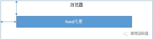
imgfixed:元素的定位是相对于 window (或者 iframe)边界的,和其他元素没有关系。但是它具有破坏性,会导致其他元素位置的变化。
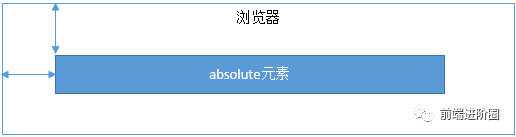
imgabsolute:元素的定位相对于前两者要复杂许多。如果为 absolute 设置了 top、left,浏览器会根据什么去确定它的纵向和横向的偏移量呢?答案是浏览器会递归查找该元素的所有父元素,如果找到一个设置了
position:relative/absolute/fixed的元素,就以该元素为基准定位,如果没找到,就以浏览器边界定位。如下两个图所示: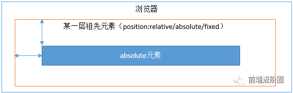
26. absolute 与 fixed 的共同点与不同点?
- • 共同点:
- • 改变行内元素的呈现方式,将 display 改为 inline-block
- • 使元素脱离普通文档流,不再占据文档物理空间
- • 覆盖非定位文档元素
- • 不同点:
- • absolute 与 fixed 的根元素不同,absolute 的根元素可设置,fixed 的根元素是html
- • 在有滚动的页面中,absolute 会跟随父元素进行滚动,而 fixed 固定在某个位置
27. 如何解决 1px 问题?
- • 1px 问题的本质:在一些
Retina屏幕上,移动端页面的 1px 会变得很粗,所呈现出来不止是 1px 的效果,原因就是 CSS 中的 1px 不能和移动端的 1px 划等号,他们之间是有一个比例关系。
window.devicePixelRatio = 设备的物理像素 / CSS像素。- • 解决方法:
- 1. 直接写 0.5px: 通过 js 拿到 window.devicePixelRatio 的值, 然后进行判断处理(如果是 1,则直接返回,否则 1 / window.devicePixelRatio),然后动态的设置 CSS 属性中的值,以此来达到 1px 的效果。
- • 缺点:兼容性不行, andriod 直接不兼容,ios 需要 8.0 以上的版本
<div id="container" data-device={{window.devicePixelRatio}}></div>- 1. 通过伪元素
#container[data-device="2"] {
    position: relative;
}
#container[data-device="2"]::after{
    position:absolute;
    top: 0;
    left: 0;
    width: 200%;
    height: 200%;
    content:"";
    transform: scale(0.5);
    transform-origin: left top;
    box-sizing: border-box;
    border: 1px solid #333;
}- • 缺点:代码较多,但兼容性好
- 1. viewport 缩放来解决
<meta name="viewport" content="initial-scale=0.5, maximum-scale=0.5, minimum-scale=0.5, user-scalable=no">- • 这里针对像素比为 2 的页面,把整个页面缩放为了原来的 1/2 大小。这样,本来占用 2 个物理像素的 1px 样式,现在占用的就是标准的一个物理像素。根据像素比的不同,这个缩放比例可以被计算为不同的值,用 js 代码实现如下:
const scale = 1 / window.devicePixelRatio;
// 这里 metaEl 指的是 meta 标签对应的 Dom
metaEl.setAttribute('content', `width=device-width,user-scalable=no,initial-scale=${scale},maximum-scale=${scale},minimum-scale=${scale}`);- • 缺点:整个页面都会被缩放
28. 如何判断元素进入可视区域?
- 1. offsetTop、scrollTop
- 2. getBoundingClientRect
- 3. Intersection Observer
`window.innerHeight` 是浏览器可视区的高度;
`document.body.scrollTop || document.documentElement.scrollTop` 是浏览器滚动的过的距离;
`imgs.offsetTop` 是元素顶部距离文档顶部的高度(包括滚动条的距离);
内容达到显示区域的:`img.offsetTop < window.innerHeight + document.body.scrollTop;`- • 方式一:offsetTop、scrollTop
// 公式

el.offsetTop - document.documentElement.scrollTop <= viewPortHeight

// 代码实现
function isInViewPortOfOne (el) {
    // viewPortHeight 兼容所有浏览器写法
    const viewPortHeight = window.innerHeight || document.documentElement.clientHeight || document.body.clientHeight
    const offsetTop = el.offsetTop
    const scrollTop = document.documentElement.scrollTop
    const top = offsetTop - scrollTop
    return top <= viewPortHeight
}- • 方式二:getBoundingClientRect
- • 返回值是一个 DOMRect对象,拥有left, top, right, bottom, x, y, width, 和 height属性
const target = document.querySelector('.target');
const clientRect = target.getBoundingClientRect();
console.log(clientRect);

// {
//   bottom: 556.21875,
//   height: 393.59375,
//   left: 333,
//   right: 1017,
//   top: 162.625,
//   width: 684
// }

// A:
// 如果一个元素在视窗之内的话,那么它一定满足下面四个条件:

// top 大于等于 0
// left 大于等于 0
// bottom 小于等于视窗高度
// right 小于等于视窗宽度


// 代码实现
function isInViewPort(element) {
    const viewWidth = window.innerWidth || document.documentElement.clientWidth;
    const viewHeight = window.innerHeight || document.documentElement.clientHeight;
    const {
        top,
        right,
        bottom,
        left,
    } = element.getBoundingClientRect();

    return (
        top >= 0 &&
        left >= 0 &&
        right <= viewWidth &&
        bottom <= viewHeight
    );
}- • 方式三:Intersection Observer
- • Intersection Observer 即重叠观察者,从这个命名就可以看出它用于判断两个元素是否重叠,因为不用进行事件的监听,性能方面相比getBoundingClientRect会好很多
- • 使用步骤主要分为两步:创建观察者和传入被观察者
// 第一步:创建观察者
const options = {
    // 表示重叠面积占被观察者的比例,从 0 - 1 取值,
    // 1 表示完全被包含
    threshold: 1.0,
    root:document.querySelector('#scrollArea') // 必须是目标元素的父级元素
};

const callback = (entries, observer) => { ....}

const observer = new IntersectionObserver(callback, options);

// 通过new IntersectionObserver创建了观察者 observer,传入的参数 callback 在重叠比例超过 threshold 时会被执行`
// 上段代码中被省略的 callback
const callback = function(entries, observer) {
    entries.forEach(entry => {
        entry.time;               // 触发的时间
        entry.rootBounds;         // 根元素的位置矩形,这种情况下为视窗位置
        entry.boundingClientRect; // 被观察者的位置举行
        entry.intersectionRect;   // 重叠区域的位置矩形
        entry.intersectionRatio;  // 重叠区域占被观察者面积的比例(被观察者不是矩形时也按照矩形计算)
        entry.target;             // 被观察者
    });
};


// 第二步:传入被观察者
const target = document.querySelector('.target');
observer.observe(target);- • 实现代码:前两种方法
<head>
    <meta charset="UTF-8">
    <meta http-equiv="X-UA-Compatible" content="IE=edge">
    <meta name="viewport" content="width=device-width, initial-scale=1.0">
    <script src="https://cdnjs.cloudflare.com/ajax/libs/jquery/3.6.3/jquery.min.js" integrity="sha512-STof4xm1wgkfm7heWqFJVn58Hm3EtS31XFaagaa8VMReCXAkQnJZ+jEy8PCC/iT18dFy95WcExNHFTqLyp72eQ==" crossorigin="anonymous" referrerpolicy="no-referrer"></script>
    <title>Document</title>
    <style>
        .container {
            display: flex;
            flex-wrap: wrap;
        }

        .target {
            margin: 5px;
            width: 20px;
            height: 20px;
            background: red;
        }
    </style>
</head>

<body>
    <div class="container"></div>
</body>

</html>
<script>
    (() => {
        const $container = $(".container");
        function createTargets() {
            const htmlString = new Array(10000).fill('<div class="target"></div>').join("")
            $container.html(htmlString)
        }
        createTargets();
        const $targets = $(".target");
        function isInViewPort(el){
            //方法1
            // const viewPortHeight = window.innerHeight || document.documentElement.clientHeight || document.body.clientHeight;
            // const offsetTop = el.offsetTop;
            // const scollTop = document.documentElement.scrollTop;
            // return offsetTop-scollTop <= viewPortHeight

            // 方法2
            const viewPortHeight = window.innerHeight || document.documentElement.clientHeight || document.body.clientHeight;
            const viewPortWidth = window.innerWidth || document.documentElement.clientWidth || document.body.clientWidth;
            const {top,right,left,bottom} = el.getBoundingClientRect();
            return top >= 0 && left >= 0 && bottom <= viewPortHeight && right <= viewPortWidth
        }

        //事件监听
        $(window).on("scroll",()=>{
            console.log("scroll!!");
            $targets.each((index,element)=>{
                if(isInViewPort(element)){
                    $(element).css("background-color","blue")
                }
            })
        })
    })();
</script>- • 第三种方法
<head>
    <meta charset="UTF-8">
    <meta http-equiv="X-UA-Compatible" content="IE=edge">
    <meta name="viewport" content="width=device-width, initial-scale=1.0">
    <script src="https://cdnjs.cloudflare.com/ajax/libs/jquery/3.6.3/jquery.min.js"
        integrity="sha512-STof4xm1wgkfm7heWqFJVn58Hm3EtS31XFaagaa8VMReCXAkQnJZ+jEy8PCC/iT18dFy95WcExNHFTqLyp72eQ=="
        crossorigin="anonymous" referrerpolicy="no-referrer"></script>
    <title>Document</title>
    <style>
        * {
            margin: 0;
            padding: 0;
        }

        .test {
            width: 200px;
            height: 1000px;
            background: orange;
        }

        .box {
            width: 150px;
            height: 150px;
            margin: 50px;
            background: red;
        }

        #sta {
            position: fixed;
            left: 40%;
            top: 40%;
            width: 200px;
            height: 100px;
            background: greenyellow;
        }
    </style>
</head>

<body>
    <div class="test">test</div>
    <div class="box">box</div>
    <div id="sta">初始化</div>
</body>

</html>
<script>
    (() => {
        var status_node=document.querySelector("#sta");
        const box = document.querySelector('.box');
        const intersectionObserver = new IntersectionObserver((entries) => {
            entries.forEach((item) => {
                if (item.isIntersecting) {
                    box.innerText = '进入可视区域';
                    status_node.innerText = '进入可视区域';
                    console.log('进入可视区域');
                }else{
                    box.innerText = '出去了';
                    status_node.innerText = '出去了';
                }
            })
        });
        intersectionObserver.observe(box);
    })();
</script>
特殊字符描述
•问题标注 Q:(question)
•答案标注 R:(result)
•注意事项标准:A:(attention matters)
•详情描述标注:D:(detail info)
•总结标注:S:(summary)
•分析标注:Ana:(analysis)
•提示标注:T:(tips)
本文参与 腾讯云自媒体同步曝光计划,分享自微信公众号。
原始发表:2023-04-02,如有侵权请联系 cloudcommunity@tencent.com 删除
评论
登录后参与评论
推荐阅读
目录
腾讯云开发者
