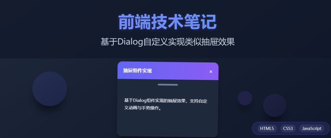
前端笔记:基于Dialog自定义实现类似抽屉效果
原创
前端笔记:基于Dialog自定义实现类似抽屉效果
原创
今天在维护vue2框架的一个业务系统遇到这样一个问题,有一个需求需要实现类似于购物车的效果,因为本身框架使用的是ElementUI框架,首先想到的就是使用官方提供的el-drawer。
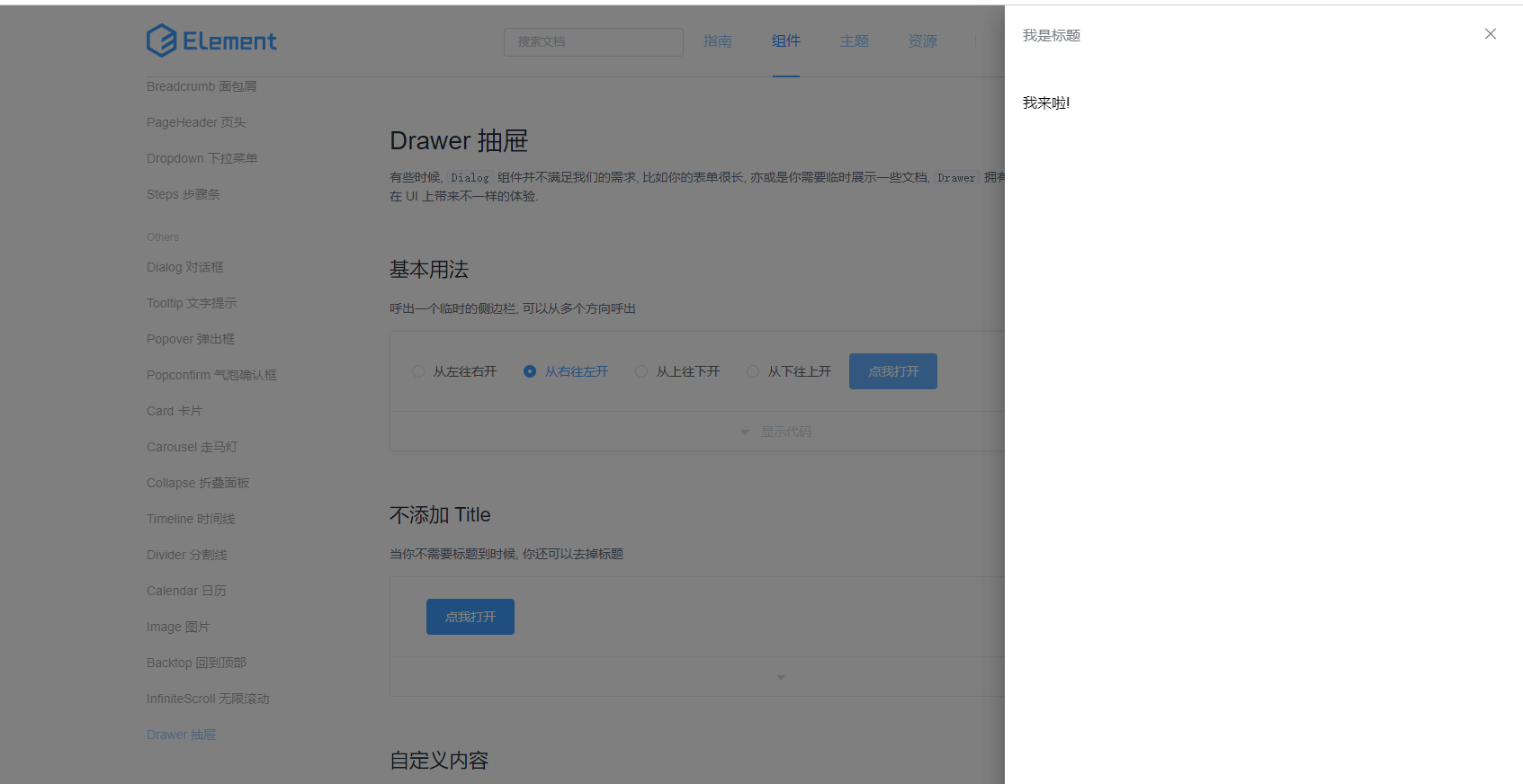
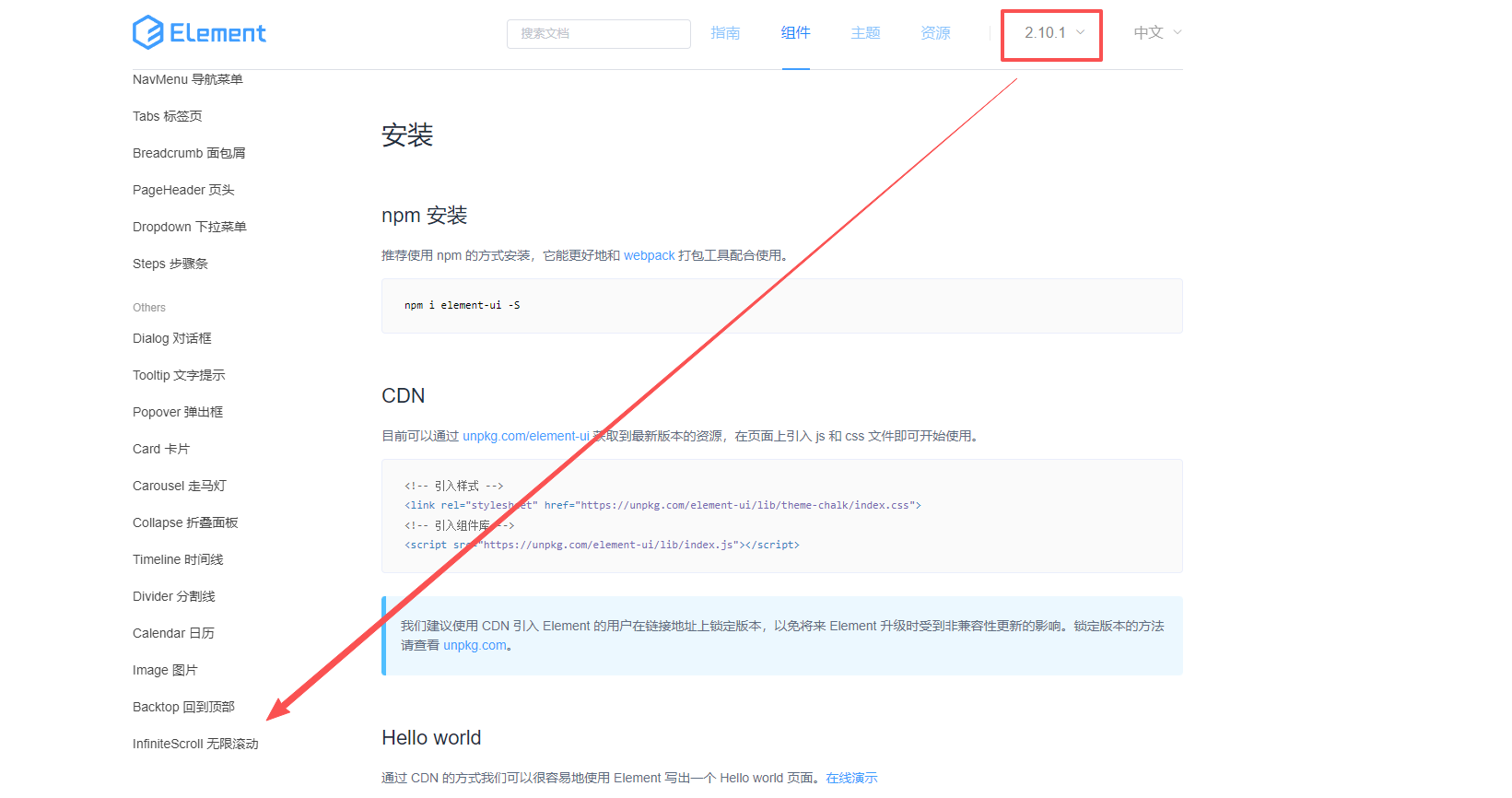
所以按照官方文档准备在现有系统写一个Demo,写完之后调试了半个小时。始终无法实现抽屉的效果。最后看了下elementui的版本是2.10.1,最后发现这个版本是不支持抽屉组件的。
考虑到属于老项目并且一直运行比较稳定,如果贸然升级elementui基础框架的话风险还是非常大的。最后决定基于ElementUI的Dialog组件自定义的方式来实现抽屉的效果。下面给大家分享具体实现的过程,感兴趣的前端朋友可以看一看!
二、代码介绍
这部分相对比较简单,直接使用Dialog组件的基本结构,然后通过自定义模板实现类似抽屉的标题栏和内容区域。
2.2 CSS部分
这部分是核心,需要定位对话框位置在页面最右侧,并且实现类似于抽屉从右向左滑动的效果。
定位与尺寸
- 使用
position: fixed将Dialog固定到视口右侧 - 设置
height: 100vh实现全高效果 - 通过
right: 0和top: 0定位到右上角 - 去除默认的圆角(
border-radius: 0)和边距(margin: 0)
动画效果
页面初始状态使用transform: translateX(100%)将Dialog对话框隐藏在右侧之外,需要打开对话框的时候通过CSS transition实现平滑的滑入效果。
.drawer-dialog {
  transform: translateX(100%);
  transition: transform 0.3s ease-out;
}

.drawer-dialog.dialog-fade-enter-active {
  transform: translateX(0);
}
2.3 JS部分
主要是实现抽屉的展示、隐藏逻辑、状态管理、计算抽屉的宽度功能。
2.4 完整的代码示例
<!DOCTYPE html>
<html lang="zh-CN">
<head>
<meta charset="UTF-8">
<meta name="viewport" content="width=device-width, initial-scale=1.0">
<title>右侧滑出抽屉组件</title>
<link rel="stylesheet" href="https://unpkg.com/element-ui/lib/theme-chalk/index.css">
<script src="https://cdn.jsdelivr.net/npm/vue@2.6.14/dist/vue.js"></script>
<script src="https://unpkg.com/element-ui/lib/index.js"></script>
<style>
* {
margin: 0;
padding: 0;
box-sizing: border-box;
}
body {
font-family: 'Helvetica Neue', Arial, sans-serif;
background: linear-gradient(135deg, #f5f7fa 0%, #c3cfe2 100%);
min-height: 100vh;
display: flex;
flex-direction: column;
align-items: center;
padding: 40px 20px;
color: #2c3e50;
}
.container {
max-width: 800px;
width: 100%;
text-align: center;
}
h1 {
margin-bottom: 20px;
font-weight: 500;
}
.description {
margin-bottom: 30px;
color: #5e6d82;
line-height: 1.6;
}
.control-panel {
background: white;
border-radius: 8px;
padding: 25px;
margin-bottom: 30px;
box-shadow: 0 4px 12px rgba(0, 0, 0, 0.1);
}
.button-group {
display: flex;
justify-content: center;
gap: 15px;
margin-bottom: 20px;
flex-wrap: wrap;
}
.demo-content {
background: white;
border-radius: 8px;
padding: 30px;
box-shadow: 0 4px 12px rgba(0, 0, 0, 0.1);
margin-bottom: 30px;
}
.demo-content p {
margin-bottom: 15px;
color: #5e6d82;
}
.status-info {
margin-top: 20px;
padding: 12px;
background: #f0f9ff;
border-radius: 4px;
border-left: 4px solid #409EFF;
}
/* 抽屉组件样式 */
.slide-drawer-mask {
position: fixed;
top: 0;
left: 0;
width: 100%;
height: 100%;
background-color: rgba(0, 0, 0, 0.5);
z-index: 9998;
}
.slide-drawer {
position: fixed;
top: 0;
right: 0;
height: 100%;
background: white;
box-shadow: -2px 0 12px rgba(0, 0, 0, 0.15);
display: flex;
flex-direction: column;
z-index: 9999;
}
.slide-drawer-header {
display: flex;
justify-content: space-between;
align-items: center;
padding: 16px 20px;
border-bottom: 1px solid #e6e9ed;
background-color: #f5f7fa;
}
.slide-drawer-title {
font-size: 16px;
font-weight: 600;
}
.slide-drawer-close {
cursor: pointer;
color: #909399;
font-size: 16px;
padding: 5px;
}
.slide-drawer-close:hover {
color: #409EFF;
}
.slide-drawer-body {
padding: 20px;
flex: 1;
overflow-y: auto;
}
/* 过渡动画 */
.fade-enter-active, .fade-leave-active {
transition: opacity 0.3s;
}
.fade-enter, .fade-leave-to {
opacity: 0;
}
.slide-right-enter-active, .slide-right-leave-active {
transition: transform 0.3s ease-out;
}
.slide-right-enter, .slide-right-leave-to {
transform: translateX(100%);
}
/* 响应式设计 */
@media (max-width: 768px) {
.button-group {
flex-direction: column;
align-items: center;
}
.slide-drawer {
width: 85% !important;
}
}
</style>
</head>
<body>
<div id="app">
<div class="container">
<h1>右侧滑出抽屉组件</h1>
<div class="control-panel">
<div class="button-group">
<el-button type="primary" @click="openDrawer">打开抽屉</el-button>
<el-button type="success" @click="openDrawer(0.25)">25%宽度</el-button>
<el-button type="warning" @click="openDrawer(0.5)">50%宽度</el-button>
<el-button type="danger" @click="openDrawer(0.75)">75%宽度</el-button>
</div>
</div>
<div class="demo-content">
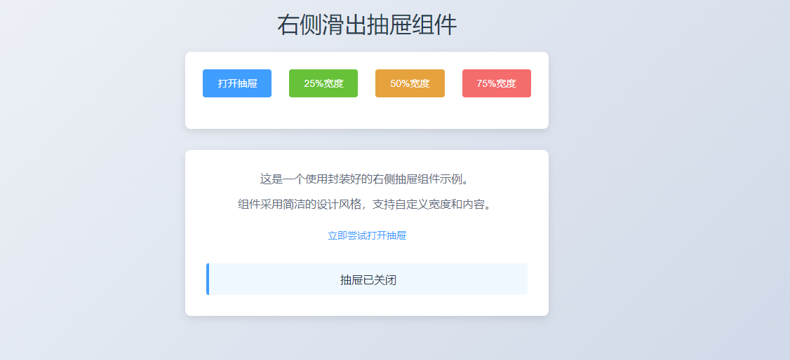
<p>这是一个使用封装好的右侧抽屉组件示例。</p>
<p>组件采用简洁的设计风格,支持自定义宽度和内容。</p>
<el-button type="text" @click="openDrawer">立即尝试打开抽屉</el-button>
<div class="status-info" v-if="statusMessage">
{{ statusMessage }}
</div>
</div>
</div>
<!-- 抽屉组件 -->
<slide-drawer
:visible="drawerVisible"
:width-ratio="drawerRatio"
title="右侧抽屉"
@close="handleClose">
<div class="drawer-content">
<p>这是从右侧滑出的抽屉内容</p>
<p>当前宽度: {{ Math.round(drawerRatio * 100) }}%</p>
<p>您可以在这里放置任何需要的内容</p>
<el-divider></el-divider>
<p>支持各种HTML元素和组件</p>
</div>
</slide-drawer>
</div>
<script>
// 定义抽屉组件
Vue.component('slide-drawer', {
props: {
visible: Boolean,
title: {
type: String,
default: '抽屉默认标题'
},
widthRatio: {
type: Number,
default: 0.3,
validator: value => value > 0 && value <= 1
},
customStyle: {
type: Object,
default: function() {
return {};
}
}
},
computed: {
drawerStyle() {
return {
width: `${this.widthRatio * 100}%`,
...this.customStyle
};
}
},
methods: {
close() {
this.$emit('close');
},
handleMaskClick() {
this.close();
}
},
template: `
<div v-if="visible">
<transition name="fade">
<div class="slide-drawer-mask" @click="handleMaskClick"></div>
</transition>
<transition name="slide-right">
<div class="slide-drawer" :style="drawerStyle">
<div class="slide-drawer-header">
<span class="slide-drawer-title">{{ title }}</span>
<span class="slide-drawer-close" @click="close">
<i class="el-icon-close"></i>
</span>
</div>
<div class="slide-drawer-body">
<slot></slot>
</div>
</div>
</transition>
</div>
`
});
new Vue({
el: '#app',
data() {
return {
drawerVisible: false,
drawerRatio: 0.3,
statusMessage: ''
};
},
methods: {
openDrawer(ratio) {
if (ratio) {
this.drawerRatio = ratio;
}
this.drawerVisible = true;
},
handleClose() {
this.drawerVisible = false;
this.statusMessage = '抽屉已关闭';
setTimeout(() => {
this.statusMessage = '';
}, 2000);
}
}
});
</script>
</body>
</html>2.5 运行效果
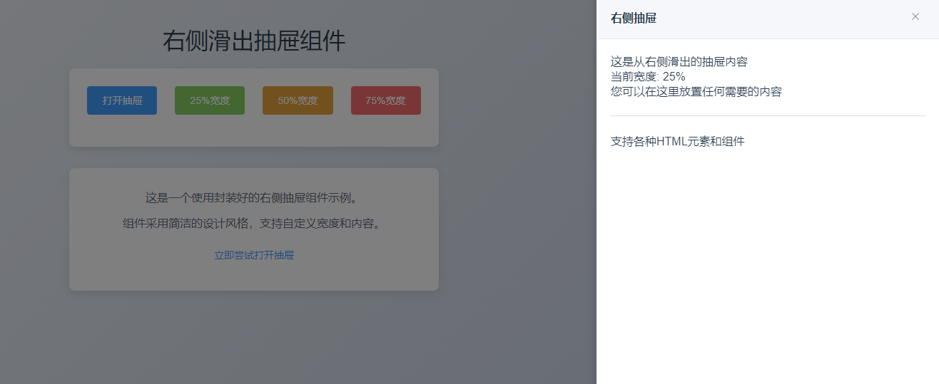
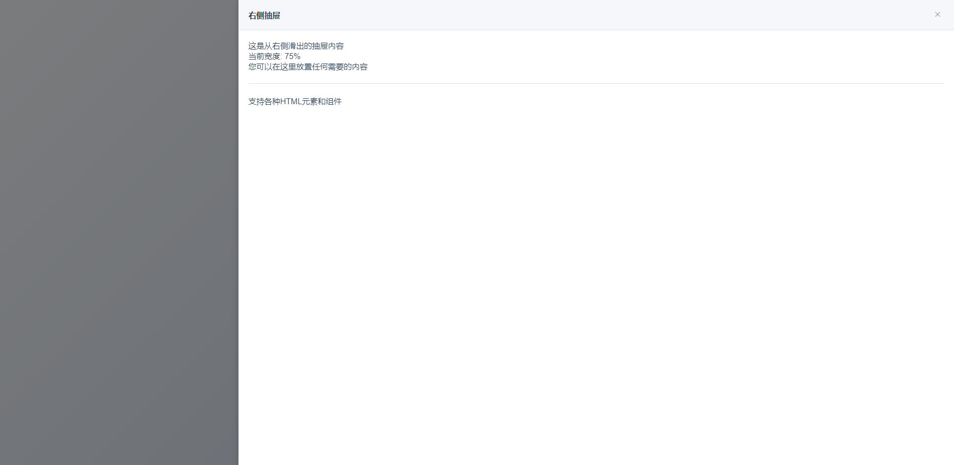
为了方面可以直接运行。这里直接采用了CDN方式引入js和css。复制代码后可以直接保存为html文件然后直接浏览器打开。预览效果如下:
首先测试点击25%宽度
然后测试点击75%宽度
三、总结
以上功能是一个相对比较简单的基于Dialog自定义实现类似抽屉效果的实用案例。对于一些老项目无法升级ElementUI基础框架且美观和业务相对简单的情况下还是值得推荐尝试的一种方案。如果是新项目推荐直接升级框架的方式最靠谱。官方提供的el-drawer才是最优的选择。当然大家如果使用过程中有啥问题的话可以评论区沟通交流!
原创声明:本文系作者授权腾讯云开发者社区发表,未经许可,不得转载。
如有侵权,请联系 cloudcommunity@tencent.com 删除。
原创声明:本文系作者授权腾讯云开发者社区发表,未经许可,不得转载。
如有侵权,请联系 cloudcommunity@tencent.com 删除。
腾讯云开发者
