
如何利用ggplot2生成加权均值图?
如何利用ggplot2生成加权均值图?
提问于 2022-01-04 22:14:43
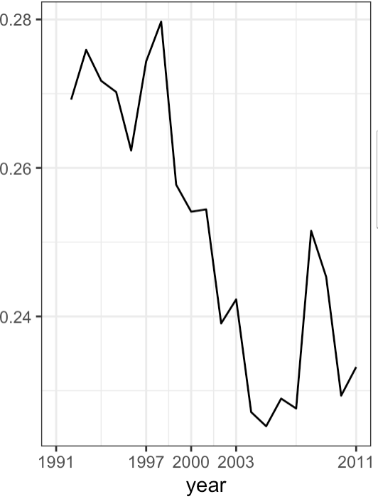
我能够使用以下代码生成变量lny_10的平均移动:
p1 <- ggplot(df, aes(x = year, y = lny_10)) +
  scale_x_continuous(breaks = c(1991, 1997, 2000, 2003, 2011), lim = c(1991, 2011)) + theme_bw() + stat_summary(geom = "line", fun.y = mean)
在同一平面上,我只想添加同一变量的加权平均的另一条趋势线,其中权重由每个行业的lnl的和确定,这样新的趋势线反映了某一行业(制造业或渔业)中lnl的权重。换句话说,如果和在曼纽夫。制造业的lny_10比重大于渔业,而制造业的the平均比重更大。
任何帮助都将不胜感激!
样本数据如下:
structure(list(firmid = structure(c("016090", "002070", "009270",
"007700", "005800", "014990", "001460", "001460", "005800", "014990"
), format.stata = "%-6s"), year = structure(c(1992, 1992, 1992,
1992, 1992, 1992, 1992, 1993, 1993, 1993), format.stata = "%9.0g"),
    lny_10 = structure(c(24.0853042602539, 24.2753143310547,
    24.1893978118896, 22.7417297363281, 24.0077304840088, 24.0432777404785,
    24.6088676452637, 24.6565208435059, 23.8993816375732, 24.2486095428467
    ), format.stata = "%9.0g"), lnl = structure(c(6.81234502792358,
    7.56631088256836, 7.19368600845337, 5.48063898086548, 7.38398933410645,
    6.63331842422485, 7.81439971923828, 7.72621250152588, 7.33040523529053,
    6.74288082122803), format.stata = "%9.0g")),  industry = structure(c("Manufacturing", "Manufacturing", "Manufacturing",
    "Manufacturing", "Manufacturing","Fishery", "Fishery","Fishery","Fishery","Fishery"), label = "classification", format.stata = "%-51s")), row.names = c(NA,
-10L), class = c("tbl_df", "tbl", "data.frame"))回答 1
Stack Overflow用户
回答已采纳
发布于 2022-01-05 22:45:16
按年份和行业分别计算权重,并在绘制之前将它们重新加入原始数据。
library(dplyr)
library(ggplot2)

dfweights <- df %>%
   group_by(year, industry) %>%
   summarise(lny_wmean = weighted.mean(lny_10,lnl))

df2 <- left_join(df, dfweights, by = c("year", "industry"))

df2 %>%
   ggplot() +
   stat_summary(aes(x = year, y = lny_10), geom = "line", fun = mean, colour = "red") +
   theme_bw() +
   geom_line(aes(x = year , y = lny_10), colour = "blue") +
geom_line(aes(x = year, y = lny_wmean), colour = "green")页面原文内容由Stack Overflow提供。腾讯云小微IT领域专用引擎提供翻译支持
原文链接:
https://stackoverflow.com/questions/70585668
复制相关文章
相似问题
腾讯云开发者
