
循环进度指示器内按钮,Android材料设计
循环进度指示器内按钮,Android材料设计
提问于 2022-02-02 10:51:09
我刚刚读到了材料设计中的按钮(MaterialButton) (进度指标材料设计),可以拿着一个圆形进度指示器,就像你在附图中看到的那样
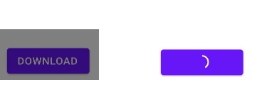
糟糕的是,当您按下按钮移除文本并显示进度指示符时,没有人知道如何实现它,是否有人已经处理过它?
任何暗示都会很感激的。谢谢
回答 2
Stack Overflow用户
回答已采纳
发布于 2022-02-02 11:26:37
实现这一点的方法之一是创建一个布局,其中您将有一个容器,并同时放置按钮和CircularProgressIndicator
    <FrameLayout
        android:layout_width="match_parent"
        android:layout_height="@dimen/some_height"
        android:background="#00000000"
        android:layout_marginRight="@dimen/margin_right"
        android:layout_marginLeft="@dimen/margin_left">

        <Button
            android:id="@+id/btn_download"
            android:layout_width="match_parent"
            android:layout_height="@dimen/some_height"
            android:text="Download"
            android:layout_gravity="center"
            android:visibility="visible"
            android:textColor="#FFFFFF"/>


    <com.google.android.material.progressindicator.CircularProgressIndicator
            android:id="@+id/progress"
            android:layout_width="wrap_content"
            android:layout_height="wrap_content" />

    </FrameLayout>
然后,您只需切换进度条的可见性并删除文本。
另一种方法是使用自定义动画绘图。然后,您可以将它添加到按钮中,作为一个带有某种位置的drawableStart或drawableEnd,或者甚至作为背景。
第三个选项是,如:https://stackoverflow.com/a/65180647/13187710
顺便说一句,在上面的xml代码中,您可以用Button代替MaterialButton。
Stack Overflow用户
发布于 2022-05-07 11:57:28
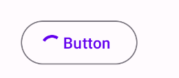
使用MaterialComponents库,您可以使用IndeterminateDrawable类创建CircularProgressIndicator,并将其应用于Button或Button中的图标。
   val spec =
        CircularProgressIndicatorSpec(this,  /*attrs=*/null, 0,
            com.google.android.material.R.style.Widget_Material3_CircularProgressIndicator_ExtraSmall)
    val progressIndicatorDrawable =
        IndeterminateDrawable.createCircularDrawable(this, spec)
    //...
    button.setOnClickListener {
        button.icon = progressIndicatorDrawable
    }
通过以下方式:
<com.google.android.material.button.MaterialButton
    android:id="@+id/indicator_button"
    style="@style/Widget.Material3.Button.OutlinedButton.Icon"
    android:layout_width="wrap_content"
    android:layout_height="wrap_content"
    android:ellipsize="end"
    android:text="Button"/>
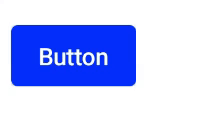
使用Compose,您可以使用以下内容:
 var progressIndicatorVisible by remember { mutableStateOf(false) }

 Button(
   onClick = {
     scope.launch {
         progressIndicatorVisible = true

         // Just for example
         delay(5000)
         progressIndicatorVisible = false
     }
   },
   modifier = Modifier.animateContentSize()){

     if (progressIndicatorVisible) {
         CircularProgressIndicator(
             color = White,
             strokeWidth = 2.dp,
             modifier = Modifier.size(15.dp)
         )
     }
     Text (
         "Button",
         modifier = Modifier.padding(start = if (progressIndicatorVisible) 8.dp else 0.dp)
     )
 }
页面原文内容由Stack Overflow提供。腾讯云小微IT领域专用引擎提供翻译支持
原文链接:
https://stackoverflow.com/questions/70954321
复制相关文章
相似问题
腾讯云开发者
