
单张全屏幕切换/按钮R发亮
单张全屏幕切换/按钮R发亮
提问于 2022-02-04 18:40:54
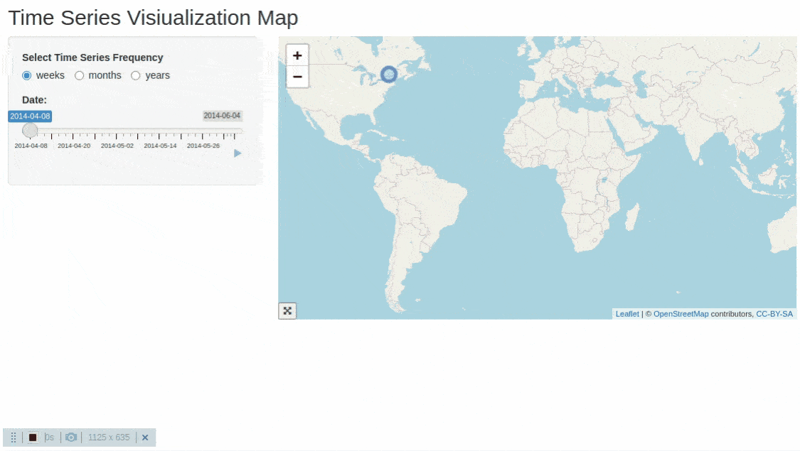
我正试图通过在time series中使用滑块通过leaflet创建一个R Shiny可视化。这个应用程序运行良好。作为另一个步骤,我正在尝试添加一个toggle/button,用户可以单击它,然后map将加载到fullscreen中。
如何添加按钮功能以切换全屏地图显示,然后再次单击它以返回到原始/默认大小?
代码
# This is a Shiny time series map web application
library(shiny)
library(tidyverse)
library(tidyr)
library(leaflet)
library(xts)


xts_to_tibble <- function(xts_obj) {
  data.frame(index(xts_obj), coredata(xts_obj)) %>%
    set_names(c("date", names(xts_obj))) %>%
    as_tibble()
}

# Create sample data
Date <- c(
  "2014-04-08", "2014-06-04", "2014-04-30",
  "2014-05-30", "2014-05-01"
)
lat <- as.numeric(c(
  "45.53814", "45.51076", "45.43560", "45.54332",
  "45.52234"
))
lon <- as.numeric(c(
  "-73.63672", "-73.61029", "-73.60100",
  "-73.56000 ", "-73.59022"
))
id <- as.numeric(c("1", "2", "3", "4", "5"))

# Create a df from the above columns
df <- data.frame(id, lat, lon, Date)
df$Year <- lubridate::year(df$Date)
df$Month <- lubridate::month(df$Date, label = TRUE, abbr = FALSE)
df$Week <- lubridate::week(df$Date)
df$Date <- as.Date(df$Date)
ui <- fluidPage(

  # Title
  titlePanel("Time Series Visiualization Map"),
  sidebarLayout(

    # Define the sidebar
    sidebarPanel(
      radioButtons(
        inputId = "Frequency",
        label = " Select Time Series Frequency",
        choices = c(
          "weeks",
          "months",
          "years"
        ),
        selected = "weeks",
        inline = T
      ),
      uiOutput("Time_Series_UI")
    ),
    mainPanel(
      leafletOutput("Time_Series_Map")
    ),
  )
)


# Define server logic required to draw a histogram
server <- function(input, output) {

  # Render slider input depending on data frequency

  observe({
    # Create an xts object
    df_xts <- xts(df, order.by = as.Date(df$Date))

    # All_Dates = unique(df$Start_Date)

    Filtered_Dates <- df_xts[xts::endpoints(
      df_xts,
      on = input$Frequency
    )] %>% xts_to_tibble()

    output$Time_Series_UI <- renderUI({
      sliderInput("Date", "Date:",
        min = pull(slice_min(Filtered_Dates, date), date),
        max = pull(slice_max(Filtered_Dates, date), date),
        value = pull(slice_min(Filtered_Dates, date), date),
        step = 1,
        #timeFormat = "%YYYY-%MM-%DD",
        animate = T
      )
    })
  })

  # Filter data for the date selected
  Filtered_Data <- reactive({
    req(input$Date)
    filter(df, Date == input$Date)
  })


  # Create the leaflet map
  output$Time_Series_Map <- renderLeaflet({
    leaflet(df) %>%
      addTiles() %>%
      setView(lat = 0, lng = 0, zoom = 2)
  })

  # Create data markers for selected date
  observe({
    # print(input$Date)

    leafletProxy("Time_Series_Map", data = Filtered_Data()) %>%
      addCircleMarkers(
        lng = ~lon, lat = ~lat,
        popup = ~id
      )
  })
}

# Run the application
shinyApp(ui = ui, server = server)Stack Overflow用户
回答已采纳
发布于 2022-02-04 23:49:59
试试这段代码
# This is a Shiny time series map web application
library(shiny)
library(tidyverse)
library(leaflet)
library(xts)


xts_to_tibble <- function(xts_obj) {
    data.frame(index(xts_obj), coredata(xts_obj)) %>%
        set_names(c("date", names(xts_obj))) %>%
        as_tibble()
}

# Create sample data
Date <- c(
    "2014-04-08", "2014-06-04", "2014-04-30",
    "2014-05-30", "2014-05-01"
)
lat <- as.numeric(c(
    "45.53814", "45.51076", "45.43560", "45.54332",
    "45.52234"
))
lon <- as.numeric(c(
    "-73.63672", "-73.61029", "-73.60100",
    "-73.56000 ", "-73.59022"
))
id <- as.numeric(c("1", "2", "3", "4", "5"))

# Create a df from the above columns
df <- data.frame(id, lat, lon, Date)
df$Year <- lubridate::year(df$Date)
df$Month <- lubridate::month(df$Date, label = TRUE, abbr = FALSE)
df$Week <- lubridate::week(df$Date)
df$Date <- as.Date(df$Date)
ui <- fluidPage(
    htmltools::htmlDependencies(icon("", verify_fa = FALSE)),
    tags$style(
        '
        .plot-zoom {
            position: absolute;
            border: none;
            background-color: transparent;
            bottom: 0;
            left: 0;
            z-index: 1;
        }
        .full-screen {
            position: fixed;
            height: 100vh !important;
            width: 100vw !important;
            left: 0;
            top: 0;
            z-index: 9999;
            overflow: hidden;
        }

        .leaflet-full-screen {
            position: relative;
        }
        '
    ),
    # Title
    titlePanel("Time Series Visiualization Map"),
    sidebarLayout(

        # Define the sidebar
        sidebarPanel(
            radioButtons(
                inputId = "Frequency",
                label = " Select Time Series Frequency",
                choices = c(
                    "weeks",
                    "months",
                    "years"
                ),
                selected = "weeks",
                inline = T
            ),
            uiOutput("Time_Series_UI")
        ),
        mainPanel(
            div(
                class = "leaflet-full-screen",
                leafletOutput("Time_Series_Map")
            )

        ),
    ),
    tags$script(HTML(
        "
        function plotZoom(el){
            el = $(el);
            var parent = el.parent().parent();
            if(el.attr('data-full_screen') === 'false') {
                parent.addClass('full-screen')
                      .css('position', '')
                      .trigger('resize').fadeOut().fadeIn();
                el.attr('data-full_screen', 'true');
            } else {
                parent.removeClass('full-screen')
                      .css('position', 'relative')
                      .trigger('resize').fadeOut().fadeIn();
                el.attr('data-full_screen', 'false');
            }
        }

        $(function(){
           $('.leaflet-full-screen  .leaflet.html-widget').append(
            `
            <div class='plot-zoom'>
                <button onclick=plotZoom(this)  data-full_screen='false' title='Full screen'>
                    <i class='fa fa-expand-arrows-alt'></i>
                </button>
            </div>
            `);
        })
        "
    ))
)


# Define server logic required to draw a histogram
server <- function(input, output) {

    # Render slider input depending on data frequency

    observe({
        # Create an xts object
        df_xts <- xts(df, order.by = as.Date(df$Date))

        # All_Dates = unique(df$Start_Date)

        Filtered_Dates <- df_xts[xts::endpoints(
            df_xts,
            on = input$Frequency
        )] %>% xts_to_tibble()

        output$Time_Series_UI <- renderUI({
            sliderInput("Date", "Date:",
                        min = pull(slice_min(Filtered_Dates, date), date),
                        max = pull(slice_max(Filtered_Dates, date), date),
                        value = pull(slice_min(Filtered_Dates, date), date),
                        step = 1,
                        #timeFormat = "%YYYY-%MM-%DD",
                        animate = T
            )
        })
    })

    # Filter data for the date selected
    Filtered_Data <- reactive({
        req(input$Date)
        filter(df, Date == input$Date)
    })


    # Create the leaflet map
    output$Time_Series_Map <- renderLeaflet({
        leaflet(df) %>%
            addTiles() %>%
            setView(lat = 0, lng = 0, zoom = 2)
    })

    # Create data markers for selected date
    observe({
        # print(input$Date)

        leafletProxy("Time_Series_Map", data = Filtered_Data()) %>%
            addCircleMarkers(
                lng = ~lon, lat = ~lat,
                popup = ~id
            )
    })
}

# Run the application
shinyApp(ui = ui, server = server)
我在地图左下角加了一个小按钮。当点击它时,情节被放大到全屏,在全屏中,再次单击它将返回到正常视图。
如果你不喜欢按钮、位置或颜色等,你需要做的就是把你的情节组件放置在父母或祖父母或祖父母.父组件中,如果你不喜欢按钮、位置或颜色等,那就有class = "leaflet-full-screen".
- Change。
- 包含应用程序中的样式和脚本标签。通常,您希望将样式靠近应用程序的顶部(头部),并将脚本放在传单标签之后。
- 此功能适用于多个传单对象,因此它意味着它将将按钮添加到应用程序中的所有传单地图中。
看看我类似的答案,我们如何用plotly做同样的事情。不过,代码有点不同。
页面原文内容由Stack Overflow提供。腾讯云小微IT领域专用引擎提供翻译支持
原文链接:
https://stackoverflow.com/questions/70991329
复制相关文章
相似问题
腾讯云开发者
