
如何去掉边框并为MUI TextField变体添加背景颜色
我想要自定义TextField的概述变体在材料UI和下面的字段,我想删除边框或给白色和给予不同的背景颜色。我在我的应用程序中使用样式化的组件,但也尝试过makeStyles,但它没有工作,尽管当我在chrome开发工具中进行更改时,我能够做到这一点。我从文档..MuiTextField root中尝试过这个类,但是它没有工作。我为这个类使用了chrome开发工具,但是当我将这个类添加到样式组件(没有这个..css wacwkt-)时,它就不能工作。对于element.style来说,情况是一样的。
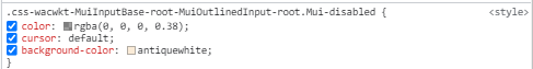
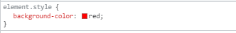
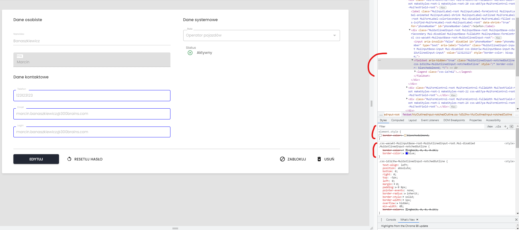
要与边框交互,我需要在chromedev工具中使用字段集选择器,它适用于element.style和这个标记的类。你可以看到左边有边框的颜色:蓝色是关于哪个TextFields的
这就是它是如何在代码中实现的
 <StyledInputSection>
                        <StyledDataHeader>
                            {contactDataTxt}
                        </StyledDataHeader>
                        <InputForm
                            name={'phoneNumber'}
                            id={'phoneNumber'}
                            label={phoneNumberLabelTxt}
                            disabled={isDisabledInputs}
                        />
                        <InputForm
                            name={'email'}
                            id={'email'}
                            label={emailLabelTxt}
                            disabled={isDisabledInputs}
                        />
                        {/* Show checkbox only for create new user by Admin */}
                        {!isDetailsView && !idUser && (
                            <CheckboxForm
                                label={emailAsLoginTxt}
                                name={'isEmailAsLogin'}
                                disabled={isDisabledInputs}
                            />
                        )}

                        <InputForm
                            name={'userName'}
                            id={'userName'}
                            label={loginLabelTxt}
                            disabled={
                                isDisabledLoginInput || isDisabledInputs
                            }
                        />
                    </StyledInputSection>
InputForm是作为可重用的TextFiled组件准备的.
感谢你的支持。
问候
Stack Overflow用户
发布于 2022-02-07 20:52:29
更新组件示例:
可以通过链接到现有类来覆盖默认样式为styled组件:
const ExampleTextField = styled(TextField)({
  backgroundColor: "#eee",
  "& .MuiOutlinedInput-notchedOutline": {
    border: "none"
  },
  "&.Mui-focused": {
    "& .MuiOutlinedInput-notchedOutline": {
      border: "none"
    }
  }
});工作组件代码示例:https://codesandbox.io/s/customizedinputs-material-demo-forked-lpxwb?file=/demo.js:166-403
原始主题示例:
如果您可以将它添加到主题中,那么像这样简单的内容可能会适用于您:
(如果不希望使用样式组件来影响每个InputForm变体,也可以在outlined中执行类似的操作。)
const theme = createTheme({
  components: {
    // Inputs
    MuiOutlinedInput: {
      styleOverrides: {
        root: {
          backgroundColor: "#eee", // As an example color
          "& .MuiOutlinedInput-notchedOutline": {
            border: "none"
          },
          "&.Mui-focused": {
            "& .MuiOutlinedInput-notchedOutline": {
              border: "none"
            }
          }
        }
      }
    }
  }
});工作主题代码示例:https://codesandbox.io/s/customstyles-material-demo-forked-u644m?file=/theme.js
https://stackoverflow.com/questions/71024987
复制相似问题
腾讯云开发者

Copyright © 2013 - 2026 Tencent Cloud. All Rights Reserved. 腾讯云 版权所有
深圳市腾讯计算机系统有限公司 ICP备案/许可证号:粤B2-20090059  粤公网安备44030502008569号
腾讯云计算(北京)有限责任公司 京ICP证150476号 | 京ICP备11018762号