
Jetpack组合中输入文本OutlinedTextField的可调性
我有一个带有OutlinedTextField的DropdownMenu,我希望在按下DropdownMenu列表中的项之后,项目的值开始在OutlinedTextField中,并根据文本的长度来调整其宽度。我怎么能做到呢?
更新(14.02.2022)
默认情况下,OutlinedTextField使用OutlinedTextFieldLayout,其中包含带有defaultMinSize修饰符参数的BasicTextField。
BasicTextField(
    value = value,
    modifier = modifier
        .then(
            if (decoratedLabel != null) {
                Modifier.padding(top = OutlinedTextFieldTopPadding)
            } else {
                Modifier
            }
        )
        .defaultMinSize(
            minWidth = MinWidth,
            minHeight = MinHeight
        )
...

 /** The default min width applied for a TextField and OutlinedTextField. Note that you can override it by applying Modifier.widthIn directly on a text field. */
 val MinWidth = 280.dp
要使宽度成为内在的Min,我必须从Compose库中复制3个文件(TextField.kt、TextFieldImpl.kt、OutlinedTextField.kt),并在OutlinedTextFieldLayout组件中使用以下更改创建自己的OutlinedTextField:
 @Composable
internal fun OutlinedFormTextFieldLayout(
    modifier: Modifier,
    value: TextFieldValue,
    onValueChange: (TextFieldValue) -> Unit,
    enabled: Boolean,
    readOnly: Boolean,
    keyboardOptions: KeyboardOptions,
    keyboardActions: KeyboardActions,
    textStyle: TextStyle,
    singleLine: Boolean,
    maxLines: Int = Int.MAX_VALUE,
    visualTransformation: VisualTransformation,
    interactionSource: MutableInteractionSource,
    decoratedPlaceholder: @Composable ((Modifier) -> Unit)?,
    decoratedLabel: @Composable (() -> Unit)?,
    leading: @Composable (() -> Unit)?,
    trailing: @Composable (() -> Unit)?,
    leadingColor: Color,
    trailingColor: Color,
    labelProgress: Float,
    indicatorWidth: Dp,
    indicatorColor: Color,
    cursorColor: Color,
    shape: Shape
) {
    val textWidth = remember { mutableStateOf(0) }
    val labelSize = remember { mutableStateOf(Size.Zero) }

    fun Modifier.widthIntrinsicSizeMinModifier() = width(IntrinsicSize.Min)
    fun Modifier.widthTextWidthModifier() = width(textWidth.value.dp)

    if (textWidth.value == 0) {
        modifier.then(Modifier.widthIntrinsicSizeMinModifier())
    } else {
        modifier.then(Modifier.widthTextWidthModifier())
    }

    BasicTextField(
        value = value,
        modifier = modifier
            .then(
                if (decoratedLabel != null) {
                    Modifier.padding(top = OutlinedTextFieldTopPadding)
                } else {
                    Modifier
                }
            )
            .onSizeChanged {
                textWidth.value = it.width
            }, ...
通过这些更改,我们不再有默认宽度了,但是我们仍然有一些来自右侧的间距
Update(15.02.2022)
不要复制@Compose库中的文件。有些API调用不起作用。在我的例子中,textColor和背景集不适用于我的自定义OutlinedFormTextField,而对于OutlinedTextField,一切都很好:
  colors = TextFieldDefaults.outlinedTextFieldColors(
       textColor = Color.Red,
       backgroundColor = backgroundColor.value
...
我还发现,与其覆盖与OutlinedTextField相关的文件,您还可以使用Row组件包装您的OutlinedTextField并在其中设置:
Modifier.defaultMinSize(minWidth = 1.dp)默认情况下,它将删除组成建议的巨大minWidth,但是标签之后的额外间距仍然存在。
有人知道怎么移除它吗?
Stack Overflow用户
发布于 2022-02-22 04:10:58
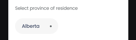
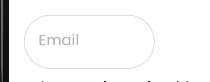
这是我使用可调OutlinedTextField组件的临时解决方案。当背景被更改时,它还修复了左上角的OutlinedTextField交叉标签:
// Duration
private const val LabelOffsetAnimationDuration = 500
private const val LabelBackgroundColorAnimationDuration = 1

private const val LabelBackgroundColorAnimationDelay = 200

private const val TextFieldBackgroundColorAnimationDuration = 0
private const val TextFieldBackgroundColorAnimationDelay = 0

private const val BorderColorAnimationDuration = 10
private const val BorderColorAnimationDelay = 50

// Offset
private const val LabelAnimationTopLeftPositionOffsetX = 20F
private const val LabelAnimationTopLeftPositionOffsetY = -30F
private const val LabelAnimationCenterPositionOffsetX = 25F
private const val LabelAnimationCenterPositionOffsetY = 0F

private const val LabelTextSizeAnimationTopLeftPosition = 12F
private const val LabelTextSizeAnimationCenterPosition = 16F

// Z-Index
private const val LabelBubbleZIndex = 2f

// Size
private val TextFieldMinWidth = 100.dp

private fun getTargetLabelPosition(isFocused: Boolean, text: String) =
 if (!isFocused && text.isNotEmpty() || isFocused) {
     LabelPosition.TopLeft
 } else {
     LabelPosition.Center
 }

@Composable
fun MyOutlinedTextField(
    modifier: Modifier = Modifier,
    textFieldState: TextFieldState,
    onValueChange: (String) -> Unit,
    label: String,
    enabled: Boolean = true,
    readOnly: Boolean = false,
    isError: Boolean,
    keyboardOptions: KeyboardOptions = KeyboardOptions.Default,
    keyboardAction: ((KeyboardActionScope) -> Unit),
    trailingIcon: @Composable (() -> Unit)? = null,
) {
    Column(
        modifier = modifier,
        verticalArrangement = Arrangement.Center
    ) {
        var textFieldIsFocused by remember { mutableStateOf(false) }
        var labelPosition by remember {
            mutableStateOf(
                getTargetLabelPosition(
                    isFocused = textFieldIsFocused,
                    text = textFieldState.text
                )
            )
        }

        val labelPositionTransition = updateTransition(
            targetState = labelPosition,
            label = LabelPositionTransitionLabel
        )

        val labelOffsetAnimation by labelPositionTransition.animateOffset(
            transitionSpec = {
                tween(
                    durationMillis = LabelOffsetAnimationDuration
                )
            },
            label = LabelOffsetAnimationLabel
        ) { position ->
            when (position) {
                LabelPosition.TopLeft -> Offset(
                    LabelAnimationTopLeftPositionOffsetX,
                    LabelAnimationTopLeftPositionOffsetY
                )
                LabelPosition.Center -> Offset(
                    LabelAnimationCenterPositionOffsetX,
                    LabelAnimationCenterPositionOffsetY
                )
            }
        }

        val labelTextSizeAnimation by labelPositionTransition.animateFloat(
            label = LabelTextSizeAnimationLabel
        ) { position ->
            when (position) {
                LabelPosition.TopLeft -> LabelTextSizeAnimationTopLeftPosition
                LabelPosition.Center -> LabelTextSizeAnimationCenterPosition
            }
        }

        val labelBackgroundColorAnimation by labelPositionTransition.animateColor(
            transitionSpec = {
                tween(
                    durationMillis = LabelBackgroundColorAnimationDuration,
                    delayMillis = LabelBackgroundColorAnimationDelay,
                )
            },
            label = LabelBackgroundColorAnimationLabel
        ) { position ->
            when (position) {
                LabelPosition.TopLeft -> Color.White
                LabelPosition.Center -> Color.Transparent
            }
        }

        val textFieldIsFocusedTransition = updateTransition(
            targetState = textFieldIsFocused,
            label = TextFieldIsFocusedTransitionLabel
        )

        val textFieldBackgroundColorAnimation by textFieldIsFocusedTransition.animateColor(
            transitionSpec = { ->
                tween(
                    durationMillis = TextFieldBackgroundColorAnimationDuration,
                    delayMillis = TextFieldBackgroundColorAnimationDelay,
                )
            },
            label = TextFieldBackgroundColorAnimationLabel
        ) { _isFocused ->
            when {
                _isFocused -> LinkWater
                !_isFocused && textFieldState.text.isEmpty() -> Color.Transparent
                !_isFocused && textFieldState.text.isNotEmpty() -> Alabaster
                else -> Color.Transparent
            }
        }

        val borderColorAnimation by textFieldIsFocusedTransition.animateColor(
            transitionSpec = { ->
                tween(
                    durationMillis = BorderColorAnimationDuration,
                    delayMillis = BorderColorAnimationDelay,
                )
            },
            label = BorderColorAnimationLabel
        ) { _isFocused ->
            when {
                _isFocused -> Color.Transparent
                !_isFocused && textFieldState.text.isEmpty() -> Mercury
                !_isFocused && textFieldState.text.isNotEmpty() -> Color.Transparent
                else -> Mercury
            }
        }

        val textFieldBoxModifier = Modifier.textFieldBoxModifier(
            textFieldState = textFieldState,
            textFieldBackgroundColorAnimation = textFieldBackgroundColorAnimation,
            borderColorAnimation = borderColorAnimation,
            textFieldIsFocused = textFieldIsFocused
        )

        Box(
            contentAlignment = Alignment.CenterStart
        ) {
            Text(
                modifier = Modifier
                    .zIndex(LabelBubbleZIndex)
                    .defaultMinSize(1.dp)
                    .offset(labelOffsetAnimation.x.dp, labelOffsetAnimation.y.dp)
                    .clip(
                        shape = CircleShape
                    )
                    .background(
                        color = labelBackgroundColorAnimation
                    )
                    // Padding inside the Email bubble
                    .padding(
                        start = if (labelPosition == LabelPosition.TopLeft) 8.dp else 0.dp,
                        end = if (labelPosition == LabelPosition.TopLeft) 8.dp else 0.dp,
                        top = 2.dp,
                        bottom = 2.dp
                    ),
                text = label,
                fontSize = dpToSp(
                    labelTextSizeAnimation,
                    LocalContext.current
                ).sp,
                style = LocalTextStyle.current.copy(
                    color = OsloGray
                ),
            )

            Box(
                modifier = textFieldBoxModifier
            ) {
                TextField(
                    modifier = Modifier
                        .padding(
                            start = 8.dp,
                            end = 8.dp
                        )
                        .onFocusChanged {
                            textFieldIsFocused = it.isFocused
                            labelPosition =
                                getTargetLabelPosition(textFieldIsFocused, textFieldState.text)
                            textFieldState.enableDisplayErrors(textFieldIsFocused)
                        }
                        .defaultMinSize(
                            minWidth = 1.dp
                        ),
                    value = textFieldState.text,
                    onValueChange = onValueChange,
                    enabled = enabled,
                    keyboardOptions = keyboardOptions,
                    readOnly = readOnly,
                    isError = isError,
                    keyboardActions = KeyboardActions(
                        keyboardAction
                    ),
                    trailingIcon = trailingIcon,
                    singleLine = true,
                    textStyle = TextFieldStyle,
                    colors = TextFieldDefaults.textFieldColors(
                        textColor = Fiord,
                        cursorColor = Fiord,
                        disabledTextColor = Color.Transparent,
                        backgroundColor = Color.Transparent,
                        focusedIndicatorColor = Color.Transparent,
                        unfocusedIndicatorColor = Color.Transparent,
                        disabledIndicatorColor = Color.Transparent,
                        errorIndicatorColor = Color.Transparent
                    )
                )
            }
        }
        textFieldState.getError()?.let { error ->
            TextFieldError(
                textError = error
            )
        }
    }
}

private fun Modifier.textFieldBoxModifier(
    textFieldState: TextFieldState,
    textFieldBackgroundColorAnimation: Color,
    borderColorAnimation: Color,
    textFieldIsFocused: Boolean
): Modifier {
    var basicTextFieldBoxModifier = this
        .padding(
            start = 4.dp,
            end = 4.dp,
            top = 8.dp,
            bottom = 8.dp
        )
        .height(60.dp)
        .background(
            color = textFieldBackgroundColorAnimation,
            shape = CircleShape
        )
        .border(1.dp, borderColorAnimation, CircleShape)
        .zIndex(1f)
        .wrapContentSize(
            align = Alignment.CenterStart
        )

    when {
        textFieldIsFocused -> {
            basicTextFieldBoxModifier = basicTextFieldBoxModifier.then(Modifier.fillMaxWidth())
        }
        !textFieldIsFocused && textFieldState.text.isEmpty() -> {
            basicTextFieldBoxModifier =
                basicTextFieldBoxModifier.then(Modifier.width(TextFieldMinWidth))
        }
    }

    return basicTextFieldBoxModifier
}https://stackoverflow.com/questions/71072553
复制相似问题
腾讯云开发者
