
如何在ggplot2中向散点图中添加颜色标准?
如何在ggplot2中向散点图中添加颜色标准?
提问于 2022-03-03 17:37:24
我正在创建一个零散图,以显示非常活跃的几分钟运动与消耗的卡路里之间的关系。在我的零散图中,我希望在30分钟的活动之后,这些点是绿色的。下面是我目前正在使用的代码,但我不知道如何添加一个标准来更改颜色。
ggplot(data=daily_activity) +
  geom_point(mapping=aes(x=VeryActiveMinutes, y=Calories), color="darkred") +
  geom_smooth(mapping=aes(x=VeryActiveMinutes, y=Calories)) +
  labs(title="The Relationship Between Very Active Minutes and Calories Burned",
caption = "Data collected from the FitBit Fitness Tracker Data on Kaggle")回答 1
Stack Overflow用户
发布于 2022-03-04 08:47:06
正如@stefan color基于ifelse语句所建议的,然后使用比例颜色标识将这些颜色应用到图形中:
样本代码:
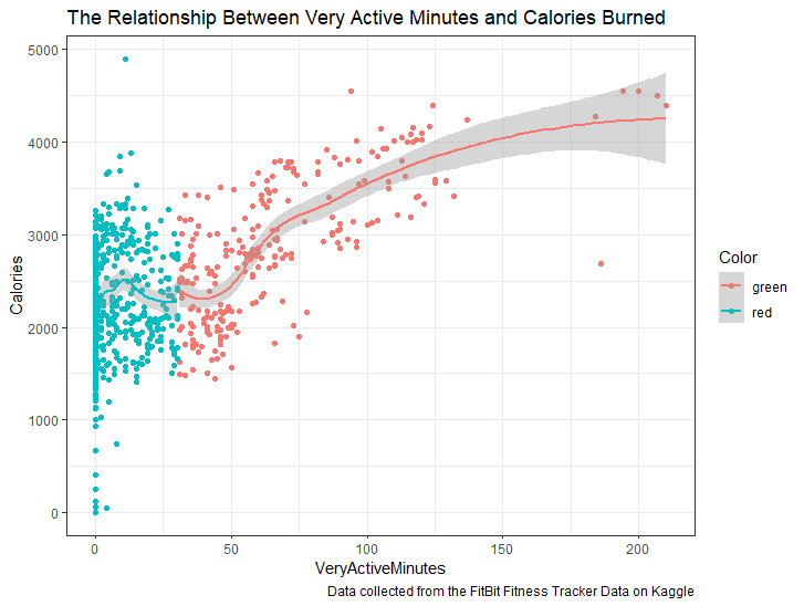
daily_activity %>%
    mutate(Color = ifelse(VeryActiveMinutes > 30, "green", "red"))%>%
    ggplot(aes(x=VeryActiveMinutes, y=Calories, color=Color)) +
      geom_point() +
      geom_smooth(mapping=aes(x=VeryActiveMinutes, y=Calories)) +
      labs(title="The Relationship Between Very Active Minutes and Calories Burned",
           caption = "Data collected from the FitBit Fitness Tracker Data on Kaggle")
输出:
页面原文内容由Stack Overflow提供。腾讯云小微IT领域专用引擎提供翻译支持
原文链接:
https://stackoverflow.com/questions/71341413
复制相关文章
相似问题
腾讯云开发者
