
按不同顺序绘制海图月度数据
按不同顺序绘制海图月度数据
提问于 2022-03-22 17:20:13
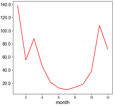
我希望在海运线图中绘制每月空气质量数据。由于空气质量最差的月份是11月至2月,我希望这几个月都在线图的中间。我的问题是,能否做到这一点?
concentration vs month
axes[1] = sns.lineplot(ax=axes[1],
                       data=df_month,
                       #x=df['date'],
                       x=df_month['month'],
                       y=df_month['monthly mean'],
                       color='red',
                       linewidth=1.5,
                       #hue=hue,
                       palette="hls")
这就是目前正在制作的情节。
我试图明确地排序月份值,但这返回了一个空白图表。
df_month['month'] = pd.Categorical(df_month['month'],
categories=['6', '7', '8', '9', '10', '11', '12', '1',
'2', '3', '4', '5'],
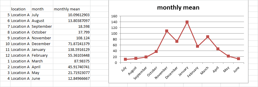
ordered=True)这就是我想要绘制的数据
    location    month   monthly mean
1   Location A  3   87.98375
2   Location A  4   45.91740741
3   Location A  5   21.71923077
4   Location A  6   12.84966667
5   Location A  7   10.09612903
6   Location A  8   13.80387097
7   Location A  9   18.598
8   Location A  10  37.799
9   Location A  11  108.124
10  Location A  12  71.87241379
11  Location A  1   138.5916129
12  Location A  2   55.36103448
这是我要实现的目标的excel图。
回答 1
Stack Overflow用户
发布于 2022-03-23 09:38:05
谢谢你的帮助。我没有意识到我必须在应用pd.Categorical之后对这些值进行排序。(我也意识到我把月号放错了引号)
# set categorical order
df_month['month'] = pd.Categorical(df_month['month'], categories=[6, 7, 8, 9,
10, 11, 12, 1, 2, 3, 4, 5], ordered=True)
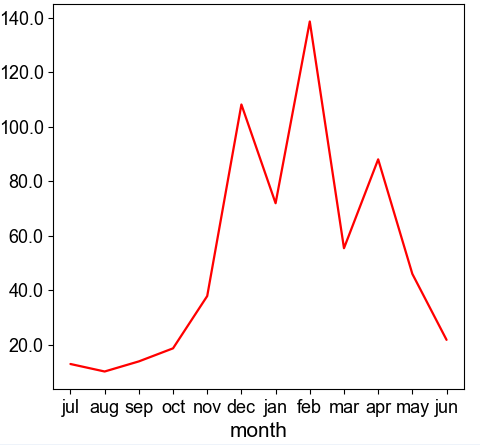
df_month.sort_values('month', inplace=True)一旦我这样做了,我可以利用您对sns.pointplot的有益建议来实现我的目标图。
# concentration vs month
axes[1] = sns.pointplot(ax=axes[1],
                       data=df_month,
                       x='month',
                       y='monthly max mean',
                       color='red',
                       scale =0.6,
                       markers='',
                       order=df_month['month'])
页面原文内容由Stack Overflow提供。腾讯云小微IT领域专用引擎提供翻译支持
原文链接:
https://stackoverflow.com/questions/71576354
复制相关文章
相似问题
腾讯云开发者
