
在for-循环中生成的Seaborn计数图,其子图只在最后一列中可见。
在for-循环中生成的Seaborn计数图,其子图只在最后一列中可见。
提问于 2022-03-23 08:37:34
我一直在搜索所有的问题和在线平台,关于如何将海运计数图可视化为for-循环中的子图。
我已经从我的数据库中创建了一个想要绘制的所需分类列名的列表。下面的代码运行循环,但我得到了4行,其中有3列为空列,只有在最后一列中才是Count图(假设这4行是根据计数图的数量生成的)。我花了好几个小时试图弄清楚该怎么做,但我可以把它做好。
我很感激有人能解释我需要做些什么,才能正确地将计数图显示为子图(1,4)。
##Code
categorical1= [ 'Gender', 'Customer Type', 'Type of Travel', 'Class']##Forloop
for f in categorical1:
    fig,axs= plt.subplots (1,4, figsize=(15,5))
    sns.countplot(data= airline_customer_satisfactionc, x= airline_customer_satisfactionc[f], hue='satisfaction')
plt.show()
提前感谢你对这个蟒蛇新手的耐心。
回答 1
Stack Overflow用户
发布于 2022-03-23 10:35:35
调用plt.subplots将创建图和所有子图。这就是为什么你看到的是四排四幅,而不是一排四幅。所以你需要把它移到for循环之外。
然后,通过将轴传递给它的ax=参数,您需要告诉seaborn它应该在哪个子图上绘制绘图。
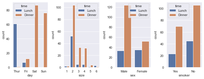
最后,虽然这不是代码中的问题,但如果您将数据格式传递给seaborn的data参数,则只需将列名传递给x
tips = sns.load_dataset("tips")
cols = ["day", "size", "sex", "smoker"]
f, axs = plt.subplots(1, len(cols), figsize=(10, 4))
for ax, col in zip(axs, cols):
    sns.countplot(data=tips, x=col, hue="time", ax=ax)
f.tight_layout()
页面原文内容由Stack Overflow提供。腾讯云小微IT领域专用引擎提供翻译支持
原文链接:
https://stackoverflow.com/questions/71584096
复制相关文章
相似问题
腾讯云开发者
