
创建具有不同列样式和底部不同标签的直方图
创建具有不同列样式和底部不同标签的直方图
提问于 2022-03-24 16:45:58
我想知道如何使用matplotlib或seaborn实现这种类型的直方图。我对不同的列样式和底部的不同标签特别感兴趣。
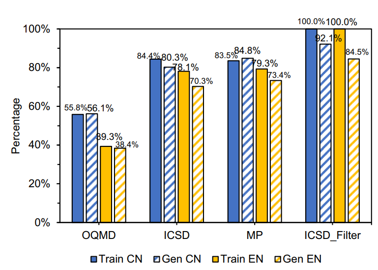
从纸上获取的图像:https://www.nature.com/articles/s41524-020-00352-0.pdf
回答 1
Stack Overflow用户
发布于 2022-03-24 17:25:24
我最近编写了一个函数,它使用matplotlib执行类似的操作。它需要一只熊猫的数据,基本上只是吸引了很多酒吧。它并不完美,而且非常适合我的具体需求,因此您可能需要对其进行调整,使其看起来与您所期望的完全一致。肯定会有更好的方法,但这可能是一个很好的开始。
def groupbar(ax,data,x,y,hue,colors=[],fs=14,rot=0,ha='center'):
    """
    groupbar(ax,data,x,y,hue,colors=[],fs=14,rot=0,ha='center')
    ax is the axis to plot onto
    data is a pandas dataframe with columns that have the same names as x, y, and hue
    colors is a list of colors to use for the bars
    x is the column name that corresponds to the categories at the bottom
    y is the column that corresponds to the bar height
    hue is the column that corresponds to the subgroup (bar color)
    colors is a list of colors for the bars
    fs, rot, and ha are tick label font size, rotation, and horizontal alignment
    """
    xs = data[x].unique()
    hues = np.unique(data[hue])
    Nx = len(xs)
    Nh = len(hues)
    width = (Nh+1)*Nx+1
    handles = []
    xvals = np.zeros((Nx,Nh))
    for xi in range(Nx):
        for hi in range(Nh):
            yval = data[(data[x]==xs[xi])&(data[hue]==hues[hi])][y].values
            xval = (hi+1)*(Nx) + xi + hi
            hand = ax.bar(x=xval,height=yval,width=0.95,color=colors[xi])
            handles.append(hand)
            xvals[xi,hi] = xval
    ax.legend(handles[::Nh],xs,fontsize=16)
    ax.set_xticks(np.median(xvals,0))
    ax.set_xticklabels(hues,fontsize=fs,rotation=rot,ha=ha)
    ax.set_axisbelow(True)
    ax.tick_params(axis='y',labelsize=fs)
    ax.grid(color=[0.8,0.8,0.8],linestyle='--')
    return handles
下面是一个示例,假设您有一个熊猫dataframe data,其中的列指定底部的类别、('x')、条高(‘百分比’)和条形类(‘类别’),然后:
fig, ax = plt.subplots()
colors = ['blue','lightblue','darkgoldenrod','gold']
groupbar(ax,data,'x','percentage','category',colors=colors)页面原文内容由Stack Overflow提供。腾讯云小微IT领域专用引擎提供翻译支持
原文链接:
https://stackoverflow.com/questions/71606311
复制相关文章
相似问题
腾讯云开发者
