
用多个数据集在ggplot中添加一个图例
用多个数据集在ggplot中添加一个图例
提问于 2022-04-06 17:22:54
我试图在r中将多个数据集合并成一个图形。我的代码似乎没有为这些数据生成一个图例。
我的两个问题是:
- 可以在我的行中添加一些代码表达式来为每组数据生成一个图例元素吗?我以为这将是一个命令,如‘填充’或‘形状’-但我错了,
,
- ,我为什么不生成一个传奇句号?我以为至少会有一个有一组数据的传说--但似乎没有--其中一个是解禁的吗?
如果无法完成上述操作,那么是否有一种简单的方法可以使用使用每个数据分组的3列数据表来绘制此图?
代码在下面。您将无法复制它,因为我需要发送CSV文件(数据集)。
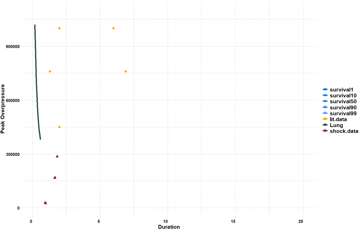
我已经包含了下面复制的代码的输出数字。理想上,我想要一个图例,列出每个不同的行/点+/-文本标签在每一行。
谢谢你的帮助!
library(tidyverse)
#These are the datasets I am turning into three dataframes #
bowen.data <- bowen
df <- data.frame(bowen)


lit.data <- lit_data
df <- data.frame(lit_data)

shock.data <- shock_tube_tests
df <- data.frame(shock_tube_tests)

high.data <- high_shock_data
df <- data.frame(high_shock_data)
low.data <- low_shock_data
df <- data.frame(low_shock_data)
#setting limit for my axis#
options(scipen = 1000000)


library(ggplot2)
#Now I wish to plot alll this data on one figure. This data describes duration and peak overpressure of shock waves. Each line of geom_line is trying to plot each datasset to produce each line, or points. I then set the X & Y limiitss, the labelss and the colours. #

ggplot(bowen.data, aes(x=Duration)) +
  geom_line(aes(y = survival99), color = "cornflowerblue", linetype="longdash") + geom_line(aes(y = survival90), color="dodgerblue1", linetype="dashed") +
geom_line(aes(y = survival50), color="steelblue", linetype="solid") +
geom_line(aes(y = survival10), color="dodgerblue2", linetype="dotdash") +
geom_line(aes(y = survival1), color="dodgerblue3", linetype="twodash") + geom_line(aes(y = lung), color="darkslategrey", linetype="solid") +
ylim(100,1100000) + xlim(0.2,20) + ylab("Peak Overpressure") + xlab("Duration") +
geom_point(data=high.data, aes(x=duration, y=high), color='seagreen4') +
geom_point(data=low.data, aes(x=duration, y=low), color='indianred') +
geom_point(data=low.data, aes(x=duration, y=low), color='indianred', shape = 13) +
geom_point(data=shock.data, aes(x=duration, y=tube), color='violetred4', shape = 17) +
geom_point(data=lit.data, aes(x=dura, y=lit), color='orange')
使用dput:
   structure(list(Duration = c(0.2, 0.3, 0.4, 0.5, 0.6), survival99 = c(3509982.865,
2422907.195, 1883026.274, 1555445.788, 1348277.839), survival90 = c(4138911.806,
2846984, 2206434.933, 1822870.548, 1566705.278), survival50 = c(5104973.144,
3490782.825, 2693285.691, 2217270.161, 1900462.526), survival10 = c(6313217.275,
4294375.461, 3299414.021, 2705203.586, 2313630.72), survival1 = c(7513231.158,
5090961.551, 3899360.722, 3190981.429, 2711178.007), lung = c(1020994.629,
698156.565, 538657.1381, 443454.0321, 380092.5051), X8 = c(NA,
NA, NA, NA, NA)), row.names = c(NA, -5L), class = c("tbl_df",
"tbl", "data.frame"))
[
冲击数据
    structure(list(duration = c(1.00244911, 0.947052916, 1.675566344,
1.6586253, 1.837305476), tube = c(24973.80469, 28125.45703, 169033.3438,
165488.6719, 285638.9375)), row.names = c(NA, -5L), class = c("tbl_df",
"tbl", "data.frame"))
发光数据
structure(list(dura = c(2, 6, 1.3, 6.9, 2), lit = c(1000000,
1000000, 760000, 760000, 450000)), row.names = c(NA, -5L), class = c("tbl_df",
"tbl", "data.frame"))
[ `enter image description here][1]回答 1
Stack Overflow用户
发布于 2022-04-07 08:05:19
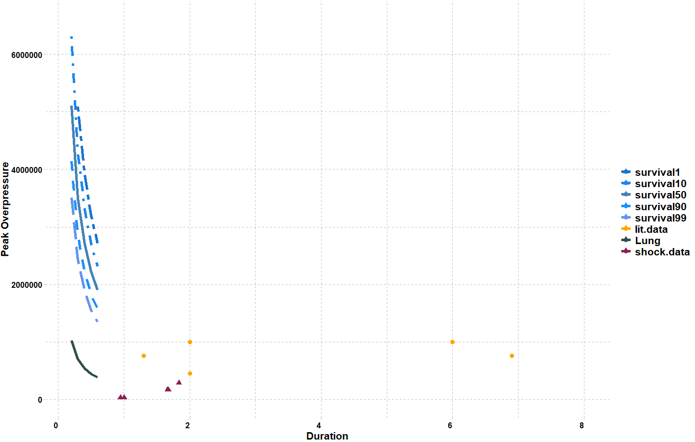
我看不出你想要的输出。其思想是通过将颜色aesthetic映射到一个常量字符串来为每一行指定一个颜色。最简单的选择是选择将出现在图例中的字符串。在aes调用中完成这一点至关重要;您正在创建到该变量的映射。
这些字符串现在可以通过scale color manual.映射到适当的颜色。
 library(ggplot2)
 library(tidyverse)
 library(ggthemes)

ggplot(bowen.data, aes(x=Duration)) +
  geom_line(aes(y = survival99, color="survival99"),  linetype="longdash", size=2) +
  geom_line(aes(y = survival90, color="survival90"),  linetype="dashed",  size=2) +
  geom_line(aes(y = survival50, color="survival50"),  linetype="solid",  size=2) +
  geom_line(aes(y = survival10, color="survival10"),  linetype="dotdash",  size=2) +
  geom_line(aes(y = survival1, color="survival1"),  linetype="twodash",  size=2) +
  geom_line(aes(y = lung, color="Lung"), linetype="solid",  size=2) +
  ylim(100,1100000) + xlim(0.2,20) + ylab("Peak Overpressure") + xlab("Duration") +
  #geom_point(data=high.data, aes(x=duration, y=high), color='seagreen4') +
  #geom_point(data=low.data, aes(x=duration, y=low), color='indianred') +
  #geom_point(data=low.data, aes(x=duration, y=low), color='indianred', shape = 13) +
  geom_point(data=shock.data, aes(x=duration, y=tube, color='shock.data'), shape = 17, size=3) +
  geom_point(data=lit.data, aes(x=dura, y=lit, color='lit.data'), size=3)+
  theme_pander()+
  theme(axis.text.x = element_text( hjust = 1, face="bold", size=12, color="black"),
        axis.title.x = element_text(face="bold", size=16, color="black"),
        axis.text.y = element_text(face="bold", size=12, color="black"),
        axis.title.y = element_text(face="bold", size=16, color="black"),
        legend.title=element_blank(),
        legend.text = element_text(family="Times", color = "black", size = 16,face="bold"))+
  scale_color_manual(values = c("survival1"="dodgerblue3","survival10"="dodgerblue2",  "survival50"="steelblue", "survival90"="dodgerblue1", "survival99"="cornflowerblue", "lit.data"="orange","Lung"="darkslategrey","shock.data"="violetred4"))
情节:
此外,您还需要调整ylim和xlim的范围。低于ylim(0,6600000) + xlim(0.2, 8)
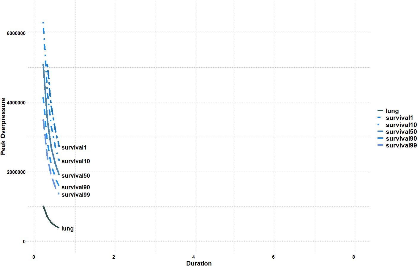
如果要向行(bowen.data)添加标签,我建议使用directlabels库。
样本代码:
   library(dplyr)
   library(ggplot2)
   library(ggthemes)
   library(directlabels)


     bowen.data%>%
  pivot_longer(cols = -1) %>%
  ggplot(aes(x=Duration,y=value))+
  geom_line(aes(linetype=name, color=name), size=2 )+
  scale_color_manual(values = c("lung"="darkslategrey", "survival1"="dodgerblue3","survival10"="dodgerblue2",  "survival50"="steelblue", "survival90"="dodgerblue1", "survival99"="cornflowerblue"))+
  scale_linetype_manual(values=c("lung"="solid","survival1" = "twodash", "survival10" = "dotdash", "survival50" = "solid" , "survival90" = "dashed", "survival99" = "longdash"))+
  geom_dl(aes(label = name), method = list(dl.trans(x = x + 0.2),"last.points", cex = 1.2, fontface='bold'))+
  ylim(0,6600000) + xlim(0.2, 8) +
  labs(x="Duration",y="Peak Overpressure", fill="Factors") +
  theme_pander()+
  theme(axis.text.x = element_text( hjust = 1, face="bold", size=12, color="black"),
        axis.title.x = element_text(face="bold", size=16, color="black"),
        axis.text.y = element_text(face="bold", size=12, color="black"),
        axis.title.y = element_text(face="bold", size=16, color="black"),
        legend.title=element_blank(),
        legend.text = element_text(family="Times", color = "black", size = 16,face="bold"))
情节:
样本数据:
bowen.data <-
      structure(
        list(
          Duration = c(0.2, 0.3, 0.4, 0.5, 0.6),
          survival99 = c(
            3509982.865,
            2422907.195,
            1883026.274,
            1555445.788,
            1348277.839
          ),
          survival90 = c(4138911.806,
                         2846984, 2206434.933, 1822870.548, 1566705.278),
          survival50 = c(
            5104973.144,
            3490782.825,
            2693285.691,
            2217270.161,
            1900462.526
          ),
          survival10 = c(6313217.275,
                         4294375.461, 3299414.021, 2705203.586, 2313630.72),
          survival1 = c(
            7513231.158,
            5090961.551,
            3899360.722,
            3190981.429,
            2711178.007
          ),
          lung = c(1020994.629,
                   698156.565, 538657.1381, 443454.0321, 380092.5051),
          X8 = c(NA,
                 NA, NA, NA, NA)
        ),
        row.names = c(NA,-5L),
        class = c("tbl_df",
                  "tbl", "data.frame")
      )


    shock.data<-structure(
      list(
        duration = c(1.00244911, 0.947052916, 1.675566344,
                     1.6586253, 1.837305476),
        tube = c(
          24973.80469,
          28125.45703,
          169033.3438,
          165488.6719,
          285638.9375
        )
      ),
      row.names = c(NA,-5L),
      class = c("tbl_df",
                "tbl", "data.frame")
    )


    lit.data<-structure(
      list(
        dura = c(2, 6, 1.3, 6.9, 2),
        lit = c(1000000,
                1000000, 760000, 760000, 450000)
      ),
      row.names = c(NA,-5L),
      class = c("tbl_df",
                "tbl", "data.frame")
    )
    #These are the datasets I am turning into three dataframes #
    bowen.data <- bowen
    df <- data.frame(bowen)


    lit.data <- lit_data
    df <- data.frame(lit_data)

    shock.data <- shock_tube_tests
    df <- data.frame(shock_tube_tests)

    #high.data <- high_shock_data
    #df <- data.frame(high_shock_data)

    #low.data <- low_shock_data
    #df <- data.frame(low_shock_data)
    #setting limit for my axis#
#options(scipen = 1000000)页面原文内容由Stack Overflow提供。腾讯云小微IT领域专用引擎提供翻译支持
原文链接:
https://stackoverflow.com/questions/71771135
复制相关文章
相似问题
腾讯云开发者
