
在条形图中突出显示一个特定的栏[python]
在条形图中突出显示一个特定的栏[python]
提问于 2022-04-07 07:56:52
我使用一个plotly.express条形图来可视化分类数据,如下所示:
fig = px.bar(data, x='Algorithm', y='NDE', text_auto='.3f', color='Algorithm',
color_discrete_map={'Ensembling':'orange', 'CO':'blue', 'Mean':'blue', 'DAE':'blue',
                              'S2P':'blue', 'S2S':'blue', 'WinGru':'blue'})
fig.update_layout(barmode='stack', xaxis={'categoryorder':'total descending'})
fig.show()
给我这个结果:
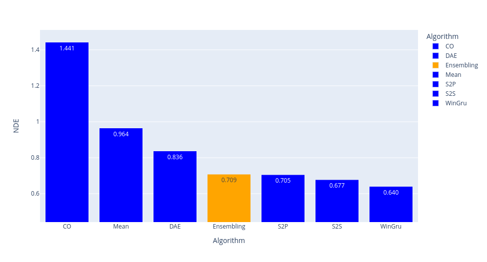
然而,在我看来,在图表中突出显示特定栏的方式似乎有点“设计过度”。
所以我的问题是:有没有人知道一种更简单的方法,在python中高亮显示一个特定的条形图?
谢谢你的建议!
回答 1
Stack Overflow用户
回答已采纳
发布于 2022-04-07 08:25:53
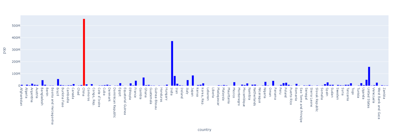
没有必要在color_discrete_map中如此明确。您可以定义默认颜色,然后覆盖。这仍然生成与示例中相同的color_discrete_map字典,但它更健壮。
import plotly.express as px

default_color = "blue"
colors = {"China": "red"}

data = px.data.gapminder().query("year == 1952")

color_discrete_map = {
    c: colors.get(c, default_color)
    for c in data.country.unique()}

fig = px.bar(data, x='country', y='pop', color='country',
             color_discrete_map=color_discrete_map)
fig.update_traces(showlegend=False)

fig.show()
页面原文内容由Stack Overflow提供。腾讯云小微IT领域专用引擎提供翻译支持
原文链接:
https://stackoverflow.com/questions/71778342
复制相关文章
相似问题
腾讯云开发者
