
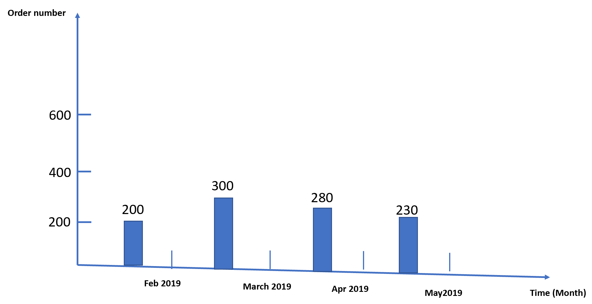
表示给定时间段和的值的时间序列条形图
表示给定时间段和的值的时间序列条形图
提问于 2022-05-15 04:51:38
有一个时间序列数据,如以下数据。
        Time  Order nun
0  2/10/2019        200
1   3/3/2019        150
2  3/15/2019         50
3  3/25/2019        100
4  4/16/2019         90
5  4/17/2019        190
6   5/6/2019        120
7  5/18/2019        110
如何根据每月价值之和生成时间序列条形图。
回答 2
Stack Overflow用户
回答已采纳
发布于 2022-05-15 05:23:25
可以将Time设置为索引,并使用pd.Grouper(freq='M')按月分组。
import matplotlib.pyplot as plt
import matplotlib.dates as mdates

df['Time'] = pd.to_datetime(df['Time'])
out = df.set_index('Time').groupby(pd.Grouper(freq='M'))['Order number'].sum()

fig, ax = plt.subplots()
bars = ax.bar(out.index, out)

ax.bar_label(bars)

ax.set_xlabel("Time (month)")
ax.set_ylabel("Order number")

ax.set_xticks(out.index)
ax.set_yticks(range(200, 800, 200))
ax.xaxis.set_major_formatter(mdates.DateFormatter("%b %Y"))

plt.show()
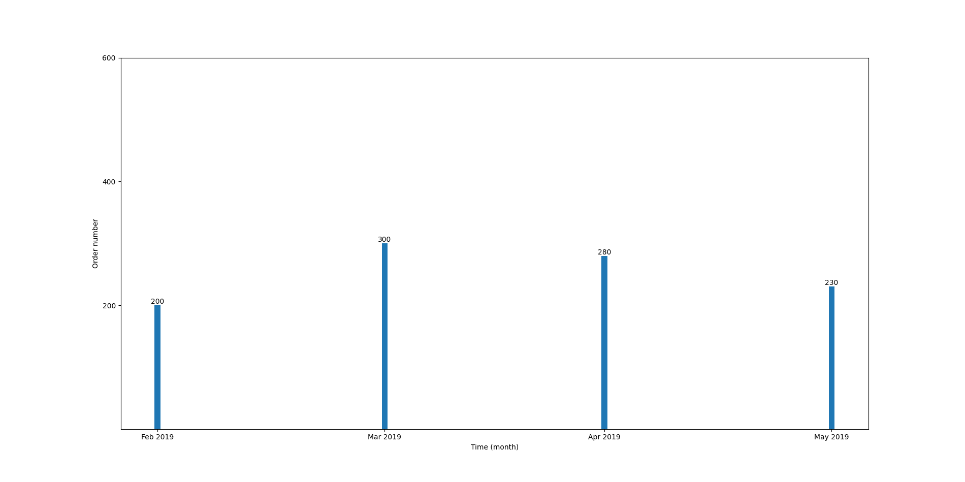
酒吧之所以这么薄,是因为酒吧一个月只需要一天时间。您可以使用字符串来使其正常。
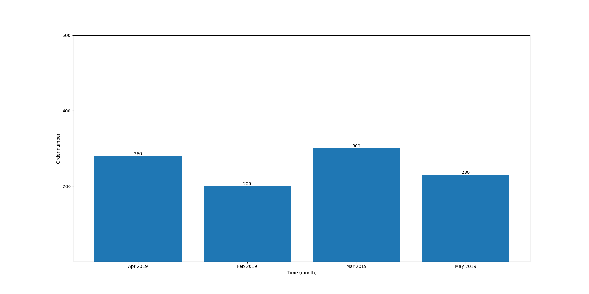
df['Time'] = pd.to_datetime(df['Time']).dt.strftime('%b %Y')
out = df.groupby('Time')['Order number'].sum()

fig, ax = plt.subplots()
bars = ax.bar(out.index, out)

ax.bar_label(bars)

ax.set_xlabel("Time (month)")
ax.set_ylabel("Order number")

ax.set_xticks(out.index)
ax.set_yticks(range(200, 800, 200))

plt.show()
Stack Overflow用户
发布于 2022-05-15 05:36:07
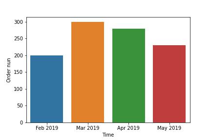
import seaborn as sns
import matplotlib.pyplot as plt

df['Time'] = pd.to_datetime(df['Time'])
plotme = df.resample('M', on='Time').sum()
sns.barplot(y=plotme['Order nun'], x=plotme['Time'].dt.strftime('%b %Y'))
plt.show()
输出:
页面原文内容由Stack Overflow提供。腾讯云小微IT领域专用引擎提供翻译支持
原文链接:
https://stackoverflow.com/questions/72245576
复制相关文章
相似问题
腾讯云开发者
