
如何根据数据组在matplotlib条形图上设置不同的颜色?
如何根据数据组在matplotlib条形图上设置不同的颜色?
提问于 2022-05-31 08:37:25
我创造了这张桌子:
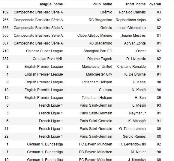
每个联赛都有80名以上的足球运动员。
我还创建了一个条形图,如下所示:
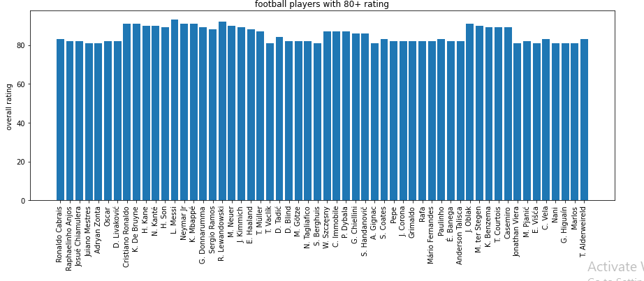
我写的代码是:
plt.figure(figsize=(15,5))
plt.bar(grouped.short_name,grouped.overall)
plt.title("football players with 80+ rating")
plt.xticks(rotation=90)
plt.ylabel("overall rating")
plt.show()
但我希望图表有不同颜色的列,基于联盟球员所代表的。例如:来自塞里亚A的球员是绿色的,来自德甲的球员-红色等等。我也想要有图例来显示哪个颜色对应于哪个联盟。我该怎么做?
Stack Overflow用户
发布于 2022-05-31 09:56:16
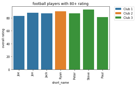
我使用seaborn并使用hue参数。你需要确保你的球员的短名字是唯一的。
import pandas as pd
import matplotlib.pyplot as plt
import seaborn as sns

data = {'league_name':['A','A','A','B','C','C','C'],
        'club_name':['Club 1','Club 1', 'Club 1','Club 2', 'Club 3', 'Club 3', 'Club 3'],
        'short_name':['Joe','Jon','Jack','Ryan','Peter','Steve','Paul'],
        'overall':[83,88,87,90,87,93,81]}

df = pd.DataFrame(data)


ax = sns.barplot(x='short_name', y='overall', data=df, hue='club_name', dodge=False)
plt.title("football players with 80+ rating")
plt.xticks(rotation=90)
plt.ylabel("overall rating")
plt.legend(bbox_to_anchor=(1.05, 1), loc='upper left', borderaxespad=0)
页面原文内容由Stack Overflow提供。腾讯云小微IT领域专用引擎提供翻译支持
原文链接:
https://stackoverflow.com/questions/72444622
复制相关文章
相似问题
腾讯云开发者

Copyright © 2013 - 2026 Tencent Cloud. All Rights Reserved. 腾讯云 版权所有
深圳市腾讯计算机系统有限公司 ICP备案/许可证号:粤B2-20090059 ![]() 粤公网安备44030502008569号
粤公网安备44030502008569号
腾讯云计算(北京)有限责任公司 京ICP证150476号 | 京ICP备11018762号