
如何使用CSS正确缩放和定位容器内的图像
如何使用CSS正确缩放和定位容器内的图像
提问于 2022-06-02 23:24:21
我正在尝试创建一个模因页面,并有装满图像的容器。有些图像是宽的,有些是超长的,我想以这样的方式显示它们:容器是固定大小的(例如,50%的屏幕宽度,高度可以是自动的),里面的图像是裁剪和居中的。我认为最好用一些照片来说明这一点。
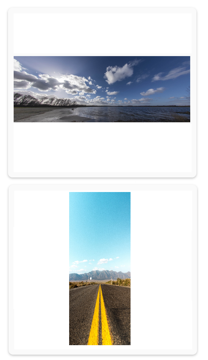
这就是我想要的:
这就是我得到的:

关键是,如果图像太宽,左边和右边,如果图像太长,则在顶部和底部得到这些白色条纹。
下面是我的CSS代码:
.homePage {
  width: 100%;
  min-height: calc(100vh - 80px);
  height: auto;
  display: flex;
  flex-direction: column;
  align-items: center;
  padding-top: 20px;
}

.homePage .post {
  width: 50%;
  background-color: rgb(250, 250, 250);
  box-shadow: rgba(0, 0, 0, 0.24) 0px 3px 8px;
  margin: 20px;
  padding: 20px;
  border-radius: 15px;
}

.post .postHeader {
  display: flex;
  justify-content: center;
  width: 100%;
}

.postHeader .title {
  flex: 50%;
}
.postHeader .deletePost {
  flex: 50%;
  display: flex;
  flex-direction: column;
  align-items: flex-end;
}

.deletePost button {
  border: none;
  background: none;
  font-size: 30px;
  cursor: pointer;
}

.post .postImgContainer {
  word-wrap: break-word;
  height: auto;
  width: 100%;
  display: flex;
  flex-direction: column;
  justify-content:center;
  overflow: hidden;
  overflow-y: auto;
}
我的HTML代码:
<div className="homePage">
      {imageLists.map((image) => {
        return (
          <div className="post">
            <div className="postHeader">
              <div className="title"></div>
            </div>
            <div className="postImgContainer">
              {" "}
              <img src={image}></img>{" "}
            </div>
          </div>
        );
      })}
</div>每当我从column转换到row in .postImgContainer的灵活方向时,它似乎是有效的,但只有一种情况下,另一种情况正在被拉伸。
谢谢你的帮助!
回答 2
Stack Overflow用户
回答已采纳
发布于 2022-06-02 23:47:36
使用flex,您可以根据图像容器中规定的最大宽度和高度将图像定位到所需的位置。我希望你能清楚地看到这个例子,如果你真的需要其他的东西,让我知道。
试试这个:
body {
  min-height: 100vh;
}

.container {
  width: 100%;
  background: blue;
}

.meme {
  width: 50%;
  margin: 15px auto;
  height: 600px;
  background: green;
  display: flex;
  justify-content: center;
  align-items: center;
}

.meme-img {
  max-height: 100%;
  max-width: 100%;
}<!DOCTYPE html>
<html lang="en">
<head>
<meta charset="UTF-8">
<meta http-equiv="X-UA-Compatible" content="IE=edge">
<meta name="viewport" content="width=device-width, initial-scale=1.0">
</head>
<body>
<div class="container">
<div class="meme">
<img src="https://cdn.pixabay.com/photo/2022/05/30/14/24/stairs-7231312_960_720.jpg" class="meme-img">
</div>
<div class="meme">
<img src="https://cdn.pixabay.com/photo/2015/10/29/14/38/web-1012467_960_720.jpg" class="meme-img">
</div>
</div>
</body>
</html>
Stack Overflow用户
发布于 2022-06-03 00:00:37
允许CSS背景发挥神奇的作用。我们可以添加一个背景图像而不是一个实际的图像,防止重复,它的中心,并包含它。
看看我的(愚蠢的)版本:
.wrapper {
  /* let's pretend it's a square */
  height: 300px;
  width: 300px;
  /* the trick is background images (see HTML)
     we use some styles here to make it all work */
  background-repeat: no-repeat;
  background-position: center;
  background-size: contain;
  /* just for the demo */
  background-color: #f7f7f7;
  border-radius: 10px;
  box-shadow: 1px 2px 7px 0px rgba(0, 0, 0, .2);
}<div class="wrapper" style="background-image: url(https://picsum.photos/600/300);"></div>
<p><!-- an empty spacer --></p>
<div class="wrapper" style="background-image: url(https://picsum.photos/300/600);"></div>
页面原文内容由Stack Overflow提供。腾讯云小微IT领域专用引擎提供翻译支持
原文链接:
https://stackoverflow.com/questions/72483243
复制相关文章
相似问题
腾讯云开发者
