
如何在geom_text中为ggplot添加条件语句?
如何在geom_text中为ggplot添加条件语句?
提问于 2022-06-14 15:46:35
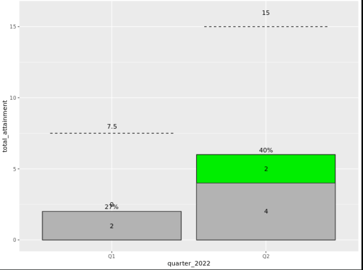
我有一幅图,看2夸脱的数据。我还包括一个目标值(虚线)和一个YTD部分(即累计和(计数))。
我遇到了一个问题,试图在该节中显示为YTD添加的#,但只显示其中的一个季度(因为Q1应该已经在条形图中有了一个值)。目前,它在下面的图中显示0和2,但我只想显示所有的> Q1值。
电流图
我尝试过目前的做法,但似乎行不通:
  **geom_text(aes(label = ifelse((quarter_2022= "Q1"), total_attainment, ifelse(quarter_2022="Q2",total_attainment+2)),
            position = position_stack(vjust = 1))) +**
地块代码
   ggplot(df1, aes(x=quarter_2022, y=total_attainment)) +
   geom_col(aes(y = YTD_TOTAL), fill = c("green1", "green2"), color = "black") +
   geom_text(aes(y = YTD_TOTAL, label = scales::percent(YTD_PERCENT_ATTAINMENT)),
             vjust = -0.5) +
   geom_col(fill = "gray70", color = "gray20") +
   geom_text(aes(label = YTD_TOTAL - total_attainment),
             position = position_stack(vjust = 1.25))+
    geom_text(aes(label = total_attainment),
             position = position_stack(vjust = 0.5))+
   geom_segment(aes(x = as.numeric(as.factor(quarter_2022)) - 0.4,
                    xend = as.numeric(as.factor(quarter_2022)) + 0.4,
                    y = attainment_target, yend = attainment_target),
                linetype = "dashed") +
   geom_text(aes(label = attainment_target),
             position = position_stack(vjust = 4))
以下是数据:
structure(list(attainment_target = c(7.5, 15), quarter_2022 = c("Q1",
"Q2"), year = structure(c(1640995200, 1640995200), class = c("POSIXct",
"POSIXt"), tzone = ""), total_attainment = c(2, 4), percent_attainment_by_quarter = c(0.2666,
0.2666), ytd = c(2, 6), YTD_TOTAL = c(2, 6), YTD_PERCENT_ATTAINMENT = c(0.266666666666667,
0.4)), row.names = c(NA, -2L), class = c("tbl_df", "tbl", "data.frame"
))回答 1
Stack Overflow用户
发布于 2022-06-14 16:09:13
在数据集中创建一个逻辑列,该列指示标签是否为0。在创建标签的geom_text中,将颜色美学设置为逻辑列。使用scale_color_manual(values = c(NA, "black"), na.value = NA)不为0的标签分配颜色。
页面原文内容由Stack Overflow提供。腾讯云小微IT领域专用引擎提供翻译支持
原文链接:
https://stackoverflow.com/questions/72619903
复制相关文章
相似问题
腾讯云开发者
