
我的html导航栏在手机屏幕上不能正常工作。
我的html导航栏在手机屏幕上不能正常工作。
提问于 2022-06-19 04:14:31
嘿,我正在使用顺风css来完成我的网站。我的肚脐没有给我在手机屏幕上的全屏视图。救命啊!
您可以检查github - 网站链接上托管的原始站点。
HTML和Tailwind-CSS:
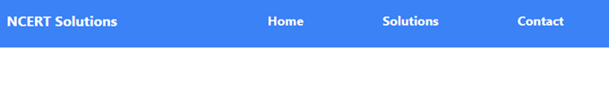
<nav class="flex justify-between bg-blue-500 w-full">
        <div class="ncrt-sol mx-48 my-6">
            <span class="text-white font-bold text-xl cursor-default">NCERT Solutions</span>
        </div>
        <div class="links">
            <ul class="flex mx-40 my-6">
                <li><a href="#" class="mx-8 text-white font-bold text-lg hover:text-blue-500 hover:bg-white px-6 py-2 hover:rounded-3xl duration-150">Home</a></li>
                <li><a href="solution.html" class="mx-8 text-white font-bold text-lg hover:text-blue-500 hover:bg-white px-6 py-2 hover:rounded-3xl duration-150">Solutions</a></li>
                <li><a href="contact.html" class="mx-8 text-white font-bold text-lg hover:text-blue-500 hover:bg-white px-6 py-2 hover:rounded-3xl duration-150">Contact</a></li>
            </ul>
        </div>
</nav>我用w-full类尝试了宽度满,但它仍然不起作用.
回答 2
Stack Overflow用户
回答已采纳
发布于 2022-06-19 04:40:38
尝试使用w-screen类,该类将编译为100%vw
编辑
对于移动设备来说,ncrt-sol和flex类的边缘太高了。
所以这引起了麻烦。因此,与mx-40不同,将其更改为mx-4
最后的代码是:
<nav class="flex justify-between bg-blue-500 w-full">
        <div class="ncrt-sol mx-4 my-6">
            <span class="text-white font-bold text-xl cursor-default">NCERT Solutions</span>
        </div>
        <div class="links">
            <ul class="flex mx-4 my-6">
                <li><a href="#" class="mx-8 text-white font-bold text-lg hover:text-blue-500 hover:bg-white px-6 py-2 hover:rounded-3xl duration-150">Home</a></li>
                <li><a href="solution.html" class="mx-8 text-white font-bold text-lg hover:text-blue-500 hover:bg-white px-6 py-2 hover:rounded-3xl duration-150">Solutions</a></li>
                <li><a href="contact.html" class="mx-8 text-white font-bold text-lg hover:text-blue-500 hover:bg-white px-6 py-2 hover:rounded-3xl duration-150">Contact</a></li>
            </ul>
        </div>
    </nav>
并同样更改边距,并将断点用于更大的屏幕,如md:、lg:等。
希望能帮上忙!
Stack Overflow用户
发布于 2022-06-19 05:05:06
.ncrt-sol div和.links div的左右边距太大,不利于移动屏幕,从而导致body元素溢出。尝试对移动设备使用较小的值。
页面原文内容由Stack Overflow提供。腾讯云小微IT领域专用引擎提供翻译支持
原文链接:
https://stackoverflow.com/questions/72674237
复制相关文章
相似问题
腾讯云开发者
