
SARIMAX预测数据置信区间的绘制
SARIMAX预测数据置信区间的绘制
提问于 2022-06-29 21:52:54
我试图沿着SARIMAX模型的预测值绘制置信区间带。
SARIMAX模型采用以下方法进行拟合:
model=sm.tsa.statespace.SARIMAX(data_df['Net Sales'],order=(1, 1, 1),seasonal_order=(1,1,1,12))
results=model.fit()
print(results.summary())
要绘制预测值,我将使用以下代码:
fig, ax = plt.subplots(figsize=(15,5))
ax.ticklabel_format(useOffset=False, style='plain')
data_df['Net_Sales forecast'] = results.predict(start = 48, end = 60, dynamic= True)
data_df[['Net Sales', 'Net_Sales forecast']].plot(ax=ax, color=['blue', 'orange'], marker='o', legend=True)
我想在预测数据周围画出95%的置信区间。我试过各种方法,但都没有用。
我理解,我可以访问SARIMAX模型结果中的置信区间参数,如下所示。
ci = results.conf_int(alpha=0.05)
ci
返回:
              0               1
ar.L1   -3.633910e-01   1.108174e+00
ma.L1   -1.253388e+00   2.229091e-01
ar.S.L12 -3.360182e+00  4.001006e+00
ma.S.L12 -4.078321e+00  3.517885e+00
sigma2  3.080743e+13    3.080743e+13
我如何将此融入到显示置信区间区间的情节中?
回答 1
Stack Overflow用户
回答已采纳
发布于 2022-06-30 01:34:03
你所显示的置信区间实际上是模型参数,而不是预测。下面是一个示例,说明如何利用statsmodels 文档中使用的数据集计算和绘制围绕预测的置信区间。
注意:在解释这些信任区间时,您需要谨慎。下面是一个相关的页面,讨论在statsmodels中实际实现了什么。
import matplotlib.pyplot as plt
import pandas as pd
import statsmodels.api as sm
import requests
from io import BytesIO
# Get data
wpi1 = requests.get('https://www.stata-press.com/data/r12/wpi1.dta').content
data = pd.read_stata(BytesIO(wpi1))
data.index = data.t
# Set the frequency
data.index.freq='QS-OCT'
# Fit the model
model = sm.tsa.statespace.SARIMAX(data['wpi'], trend='c', order=(1,1,1))
results = model.fit(disp=False)
# Get predictions
# (can also utilize results.get_forecast(steps=n).summary_frame(alpha=0.05))
preds_df = (results
.get_prediction(start='1991-01-01', end='1999-10-01')
.summary_frame(alpha=0.05)
)
print(preds_df.head())
# wpi mean mean_se mean_ci_lower mean_ci_upper
# 1991-01-01 118.358860 0.725041 116.937806 119.779914
# 1991-04-01 120.340500 1.284361 117.823198 122.857802
# 1991-07-01 122.167206 1.865597 118.510703 125.823709
# 1991-10-01 123.858465 2.463735 119.029634 128.687296
# 1992-01-01 125.431312 3.070871 119.412517 131.450108
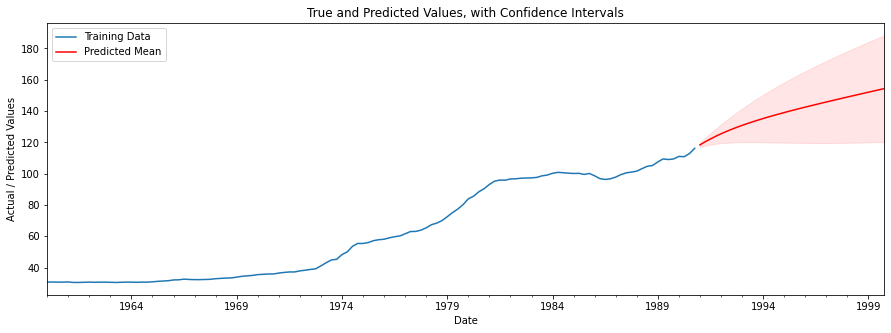
# Plot the training data, predicted means and confidence intervals
fig, ax = plt.subplots(figsize=(15,5))
ax = data['wpi'].plot(label='Training Data')
ax.set(
title='True and Predicted Values, with Confidence Intervals',
xlabel='Date',
ylabel='Actual / Predicted Values'
)
preds_df['mean'].plot(ax=ax, style='r', label='Predicted Mean')
ax.fill_between(
preds_df.index, preds_df['mean_ci_lower'], preds_df['mean_ci_upper'],
color='r', alpha=0.1
)
legend = ax.legend(loc='upper left')
plt.show()
页面原文内容由Stack Overflow提供。腾讯云小微IT领域专用引擎提供翻译支持
原文链接:
https://stackoverflow.com/questions/72808256
复制相关文章
相似问题
腾讯云开发者
