
如何在Y轴右侧的sns热图中为多组行添加多个标签?
如何在Y轴右侧的sns热图中为多组行添加多个标签?
提问于 2022-08-16 21:28:32
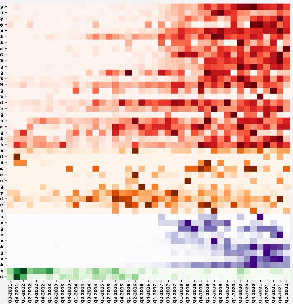
在python中,我有具有不同行组的sns热图,其中每个组的颜色不同。我想为每种颜色(每一组行)添加一个标签,最好是在Y轴的右侧。例如,对于红色组,我希望在行的右侧设置一个标签,称为“增长趋势”。对于紫色组,我想要右边的标签叫做“新兴趋势”,以此类推。下面是我的热图:
下面是我如何生成不同颜色的热图:
agg_df=pd.DataFrame(agg, columns=a_list, index=agg_x)
print(agg_df)


agg_df_1=agg_df.copy()
agg_df_2=agg_df.copy()
agg_df_3=agg_df.copy()
agg_df_4=agg_df.copy()

#generate heatmap
agg_df_1.iloc[:,24:] = float('nan')
g=sns.heatmap(agg_df_1.transpose(), annot=False,fmt=".1f",annot_kws={"fontsize":6},cmap=pyplot.cm.Reds,xticklabels=1, yticklabels=1,cbar=False)
g.set_xticklabels(g.get_xticklabels(), fontsize = 8)
g.set_yticklabels(g.get_yticklabels(), fontsize = 8)

agg_df_2.iloc[:,:24]=float('nan')
agg_df_2.iloc[:,35:]=float('nan')
g=sns.heatmap(agg_df_2.transpose(), annot=False,fmt=".1f",annot_kws={"fontsize":6},cmap=pyplot.cm.Oranges,xticklabels=1, yticklabels=1,cbar=False)
g.set_xticklabels(g.get_xticklabels(), fontsize = 8)
g.set_yticklabels(g.get_yticklabels(), fontsize = 8)


agg_df_3.iloc[:,:35]=float('nan')
agg_df_3.iloc[:,44:]=float('nan')
g=sns.heatmap(agg_df_3.transpose(), annot=False,fmt=".1f",annot_kws={"fontsize":6},cmap=pyplot.cm.Purples,xticklabels=1, yticklabels=1,cbar=False)
g.set_xticklabels(g.get_xticklabels(), fontsize = 8)
g.set_yticklabels(g.get_yticklabels(), fontsize = 8)

agg_df_4.iloc[:,:44]=float('nan')
g=sns.heatmap(agg_df_4.transpose(), annot=False,fmt=".1f",annot_kws={"fontsize":6},cmap=pyplot.cm.Greens,xticklabels=1, yticklabels=1,cbar=False)
g.set_xticklabels(g.get_xticklabels(), fontsize = 8)
g.set_yticklabels(g.get_yticklabels(), fontsize = 8)

for label in g.get_yticklabels():
  label.set_weight('bold')

for label in g.get_xticklabels():
  label.set_weight('bold')

#g.set(ylabel='Decreasing   Emerging      Mix           Increasing')


pyplot.show()更新:或者,每种颜色的图例也是一个很好的主意。我怎样才能做到这一点?
回答 2
Stack Overflow用户
发布于 2022-08-16 22:23:31
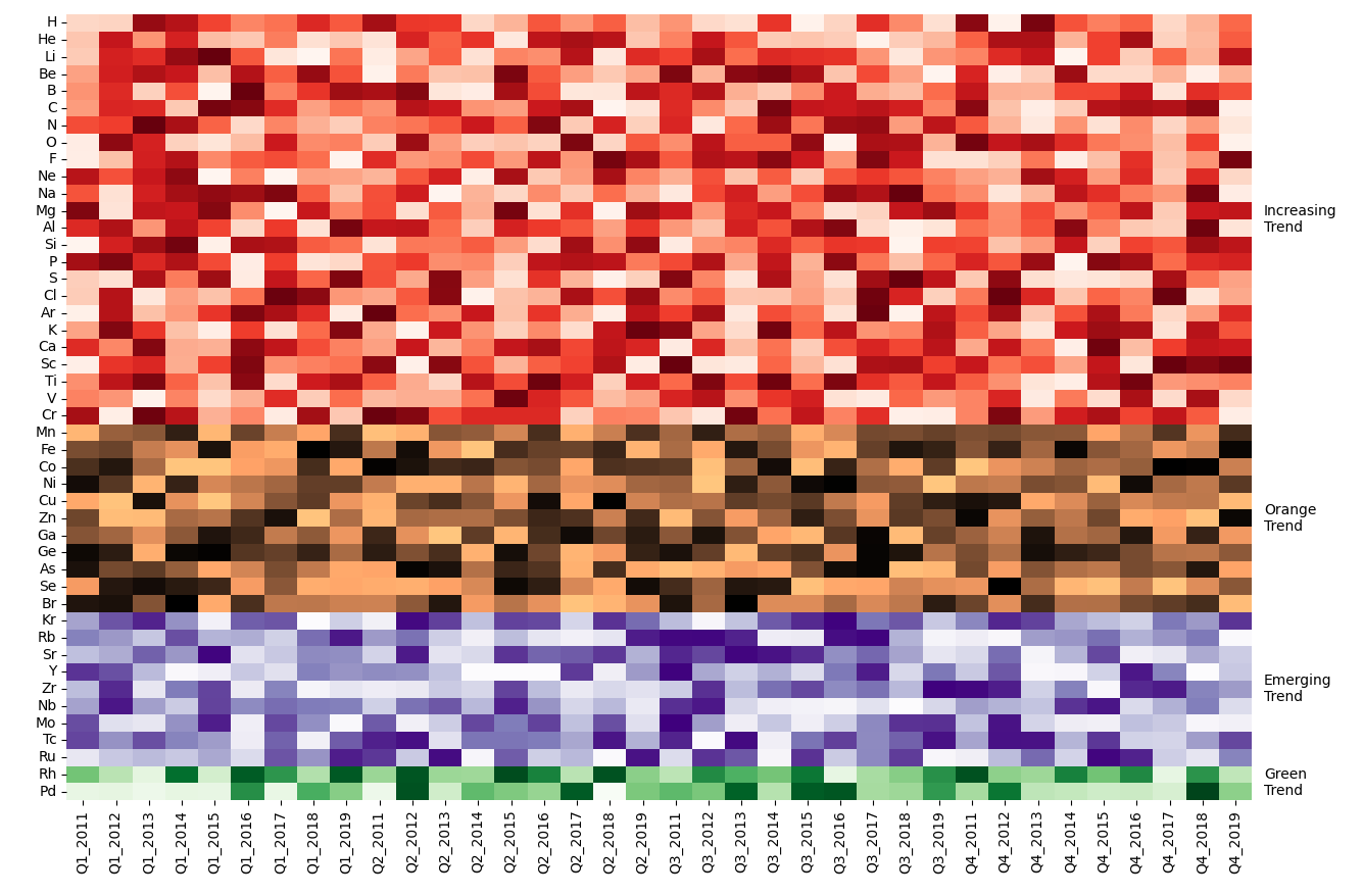
您可以通过循环简化代码,并通过yaxis转换设置文本:
from matplotlib import pyplot as plt
import seaborn as sns
import pandas as pd
import numpy as np

# create some dummy data similar to the given
columns = 'H He Li Be B C N O F Ne Na Mg Al Si P S Cl Ar K Ca Sc Ti V Cr Mn Fe Co Ni Cu Zn Ga Ge As Se Br Kr Rb Sr Y Zr Nb Mo Tc Ru Rh Pd'.split()
idx = [f'Q{i}_{y}' for i in range(1, 5) for y in range(2011, 2020)]
df = pd.DataFrame(np.random.rand(len(idx), len(columns)), columns=columns, index=idx)

# list of places where the bands start and stop
stops = [0, 24, 35, 44, len(columns)]
# color maps for each band
cmaps = ['Reds', 'copper', 'Purples', 'Greens']
# labels for the bands
labels = ['Increasing Trend', 'Orange Trend', 'Emerging Trend', 'Green Trend']

fig, ax = plt.subplots(figsize=(12, 10))
sns.set_context(font_scale=0.7)  # scale factor for all fonts
# create a loop using the begin and end of each band, the colors and the labels
for beg, end, cmap, label in zip(stops[:-1], stops[1:], cmaps, labels):
    # mask setting 0 for the band to be plotted in this step
    mask = np.repeat([[1, 0, 1]] * len(idx), [beg, end - beg, len(columns) - end], axis=1).T
    # heatmap for this band
    sns.heatmap(df.T, mask=mask, cmap=cmap, annot=False, cbar=False, ax=ax)
    # add some text to the center right of this band
    ax.text(1.01, (beg + end) / 2, '\n'.join(label.split()), ha='left', va='center', transform=ax.get_yaxis_transform())
plt.tight_layout()  # fit all text nicely into the plot
plt.show()
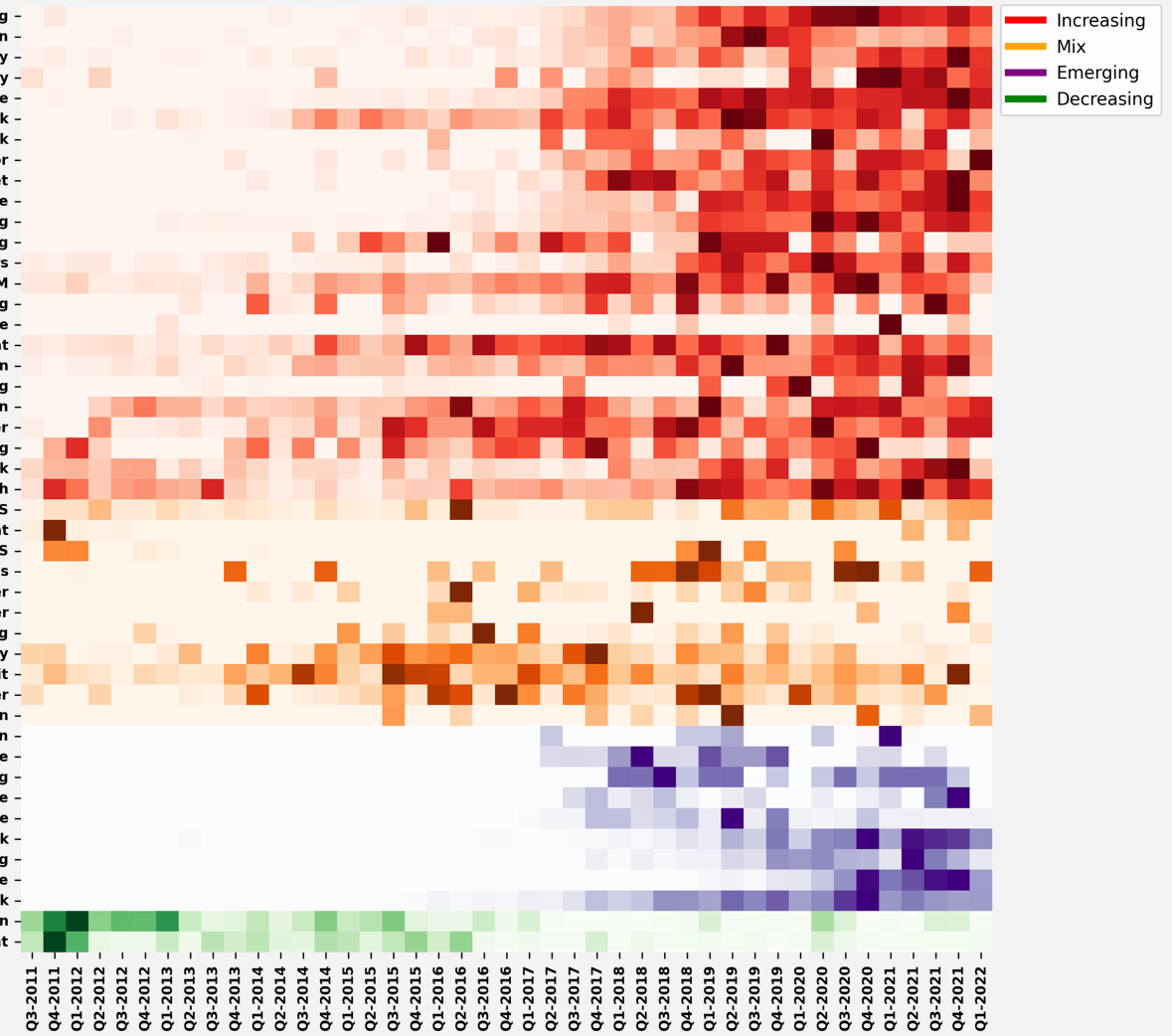
Stack Overflow用户
发布于 2022-08-16 22:18:36
对于另一个传奇,我成功地实现了这样的一个好结果:
from matplotlib.lines import Line2D
custom_lines = [Line2D([0], [0], color='red', lw=4),
                Line2D([0], [0], color='orange', lw=4),
                Line2D([0], [0], color='purple', lw=4),
                Line2D([0], [0], color='green', lw=4)]

g.legend(custom_lines, ['Increasing', 'Mix', 'Emerging', 'Decreasing'],loc='upper left', bbox_to_anchor=(1, 1.01))
页面原文内容由Stack Overflow提供。腾讯云小微IT领域专用引擎提供翻译支持
原文链接:
https://stackoverflow.com/questions/73380537
复制相关文章
相似问题
腾讯云开发者
