
在共享x轴的两个子图上悬停时如何显示y值?
在共享x轴的两个子图上悬停时如何显示y值?
提问于 2022-08-20 17:26:25
我有两个共享x轴的子图,但它只显示一个子图的y值,而不是两者。我希望悬停显示显示来自两个子图的y值。
现在显示的情况如下:
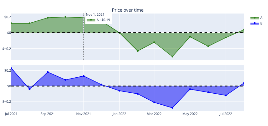
但我希望它显示y值从底部的图表,以及,即使我是悬停我的鼠标在顶部图表,反之亦然。
这是我的密码:
title = 'Price over time'
err = 'Price'


fig = make_subplots(rows=2, cols=1,
                    vertical_spacing = 0.05,
                    shared_xaxes=True,
                    subplot_titles=(title,""))

# A
fig.add_trace(go.Scatter(x= A_error['CloseDate'],
                         y = A_error[err],
                         line_color = 'green',
                         marker_color = 'green',
                         mode = 'lines+markers',
                         showlegend = True,
                         name = "A",
                         stackgroup = 'one'),
              row = 1,
              col = 1,
              secondary_y = False)

# B
fig.add_trace(go.Scatter(x= B_error['CloseDate'],
                         y = B_error[err],
                         line_color = 'blue',
                         mode = 'lines+markers',
                         showlegend = True,
                         name = "B",
                         stackgroup = 'one'),
              row = 2,
              col = 1,
              secondary_y = False)

fig.update_yaxes(tickprefix = '$')
fig.add_hline(y=0, line_width=3, line_dash="dash", line_color="black")

fig.update_layout(#height=600, width=1400,
                  hovermode = "x unified",
legend_traceorder="normal")Stack Overflow用户
回答已采纳
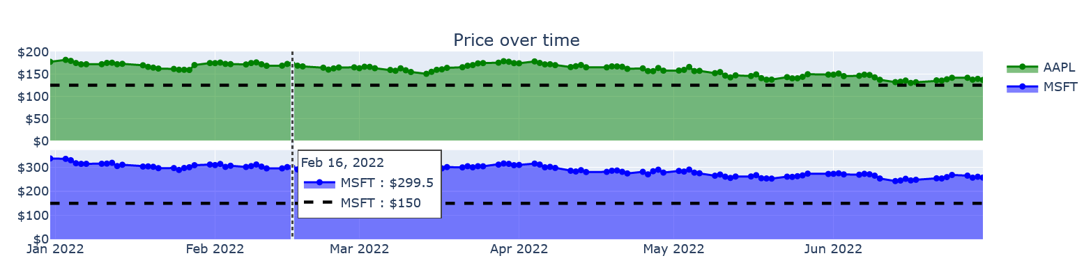
发布于 2022-08-21 02:35:21
编辑:在这个时候,我不认为将提供跨子情节的统一悬停模式。我从这里那里得到了这方面的理由。它确实会影响一些特性,但是可以应用这来解决这个问题。在您的示例中,这两幅图上都没有出现水平线。因此,我为散点图添加了两条水平线,以适应这种情况。对于这两种股票价格,您已经为每种股票设置了一个阈值。您的目标是相同的阈值,所以请修改它。
import plotly.express as px
import plotly.graph_objects as go
from plotly.subplots import make_subplots
import yfinance as yf

df = yf.download("AAPL MSFT", start="2022-01-01", end="2022-07-01", group_by='ticker')
df.reset_index(inplace=True)

import plotly.express as px
import plotly.graph_objects as go
from plotly.subplots import make_subplots

title = 'Price over time'
err = 'Price'

fig = make_subplots(rows=2, cols=1,
                    vertical_spacing = 0.05,
                    shared_xaxes=True,
                    subplot_titles=(title,""))

# AAPL
fig.add_trace(go.Scatter(x = df['Date'],
                         y = df[('AAPL', 'Close')],
                         line_color = 'green',
                         marker_color = 'green',
                         mode = 'lines+markers',
                         showlegend = True,
                         name = "AAPL",
                         stackgroup = 'one'),
              row = 1,
              col = 1,
              secondary_y = False)
# APPL $150 horizontal line
fig.add_trace(go.Scatter(x=df['Date'],
                         y=[125]*len(df['Date']),
                         mode='lines',
                         line_width=3,
                         line_color='black',
                         line_dash='dash',
                         showlegend=False,
                         name='APPL'
                        ),
              row=1,
              col=1,
              secondary_y=False)


# MSFT
fig.add_trace(go.Scatter(x= df['Date'],
                         y = df[('MSFT', 'Close')],
                         line_color = 'blue',
                         mode = 'lines+markers',
                         showlegend = True,
                         name = "MSFT",
                         stackgroup = 'one'),
              row = 2,
              col = 1,
              secondary_y = False)
# MSFT $150 horizontal line
fig.add_trace(go.Scatter(x=df['Date'],
                         y=[150]*len(df['Date']),
                         mode='lines',
                         line_width=3,
                         line_color='black',
                         line_dash='dash',
                         showlegend=False,
                         name='MSFT'
                        ),
              row=2,
              col=1,
              secondary_y=False)


fig.update_yaxes(tickprefix = '$')
fig.update_xaxes(type='date', range=[df['Date'].min(),df['Date'].max()])

#fig.add_hline(y=0, line_width=3, line_dash="dash", line_color="black")
fig.update_layout(#height=600, width=1400,
    hovermode = "x unified",
    legend_traceorder="normal")
fig.update_traces(xaxis='x2')

fig.show()

enter code here
页面原文内容由Stack Overflow提供。腾讯云小微IT领域专用引擎提供翻译支持
原文链接:
https://stackoverflow.com/questions/73428753
复制相关文章
相似问题
腾讯云开发者
