
实际上,将px.timeline图与go.Figure混合生成一个可视化和html文件。
实际上,将px.timeline图与go.Figure混合生成一个可视化和html文件。
提问于 2022-08-25 09:26:17
我希望用px.timeline图表和go.Table创建一个可视化(子图),基本上将这两个数字放在同一个页面上,并生成一个html文件。下面是示例数据&未完成的代码:
from plotly.subplots import make_subplots
import pandas as pd
import plotly.express as px
import plotly.graph_objs as go
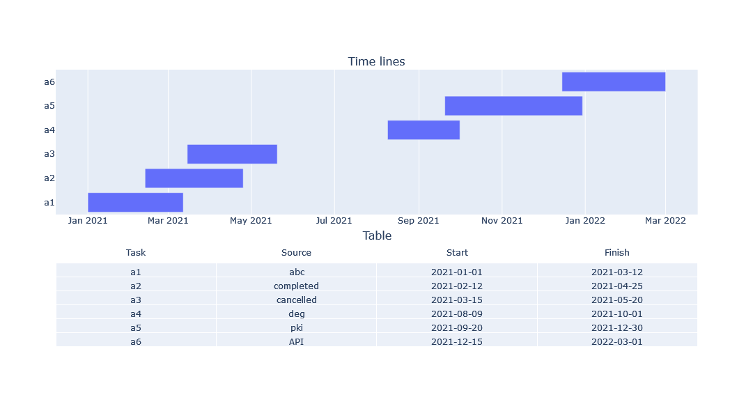
df = pd.DataFrame({'Task': ['a1', 'a2', 'a3', 'a4', 'a5', 'a6'],
'Source': ['abc', 'completed', 'cancelled', 'deg', 'pki', 'API'],
'Start': ['2021-01-01', '2021-02-12', '2021-03-15', '2021-08-09', '2021-09-20', '2021-12-15'],
'Finish': ['2021-03-12', '2021-04-25', '2021-05-20', '2021-10-01', '2021-12-30', '2022-03-01']})
fig1 = px.timeline(df, x_start='Start', x_end='Finish')
fig2 = go.Figure(data=[go.Table(
header=dict(
values=['Task', 'Source', 'Start', 'Finish'],
line_color='white', fill_color='white'
),
cells=dict(
values=[df['Task'], df['Source'], df['Start'], df['Finish']],
align='center'
)
)])不幸的是,现在我只能分别生成两张图表,你能帮我把这两张图放在同一个子图上吗?
非常感谢
Stack Overflow用户
回答已采纳
发布于 2022-08-25 10:23:10
只使用时间线数据创建一个子图;第二个设置表图。最后,将第一个x轴更改为日期类型.
from plotly.subplots import make_subplots
import pandas as pd
import plotly.express as px
import plotly.graph_objs as go


df = pd.DataFrame({'Task': ['a1', 'a2', 'a3', 'a4', 'a5', 'a6'],
                   'Source': ['abc', 'completed', 'cancelled', 'deg', 'pki', 'API'],
                   'Start': ['2021-01-01', '2021-02-12', '2021-03-15', '2021-08-09', '2021-09-20', '2021-12-15'],
                   'Finish': ['2021-03-12', '2021-04-25', '2021-05-20', '2021-10-01', '2021-12-30', '2022-03-01']})

fig = make_subplots(rows=2, cols=1,
                   specs=[[{'type': 'bar'}],
                          [{'type': 'table'}]],
                    subplot_titles=('Time lines', 'Table'),
                    row_heights=[0.55, 0.45],
                    vertical_spacing=0.1)

fig1 = px.timeline(df, x_start='Start', x_end='Finish', y='Task')

fig.add_trace(go.Bar(fig1.data[0]), row=1,col=1)

fig.add_trace(go.Table(
    header=dict(
        values=['Task', 'Source', 'Start', 'Finish'],
        line_color='white', fill_color='white'
    ),
    cells=dict(
        values=[df['Task'], df['Source'], df['Start'], df['Finish']],
        align='center'
    )
), row=2, col=1)

fig.update_layout(autosize=True,
                  height=600
                 )
fig.update_xaxes(type='date')
页面原文内容由Stack Overflow提供。腾讯云小微IT领域专用引擎提供翻译支持
原文链接:
https://stackoverflow.com/questions/73485095
复制相关文章
相似问题
腾讯云开发者
