
增大matplotlib上轴的标签大小
增大matplotlib上轴的标签大小
提问于 2022-09-03 19:59:06
我只是想知道如何为matplotlib中的子图增加x轴和y轴标签的字体大小。我绘制了六个子图,并设法增加了它们的图形大小,但我只是想知道如何为我的绘图增加x和y轴标签的字体大小。我搜索了堆叠溢出,但没有找到任何有价值的解决方案。这些地块的代码如下:
fig,axes = plt.subplots(2,3,figsize=(30,30))
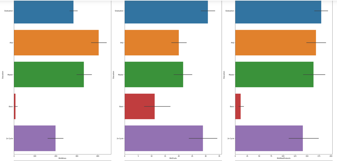
sns.barplot(ax=axes[0,0],y=df["Education"],x=df["MntWines"],data=df)
sns.barplot(ax=axes[0,1],y=df["Education"],x=df["MntFruits"],data=df)
sns.barplot(ax=axes[0,2],y=df["Education"],x=df["MntMeatProducts"],data=df)
sns.barplot(ax=axes[1,0],y=df["Education"],x=df["MntFishProducts"],data=df)
sns.barplot(ax=axes[1,1],y=df["Education"],x=df["MntSweetProducts"],data=df)
sns.barplot(ax=axes[1,2],y=df["Education"],x=df["MntGoldProds"],data=df)
plt.tight_layout()
plt.show()产出数字如下:
做这件事的任何线索都将不胜感激。谢谢!
Stack Overflow用户
发布于 2022-09-03 20:05:50
您应该能够通过以下行全局更新标签大小:
from matplotlib import pyplot as plt
plt.rcParams.update({'axes.labelsize': 'large'})请参阅https://matplotlib.org/stable/tutorials/introductory/customizing.html
页面原文内容由Stack Overflow提供。腾讯云小微IT领域专用引擎提供翻译支持
原文链接:
https://stackoverflow.com/questions/73595093
复制相关文章
相似问题
腾讯云开发者
