
R ggplot2将geom_bar更改为单一颜色
R ggplot2将geom_bar更改为单一颜色
提问于 2022-09-06 18:42:40
根据下面的代码和数据,如何将条形颜色更改为单色#0277BD
我试过scale_fill_manual(values=c("#0277BD")),但它不起作用。
Error in `f()`:
! Insufficient values in manual scale. 24 needed but only 1 provided.我也尝试过scale_fill_brewer(palette="Blues"),但这也不起作用。
Warning message:
In RColorBrewer::brewer.pal(n, pal) :
  n too large, allowed maximum for palette Blues is 9
Returning the palette you asked for with that many colors
数据:
df = structure(list(CITYNAME = c("a", "b", "c",
    "d", "e", "f", "g",
    "h", "i", "j", "k",
    "l", "m", "n", "p", "q",
    "r", "s", "t", "u",
    "w", "x", "y", "z"), AvgTMin = c(20.28,
20.38, 20.08, 20.35, 20.38, 20.76, 21, 21.21, 20.45, 20.21, 21.18,
20.29, 20.61, 20.44, 20.95, 19.75, 20.58, 20.32, 21.05, 20.28,
20.09, 20.15, 20.73, 20.12)), row.names = c(NA,
    -24L), class = c("tbl_df", "tbl", "data.frame"))
代码:
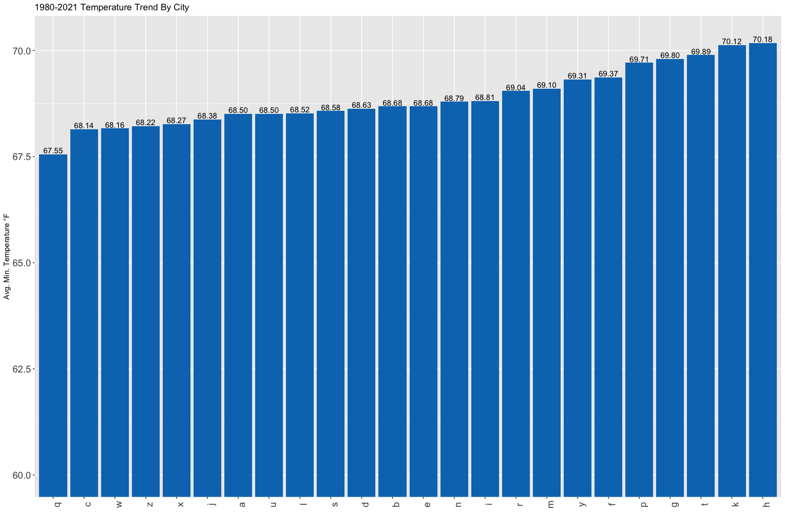
# Plot in Fahrenheit

    df %>% mutate(AvgTMin = AvgTMin * (1.8) + 32) %>% # Convert from C to F
          ggplot(aes(x = reorder(CITYNAME,AvgTMin), y = AvgTMin, fill = CITYNAME)) +
          geom_bar(stat="identity") +
          coord_cartesian(ylim = c(60,70.3)) +
          theme(axis.text = element_text(size = 14)) +
          geom_text(aes(label=sprintf("%0.2f", AvgTMin)), vjust=-0.2, size = 4) +
          labs(x = NULL, y = "Avg. Min. Temperature \u00B0F") +
          theme(axis.text.x = element_text(angle = 90),  legend.position = 'none') +
ggtitle("1980-2021 Temperature Trend By City")回答 2
Stack Overflow用户
回答已采纳
发布于 2022-09-06 18:52:39
您可以在geom_bar调用中指定单个颜色:
geom_bar(stat="identity", fill = "0277BD") +在您的代码中,您还可以在fill调用中删除ggplot美学,除非其他层需要它。
Stack Overflow用户
发布于 2022-09-06 19:09:02
如果希望不使用fill参数,则还可以使用scale_fill_manual,但需要为所有唯一值复制颜色。
library(tidyverse)

df %>%
  mutate(AvgTMin = AvgTMin * (1.8) + 32) %>% # Convert from C to F
  ggplot(aes(
    x = reorder(CITYNAME, AvgTMin),
    y = AvgTMin,
    fill = CITYNAME
  )) +
  geom_bar(stat = "identity") +
  coord_cartesian(ylim = c(60, 70.3)) +
  theme(axis.text = element_text(size = 14)) +
  geom_text(aes(label = sprintf("%0.2f", AvgTMin)), vjust = -0.2, size = 4) +
  labs(x = NULL, y = "Avg. Min. Temperature \u00B0F") +
  theme(axis.text.x = element_text(angle = 90),
        legend.position = 'none') +
  ggtitle("1980-2021 Temperature Trend By City") +
  scale_fill_manual(values = rep_len("#0277BD", length(unique(df$CITYNAME))))
输出
页面原文内容由Stack Overflow提供。腾讯云小微IT领域专用引擎提供翻译支持
原文链接:
https://stackoverflow.com/questions/73626519
复制相关文章
相似问题
腾讯云开发者
