
移除python中条形图中的白色边框
移除python中条形图中的白色边框
提问于 2022-10-05 00:46:56
所以我在堆栈流中找到了这段代码:Plot on primary and secondary x and y axis with a reversed y axis
#1 Import Library

import matplotlib.pyplot as plt
%matplotlib
import numpy as np
import pandas as pd

#2 IMPORT DATA
sfData=pd.read_excel('data/streamflow validation.xlsx',sheet_name='Sheet1')

#3 Define Data
x = sfData['Year']
y1 = sfData['Observed']
y2 = sfData['Simulated']
y3 = sfData['Areal Rainfall']

# Or we can use loc for defining the data
x = list(sfData.iloc[:, 0])
y1 = list(sfData.iloc[:, 1])
y2 = list(sfData.iloc[:, 2])
y3 = list(sfData.iloc[:, 3])

#4 Plot Graph
fig, ax1 = plt.subplots(figsize=(12,10))
# increase space below subplot
fig.subplots_adjust(bottom=0.3)
# Twin Axes
# Secondary axes
ax2 = ax1.twinx()
ax2.bar(x, y3, width=15, bottom=0, align='center', color = 'b', data=sfData)
ax2.set_ylabel(('Areal Rainfall(mm)'),
            fontdict={'fontsize': 12})
# invert y axis
ax2.invert_yaxis()
# Primary axes
ax1.plot(x, y1, color = 'r', linestyle='dashed', linewidth=3, markersize=12)
ax1.plot(x, y2, color = 'k', linestyle='dashed', linewidth=3, markersize=12)

#5 Define Labels
ax1.set_xlabel(('Years'),
           fontdict={'fontsize': 14})
ax1.set_ylabel(('Flow (m3/s)'),
               fontdict={'fontsize': 14})

#7 Set limit
ax1.set_ylim(0, 45)
ax2.set_ylim(800, 0)
ax1.set_xticklabels(('Jan 2003', 'Jan 2004', 'Jan 2005', 'Jan 2006', 'Jan 2007', 'Jan 2008', 'Jan 2009' ),
                    fontdict={'fontsize': 13})
for tick in ax1.get_xticklabels():
    tick.set_rotation(90)

#8 set title
ax1.set_title('Stream Flow Validation 1991', color = 'g')

#7 Display legend
legend = fig.legend()
ax1.legend(['Observed', 'Simulated'], loc='upper left', ncol=2, bbox_to_anchor=(-.01, 1.09))
ax2.legend(['Areal Rainfall'], loc='upper right', ncol=1, bbox_to_anchor=(1.01, 1.09))

#8 Saving the graph
fig.savefig('output/figure1.png')
fig.savefig('output/figure1.jpg')
但是,我的输出数字是这样的:
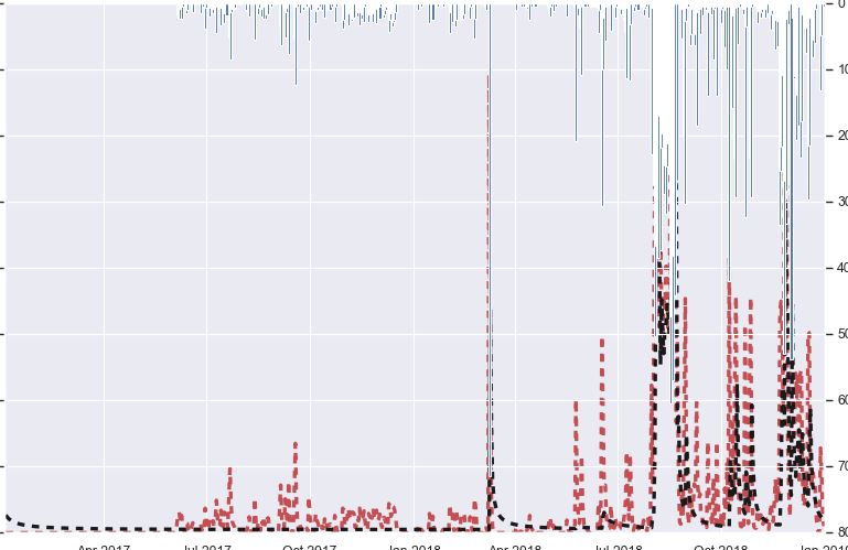
现在我想知道如何删除那些白色的部分,这样它就可以显示纯蓝色的条形图了?
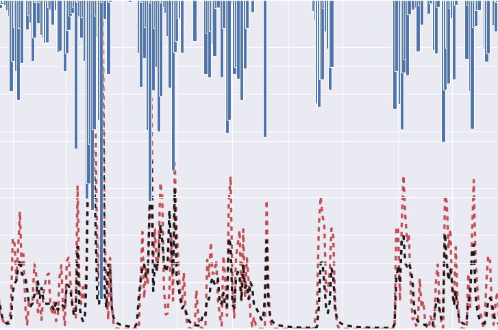
在我的一个数据集中,它运行得非常好,如下所示:
但是我想删除条形图中的白色边框,这样它就不会像将来任何数据集中的第一张图片那样结束了。
Stack Overflow用户
发布于 2022-10-05 12:32:14
这里有两个链接,可能会帮助您解决问题。
https://community.plotly.com/t/how-to-remove-the-white-border-from-bar-marker/41724/2
How to remove white lines around bars using plotly.express.bar?
需要设置marker_line_width的
页面原文内容由Stack Overflow提供。腾讯云小微IT领域专用引擎提供翻译支持
原文链接:
https://stackoverflow.com/questions/73954936
复制相关文章
相似问题
腾讯云开发者
