
在geom_map下面添加图例中的国家名称
在geom_map下面添加图例中的国家名称
提问于 2022-11-01 13:14:52
我想在我的地图下面加上一个国名的传说。
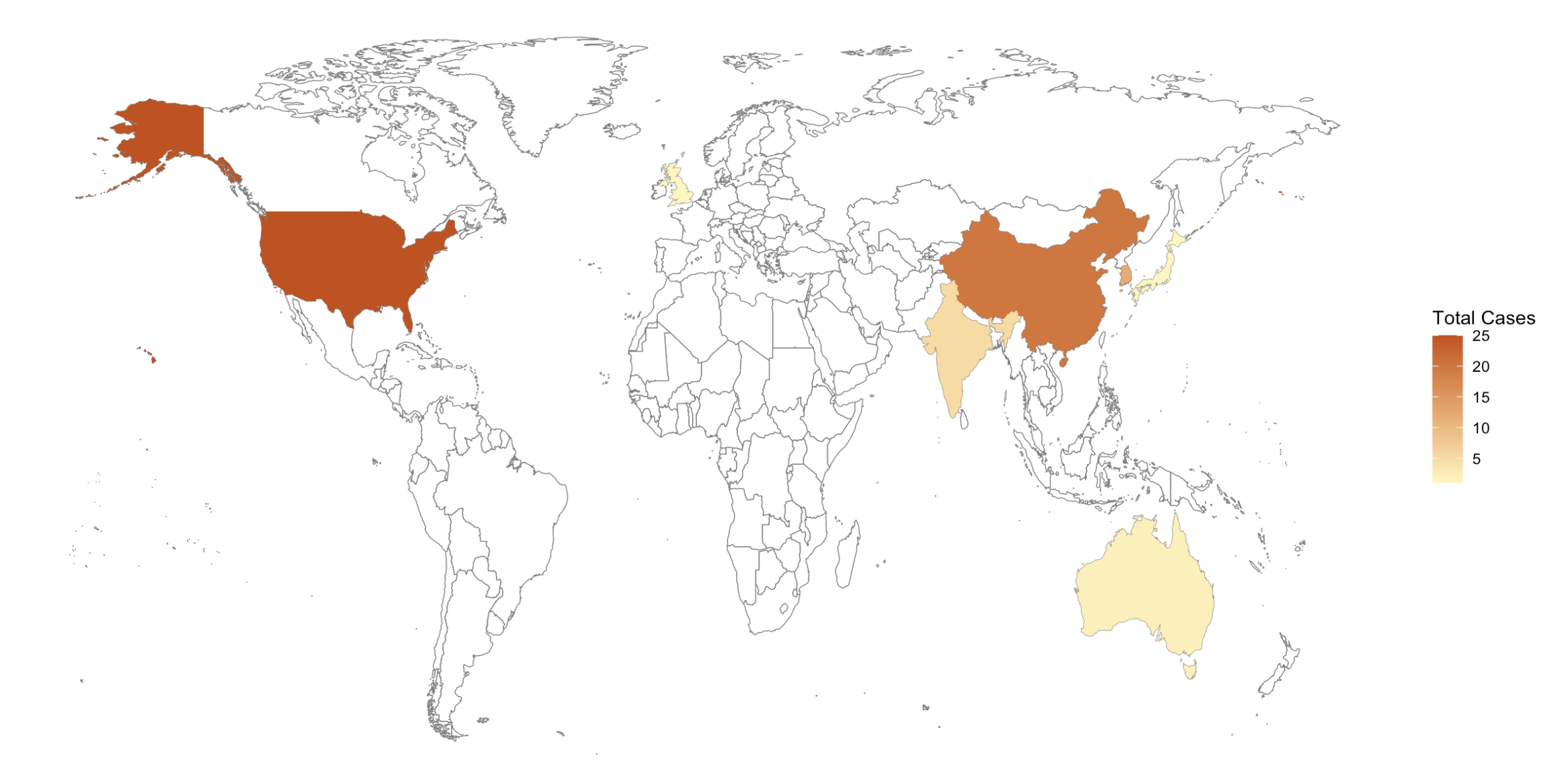
我有关于不同地区事件发生频率的数据:
trend_country_freq  <- structure(list(country = c("US", "CN", "KR", "IN", "AU", "GB",
"JP"), n = c(25L, 20L, 12L, 5L, 2L, 1L, 1L), country_name = c("USA",
"China", "South Korea", "India", "Australia", "UK", "Japan")), row.names = c(1L,
2L, 3L, 4L, 5L, 7L, 8L), class = "data.frame")现在,我使用maps和ggplot2包创建一个世界地图,显示事件发生的频率:
library(maps)
library(ggplot2)

world_map <- map_data("world")
world_map <- subset(world_map, region != "Antarctica")

ggplot(trend_country_freq) +
  geom_map(
    dat = world_map, map = world_map, aes(map_id = region),
    fill = "white", color = "#7f7f7f", size = 0.25
  ) +
  geom_map(map = world_map, aes(map_id = country_name, fill = n), size = 0.25) +
  scale_fill_gradient(low = "#fff7bc", high = "#cc4c02", name = "Total Cases") +
  expand_limits(x = world_map$long, y = world_map$lat) +
  theme(panel.grid.major = element_blank(), panel.grid.minor = element_blank(),
panel.background = element_blank()) +
  theme(axis.title = element_blank(),
        axis.ticks = element_blank(),
        axis.text = element_blank())
结果如下:
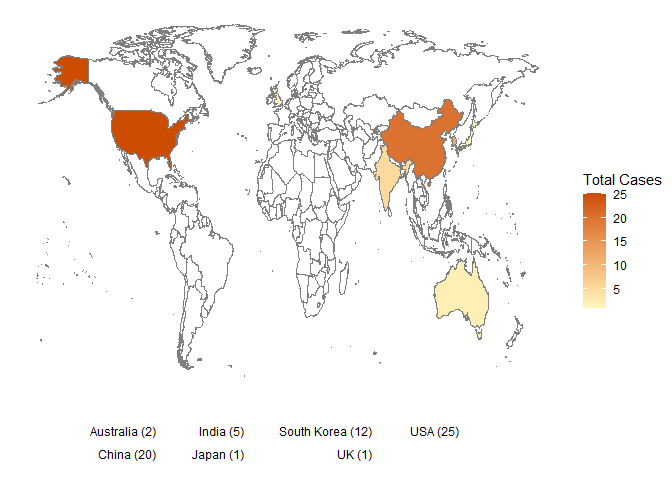
但我真的想要这样的东西:
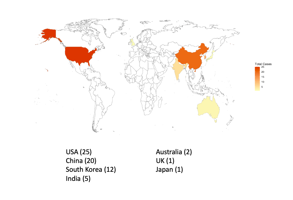
你有办法生成这样一张地图吗?非常感谢!
回答 3
Stack Overflow用户
回答已采纳
发布于 2022-11-01 13:42:01
我们可以简单地将文本写成geom层:
ggplot(trend_country_freq) +
  geom_map(
    dat = world_map, map = world_map, aes(map_id = region),
    fill = "white", color = "#7f7f7f", size = 0.25
  ) +
  geom_map(map = world_map, aes(map_id = country_name, fill = n), size = 0.25) +
  scale_fill_gradient(low = "#fff7bc", high = "#cc4c02", name = "Total Cases") +
  expand_limits(x = world_map$long, y = world_map$lat) +
  theme(panel.grid.major = element_blank(), panel.grid.minor = element_blank(),
        panel.background = element_blank()) +
  theme(axis.title = element_blank(),
        axis.ticks = element_blank(),
        axis.text = element_blank()) +
  geom_text(aes(label = paste0(country_name, ' (', n, ')'),
                x = rep(c(-50, 50), each = 4)[-8],
                y = rep(seq(-90, -120, -10), 2)[-8]),
            hjust = 0)
Stack Overflow用户
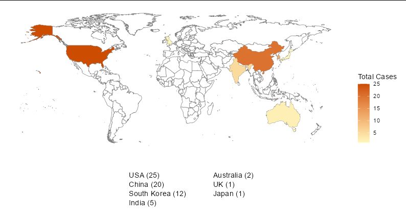
发布于 2022-11-01 13:34:02
这里有一个黑客,不知道它有多棒:
transform(trend_country_freq,                                            # NEW
  txt = sprintf("%s (%i)", country_name, n),                             #
  vj = -1.2 * seq(nrow(trend_country_freq))                              #
) |>                                                                     #
  ggplot() +                                                             # CHANGED
  geom_map(
    dat = world_map, map = world_map, aes(map_id = region),
    fill = "white", color = "#7f7f7f", size = 0.25
  ) +
  geom_map(map = world_map, aes(map_id = country_name, fill = n), size = 0.25) +
  scale_fill_gradient(low = "#fff7bc", high = "#cc4c02", name = "Total Cases") +
  expand_limits(x = world_map$long, y = world_map$lat) +
  theme(panel.grid.major = element_blank(), panel.grid.minor = element_blank(),
panel.background = element_blank()) +
  theme(axis.title = element_blank(),
        axis.ticks = element_blank(),
        axis.text = element_blank()) +
  geom_text(aes(label = txt, vjust = vj), x = -Inf, y = -Inf, hjust = 0) # NEW
Stack Overflow用户
发布于 2022-11-01 13:44:55
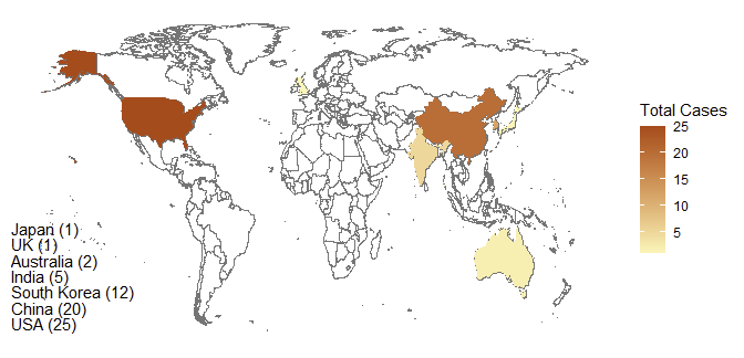
另一种选择:
library(tidyverse)
library(maps)


p1 <- trend_country_freq |>
  mutate(lab = paste0(country_name, " (", n, ")")) |>
  ggplot() +
  geom_map(
    dat = world_map, map = world_map, aes(map_id = region),
    fill = "white", color = "#7f7f7f", size = 0.25
  ) +
  geom_map(map = world_map, aes(map_id = country_name, fill = n, color = lab), size = 0.25) +
  scale_fill_gradient(low = "#fff7bc", high = "#cc4c02", name = "Total Cases") +
  scale_color_manual(values = rep(NA, 7), name = "")+
  expand_limits(x = world_map$long, y = world_map$lat) +
  theme(panel.grid.major = element_blank(),
        panel.grid.minor = element_blank(),
        panel.background = element_blank(),
        axis.title = element_blank(),
        axis.ticks = element_blank(),
        axis.text = element_blank(),
        legend.key = element_blank()) +
  guides(color = guide_legend(direction='horizontal',label.position = "left",
                              override.aes = list(fill = NA, color = NA)))


guide_color <- cowplot::get_legend(p1 + guides(color = "none"))

cowplot::plot_grid(p1 +
            guides(fill = "none") +
            theme(legend.position = "bottom"),
          guide_color,
          ncol = 2, rel_widths = c(.85, .15))
页面原文内容由Stack Overflow提供。腾讯云小微IT领域专用引擎提供翻译支持
原文链接:
https://stackoverflow.com/questions/74276544
复制相关文章
相似问题
腾讯云开发者
