
R:mgcv在GAM的2D热图中添加颜色条
我正在用mgcv来拟合一个gam,并用默认的plot.gam()函数绘制结果。我的模型包括一个2D平滑的,我想把结果绘制成一个热图。有没有办法为热图添加一个色条?
我以前研究过其他GAM盆栽包,但它们都没有提供必要的可视化。请注意,为了说明起见,这只是一个简化;实际的模型(和报告需求)要复杂得多。
编辑:我最初在张量产品中交换了y和z,更新后的在代码和绘图中都反映了正确的版本。
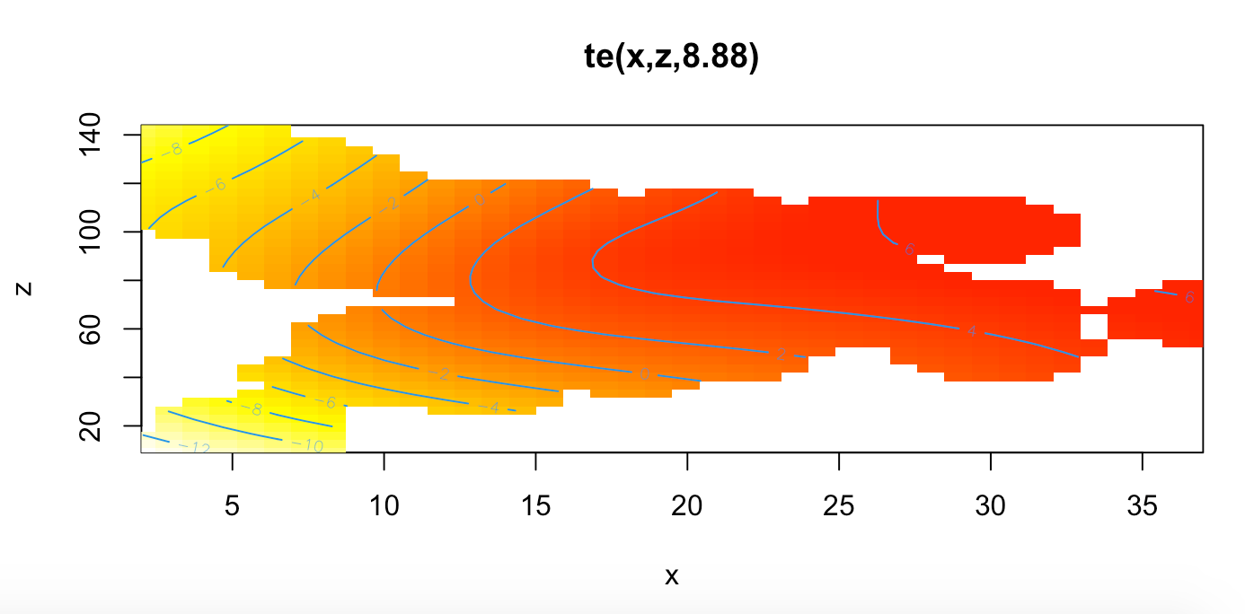
df.gam<-gam(y~te(x,z), data=df, method='REML')
plot(df.gam, scheme=2, hcolors=heat.colors(999, rev =T), rug=F)
样本数据:
structure(list(x = c(3, 17, 37, 9, 4, 11, 20.5, 11.5, 16, 17,
18, 15, 13, 29.5, 13.5, 25, 15, 13, 20, 20.5, 17, 11, 11, 5,
16, 13, 3.5, 16, 16, 5, 20.5, 2, 20, 9, 23.5, 18, 3.5, 16, 23,
3, 37, 24, 5, 2, 9, 3, 8, 10.5, 37, 3, 9, 11, 10.5, 9, 5.5, 8,
22, 15.5, 18, 15, 3.5, 4.5, 20, 22, 4, 8, 18, 19, 26, 9, 5, 18,
10.5, 30, 15, 13, 27, 19, 5.5, 18, 11.5, 23.5, 2, 25, 30, 17,
18, 5, 16.5, 9, 2, 2, 23, 21, 15.5, 13, 3, 24, 17, 4.5), z = c(144,
59, 66, 99, 136, 46, 76, 87, 54, 59, 46, 96, 38, 101, 84, 64,
92, 56, 69, 76, 93, 109, 46, 124, 54, 98, 131, 89, 69, 124, 105,
120, 69, 99, 84, 75, 129, 69, 74, 112, 66, 78, 118, 120, 103,
116, 98, 57, 66, 116, 108, 95, 57, 41, 20, 89, 61, 61, 82, 52,
129, 119, 69, 61, 136, 98, 94, 70, 77, 108, 118, 94, 105, 52,
52, 38, 73, 59, 110, 97, 87, 84, 119, 64, 68, 93, 94, 9, 96,
103, 119, 119, 74, 52, 95, 56, 112, 78, 93, 119), y = c(96.535,
113.54, 108.17, 104.755, 94.36, 110.74, 112.83, 110.525, 103.645,
117.875, 105.035, 109.62, 105.24, 119.485, 107.52, 107.925, 107.875,
108.015, 115.455, 114.69, 116.715, 103.725, 110.395, 100.42,
108.79, 110.94, 99.13, 110.935, 112.94, 100.785, 110.035, 102.95,
108.42, 109.385, 119.09, 110.93, 99.885, 109.96, 116.575, 100.91,
114.615, 113.87, 103.08, 101.15, 98.68, 101.825, 105.36, 110.045,
118.575, 108.45, 99.21, 109.19, 107.175, 103.14, 94.855, 108.15,
109.345, 110.935, 112.395, 111.13, 95.185, 100.335, 112.105,
111.595, 100.365, 108.75, 116.695, 110.745, 112.455, 104.92,
102.13, 110.905, 107.365, 113.785, 105.595, 107.65, 114.325,
108.195, 96.72, 112.65, 103.81, 115.93, 101.41, 115.455, 108.58,
118.705, 116.465, 96.89, 108.655, 107.225, 101.79, 102.235, 112.08,
109.455, 111.945, 104.11, 94.775, 110.745, 112.44, 102.525)), row.names = c(NA,
-100L), class = "data.frame")Stack Overflow用户
发布于 2021-11-18 10:21:26
在ggplot2生态圈内可靠地这样做会更容易(IMHO)。
我将使用我的{‘ll}包展示一种固定的方法,但也可以签出{mgcViz}。我还将建议一种更通用的解决方案,使用工具,从{ them }到关于模型平滑的额外信息,然后使用ggplot()自己绘制它们。
library('mgcv')
library('gratia')
library('ggplot2')
library('dplyr')

# load your snippet of data via df <- structure( .... )

# then fit your model (note you have y as response & in the tensor product
# I assume z is the response below and x and y are coordinates
m <- gam(z ~ te(x, y), data=df, method='REML')

# now visualize the mode using {gratia}
draw(m)
这就产生了:
{ data }的draw()方法还不能绘制所有的东西,但是如果它不起作用,您仍然应该能够使用{data}中的工具来评估您需要的数据,然后您可以手工用ggplot()自己绘制这些数据。
若要获取平滑的值,即plot.gam()或draw()显示的绘图背后的数据,请使用gratia::smooth_estimates()
# dist controls what we do with covariate combinations too far
# from support of the data. 0.1 matches mgcv:::plot.gam behaviour
sm <- smooth_estimates(m, dist = 0.1)
屈服
r$> sm
# A tibble: 10,000 × 7
   smooth  type   by      est    se     x     y
   <chr>   <chr>  <chr> <dbl> <dbl> <dbl> <dbl>
 1 te(x,y) Tensor NA     35.3 11.5      2  94.4
 2 te(x,y) Tensor NA     35.5 11.0      2  94.6
 3 te(x,y) Tensor NA     35.7 10.6      2  94.9
 4 te(x,y) Tensor NA     35.9 10.3      2  95.1
 5 te(x,y) Tensor NA     36.2  9.87     2  95.4
 6 te(x,y) Tensor NA     36.4  9.49     2  95.6
 7 te(x,y) Tensor NA     36.6  9.13     2  95.9
 8 te(x,y) Tensor NA     36.8  8.78     2  96.1
 9 te(x,y) Tensor NA     37.0  8.45     2  96.4
10 te(x,y) Tensor NA     37.2  8.13     2  96.6
# … with 9,990 more rows在输出中,x和y是两个协变量范围内值的网格(每个协变量中的网格点数由n控制,使得二维张量积光滑的网格由n控制为n )。est是协变量的平滑值的估计值,se是它的标准误差。对于具有多个平滑的模型,smooth变量使用{mgcv}给每个模型平滑的内部标签--这些是在调用GAM上的summary()获得的输出中使用的标签。
如果需要的话,我们可以使用add_confint()增加一个置信区间。
现在,您可以使用ggplot()手工绘制平滑的图形。此时,您有两个选项
- 如果
draw()能够处理想要绘制的平滑类型,则可以对该对象使用draw()方法,然后在此基础上进行构建,或 - 用手计划每件事。
备选案文1
# evaluate just the smooth you want to plot
smooth_estimates(m, smooth = "te(x,y)", dist = 0.1) %>%
draw() +
geom_point(data = df, alpha = 0.2) # add a point layer for original data在给定模型对象本身时,这很大程度上得到了draw()产生的结果。您可以将它添加到它中,就好像它是一个ggplot对象一样(这不是gratia:::draw.gam()返回的对象的情况,它是由{patchwork}包装的,需要其他方式与情节交互)。
选项2
在这里,你完全掌控着
sm <- smooth_estimates(m, smooth = "te(x,y)", dist = 0.1)
ggplot(sm, aes(x = x, y = y)) +
  geom_raster(aes(fill = est)) +
  geom_point(data = df, alpha = 0.2) + # add a point layer for original data
  scale_fill_viridis_c(option = "plasma")
产
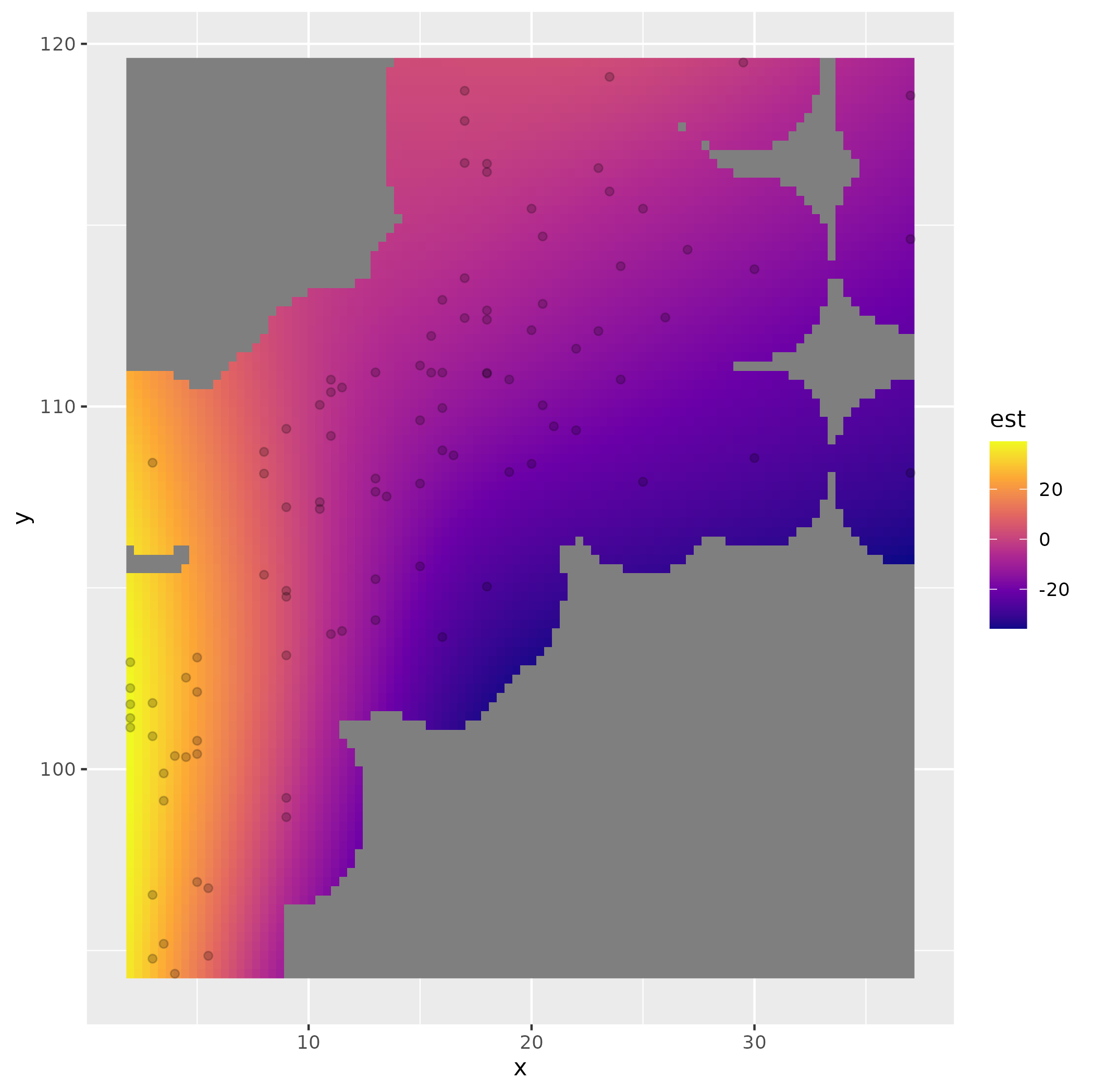
使用不同的调色板可能会更好,类似于gratia:::draw.smooth_estimates使用的一个调色板
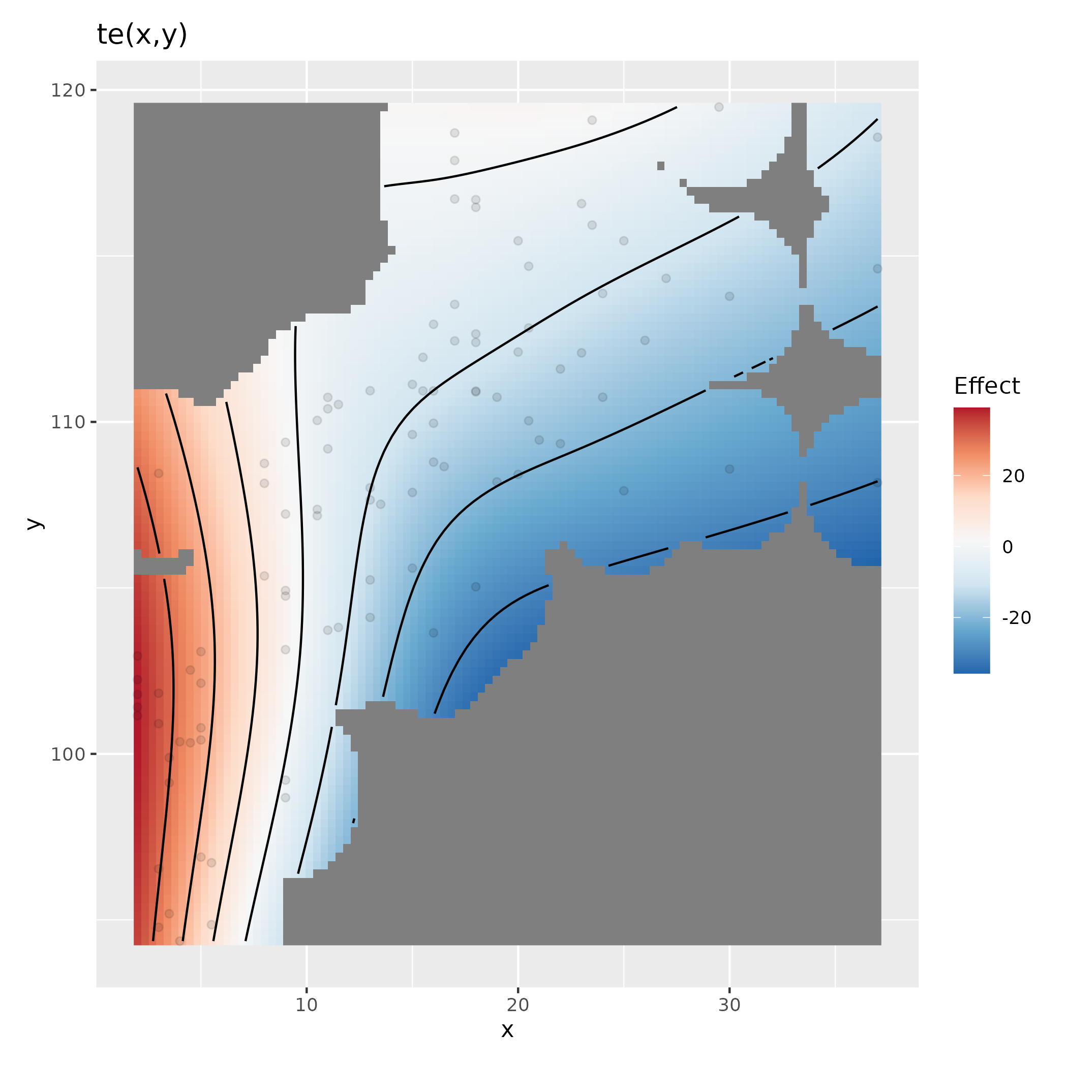
sm <- smooth_estimates(m, smooth = "te(x,y)", dist = 0.1)
ggplot(sm, aes(x = x, y = y)) +
  geom_raster(aes(fill = est)) +
  geom_contour(aes(z = est), colour = "black") +
  geom_point(data = df, alpha = 0.2) + # add a point layer for original data
  scale_fill_distiller(palette = "RdBu", type = "div") +
  expand_limits(fill = c(-1,1) * abs(max(sm[["est"]])))
产

最后,如果{ model }不能处理您的模型,我希望您能够提交一个bug报告这里,以便我能够支持尽可能多的模型类型。但是,也要尝试使用{mgcv}来可视化使用{mgcv}安装的GAMs。
https://stackoverflow.com/questions/69998120
复制相似问题
腾讯云开发者
