
用反向y轴绘制主次x轴和y轴的图
用反向y轴绘制主次x轴和y轴的图
提问于 2021-10-14 00:35:08
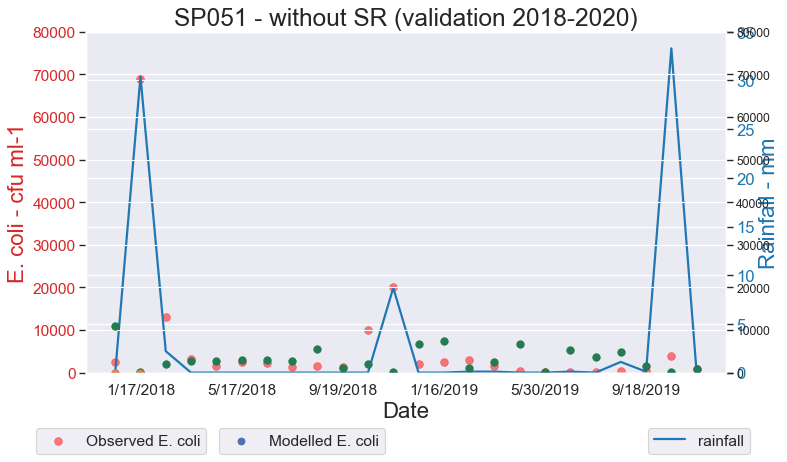
我创建了这幅图,在左边的"y轴“上”观察到了大肠杆菌“,右侧的"y轴”上有“模拟大肠杆菌”,"x轴“上有”日期“。
代码是
# -*- coding: utf-8 -*-
import numpy as np
import matplotlib.pyplot as plt
import pandas as pd

source = "Sample_table.csv"
df = pd.read_csv(source, encoding = 'unicode_escape')

x = df['Date_1']
y1 = df['Obs_Ec']
y2 = df['Rain']
y3 = df['Mod_Ec']

# Plot Line1 (Left Y Axis)
fig, ax1 = plt.subplots(1,1,figsize=(10,6), dpi= 80)

# Plot Line2 (Right Y Axis)
ax2 = ax1.twinx()  # instantiate a second axes that shares the same x-axis
ax2.plot(x, y2, color='tab:blue', linewidth=2.0)

# Plot Line2 (Right Y Axis)
ax3 = ax1.twinx()  # instantiate a second axes that shares the same x-axis
ax3.scatter(x, y3)

# Control limits of the y Axis
a,b = 0,80000
c,d = 0,80000
e,f = 0,35
ax1.set_ylim(a,b)
ax3.set_ylim(c,d)
ax2.set_ylim(e,f)

# Decorations
# ax1 (left Y axis)
ax1.set_xlabel('Date', fontsize=20)
ax1.set_ylabel('E. coli - cfu ml-1', color='tab:red', fontsize=20)
ax1.tick_params(axis='y',rotation=0, labelcolor='tab:red')
ax1.grid(alpha=.0)
ax1.tick_params(axis='both', labelsize=14)

# Plot the scatter points
ax1.scatter(x, y1,
       color="red",  # Color of the dots
       s=50,         # Size of the dots
       alpha=0.5,     # Alpha of the dots
       linewidths=0.5)  # Size of edge around the dots
ax1.scatter(0**np.arange(5), 0**np.arange(5))
ax1.legend(['Observed E. coli'], loc='right',fontsize=14, bbox_to_anchor=(0.2, -0.20))

ax3.scatter(x, y3,
       color="green",  # Color of the dots
       s=50,         # Size of the dots
       alpha=0.5,     # Alpha of the dots
       linewidths=0.5)  # Size of edge around the dots
ax3.scatter(0**np.arange(5), 0**np.arange(5))
ax3.legend(['Modelled E. coli'], loc='right',fontsize=14, bbox_to_anchor=(0.48, -0.20))

# ax2 (right Y axis)
ax2.set_ylabel("Rainfall - mm", color='tab:blue', fontsize=20)
ax2.tick_params(axis='y', labelcolor='tab:blue')
ax2.tick_params(axis='both', labelsize=15)
ax2.set_xticks(np.arange(1, len(x), 4))
ax2.set_xticklabels(x[0::4], rotation=15, fontdict={'fontsize':10})
ax2.set_title("SP051 - without SR (validation 2018-2020)", fontsize=22)
ax2.legend(['rainfall'], loc='right',fontsize=14, bbox_to_anchor=(1.05, -0.20))
fig.tight_layout()
plt.show()
但是这段代码给了我下面的情节:
我想在这个情节中改变三件事:
- 首先,将蓝线图转换为条形图。
- 其次,也是更重要的一点,我想让表示降雨的条形图显示在图的顶部。
- 第三,我需要去掉右边"y轴“上黑色的勾号,把"ax3散点图”简单地共享左边的"y轴“。
下面是我想要创建的图的一个例子,但我将使用散点图代替行,如上一个图所示:
数据
这些数据可以在这里下载:数据链接
data = {'Date_1': ['1/17/2018', '2/21/2018', '3/21/2018', '4/18/2018', '5/17/2018', '6/20/2018', '7/18/2018', '8/8/2018', '9/19/2018', '10/24/2018', '11/21/2018', '12/19/2018', '1/16/2019', '2/20/2019', '3/20/2019', '4/29/2019', '5/30/2019', '6/19/2019', '7/19/2019', '8/21/2019', '9/18/2019', '10/16/2019', '1/22/2020', '2/19/2020'],
        'FLOW_OUTcms': [0.00273, 0.01566, 0.02071, 0.00511, 0.00777, 0.00581, 0.00599, 0.00309, 0.00204, 0.04024, 0.00456, 0.0376, 0.00359, 0.00301, 0.01515, 0.02796, 0.00443, 0.03602, 0.0071, 0.00255, 0.00159, 0.00319, 0.04443, 0.04542],
        'Rain': [0.0, 30.4, 2.2, 0.0, 0.0, 0.0, 0.0, 0.0, 0.0, 0.0, 0.0, 8.7, 0.0, 0.0, 0.1, 0.1, 0.0, 0.0, 0.1, 0.0, 1.1, 0.1, 33.3, 0.0],
        'Mod_Ec': [10840, 212, 1953, 2616, 2715, 2869, 3050, 2741, 5479, 1049, 2066, 146, 6618, 7444, 992, 2374, 6602, 82, 5267, 3560, 4845, 1479, 58, 760],
        'Obs_Ec': [2500, 69000, 13000, 3300, 1600, 2400, 2300, 1400, 1600, 1300, 10000, 20000, 2000, 2500, 2900, 1500, 280, 260, 64, 59, 450, 410, 3900, 870]}

df = pd.DataFrame(data)回答 2
Stack Overflow用户
回答已采纳
发布于 2021-10-14 02:12:22
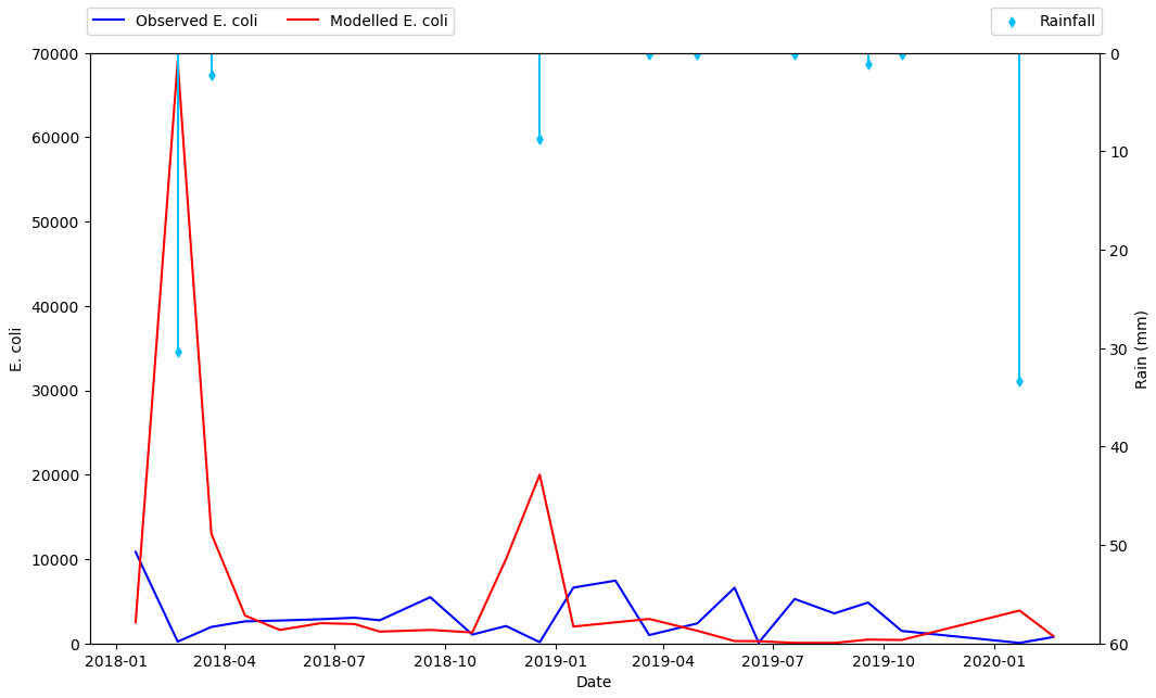
- 用
pandas.DataFrame.plot直接绘图会更好 - 把雨水描绘成散点图,然后再加上垂直线,要比用条形图好。这种情况是这样的,因为barplot是0索引的,而不是用日期范围索引的,因此很难在两种类型的滴答位置之间对齐数据点。
- 从表面上看,我认为只添加雨大于0的点会更好,所以数据可以被过滤,只绘制这些点。
- 绘制x和y的主图,并将其赋值给轴
ax - 从
ax创建一个辅助x轴并将其分配给ax2 - 将次要y轴绘制到
ax2上,自定义次轴。
- 在
python 3.10**,**pandas 1.5.0**,**matplotlib 3.5.2中测试的 - 在
matplotlib 3.5.0中,可以使用ax.set_xticks来设置刻度和标签。否则,使用ax.set_xticks(xticks),然后是ax.set_xticklabels(xticklabels, ha='center'),按照这个回答。
import pandas as pd

# starting with the sample dataframe, convert Date_1 to a datetime dtype
df.Date_1 = pd.to_datetime(df.Date_1)

# plot E coli data
ax = df.plot(x='Date_1', y=['Mod_Ec', 'Obs_Ec'], figsize=(12, 8), rot=0, color=['blue', 'red'])

# the xticklabels are empty strings until after the canvas is drawn
# needing this may also depend on the version of pandas and matplotlib
ax.get_figure().canvas.draw()

# center the xtick labels on the ticks
xticklabels = [t.get_text() for t in ax.get_xticklabels()]
xticks = ax.get_xticks()
ax.set_xticks(xticks, xticklabels, ha='center')

# cosmetics
# ax.set_xlim(df.Date_1.min(), df.Date_1.max())
ax.set_ylim(0, 70000)
ax.set_ylabel('E. coli')
ax.set_xlabel('Date')
ax.legend(['Observed E. coli', 'Modelled E. coli'], loc='upper left', ncol=2, bbox_to_anchor=(-.01, 1.09))

# create twinx for rain
ax2 = ax.twinx()

# filter the rain column to only show points greater than 0
df_filtered = df[df.Rain.gt(0)]

# plot data with on twinx with secondary y as a scatter plot
df_filtered.plot(kind='scatter', x='Date_1', y='Rain', marker='d', ax=ax2, color='deepskyblue', secondary_y=True, legend=False)

# add vlines to the scatter points
ax2.vlines(x=df_filtered.Date_1, ymin=0, ymax=df_filtered.Rain, color='deepskyblue')

# cosmetics
ax2.set_ylim(0, 60)
ax2.invert_yaxis()  # reverse the secondary y axis so it starts at the top
ax2.set_ylabel('Rain (mm)')
ax2.legend(['Rainfall'], loc='upper right', ncol=1, bbox_to_anchor=(1.01, 1.09))
Stack Overflow用户
发布于 2022-08-13 23:05:09
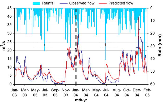
我创建了这幅图,在这里我“观察”和“模拟”了流流数据,我在左边的“y-轴”,右侧的“y-轴”和“x-轴”上画了“日期”。
#1 Import Library

import matplotlib.pyplot as plt
%matplotlib
import numpy as np
import pandas as pd

#2 IMPORT DATA
sfData=pd.read_excel('data/streamflow validation.xlsx',sheet_name='Sheet1')

#3 Define Data
x = sfData['Year']
y1 = sfData['Observed']
y2 = sfData['Simulated']
y3 = sfData['Areal Rainfall']

# Or we can use loc for defining the data
x = list(sfData.iloc[:, 0])
y1 = list(sfData.iloc[:, 1])
y2 = list(sfData.iloc[:, 2])
y3 = list(sfData.iloc[:, 3])

#4 Plot Graph
fig, ax1 = plt.subplots(figsize=(12,10))
# increase space below subplot
fig.subplots_adjust(bottom=0.3)
# Twin Axes
# Secondary axes
ax2 = ax1.twinx()
ax2.bar(x, y3, width=15, bottom=0, align='center', color = 'b', data=sfData)
ax2.set_ylabel(('Areal Rainfall(mm)'),
            fontdict={'fontsize': 12})
# invert y axis
ax2.invert_yaxis()
# Primary axes
ax1.plot(x, y1, color = 'r', linestyle='dashed', linewidth=3, markersize=12)
ax1.plot(x, y2, color = 'k', linestyle='dashed', linewidth=3, markersize=12)

#5 Define Labels
ax1.set_xlabel(('Years'),
           fontdict={'fontsize': 14})
ax1.set_ylabel(('Flow (m3/s)'),
               fontdict={'fontsize': 14})

#7 Set limit
ax1.set_ylim(0, 45)
ax2.set_ylim(800, 0)
ax1.set_xticklabels(('Jan 2003', 'Jan 2004', 'Jan 2005', 'Jan 2006', 'Jan 2007', 'Jan 2008', 'Jan 2009' ),
                    fontdict={'fontsize': 13})
for tick in ax1.get_xticklabels():
    tick.set_rotation(90)

#8 set title
ax1.set_title('Stream Flow Validation 1991', color = 'g')

#7 Display legend
legend = fig.legend()
ax1.legend(['Observed', 'Simulated'], loc='upper left', ncol=2, bbox_to_anchor=(-.01, 1.09))
ax2.legend(['Areal Rainfall'], loc='upper right', ncol=1, bbox_to_anchor=(1.01, 1.09))

#8 Saving the graph
fig.savefig('output/figure1.png')
fig.savefig('output/figure1.jpg')
页面原文内容由Stack Overflow提供。腾讯云小微IT领域专用引擎提供翻译支持
原文链接:
https://stackoverflow.com/questions/69563804
复制相关文章
相似问题
腾讯云开发者
