
~ 3H频率的matplotlib图采样策略
~ 3H频率的matplotlib图采样策略
提问于 2021-04-29 09:34:21
问题概述
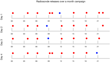
我正试图为我所做的一个实验制定一个抽样时间表。我们开始每3小时取样一次,我希望能够观察每一个样本在一个每日周期中的绘制时间。
- x轴变量应该是一天中的时间(00:00 -23:00)。
- 每一行(或者是y轴变量?)应该是新的一天。
- 的重点应该是与理想的3小时抽样策略相比,它是提前发布(蓝色)还是晚发布(红色)。
我设想的情节如下:
模拟虚拟数据来解释这个问题
import xarray as xr
import numpy as np
import matplotlib.pyplot as plt
import pandas as pd
from pandas.tseries.offsets import DateOffset
import matplotlib.dates as mdates
import itertools

value = np.random.normal(size=100)
expected_time = pd.date_range("2000-01-01", freq="180min", periods=100)
# add random offset to simulate being +/- the true expected release time
time_deltas = np.array([DateOffset(minute=max(0, min(int(i), 59))) for i in np.abs(np.random.normal(0, 10, size=100))])
time = [expected_time[i] + time_deltas[i] if (i % 2 == 0) else expected_time[i] - time_deltas[i] for i in range(100)]

df = pd.DataFrame({"launchtime": time, "value": value})
ds = df.set_index("launchtime").to_xarray()
ds = ds.assign_coords(expected_time=("launchtime", expected_time))
正如您所看到的,底层数据大约每3小时进行一次观察(尽管确切的时间略有变化)。
In []: ds["launchtime.hour"]

Out[]:
<xarray.DataArray 'hour' (launchtime: 100)>
array([ 0,  3,  6,  9, 12, 15, 18, 21,  0,  3,  6,  9, 12, 15, 18, 21,  0,
        3,  6,  9, 12, 15, 18, 21,  0,  3,  6,  9, 12, 15, 18, 21,  0,  3,
        6,  9, 12, 15, 18, 21,  0,  3,  6,  9, 12, 15, 18, 21,  0,  3,  6,
        9, 12, 15, 18, 21,  0,  3,  6,  9, 12, 15, 18, 21,  0,  3,  6,  9,
       12, 15, 18, 21,  0,  3,  6,  9, 12, 15, 18, 21,  0,  3,  6,  9, 12,
       15, 18, 21,  0,  3,  6,  9, 12, 15, 18, 21,  0,  3,  6,  9])
Coordinates:
  * launchtime     (launchtime) datetime64[ns] 2000-01-01 ... 2000-01-13T09:0...
expected_time (launchtime) datetime64[ns] 2000-01-01 ... 2000-01-13T09:0...首次尝试使用matplotlib
# get the total number of days
day_months = list(itertools.product(np.unique(ds["launchtime.day"].values), np.unique(ds["launchtime.month"].values)))
N_DAYS = len(day_months)

fig, axs = plt.subplots(N_DAYS, 1, figsize=(6, 0.5*N_DAYS), sharey=True)
for ix, (day, month) in enumerate(day_months):

    mask = (ds["launchtime.day"] == day) & (ds["launchtime.month"] == month)
    day = ds.sel(launchtime=mask)
    error = np.array([pd.to_datetime(dt) for dt in day.launchtime.values]) - np.array([pd.to_datetime(dt) for dt in day.expected_time.values])
    error = [e.total_seconds() for e in error]
    colors = ["r" if e > 0 else "b" if e < 0 else "grey" for e in error]
    print(colors)
    ax = axs[ix]

    ax.scatter(day.expected_time, [1 for _ in range(len(day.expected_time))], color=colors)
    ax.set_ylabel(f"Day {ix}")

    # remove the spines and ytick labels
    for spine in ax.spines:
        ax.spines[spine].set_visible(False)

    ax.axes.yaxis.set_visible(False)

plt.xticks(rotation=60)
fig.suptitle("Radiosonde Releases over a month campaign")
#剩余问题
我看到的主要问题是:
X轴应该是每日循环,而不是包含Day/Month/Year
- It的“日期时间”,最好每天将其整齐地作为一个新列,或者作为一个面,或者使用每一天作为y轴变量
。
回答 1
Stack Overflow用户
发布于 2021-05-09 08:23:21
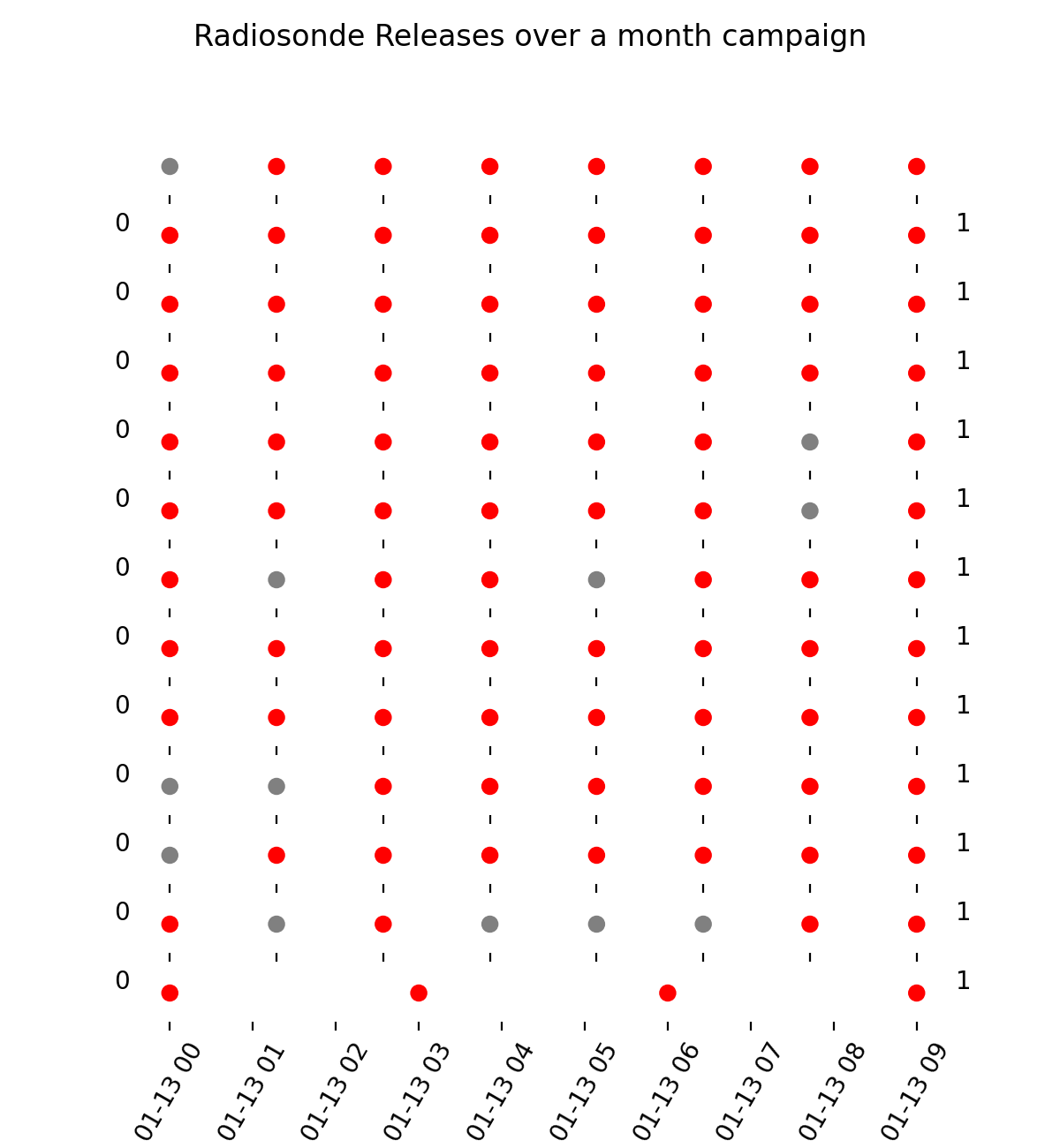
下面是一个完整的、可复制的示例,它具有以下关键特性:
operations;
- the对时间三角洲进行矢量化的模拟,用Timedelta对象代替DateOffset进行校正,因此现在大约有一半的点是蓝色的;
- 保留了叠加子图的方法(而不是用y轴变量显示天数),因为这避免了对x轴值的额外计算,并使使用x轴勾标和脊柱绘制灰色线变得更容易(如图中所示);day);
fig.subplots_adjust
- 通过设置适当的x轴限值来解决x轴对齐问题(例如,最后一个子图),在有时频率不规则的情况下,使用不是从
expected_time时间戳列表中提取的时间戳来设置适当的x轴限值(例如,在一个expected_time上午夜没有启动,并且使用图形高度来调整子图之间的垂直空间,以确保刻度标签是可见的,而不是使用修改图形大小的tight_layout或constrained_layout。
导入包并生成示例数据
import numpy as np               # v 1.19.2
import pandas as pd              # v 1.2.3
import matplotlib.pyplot as plt  # v 3.3.4

rng = np.random.default_rng(seed=1)  # random number generator
size = 30
expected_time = pd.date_range("2000-01-01", freq="180min", periods=size)
time_deltas = np.array([pd.Timedelta(int(i), unit="minute")
                        for i in abs(rng.normal(0, 10, size=size))])
time = [expected_time[i] + time_deltas[i] if (i % 2 == 0)
        else expected_time[i] - time_deltas[i] for i in range(size)]
df = pd.DataFrame({"launchtime": time, "expected_time": expected_time})
创建matplotlib图
# Create day/month tuples based on expected time to ensure correct plotting for
# cases where a day would have only one launch time occuring early before midnight
day_months = [(dt.day, dt.month) for dt in df["expected_time"].dt.date.unique()]
N_DAYS = len(day_months)

fig, axs = plt.subplots(N_DAYS, 1, figsize=(6, 1*N_DAYS), sharey=True)
for ix, (day, month) in enumerate(day_months):
    day = df[(df["expected_time"].dt.day==day) & (df["expected_time"].dt.month==month)]
    deltas = pd.to_datetime(day["expected_time"]) - pd.to_datetime(day["launchtime"])
    error = deltas.dt.total_seconds()
    colors = ["red" if e > 0 else "blue" if e < 0 else "grey" for e in error]
    # Create midnight timestamp regardless of the times of the data points
    ts = pd.to_datetime(day["expected_time"].dt.date.min())

    # Create subplot with appropriate x-axis limits and ticks
    ax = axs[ix]
    ax.scatter(day["launchtime"], np.repeat(1, len(day)), color=colors, clip_on=False)
    ax.set_xlim(ts, ts + pd.Timedelta(23, unit="hour"))
    ax.set_xticks(day["expected_time"])
    ax.set_xticklabels(day["expected_time"].dt.strftime("%H:%S"))
#     ax.set_xticklabels(day["expected_time"].dt.hour)  # alternative method
    ax.set_ylabel(f"Day {ix}", labelpad=25, y=0.3, size=12)
    ax.set_yticks([])

    # Format spines and ticks to draw grey lines
    for spine in ["left", "right", "top"]:
        ax.spines[spine].set_visible(False)
    ax.spines["bottom"].set(linewidth=3, color="lightgrey")
    ax.tick_params(axis="x", direction="in", length=13,
                   width=3, color="lightgrey", pad=7)

fig.suptitle("Radiosonde Releases over a month campaign", size=14, y=0.95)
fig.subplots_adjust(hspace=0.5)
页面原文内容由Stack Overflow提供。腾讯云小微IT领域专用引擎提供翻译支持
原文链接:
https://stackoverflow.com/questions/67314731
复制相关文章
相似问题
腾讯云开发者
