
相关热图
相关热图
提问于 2021-03-10 20:53:17
我已经创建了一个较低的三角相关热图使用海运,我喜欢。现在尝试使用Plotly创建相同的内容。不幸的是,我不能像我对Seaborn那样微调它。
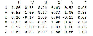
names = ['U', 'V', 'W', 'X', 'Y', 'Z']
r = pd.DataFrame(index = names, columns = names)
r['U'] = np.array([1.0,   0.53,    0.26,  0.63, 0.52, 0.65] )
r['V'] = np.array([0.53,   1.0,   -0.17, 0.83, 1, 0.85])
r['W'] = np.array([0.26,  -0.17,    1.0,  0.04, -0.15, 0.09])
r['X'] = np.array([0.63, 0.83, 0.04, 1, 0.83, 0.80])
r['Y'] = np.array([0.52, 1, -0.15, 0.83, 1, 0.86])
r['Z'] = np.array([0.65, 0.85, 0.09, 0.80, 0.86, 1.0])

print(r)
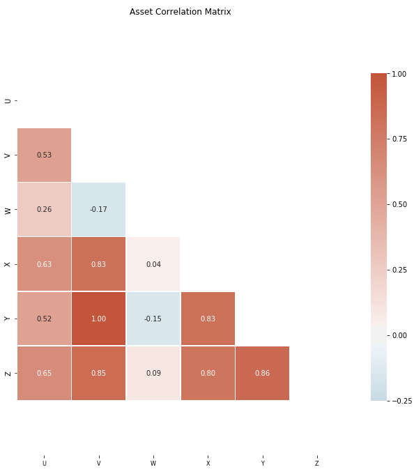
import seaborn as sns

# sns.set_theme(style="white")

mask = np.triu(np.ones_like(r, dtype=bool))

# Set up the matplotlib figure
f, ax = plt.subplots(figsize=(11, 9))

# Generate a custom diverging colormap
cmap = sns.diverging_palette(230, 20, n=256, as_cmap=True)

# Draw the heatmap with the mask and correct aspect ratio
sns.heatmap(r,
            mask=mask,
            cmap=cmap,
            vmax=1,
            vmin = -.25,
            center=0,
            square=True,
            linewidths=.5,
            annot = True,
            fmt='.2f',
            annot_kws={'size': 10},
            cbar_kws={"shrink": .75})

plt.title('Asset Correlation Matrix')
plt.tight_layout()
ax.tick_params(axis = 'x', labelsize = 8)
ax.set_ylim(len(corr)+1, -1)
# plt.savefig('corrTax.png', dpi = 600)

plt.show()
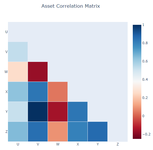
我试着用Plotly来创建这个。以下是我迄今所能做的。
mask = np.triu(np.ones_like(r, dtype=bool))
rLT = r.mask(mask)

heat = go.Heatmap(
    z = rLT,
    x = rLT.columns.values,
    y = rLT.columns.values,
    zmin = - 0.25, # Sets the lower bound of the color domain
    zmax = 1,
    xgap = 1, # Sets the horizontal gap (in pixels) between bricks
    ygap = 1,
    colorscale = 'RdBu'
)

title = 'Asset Correlation Matrix'

layout = go.Layout(
    title_text=title,
    title_x=0.5,
    width=600,
    height=600,
    xaxis_showgrid=False,
    yaxis_showgrid=False,
    yaxis_autorange='reversed'
)

fig=go.Figure(data=[heat], layout=layout)
fig.show()
- 我所创建的Seaborn彩色地图,我想在Plotly中创建类似的东西。我怎么能这么做?
- 我能控制轴心标签的尺寸。
- 希望将值放入每个框(海运中的
annot选项),并带有舍入选项
回答 2
Stack Overflow用户
发布于 2021-05-20 19:45:42
黛布。这是你的第一个问题的答案。
我所创建的Seaborn彩色地图,我想在Plotly中创建类似的东西。我怎么能这么做?
您可以使用内置的彩色鳞片,它可以通过Heatmap构造函数中的参数colorscale来设置。此外,您还可以设置Plotly的主题,以摆脱丑陋的背景
import plotly.io as pio
import plotly.express as px
import plotly.graph_objects as go

pio.templates.default = "plotly_white"

go.Heatmap(
    z=corr.mask(mask),
    x=corr.columns,
    y=corr.columns,
    colorscale=px.colors.diverging.RdBu,
    zmin=-1,
    zmax=1
)
Stack Overflow用户
发布于 2021-06-01 19:06:20
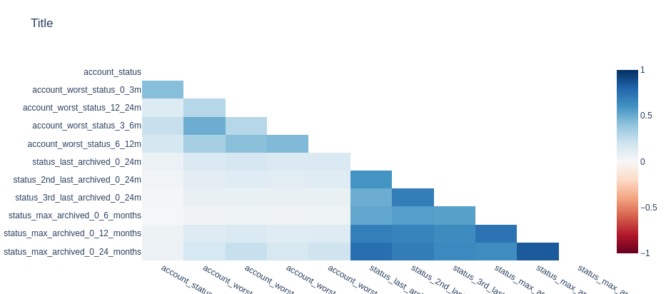
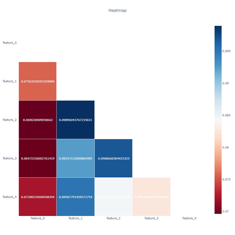
您可以使用来自plotly.figure_factory的巧妙函数plotly.figure_factory,而不是普通的热图。该函数接受numpy数组,而不是直接接受dataframe。正式参考,这是我的解决方案
import plotly.figure_factory as ff

corr = df.iloc.corr()
mask = np.triu(np.ones_like(corr, dtype=bool))
df_mask = corr.mask(mask)

fig = ff.create_annotated_heatmap(z=df_mask.to_numpy(),
                                  x=df_mask.columns.tolist(),
                                  y=df_mask.columns.tolist(),
                                  colorscale=px.colors.diverging.RdBu,
                                  hoverinfo="none", #Shows hoverinfo for null values
                                  showscale=True, ygap=1, xgap=1
                                 )

fig.update_xaxes(side="bottom")

fig.update_layout(
    title_text='Heatmap',
    title_x=0.5,
    width=1000,
    height=1000,
    xaxis_showgrid=False,
    yaxis_showgrid=False,
    xaxis_zeroline=False,
    yaxis_zeroline=False,
    yaxis_autorange='reversed',
    template='plotly_white'
)

# NaN values are not handled automatically and are displayed in the figure
# So we need to get rid of the text manually
for i in range(len(fig.layout.annotations)):
    if fig.layout.annotations[i].text == 'nan':
        fig.layout.annotations[i].text = ""

fig.show()
您可以使用@ottovon指定的zmin和zmax。
基本的热图也可以使用,但是注释需要通过指定一些函数来手动完成,我想。
对于四舍五入的注释,请参考这个实际上:如何在带注释的热图中圆圈显示文本,但在悬停时保持完整格式?线程。
此外,您可以引用官方博士来调整xticks的大小,对于yticks也可以这样做。我并没有实际执行这些建议,但它们应该运作良好。
页面原文内容由Stack Overflow提供。腾讯云小微IT领域专用引擎提供翻译支持
原文链接:
https://stackoverflow.com/questions/66572672
复制相关文章
相似问题
腾讯云开发者
