
to图:根据月份调整轴间距。
to图:根据月份调整轴间距。
提问于 2021-02-23 21:06:19
更新:
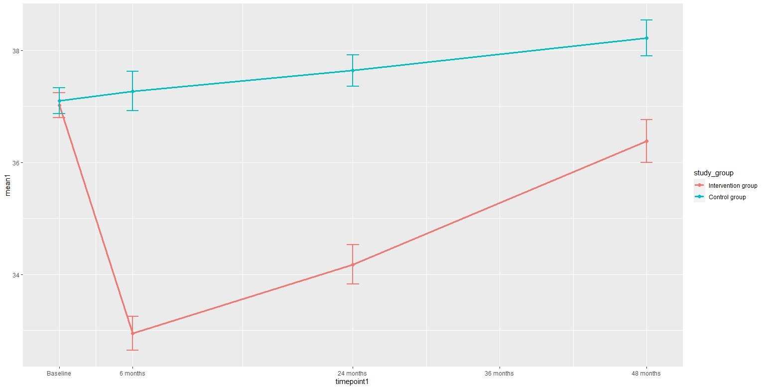
如何修改以下ggplot以获得以下内容:
- X轴应调整数月,即基线至6个月应较短,6个月至24个月应视时间点之间的月数而定。(下面的解决方案)
- Include在24个月至48个月之间的X轴断裂(例如36个月)
- 通过减少基线前和48个月后的空白使地块变大。(下面的解决方案)
谢谢你的帮忙!
fat <- structure(list(study_group = structure(c(1L, 1L, 1L, 1L, 2L,
2L, 2L, 2L), .Label = c("Intervention group", "Control group"
), class = "factor"), mean1 = c(37.02, 32.95, 34.18, 36.38, 37.1,
37.27, 37.64, 38.22), se1 = c(0.22, 0.3, 0.35, 0.38, 0.23, 0.35,
0.28, 0.32), timepoint1 = c(0, 6, 24, 48, 0, 6, 24, 48)), row.names = c(3L,
7L, 11L, 15L, 19L, 23L, 27L, 31L), class = "data.frame")


ggplot(fat, aes(timepoint1, mean1, colour = study_group)) +
  geom_point(size=2) +
  geom_line(size=1.2) +
  geom_errorbar(aes(ymin=mean1-se1, ymax=mean1+se1), width=1, size=1) +
  scale_x_continuous(
    breaks = c(0, 6, 24, 36, 48),
    labels = c("Baseline", "6 months", "24 months", "36 months", "48 months"),
    expand = c(0.05, 0))
回答 1
Stack Overflow用户
回答已采纳
发布于 2021-02-23 21:13:38
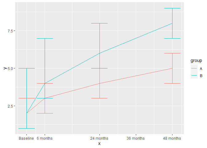
您最好的选择是将月数编码为numeric向量,而不是一个因子/字符。然后,您可以设置断线和重新标签的x轴。两边的空白由缩放的expand参数控制。下面是使用虚拟数据的示例:
library(ggplot2)
#> Warning: package 'ggplot2' was built under R version 4.0.3

df <- data.frame(
  x = rep(c(0, 6, 24, 48), 2), # <- encode as numeric
  ymin = c(1,2,3,4,1,3,5,7),
  y = c(2,3,4,5,2,4,6,8),
  ymax = c(3,4,5,6,5,7,8,9),
  group = rep(c("A", "B"), each = 4)
)

ggplot(df, aes(x, y, colour = group)) +
  geom_line() +
  geom_errorbar(aes(ymin = ymin, ymax = ymax)) +
  # Details for the x-axis
  scale_x_continuous(
    breaks = c(0, 6, 24, 36, 48),
    labels = c("Baseline", "6 months", "24 months", "36 months", "48 months"),
    expand = c(0.02, 0)
  )
作为对此提出问题的建议,尝试包括一些相关的(虚拟的)数据,并省略与当前问题无关的代码(例如主题设置、y尺度、装饰等)。这样就可以更容易地触及问题的核心,而不必被额外的代码分散注意力,也不必生成虚拟数据。
页面原文内容由Stack Overflow提供。腾讯云小微IT领域专用引擎提供翻译支持
原文链接:
https://stackoverflow.com/questions/66341098
复制相关文章
相似问题
腾讯云开发者
