
Ggplot2改变条形图的颜色。错误n太大,允许调色板的最大值
Ggplot2改变条形图的颜色。错误n太大,允许调色板的最大值
提问于 2020-12-22 23:54:59
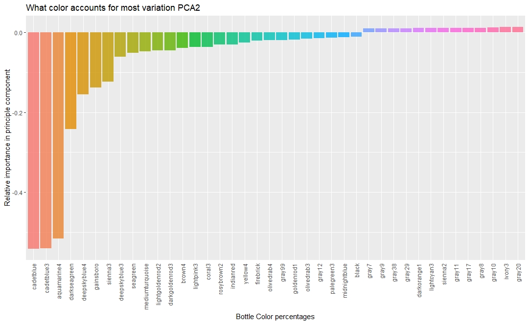
我有以下基于这个数据集的图表
我的目标是将每个条形上的颜色与“标签”颜色名称相匹配。
我试过用调色板
palette <- RColorBrewer::brewer.pal(length(unique(tidied_pca$Tag)),name = 'Set1')但我知道这个错误
    Warning message:
In RColorBrewer::brewer.pal(length(unique(tidied_pca$Tag)), name = "Set1") :
  n too large, allowed maximum for palette Set1 is 9
Returning the palette you asked for with that many colors
呈现图形的原始代码如下所示:
 tidied_pca %>%
  filter(PC == "PC2") %>%
  top_n(40, abs(Contribution)) %>%
  mutate(Tag = reorder(Tag, Contribution)) %>%
  ggplot(aes(Tag, Contribution, fill = Tag)) +
  geom_col(show.legend = FALSE, alpha = 0.8) +
  theme(axis.text.x = element_text(angle = 90, hjust = 1, vjust = 0.5),
        axis.ticks.x = element_blank()) +
  labs(x = "Bottle Color percentages",
       y = "Relative importance in principle component",
title = "What color accounts for most variation PCA2")Stack Overflow用户
回答已采纳
发布于 2020-12-23 00:27:34
若要仅使用标记列中的颜色,请添加
+ scale_fill_identity()但是对于实际的错误消息,没有颜色酿造者调色板有那么多不同的颜色。对于Set1,您得到的最大颜色是9。您可以在这些值之间进行插值以获得更多的颜色,但这样您可能会失去易于区分的颜色的优点。您可以使用基本的R colorRampPalette函数来实现这一点。
palette <- colorRampPalette(RColorBrewer::brewer.pal(9,name = 'Set1'))(length(unique(tidied_pca$Tag)))页面原文内容由Stack Overflow提供。腾讯云小微IT领域专用引擎提供翻译支持
原文链接:
https://stackoverflow.com/questions/65417363
复制相关文章
相似问题
腾讯云开发者

Copyright © 2013 - 2026 Tencent Cloud. All Rights Reserved. 腾讯云 版权所有
深圳市腾讯计算机系统有限公司 ICP备案/许可证号:粤B2-20090059 ![]() 粤公网安备44030502008569号
粤公网安备44030502008569号
腾讯云计算(北京)有限责任公司 京ICP证150476号 | 京ICP备11018762号