
使用Material创建带有标签、文本、选择和按钮元素的内联表单(类似于Boostrap)
使用Material创建带有标签、文本、选择和按钮元素的内联表单(类似于Boostrap)
提问于 2020-11-21 00:03:33
我正在努力使用Material-UI和React创建内联表单,类似于以下内容
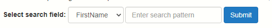
引导HTML片段
我使用下面的HTML片段创建了上面的内容。你可以在W3Schools试试这个。
<div class="container">
  <h2>Inline form</h2>
  <p>Make the viewport larger than 768px wide to see that all of the form elements are inline, left aligned, and the labels are alongside.</p>
  <form class="form-inline" action="/action_page.php">
    <div class="form-group">
      <label for="sel1">Select search field:</label>
      <select class="form-control" id="sel1">
        <option>FirstName</option>
        <option>LastName</option>
        <option>PostCode</option>
        <option>Gender</option>
      </select>
    </div>
    <div class="form-group">
      <input type="email" class="form-control" id="email" placeholder="Enter search pattern" name="email">
    </div>
    <button type="submit" class="btn btn-primary">Submit</button>
  </form>
</div>
我尝试使用资料用户界面
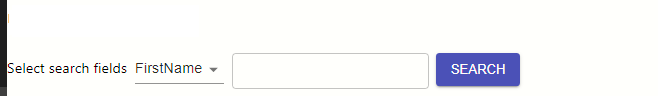
<label htmlFor="selectsearchfield">Select search fields</label>
<span> </span>
<NativeSelect id="selectsearchfield" value={{}}>
<option value="FirstName">FirstName</option>
<option value="LastName">LastName</option>
</NativeSelect>
<span> </span>
<TextField
label="" id="outlined-size-small" defaultValue="" variant="outlined" size="small" disableUnderline />
<span> </span>
<Button size="medium" variant="contained" color="primary">Search</Button>问题
可以清楚地看到,Bootstrap的输出要专业得多。请,任何建议如何改善内联形式使用材料UI看n感觉,以使它接近Bootstrap。
谢谢,
Sau
Stack Overflow用户
回答已采纳
发布于 2020-11-21 10:08:20
您可以使用material-ui makeStyles并使其响应也可以:-
import React, { useState } from "react";
import "./style.css";
import classNames from "classnames";
import { makeStyles } from "@material-ui/core/styles";
import {
  Button,
  FormControl,
  OutlinedInput,
  TextField,
  Typography,
  Select,
  MenuItem
} from "@material-ui/core";

export default function App() {
  const classes = useStyles();

  const fields = ["FirstName", "LastName", "PostCode", "Gender"];
  const [searcBy, setSearchBy] = useState("FirstName");
  const [searchText, setSearchText] = useState("");

  return (
    <div className={classes.root}>
      <form className={classes.form}>
        <FormControl className={classNames(classes.formControl, classes.text)}>
          <Typography variant="body1" className={classes.type}>
            Select search fields:
          </Typography>
        </FormControl>
        <FormControl
          className={classNames(classes.formControl, classes.select)}
        >
          <Select
            labelId="typesLabel"
            label="Types"
            input={<OutlinedInput classes={{ input: classes.input }} />}
            value={searcBy}
            onChange={e => setSearchBy(e.target.value)}
          >
            {fields.map(field => (
              <MenuItem key={field} value={field}>
                {field}
              </MenuItem>
            ))}
          </Select>
        </FormControl>
        <FormControl
          className={classNames(classes.formControl, classes.search)}
        >
          <TextField
            label="Enter search pattern"
            variant="outlined"
            size="small"
            value={searchText}
            onChange={e => setSearchText(e.target.value)}
          />
        </FormControl>
        <Button
          type="submit"
          variant="contained"
          color="primary"
          className={classes.submitBtn}
        >
          Primary
        </Button>
      </form>
    </div>
  );
}

const useStyles = makeStyles(theme => ({
  root: {
    display: "flex",
    justifyContent: "center",
    alignItems: "center"
  },
  form: {
    width: 800,
    display: "flex",
    flexWrap: "wrap",
    justifyContent: "center",
    alignItems: "center"
  },
  container: {
    display: "flex",
    justifyContent: "center",
    alignItems: "center"
  },
  text: {
    minWidth: 120
  },
  type: {
    fontWeight: 600
  },
  formControl: {
    marginRight: theme.spacing(1),
    [theme.breakpoints.down("xs")]: {
      minWidth: "100%",
      marginRight: theme.spacing(0),
      marginBottom: theme.spacing(1)
    }
  },
  input: {
    padding: "10px 14px"
  },
  select: {
    maxWidth: 130
  },
  search: {
    maxWidth: 180
  },
  submitBtn: {
    [theme.breakpoints.down("xs")]: {
      width: "100%"
    }
  }
}));或者,您也可以结合使用来自Grid的@material-ui/core.Grid,而不是像上面的例子那样使用'flex‘。
结果是:-
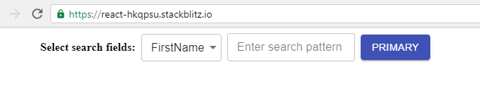
- 对上面发生的事情的一点解释:-
- 将
input={<OutlinedInput classes={{ input: classes.input }} />}作为select元素props将使我们能够创建自己的outline,而不是依赖于来自材料-用户界面选择文档代码的给定示例代码。 - 我们之所以这样做,是因为您想使它与上面的
Bootstraps示例完全一样。我们需要以某种方式使select元素的高度变短。使用元素TextField,您可以只指定size="small"。但是对于select来说,这个选项是不可用的。这就是为什么我们有这样的方法。或者可以使用selectofmaterial-ui/core/styles直接更改withStyles输入元素的整体样式。
- 将
您也可以参考这个沙箱码来查看实际的工作结果。
页面原文内容由Stack Overflow提供。腾讯云小微IT领域专用引擎提供翻译支持
原文链接:
https://stackoverflow.com/questions/64938484
复制相关文章
相似问题
腾讯云开发者
