
以编程方式偏移x轴上的Plotly.js移位图
以编程方式偏移x轴上的Plotly.js移位图
提问于 2020-11-18 10:11:43
我正在绘制一个'scattergl‘图。
在我的应用程序中,可以切换到
- 数据来自特定的时间框架,
- 或显示实时数据(每秒钟更新一次).
对于实时视图,我使用extendTraces每秒推送新的点。
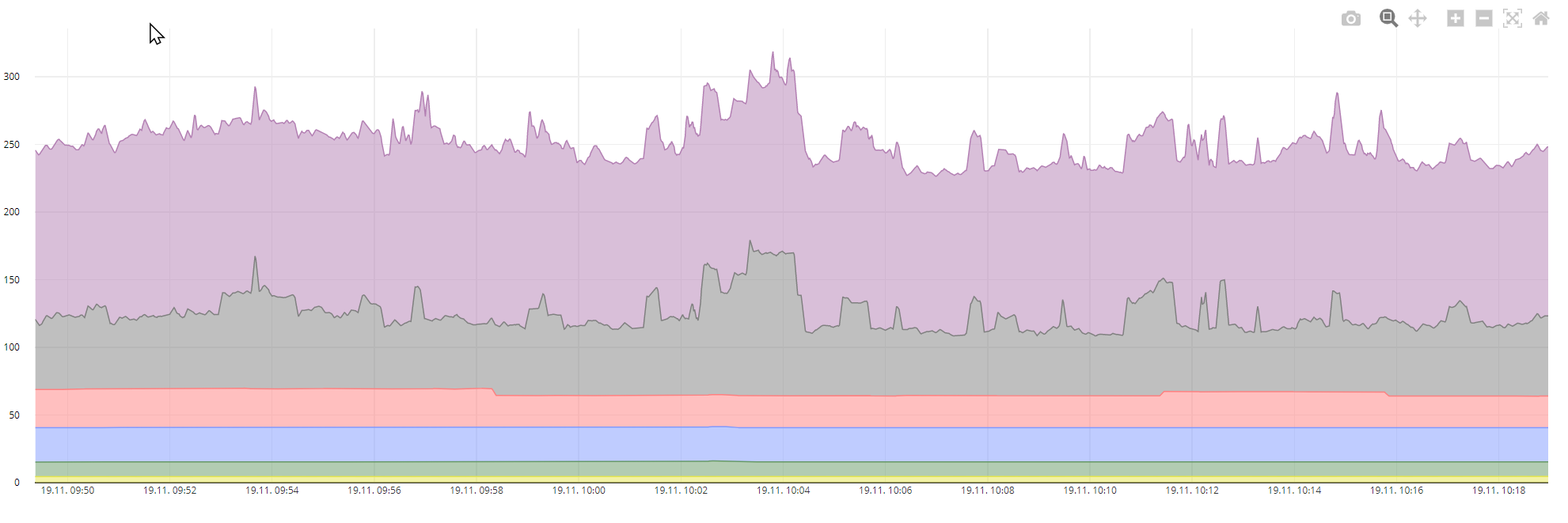
在实时视图中,我想改变我的图形的x位置,所以图形在屏幕上“移动”,新的点总是出现在同一个位置。现在它是自动标度,我不想当数据被流时,但我不知道如何设置框架或位置或某物来实现我的目标。
现在是自动标度:
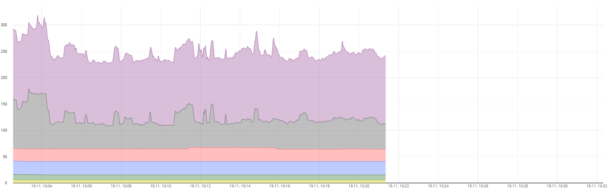
这是我想要的,+所有新的点都出现在同一个位置,旧的数据被移到左边:
另外,当从固定的时间框架切换到实时视图时,我想要“跳转”到更新数据,因为在实时模式下,我对“大图”不感兴趣。我可能想放大手动,或平移等,但在切换它应该“放大”我的代码到新的更新点。
我好像用错了搜索词。也许有人知道要传递的正确配置选项?
我如何扩展:
Plotly.extendTraces(nativeElement, {x, y}, numbers, maxPoints);这是我数据的一部分:
{
  "data": [
    {
      "type": "scatter",
      "x": [
        "2020-11-18T09:52:58.000Z",
        "2020-11-18T09:52:59.000Z",
        "2020-11-18T09:53:00.000Z",
        "2020-11-18T09:53:01.000Z"
      ],
      "y": [
        4.637524903199999,
        4.635876884400001,
        4.6342288656,
        4.635876884400001
      ],
      "time": [],
      "mode": "lines",
      "marker": {
        "size": 5
      },
      "domain": {
        "x": [
          0.25,
          0.75
        ],
        "y": [
          0.25,
          0.75
        ]
      },
      "showlegend": true,
      "name": "Euro/time\r\n<Beleuchtung 1>",
      "stackgroup": "one",
      "fill": "tonexty",
      "line": {
        "color": "rgba(230,230,77,1)",
        "width": 1,
        "dash": "solid"
      },
    },
  ],
  "layout": {
    "margin": {
      "l": 50,
      "r": 50,
      "t": 5,
      "b": 50
    },
    "autosize": true,
    "showlegend": false,
    "hovermode": "closest",
    "legend": {
      "x": 0,
      "y": 1,
      "traceorder": "normal",
      "font": {
        "family": "sans-serif",
        "size": 10,
        "color": "#000"
      },
      "bgcolor": "#E2E2E255",
      "bordercolor": "#FFFFFF",
      "borderwidth": 2,
      "orientation": "h"
    },
    "title": null,
    "xaxis": {
      "tickfont": {
        "color": "#333",
        "size": 8
      },
      "title": null,
      "titlefont": {
        "color": "rgb(148, 103, 189)",
        "size": 10
      },
      "nticks": 20,
      "domain": [
        0.01,
        0.99
      ],
      "tickformatstops": [
        {
          "dtickrange": [
            null,
            1000
          ],
          "value": "%H:%M:%S.%L"
        },
        {
          "dtickrange": [
            1000,
            60000
          ],
          "value": "%H:%M:%S"
        },
        {
          "dtickrange": [
            60000,
            86400000
          ],
          "value": "%d.%m. %H:%M"
        },
        {
          "dtickrange": [
            86400000,
            604800000
          ],
          "value": "%d.%m.%y"
        },
        {
          "dtickrange": [
            604800000,
            "M1"
          ],
          "value": "%d.%m.%y"
        },
        {
          "dtickrange": [
            "M1",
            "M12"
          ],
          "value": "%b '%y"
        },
        {
          "dtickrange": [
            "M12",
            null
          ],
          "value": "%Y Y"
        }
      ]
    },
    "yaxis": {
      "tickfont": {
        "color": "rgba(0,0,0,1)",
        "size": 8
      },
      "title": "Geld [T€/year]",
      "titlefont": {
        "color": "rgba(0,0,0,1)",
        "size": 10
      },
      "side": "left",
      "domain": [
        0.05,
        0.95
      ],
      "showgrid": true,
      "ticks": "",
      "showticklabels": true,
      "position": 0
    },
    "hoverlabel": {
      "font": {
        "size": 10
      },
      "bgcolor": "#FFF",
      "namelength": -1
    }
  }
}回答 1
Stack Overflow用户
发布于 2020-11-25 10:15:19
您可以通过使用x轴布局属性中的范围值来实现这一点。
layout = {
    xaxis: {
        autorange: false,
        range: ['2016-07-01', '2016-12-31']
   },
   .....
};
https://plotly.com/javascript/time-series/#manually-set-range
页面原文内容由Stack Overflow提供。腾讯云小微IT领域专用引擎提供翻译支持
原文链接:
https://stackoverflow.com/questions/64890990
复制相关文章
相似问题
腾讯云开发者

Copyright © 2013 - 2026 Tencent Cloud. All Rights Reserved. 腾讯云 版权所有
深圳市腾讯计算机系统有限公司 ICP备案/许可证号:粤B2-20090059 ![]() 粤公网安备44030502008569号
粤公网安备44030502008569号
腾讯云计算(北京)有限责任公司 京ICP证150476号 | 京ICP备11018762号