
如何在R中绘制2个图的概率密度函数
如何在R中绘制2个图的概率密度函数
提问于 2020-09-16 09:35:17
我试图可视化两个分布的直方图,然后在相同的pdf图中可视化分布。
首先,我试图模拟从正态分布中抽取的100到5000张图,这个正态分布包含=6 ochσ= 2。
企图:
x <-rnorm(n=100, mean=6, sd=2)
hist(x, probability=TRUE)
y <-rnorm(n=5000, mean=6, sd=2)
hist(x, probability=TRUE)
我相信对直方图的可视化是正确的。但是,我不明白如何在同一张图中显示这两个图的pdf。我找到了一个名为pdfPlot()的函数,但无法使它工作。
我如何将x和y组合成一个图,并显示它们的pdf?
回答 1
Stack Overflow用户
回答已采纳
发布于 2020-09-16 11:37:30
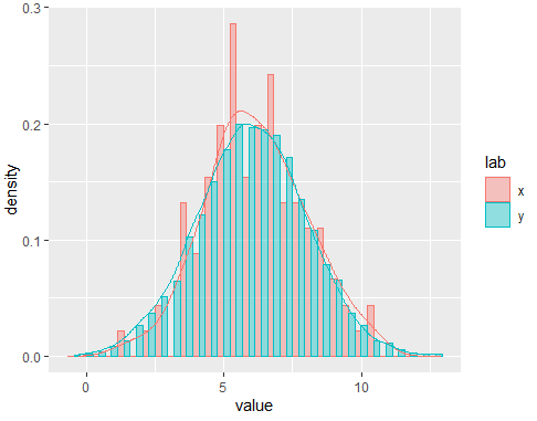
也许您需要考虑的一个选项是ggplot2。如果有必要,我会把密码留给你。您可以在dataframe中设置变量,然后绘制它们。您可以将元素作为position从geom_histogram()中删除,以便在绘图中具有其他透视图。在这里,代码:
library(ggplot2)
set.seed(123)
#Code
x <-rnorm(n=100, mean=6, sd=2)
hist(x, probability=TRUE)
y <-rnorm(n=5000, mean=6, sd=2)
hist(x, probability=TRUE)
#Data
x <-rnorm(n=100, mean=6, sd=2)
y <-rnorm(n=5000, mean=6, sd=2)
xlab <- rep('x',100)
ylab <- rep('y',5000)
#Dataframe
df <- data.frame(value=c(x,y),lab=c(xlab,ylab),stringsAsFactors = F)
#Plot
ggplot(df,aes(x=value,fill=lab,color=lab,group=lab))+
  geom_histogram(aes(y = ..density..), alpha = 0.4,position = position_dodge())+
  geom_line(aes(y = ..density..,), stat = 'density',show.legend = F)
输出:
页面原文内容由Stack Overflow提供。腾讯云小微IT领域专用引擎提供翻译支持
原文链接:
https://stackoverflow.com/questions/63917187
复制相关文章
相似问题
腾讯云开发者
