
从excel xlsx到3D绘图的三维绘图测量数据
从excel xlsx到3D绘图的三维绘图测量数据
提问于 2020-08-20 20:36:30
我试图将XYZ值转换为一个网格,或者用函数直接绘制它们。
我有一张有测量值的桌子。在不同的压力下测量了一组分的流量。因此,有以下测量值:
- 压力1: X轴:位置值Y轴:流量值
- 压力2: X轴:位置值Y轴:流量值
- ....
在8个不同的压力下,我一共有16个列,X值.
实际上,我不认为这有那么难。如果你把Z轴(深度)切成8个切片,那么每个切片都有X坐标.因此,软件只需将它们线性地连接起来,或在图中用样条进行连接。
是否有一个函数,我为每个Z值指定了一个X列,并且可以输出为一个曲面图?
为了更清楚地说明,我创建了一个包含值的示例虚拟表:

回答 2
Stack Overflow用户
发布于 2020-08-21 08:33:31
这是你想要的吗?
import matplotlib.pyplot as plt
import numpy as np

# generate x, y
x = np.linspace(0, 10, 51)
w = np.linspace(0.5, 0.20, 10)
y = np.array([np.sin(wi*x)/wi for wi in w]) # 10 rows, 51 cols
# and a very generic z
z = np.linspace(1, 10, 10)

# note that in a surface plot the indipendent variable is Z,
# so IF our indipendent variable is y…
X, Y = np.meshgrid(x, z) ; Z = y # X, Y have 10 rows, 51 cols too

# this stuff is pretty standard, you can find info everywhere
fig = plt.figure() ; ax = fig.gca(projection='3d')
surf = ax.plot_surface(X, Y, Z, cmap='viridis')
ax.set(xlabel='x', ylabel='z', zlabel='y')
ax.view_init(elev=15, azim=-100)
fig.colorbar(surf, shrink=0.67) # the 1st arg is the output of plot_surface
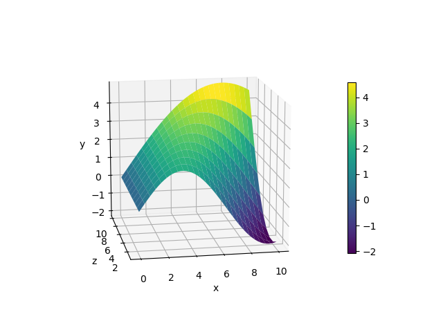
颜色地图是默认的,您可以按名称选择另一个。您可以使用plt.colormaps()查看彩色地图名称的完整列表。
Stack Overflow用户
发布于 2020-08-21 12:44:23
这并不是完全正确的答案,因为我想从一个DataFrame表中导入一个。在Excel表中,输入的值与我上一封邮件中的图片相同。我想用3D来描绘它们。
我导入数据如下所示
from mpl_toolkits.mplot3d import Axes3D
import pandas as pd


fig = plt.figure()
ax = Axes3D(fig)

df=pd.read_excel('raw.xlsx')页面原文内容由Stack Overflow提供。腾讯云小微IT领域专用引擎提供翻译支持
原文链接:
https://stackoverflow.com/questions/63512806
复制相关文章
相似问题
腾讯云开发者
